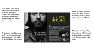
1. This double page spread
has one main picture on
one side which your
attention is immediately
drawn to, this makes it
eye catching and draws
the reader in.
There isn’t a lot of writing
which will make people
more likely to read it as it
isn’t going to bore them.
The yellow writing in big
letters draws in the reader
and makes them want to
read the article as it is very
clear.
The colours stand out very
well from the background,
this also entices the reader
in and grabs their attention.
2. The image goes over both
pages, the large image
draws the readers eye in
and entices them to read
the article.
The colours are very
neutral making it easier
on the eye for the reader
making it less ‘in your
face’.
The writing at the
bottom entices the
reader in and makes
them intrigued, this is
because of the
contrasting colouring
between the red and the
grey.
The pages have no smaller
images but just text. This
could be to fit in with the
more classy style of the
article with the colours and
organised layout.
3. This double page spread
has a very messy layout
and lacks organisation.
This page however
reflects the band as they
are a pop punk band
and punk culture is very
messy and lacks
organisation.
The colours also reflect
the bands genre as the
colours are very ‘in your
face’ just like how punk
music is.
The use of different text
appeals to a younger
audience as it makes the
page more interesting
and stands out more
because of this lack or
organisation.
The large image on its
own shows that the
singer doesn’t care and
this again appeals to the
audience.