
Recommended
More Related Content
What's hot
What's hot (20)
Similar to Album Advert 1 Analysis: The Weeknd - The Madness
Similar to Album Advert 1 Analysis: The Weeknd - The Madness (20)
Recently uploaded
Recently uploaded (20)
Album Advert 1 Analysis: The Weeknd - The Madness
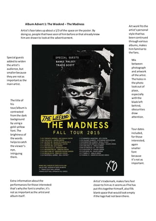
- 1. Album Advert 1: The Weeknd – The Madness Artist’sface takesupabout a 1/3 of the space on the poster.By doingso,people thathave seenof himbefore orthat alreadyknow himare drawnto lookat the advertisement. The title of his tour/albumis contrasted fromthe dark background by usinga gold-yellow font.The brightnessof the words helpstocatch the viewer’s eye, intriguing them. Extra informationaboutthe performancesforthose interested: that’swhythe fontissmaller,it’s not as importantasthe artistand albumitself. Tour dates included, for those interested, again smaller font because it’snot as important. Mix between photograph and artwork of the artist. The holesin the photo lookout of place, especially withthe blackleft behind, obscurities draw attention. Special guests addedto widen the artist’s audience,but smallerbecause theyare notas importantas the mainartist. Artist’strademark,makesfansfeel closerto himas it seemsasif he has put thistogetherhimself,alsofills blankspace that wouldlookempty if the logohad not beenthere. Art workfitsthe artist’spersonal style thathas beencontinued throughvarious albums,makes himfamiliarto the fans.