English - 3 - Financial benchmarking for inventory turns and working capital.
•
1 like•149 views

This article fits in a series of articles inspired by the book ‘Supply Chain Metrics That Matter’. In her latest book Lora Cecere introduces ‘which are the metrics that matter’, ‘how to ensure strength, balance and resilience’, what are the ‘evolutions in different sectors’, … In this third article, Bram tries to explore alternatives for measuring the cash side and the service-cost side of the supply chain triangle. He compares inventory turns and CCC for the cash side. He compares EBIT and EBITDA for the service-cost side. We also derive the best practice curve amongst 3 benchmark companies and derive resulting targets for a combination of EBIT-inventory or EBIT-CCC. We hope you enjoy the reading.

Recommended
Recommended
More Related Content
Viewers also liked
Viewers also liked (17)
Similar to English - 3 - Financial benchmarking for inventory turns and working capital.
Similar to English - 3 - Financial benchmarking for inventory turns and working capital. (20)
More from Bram Desmet
More from Bram Desmet (19)
Recently uploaded
Recently uploaded (20)
English - 3 - Financial benchmarking for inventory turns and working capital.
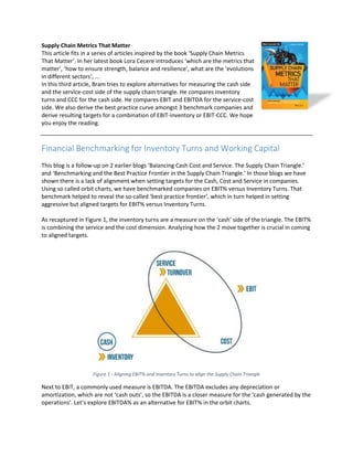
- 1. Supply Chain Metrics That Matter This article fits in a series of articles inspired by the book ‘Supply Chain Metrics That Matter’. In her latest book Lora Cecere introduces ‘which are the metrics that matter’, ‘how to ensure strength, balance and resilience’, what are the ‘evolutions in different sectors’, … In this third article, Bram tries to explore alternatives for measuring the cash side and the service-cost side of the supply chain triangle. He compares inventory turns and CCC for the cash side. He compares EBIT and EBITDA for the service-cost side. We also derive the best practice curve amongst 3 benchmark companies and derive resulting targets for a combination of EBIT-inventory or EBIT-CCC. We hope you enjoy the reading. Financial Benchmarking for Inventory Turns and Working Capital This blog is a follow-up on 2 earlier blogs ‘Balancing Cash Cost and Service. The Supply Chain Triangle.’ and ‘Benchmarking and the Best Practice Frontier in the Supply Chain Triangle.’ In those blogs we have shown there is a lack of alignment when setting targets for the Cash, Cost and Service in companies. Using so called orbit charts, we have benchmarked companies on EBIT% versus Inventory Turns. That benchmark helped to reveal the so-called ‘best practice frontier’, which in turn helped in setting aggressive but aligned targets for EBIT% versus Inventory Turns. As recaptured in Figure 1, the inventory turns are a measure on the ‘cash’ side of the triangle. The EBIT% is combining the service and the cost dimension. Analyzing how the 2 move together is crucial in coming to aligned targets. Figure 1 - Aligning EBIT% and Inventory Turns to align the Supply Chain Triangle Next to EBIT, a commonly used measure is EBITDA. The EBITDA excludes any depreciation or amortization, which are not ‘cash outs’, so the EBITDA is a closer measure for the ‘cash generated by the operations’. Let’s explore EBITDA% as an alternative for EBIT% in the orbit charts.
- 2. Inventory is a part of working capital, together with the Accounts Payable and the Accounts Receivable. Lowering working capital generates cash. Working capital can be measured by the so-called ‘Cash Conversion Cycle’. Let’s explore the Cash Conversion Cycle as an alternative for the Inventory Turns in the orbit charts. Where EBIT or EBITDA per inventory $ or per working capital $ helps in getting meaningful benchmarks and aligned targets, they are not common financial metrics. We will close this blog by discussing the Return On Capital Employed or ROCE which is close to the EBIT% vs CCC, and which is a more common financial metric. Benchmarking EBITDA% versus Inventory Turns Figure 2 recaps the EBIT versus Inventory Turns for our 3 technology companies presented in the blog ‘Benchmarking and the Best Practice Frontier in the Supply Chain Triangle.’ In that blog we also discussed how Company 2 showed strength in inventory turns but was unbalanced with EBIT%. Both Company 1 and Company 3 get hit by the financial crisis but Company 1 shows a full rebound to pre- crisis profitability at better turns. It proves to be more resilient. Figure 2 - Orbit chart on 'EBIT%' versus 'Inventory Turns' for 3 competing technology companies Figure 3 compares EBITDA% versus inventory turns for the same 3 companies. EBITDA% is higher than the EBIT% as it does not account for the depreciations and the amortizations. There is a noticeable difference in the comparison of Company 1 and Company 3 for the 2 graphs. When comparing EBIT% Company 3 is clearly superior in the period 2004-2007. When comparing EBITDA% they seem to be closer.
- 3. Figure 3 - Orbit chart on 'EBITDA%' versus 'Inventory Turns' for 3 competing technology companies The difference is not a performance but an accounting difference. There are 2 basic options to account for investments in R&D: - Either, we account for the R&D cost of the year, in the year itself. The R&D costs can be covered in the Selling, General and Adminstrative costs, or mentioned as a separate item, but in any case they are included ‘above’ the EBITDA line, so accounted for in the EBITDA. - Either, we ‘capitalize’ the R&D expense, and depreciate it over the lifetime of the corresponding products. In this case, the R&D costs are ‘below’ the EBITDA line, so not accounted for in the EBITDA, but mentioned as a depreciation cost below the EBITDA line. Figure 4 compares the EBIT% and the EBITDA% for our 3 companies. For company 1, the EBITDA is consistently higher than the EBIT. This has to do with the depreciation of the R&D costs. This company is using the second approach. It is because they follow the first accounting approach.
- 4. Figure 4 - Comparing EBITDA% and EBIT% As a result the comparison in Figure 3 is not a fair comparison. 2 companies have accounted for the R&D costs in their EBITDA, company 1 has not. When benchmarking we need to be careful to compare apples to apples. Figure 2 is comparing apples to apples, all companies have accounted for R&D expenses. Figure 3 is comparing apples with pears, company 2 and 3 have accounted for R&D expenses where company 1 has not. Benchmarking EBIT% versus Cash Conversion Cycle Figure 5 shows an orbit chart for the EBIT% versus the Cash Conversion Cycle (CCC) for our 3 technology companies. The Cash Conversion Cycle is calculated as the Days Inventory On Hand (DIOH) + the Days of Sales Outstanding (DSO) – the Days of Payables Outstanding (DPO). Figure 5 - EBIT% versus Cash Conversion Cycle for 3 technology companies
- 5. Where in Figure 2 we want to be on the ‘top right’ corner, high EBIT% and high inventory turns, in Figure 5 we want to be on the top left corner, high EBIT% and a low CCC corresponding with a low working capital. From Figure 5 we see that Company 3 has a low CCC but for a low profitability. It is comparable to our conclusion for Figure 2. It is strong in working capital management but unbalanced with a substandard profitability. From that same Figure 5 we see that Company 1 has done a good job in reducing it’s working capital while keeping the EBIT% at decent levels. 2014 was a bad year as the CCC increased and the EBIT% went down. The direction of 2010 – 2012 was a better one, decreasing CCC while increasing EBIT%. The company should look to regain that momentum. Company 3 looks struggling from Figure 5, EBIT% has come down, and CCC has increased. Going back to Figure 2 gives a comparable message. For 2012 Company 1 and Company 3 have a comparable EBIT% but Company 1 has a higher inventory turns. In general we expect the ‘Inventory Turns’ and the ‘CCC’ indeed to point in the same direction. When companies work on inventories, they are likely to do it for cash reasons so they also work on Payables and Receivables. Reveal the “Best Practice Frontier” for EBIT% versus CCC As we did in the previous blog ‘Benchmarking and the Best Practice Frontier in the Supply Chain Triangle.’ for EBIT% versus Inventory Turns, Figure 6 shows the Minimum, the Median and the Maximum “EBIT per working capital $” curves. It is OK to have more working capital, as long as the EBIT per working capital $ is higher. For Figure 6 we have taken the years with a Minimum, Median and Maximum EBIT per working capital $ for company 1. For each of these years we have shown the combination of EBIT% and CCC that would have led to the same EBIT per working capital $.
- 6. Figure 6 - Minimum, Median, Maximum EBIT per invested dollar curves for Company 1 Figure 7 shows the same for Companies 2 and 3. The graph on the bottom right compares the median performance of the 3 companies. Figure 7 - Min/Med/Max EBIT% vs CCC for Companies 1, 2 and 3
- 7. As we did in the previous blog ‘Benchmarking and the Best Practice Frontier in the Supply Chain Triangle’, the Median and the Maximum of Company 3 can again be used as a benchmark and for target setting. As shown in Figure 8, when going for the Median curve, the Company 1 should - Either return to a CCC of around 100 days for an EBIT% of around 6% - Either has to boost EBIT% back to 8% if it’s CCC stays around 130 days Figure 8 - Target Setting for Company 1 based on EBIT% vs CCC benchmarking analysis If we take it a couple of steps further, and go for the Maximum curve, Figure 9 shows that a stretched target for Company 1 would be to - Either further boost its performance to land ad a CCC of around 70 days for an EBIT of around 10% - Or either further boost its EBIT to around 20% for the current CCC of around 130 days Again, these targets seem overly aggressive but Company 3 has been close to that performance for 3 consecutive years. A detailed analysis of how they did should reveal opportunities for Company 1 to shift in that same direction. The 2 options also seem to go in quite opposite directions. As we will introduce in a next blog, we believe the choice of direction is one of the choice of strategy.
- 8. Figure 9 - Stretched Target Setting for Company 1 based on EBIT% vs CCC benchmarking analysis The ROCE as a common financial metric spanning the Supply Chain Triangle. So far we have used the EBIT per inventory $ or per working capital $ as a metric spanning the supply chain triangle. Where these help to define a good benchmarking strategy for the Inventory Turns or the Cash Conversion Cycle, they are not common financial metrics. A more commonly used financial metric spanning the full Supply Chain Triangle is the Return On Capital Employed or the ROCE. The ROCE is defined as follows: EmployedCapital EBIT ROCE = With Capital Employed = Fixed Assets + Working Capital. The main difference with what we did so far is the Fixed Assets. The Fixed Assets can be told to be part of the ‘Cash’ part of the triangle. So this metric is clearly going beyond the Supply Chain Triangle. Figure 10 shows the ROCE evolution for our three benchmark companies. We come to comparable conclusions. Competitor 1 has below standard ROCE and seems to be in a prolonged period of trouble. Competitor 2 is doing well before and during the crisis but had difficulties to sustain that after the crisis period. Company 1 has improved its ROCE performance. From the previous analyses we know that the EBIT% has come down but so has the working capital, leading to an overall improvement in the profitability of the company.
- 9. Figure 10 - ROCE evolution for 3 competing technology companies In conclusion, we need to take care to compare apples with apples when performing a benchmark. Benchmarking with inventory turns or with working capital gives comparable results, which is not too surprising. Benchmarking EBIT per inventory $ or per working capital $ allows balanced target setting. Though they are not common financial metrics, they point in the same direction as the ROCE, which is a more common financial metric. Dr. Bram Desmet is adjunct professor in Operations and Supply Chain at the Vlerick Business School. He obtained his Phd at Gent University on the topic of “Safety stock optimization in multi-echelon production-distribution networks”. He is working on a book on “Supply chain strategy” and “Managing Working Capital. As the Managing Director of Solventure and a Partner at MÖBIUS Consulting he helps global production and retail organizations in the domains of Strategy, Supply Chain and Operations. He welcomes your feedback at bram_desmet@solventure.eu