1. HouseStyle: The house style forthismagazine isvery
simplistic,the coloursconsistsof blacks,andwhites.This
was usedtomake the artiststandout fromthe
backgroundto directthe attentiontowardsher.There
are 5 differentfontsonthiscontentspage thiswasused
to make each sectionof the page standout fromeach
other,to make iteasierto use.The firstfontisusedfor
the mastheadto show whatthe page isabout.The
secondfontisusedfor the subheadingtosplitthe
sectionsof the contentssothe reader can findwhatthey
wantto read withease.The otherfontswere usedto
splitupthe parts of the subheadingstoprovide titlesand
descriptionsof the articles,aswell asprovidingcreditto
the author and photographerof the article.
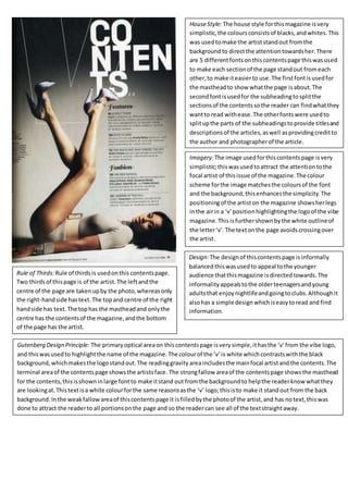
Imagery:The image usedforthiscontentspage isvery
simplistic;thiswasusedtoattract the attentiontothe
focal artist of thisissue of the magazine.The colour
scheme forthe image matchesthe coloursof the font
and the background,thisenhancesthe simplicity.The
positioningof the artiston the magazine showsherlegs
inthe airin a ‘v’positionhighlightingthe logoof the vibe
magazine.Thisisfurthershownbythe white outlineof
the letter‘v’.The textonthe page avoidscrossingover
the artist.
Gutenberg Design Principle: The primaryoptical areaon thiscontentspage isverysimple,ithasthe ‘v’from the vibe logo,
and thiswasusedto highlightthe name of the magazine.The colourof the ‘v’is white whichcontrastswiththe black
background,whichmakesthe logostandout.The readinggravity areaincludesthe mainfocal artistandthe contents.The
terminal areaof the contentspage showsthe artistsface. The strongfallow areaof the contentspage showsthe masthead
for the contents,thisisshowninlarge fontto make itstand out fromthe backgroundto helpthe readerknowwhatthey
are lookingat.Thistextisa white colourforthe same reasonsasthe ‘v’ logo;thisisto make it standout from the back
background.Inthe weakfallowareaof thiscontentspage it isfilledbythe photoof the artist,and has notext,thiswas
done to attract the readerto all portionsonthe page and so the readercan see all of the textstraightaway.
Design:The designof thiscontentspage isinformally
balanced thiswasusedto appeal tothe younger
audience thatthismagazine isdirectedtowards.The
informalityappealstothe olderteenagersandyoung
adultsthat enjoynightlifeandgoingtoclubs.Althoughit
alsohas a simple design whichiseasytoread and find
information.
Rule of Thirds:Rule of thirdsis usedonthis contentspage.
Two thirdsof thispage is of the artist.The leftandthe
centre of the page are takenupby the photo,whereasonly
the right-handside hastext.The topand centre of the right
handside has text.The tophas the mastheadand onlythe
centre has the contentsof the magazine,andthe bottom
of the page has the artist.
2. HouseStyle: The house style forthismagazine isvery
crowedunlike the vibe magazine,the coloursconsistof
blacks,andwhitesandyellow.Thisenhancesthe genre
of the rock magazine,the white backgroundmakesthe
blacktextstand out,and the yellow isusedtoattract the
readeras it standsoutfrom the black.There are 2
differentfontsonthiscontents page;thiswasusedto
make it easiertoread.The firstfont isthe same font
usedforthe mastheadof the magazine;thisisusedas
the subheadingforthe magazine tomake eachone
standout, whichishelpbythe yellow colour. The second
fontis used togive the title of the article incapital
lettersandinbold,andthe descriptionsof the articles
are shown ina smallerfont.Thishelpskeepsthe busy
contentspage easyto follow.
Imagery:The mainimage usedforthiscontentspage
showsa picture of a concert;thiswas usedto link with
the genre and attracts the target audience forthis
magazine.There are otherphotosonthe contentspage
whichshowsshotsthat linktothe correspondingarticle.
The colour scheme forthe image showsa dark
backgroundand the focal artistcrowd surfingwearinga
white shirt,whichmatchesthe colourscheme of the
magazine’scontentspage.The targetaudience wouldbe
attractedto thismagazine as theywould be interestedin
rock concerts.
Design:The designof thiscontentspage iswell balanced
withthe image onthe tophalf and the contentson the
bottomhalf.Thishelpsthe keepthe magazine simple
and easiertoread. The informal balance forthis
magazine linkstothe youngteenageraudience asthey
wouldbe interestedinconcertsandrock music.
Gutenberg Design Principle: In the primaryoptical area,the
mastheadof the word ‘contents’isused,thishelpsthe
readerknowwhatpage theyare lookingatafterturning
the page.The readinggravityarea,goesthroughthe image
and the contentsof the page,so the readerwouldknow
whatis inthe magazine,there isalsoanadvertisement
towardsthe bottomof the page whichtalksabout a “Brit
Pack PosterSpecial!”Havingthisinthe readinggravityarea
helpsthe reader,asit wouldattractthemto thispage or to
purchase the magazine.Inthe terminal areaof the
contentspage ithas anotheradvertisementforthe
subscriptionof ‘Kerrang!’magazine,sothe readerwould
notice the advertisementmore thanif itwasinthe weak
fallowarea.Inthe strong fallowarea,itismainlyempty,
onlyincludingthe mainimage of the page.Inthe weak
fallowarea,there are the editor’snotes;thiswouldhave
beenplacedhere soitdoesn’ttake awayfromthe restof
the magazine.