Downloaded 198 times


![6
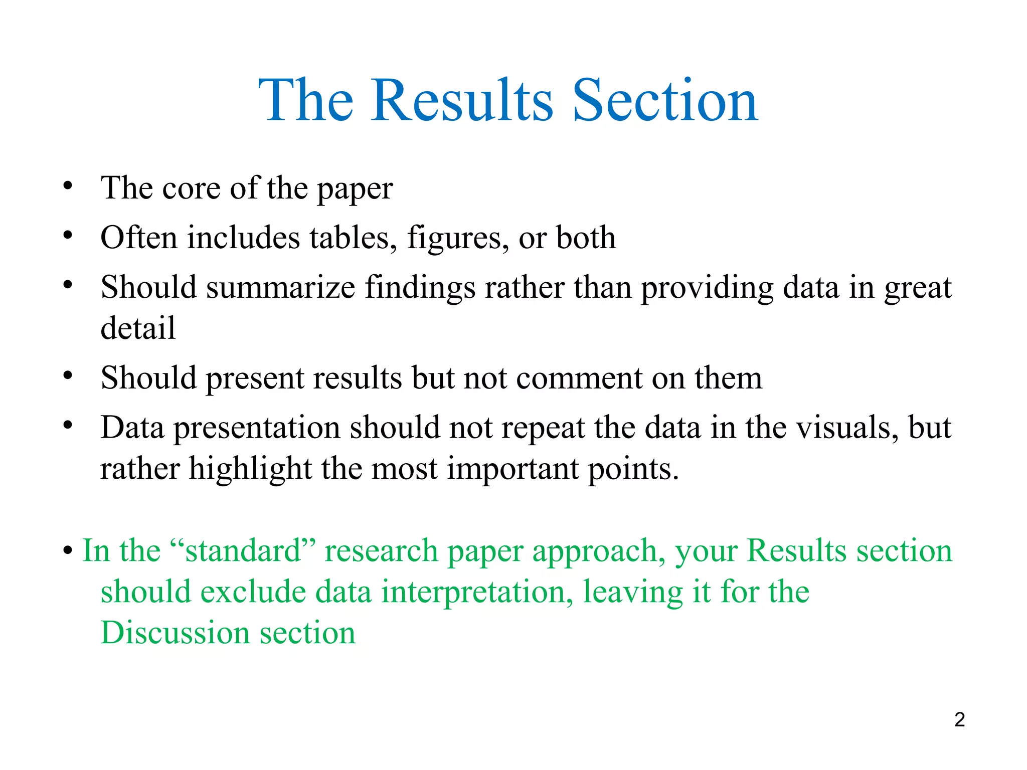
State the result and then present the data or cite a figure or
table.
In the 20 control subjects, the mean resting blood pressure was
85 ± 5(SD) mmHg. In comparison, in the 30 patients, the mean
resting blood pressure was 94 ± 3(SD) mmHg.
vs.
The mean resting blood pressure was 10% higher in the 30
patients than in the 20 control subjects (94 ± 3 [SD] vs 85
±5[SD] mmHg, P< 0.02).
Do not provide incomplete information
“People taking ibuprofen daily were more likely to have
asthma.”
More likely than whom?](https://image.slidesharecdn.com/writing-the-results-section-190704083756/75/Writing-the-results-section-for-scientific-publication-6-2048.jpg)


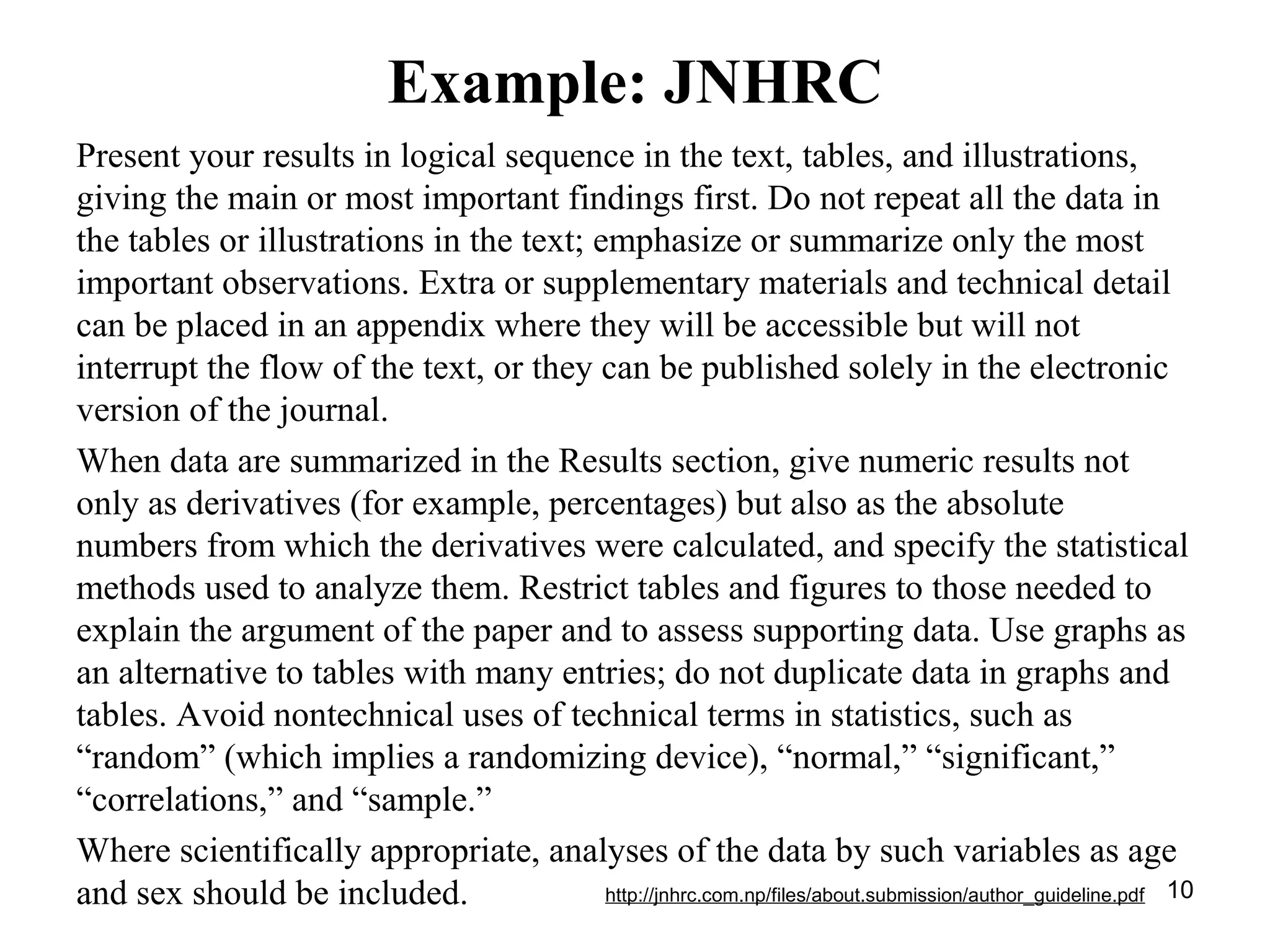


The document outlines key principles for preparing the results section of a scientific paper, emphasizing that this section should summarize key findings without offering interpretation, using clear descriptions and avoiding raw data. It stresses the importance of logical organization in presenting data through tables and figures, ensuring that these visuals complement the text rather than duplicate it. Additionally, it provides tips for using statistical analysis effectively and guidelines for the appropriate design and presentation of tables and figures.


![Choosing research topic[1]](https://cdn.slidesharecdn.com/ss_thumbnails/choosingresearchtopic1-171005154619-thumbnail.jpg?width=640&height=640&fit=bounds)