1. BAND LOGOS.
Ashleigh Weir
Band logos are used as a quick, recognisable icon of a
band/artist; they should be readable, scalable (from badges to
backdrops etc.) and memorable! The denotations and
connotations should back the brand image that the band/artist
want to make.
Some bands like to keep their logo consistent,
whereas others like to have a new one to match
each new tour, look or musical direction they
make; for example David Bowie, Madonna or
Prince.
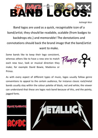
As with every aspect of different types of music, logos usually follow genre
conventions to appeal to the certain audience, for instance classic rock/metal
bands usually stay within the colour palette of black, red and white; the viewer
can understand that these are logos rock band because of this, and the pointy,
jagged fonts.
2. Looking at some bands that fall into the kind genres I’m looking at (trip hop,
industrial, electronic) the logos of bands vary a considerable amount so I’ll look
at a few individually.
How To Destroy Angels (..or How to destroy angels_ now?)
They have created this logo by taking parts of letters ‘HTDA’ and
putting it together; looking almost like a stencil in the way is it
written. It uses darker colours as do most alternative bands to
allow viewers to understand what sort of genre they may be.
Similarly with other ones I have looked at surrounding my genres (or just interesting) they
seem to be quite simple, memorable and predominantly black and white.