Test bank for consumer behaviour buying having and being eighth canadian edit...
Digipak analysis
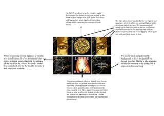
1. For the CD we chose to go for a simple image
that captured the theme of our song,as well as the
theme of most songs in the POP genre. We chose
gold bars as they relate most with our colour
scheme whilst capturing the concept of Lorde
Royals.
We did a photoshoot specifically for our digipak and
magazine advert in which we used gold glitter paint
down one side of my face. We wanted to avoid
taking a still from our video as we felt this looked
unprofessionalbut we are pleased with how the
photos we took came out on our digipak. Once again
our gold and black theme is clear.
We used a black and gold marble
background to tie all the parts of the
digipak together. Marble is also a popular
trend at the moment so by adding this it
appears modern and sleek.
The dispersed image effect we gained from Picsart
made our front cover look more professional and
appealing. We brightened the imaged so it would
become more appealing on a shelf and featured a
clear readable text. Once again the orange and black
theme is clear as when we looked at failed digipak
we realised the importance of retaining a theme
throughout as it comes across more put togetherand
professional.
When researching famous digipak’s a tracklist
was a vital feature. It is key information that also
makes a digipak more collectable by outlining
all the tracks on the album. We used a similar
bold capitalised text for the tracklist to make it
look sharp and readable.