
Recommended
More Related Content
What's hot
Viewers also liked
Viewers also liked (20)
Similar to Magazine analysis
Similar to Magazine analysis (20)
Recently uploaded
Recently uploaded (20)
Magazine analysis
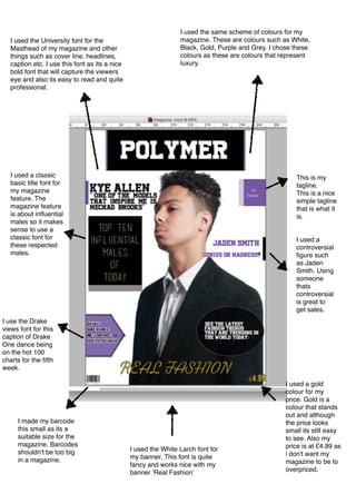
- 1. I used the same scheme of colours for my magazine. These are colours such as White, Black, Gold, Purple and Grey. I chose these colours as these are colours that represent luxury. I used the University font for the Masthead of my magazine and other things such as cover line, headlines, caption etc. I use this font as its a nice bold font that will capture the viewers eye and also its easy to read and quite professional. This is my tagline. This is a nice simple tagline that is what it is. I used the White Larch font for my banner. This font is quite fancy and works nice with my banner ‘Real Fashion’ I use the Drake views font for this caption of Drake One dance being on the hot 100 charts for the fifth week. I made my barcode this small as its a suitable size for the magazine. Barcodes shouldn't be too big in a magazine. I used a gold colour for my price. Gold is a colour that stands out and although the price looks small its still easy to see. Also my price is at £4.99 as i don't want my magazine to be to overpriced. I used a controversial figure such as Jaden Smith. Using someone thats controversial is great to get sales. I used a classic basic title font for my magazine feature. The magazine feature is about influential males so it makes sense to use a classic font for these respected males.
- 2. These are the two pictures that featured in my article. I feel that these two images match well side to side and it looks cool how one is in colour and the other is in black and white. I used the university font again for the title of my article. As its a nice bold font and its easy to read and quite professional. Also I'm keeping to my colour scheme.
- 3. These are the two other pictures featured in my article. I did the same thing again by featuring a picture thats in colour and one thats in black and white side by side. Also i featured these images in the magazine as it shows a natural, cheerful personality to my model and a serious sophisticated look to my model. I kept to the same colour scheme.This is the interview with my model Kye Allen. I used the university font again due to it being a nice bold font and its easy to see.