
Recommended
More Related Content
What's hot
What's hot (20)
Similar to Arranging a Photoshop Workspace
Similar to Arranging a Photoshop Workspace (20)
More from AdamPatersonMedia
More from AdamPatersonMedia (20)
Recently uploaded
Recently uploaded (20)
Arranging a Photoshop Workspace
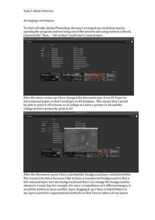
- 1. Task 2 Adam Paterson Arranging a workspace To Start off with Adobe Photoshop, the way I arranged my workshop was by opening the program and not using any of the presets and using manual controls. I pressed the “New…” tab so that I could start a new project After the menu comes up I then changed the document type from US Paper to International paper so that I could get an A4 template. This meant that I would be able to print it off at home or at college as I have a printer in A4 and the college printers primarily print in A4 After the document opens I then unlocked the background layer and deleted this. The reason I do this is because I like to have a transparent background so that a full coloured layer isn’t the background and that I can change the background to whatever I want. Say for example if it were a compilation of 4 different images, it would be useless to have another layer clogging it up. I then created folders in my layers panel for organizational methods so that I know where all my layers
- 2. Task 2 Adam Paterson are based off their location on the document and the relevant folder for them. After this I am ready to start making my product. Using Tools on Photoshop Making Shapes and Shape Manipulation To make a basic shape in Photoshop you go to the task bar along the left hand side of the workspace. Then over the shape menu you click and hold down to select which shape you would like to use. In this case I will use a rectangle shape and show the different mechanics of the property variables. After you have selected a shape, a crosshair will replace your cursor. Clicking and dragging this over your workspace will make the outline of a shape. By letting go of the left click the shape will appear. To make more mathematically accurate lengths, by holding Shift when you click and drag will make a square box that gets bigger from the anchor point being the bottom left of the shape. And by holding Alt you make a square shape that gets bigger as if the anchor point is the middle of the shape.
- 3. Task 2 Adam Paterson When you make a shape a box will appear that is the Properties of that shape. They include interchangeable variables such as shape (Width and Height), Colour, Lines, Type of lines etc. To change the colour of the shape, click on the furthest left coloured box on the properties menu. Off this you can select any colour off the colour pallet, or any colour you have on your computer by using the dropper to select that colour. By changing the colour it means that there is more creative control over what you want your graphics to look like. To change the entire background of the image using a colour properties change can dramatically change the mood of the creation. To add a gradient to your image press on the tab that has a gradient from Black to White. From here there are a range of different gradients. For a
- 4. Task 2 Adam Paterson better visual at it, I chose the ugly looking tri coloured gradient. But from this we can see the colour spread a lot more easy. The colour banner at the bottom of the page that is a strip going across controls how far your gradient is. If you want more yellow and less red, you would drag the yellow tab closer towards the middle and this is the same for any gradient changes. To change the outline on the box, by pressing the box that has originally a line struck through it, to signify that the colour is Null by choosing a colour will make an outline going around the box. To make this line thicker you must adjust the slider to make it be really subtle or to be a thick border around the shape. You can also change the type of border, if you want a jaded border that isn’t a complete one, you can change it by pressing the drop down menu for changing this entity. You can also change to little dots all surrounding the border of the shape. Making Text and Text Manipulation To get a text entity you must go to the text box menu on the sidebar panel. Dropping the menu down will reveal other ways of making the text work. In this example I will use the more common Horizontal type tool By clicking on the workspace a Blinking type cursor will appear. This is where you can type your text. The way of doing this is so that you do not need excess space so that your work doesn’t require that you change the text box size over and over to compensate for the extra room.
- 5. Task 2 Adam Paterson Where as in this way of making text, by clicking and dragging a text area tool. Text can only be put in the box that is provided. Where as before, the text could go on and on, as there is no safe space that the border walls end so the text does not know where to stop. Only where to start and carry on. To edit basic text variables, when the text layer is selected in the Layers panel, at the top taskbar there are different changeable variables. Such as font. The way in which font works is by pressing on a drop down menu and selecting the name of your font by either typing it in, or by hovering over the font name of your choice and getting a preview with the text you have typed. Font size is also there, which is more manual and means you have to select the font size before you get a preview. You can also hover over the Two T logos next to font size and toggle the size, which gives you a preview and also uses font sizes that are not defined in the drop down menu. There is also colour options that work the same as the rectangle, and positional menus that let text be left, centered or on the right. The very end panel is the Properties menu, which reveals more text changes. In the character panel. There are still options for the above- mentioned variables but also more advanced ones to. Text spacing when vertically stacked on this example is set to (Auto) which means the spacing is natural and what we are used to, bringing it to a negative brings the two lines closer together, and making the number increase makes the lines separate giving more room between each line. Option VA with a horizontal arrow below it is used fro spacing between lettering, this can be used so that text can be bunched together. The T with a vertical arrow is used to stretch lettering without pixilation so that the image quality is much sharper than just dragging the layer upwards, and the T with a Horizontal arrow is the same function but by stretching text horizontally. And the Panel of T’s under these all control typefaces, such as Bold, Italics, and Underline Etc.
- 6. Task 2 Adam Paterson The paragraph tab is a small extension on the basic one we are given. It allows more ways for us to manipulate the paragraphing of our text, and also give us mathematical manual controls so that paragraphing can be accurate when placed on such things as a border for example, where text will need to be contained within a certain area. Brush Tools The brush tool is used to apply manual drawing over a layer. In this instance I am using a new layer, selected by choosing the Page layer button the bottom of the layers panel. The reason why I choose this instead of drawing on the layer itself is because I would rather feel like I’m drawing over a transparent layer, than directly adjust the layer I’m working on. After I created the layer I then went to the tool panel and selected the brush tool. There are other tools but for this example I will use the most common brush tool. .
- 7. Task 2 Adam Paterson The properties menu will open up when you select the brush tool. The circle crosshairs at the top left is about the nib on the end of the brush. By dragging the sides in the pen becomes narrower like an old quill pen. Where as it is now is more of a round finish that we are accustomed to. We can also adjust the size of the brush so that the lines are thicker or thinner, the sharpness of the brush so that there is no softness on the edges and it becomes more hard on the layer. We can also choose to put on a custom brush that changes the end and has an effect on the way that the brush writes on the page. To draw on the layer, your cursor is the brush pen. It is recommended that you use a graphics tablet to write and draw as you have more of a handheld feel to when you draw. You can also change the colour using the colour picker on the sidebar, which is interchangeable at any point and does not effect and previous strokes. To remove any errors or strokes, you may want to either undo the error in the panel, or you can use the erase tool also on the sidebar, which is used to erase anything on a layer, this must be used carefully so that any wrong layers or parts of a layer are erased.
- 8. Task 2 Adam Paterson Magic Wand Tool The magic wand tool is a way of selecting an area of colour that is the same colour. The way this works is by making a mask around the borders of where a colour change is depending on its colour. The reason why people use this is because they want to clip a part of a picture maybe to put a background in or just to make a PNG. When you select the magic wand tool and press on a certain area, the area that has the same colour is highlighted, ready to clipping of that colour meaning that any borders are left untouched and all the colour in a certain area is highlighted. This can be deleted, moved, removed, drawn etc. The other tool available here is the quick selection tool which works like the magic wand tool; but instead clips only certain areas of the same colour unless you click more and select the whole area. This is a manual way of using a magic wand tool and makes more accurate and intricate highlighting. Brightness and Contrast changes with Burn Tool The use of the burn tool is more to directly effect photos more than most layers as it involves changing the brightness of an area so that it makes the composition look a lot more better rather than increasing the whole images brightness or contrast, its just certain parts of an image which gives more manual control.
- 9. Task 2 Adam Paterson When you press the burn tool a cursor like the brush appears and using the same appliances as that we can set the hardness and size of the brush. From here we can brush over certain parts of the image we want to change. The first image here is without burn, where as the second one is. Notice the difference in shadowing and contrast as the burn is applied, bringing out more detail and making it look more correctly exposed. Image Manipulation
- 10. Task 2 Adam Paterson For my image manipulation I use Adobe Lightroom over adobe Photoshop. I use this because I can see all my photos in a Showreel and select which one I want to choose and not have separate files for them all across Photoshop. This is much more easier when you are working with a batch of photos aswell. For This example I will use an image I took. I took the image in a RAW format that means it was directly editable to change the exposure and more features than I would be able to a JPEG File. I started off by straightening the image so that the horizon line is at a flat 180 degree. I do this because I want the image to look straight. I could do every edit possible but if the photo is not straight it would loo strange, as if you need to tilt your head to look at it. I do this by going to the above Transform panel and changing the rotation and scale so that the horizon lines are straight. I then went to the tone curve line and dropped the shadows, this meant that the darks in the image really come out more and are more obvious. In an image that is already bright with no dark hotspots, by dropping the shadows and darks to really low it doesn’t affect the overall dark look on the photo.
- 11. Task 2 Adam Paterson I then gradually dragged up the light tones, as the image was already rather bright (As you can see on the histogram) this was only a light touch, just to bring out the highlights and make the image look less dull in the lights than it did before. Using Existing Materials Existing materials are useful because they offer a way of gaining materials that you do not have to create yourself, save time and effort along with getting a professionally looking outcome if the materials you use are of a professional quality. For my poser, I used a Manchester Bee as an existing material. A quick Google search helped me find a PNG that I found was perfect for my music poster.
- 12. Task 2 Adam Paterson I found a PNG of the bee, which was perfect for my poster; it was Bold, soft on the edges and curved. Giving a chilled tone to it rather than it being straight edged and looks sharp. I put this into my music poster menu and moved it up the top layer on my layer panel on the layer menu. I then added ruler guidelines on the rectangle borderlines that were 0.5 cm from them to give a safe space between the two entities. I then shrink these images to a suitable size and put them in each corner.
- 13. Task 2 Adam Paterson Using new materials I used new materials by re creating a sonder poster that I couldn’t find online. It consisted of the sonder meaning in a circular logo along with the logo aswell. I started off by getting a PNG file of the sonder logo itself, going on Photoshop and stripping the main parts away from each other. So I had a PNG of just SONDER and a PNG of FESTIVAL so that they were detached. I then made a circular background similar to the one used in the other logo. On top of that I then dropped my SONDER PNG on top of that and then the festival one just under it. I
- 14. Task 2 Adam Paterson resized the festival size just because there is a subtle change in text placing on the original logo itself where festival is just shorter in width and smaller in height aswell when it is under the SONDER logo. I then dropped lines on either side of FESTIVAL just so that there was no dead space, and offered as a differential barrier between the masthead title above and what was going to appear below. I then added a text box and set the paragraphing to centralize the text. I then typed out the definition of sonder, along with the fact it was a noun, and resized the text so it gave some extra room between it and the outsides of the circle background.