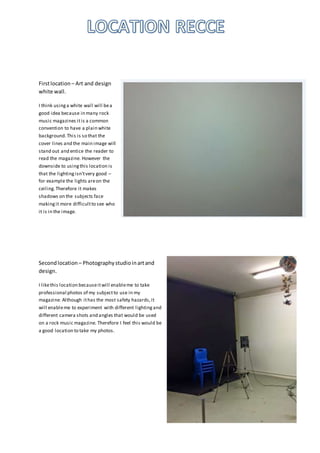
1. Firstlocation – Art and design
white wall.
I think usinga white wall will bea
good idea because in many rock
music magazines itis a common
convention to have a plain white
background.This is so that the
cover lines and the main image will
stand out and entice the reader to
read the magazine. However the
downside to usingthis location is
that the lightingisn’tvery good –
for example the lights areon the
ceiling.Therefore it makes
shadows on the subjects face
makingit more difficultto see who
it is in the image.
Secondlocation – Photographystudioinartand
design.
I likethis location becauseitwill enableme to take
professional photos of my subjectto use in my
magazine. Although ithas the most safety hazards,it
will enableme to experiment with different lightingand
different camera shots and angles that would be used
on a rock music magazine. Therefore I feel this would be
a good location to take my photos.
2. Last location– Hamptonbrick wall.
My lastlocation I havechosen is Hamptons
brick wall.I likethis becauseitwill givea
bit of background to the image on my
cover page. I also think itgives a bitof an
outsiderustic look which many rock singers
have. However I the disadvantageis thatit
will bedifficultto make my main image
and cover lines stand out from the wall.
Also I think the bricks will makeitlook too
busy on the page and so distractthe reader
from what they should be focusingon (the
masthead, main image and main cover
line).