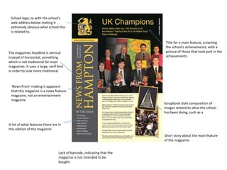
1. School logo, to with the school’s
web address below making it
extremely obvious what school this
is related to.
The magazines headline is vertical
instead of horizontal, something
which is not traditional for most
magazines. It uses a large, serif font
in order to look more traditional
Scrapbook style composition of
images related to what the school
has been doing, such as a
A list of what features there are in
this edition of the magazine
Title for a main feature, crowning
the school’s achievements, with a
picture of those that took part in the
achievements
Lack of barcode, indicating that the
magazine is not intended to be
bought.
Short story about the main feature
of the magazine.
‘News From’ making it apparent
that this magazine is a news feature
magazine, not an entertainment
magazine
2. More photo collages to make the
magazine look like a collage or a
scrap book, so the magazine looks
somewhat less official and more
inviting.
Multiple short stories on single page
so the magazine appears more busy
and full of content that if it was a
single story to a page.
Boundaries of picture and body text
are less apparent in this picture,
creating an interesting composition
Picture blends into body text,
creating a visually interesting effect.
3. Title of the magazine at the top with
a picture of the head teacher, the
date and the school emblem on the
right. Date is useful
Large thank you letter from the
headteacher to all staff and students
Term dates so that a student or
parent would not have to phone in
or check online to work out term
dates, a useful addition
Lack of barcode, indicating that the
magazine is not intended to be
bought.
4. Title of the feature so that the
audience knows what they are going
to be looking at.
Body text in a font that is designe to
look somewhat handwritten, so it is
more personal to the reader, like it
was drawn too.
Photo collages down the sides
create an interesting visual effect
when combined with the body text.
White on green with a border
creates a sense of depth in the
magazine, causing the focus(body
and images) to ‘pop’
5. Name of magazine, and as the
magazine is annual it has the year’s
edition below the title.
‘caterhamian’ is in bold to create
emphasis around the name of the
school.
School emblem and name on the
bottom of the magazine, so it is
clear which school’s magazine this
is.
Tagline of the school so the school,
so the magazine cover is both more
interesting and has more content on
the frontpage.
Lack of barcode, indicating that the
magazine is not intended to be
bought.
Name of magazine, and as the
magazine is annual it has the year’s
edition below the title.
‘caterhamian’ is in bold to create
emphasis around the name of the
school.
Image of a school celebration that is
relevant to the year – the school’s
200th year of existence.
Series of images about school events
and achievements, demonstrating that
the school has a wide variety of
activities offered.
6. Picture of the Olympic Stadium,
with the ‘Olympic Site Trip’ title
below it, making the content of the
article obvious. The writer is also
displayed below.
Sub-headline gives slightly more
information than the headline,
giving specifics about what is in the
article
Miscellaneous picture relating to
the trip to fill space on the article,
the picture is taken with a London
landmark in shot.
Inspiring quote relating to the
subject matter.
Actual article itself about the
Olympic stadium trip Navigational features: page numbers
as the magazine is more than 150
pages long