
Recommended
More Related Content
What's hot
What's hot (20)
Viewers also liked
Viewers also liked (18)
Similar to Signs and signifiers (contents page)
Similar to Signs and signifiers (contents page) (20)
Recently uploaded
Recently uploaded (20)
Signs and signifiers (contents page)
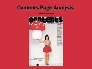
- 1. Contents Page Analysis. Poppy Thompson
- 2. Blender Contents Page This contents page is very simple with very little text on it and hugely focused on the main picture in the middle. The picture is of the massive pop star “Katy Perry” she is known for her bubble-gum pop style yet sophisticated music taste and the magazine definitely shows her bubble-gum pop look in this picture making her the main object on the contents page as through her bright coloured outfit on the pale grey background and the size of the picture. This will appeal to her fans as they are used to her style and music whereas the oppositional readers will see her as “twee” and over the top which can be seen as over-baring and weird.
- 3. Continued… The magazine has very little writing on it that could be seen as a positive thing to some readers as it is easy and simple for them to navigate the magazine and see in one go what it contains. However the oppositional reading could be that the readers of that particular magazine are juvenile because the whole page is just pictures and not much writing. The bold writing that says “Contents” presents the magazine as bold and confident and with Katy Perry as the main feature is shows their “whacky” side and that they aren’t afraid to be different, however this could put some people off reading the magazine such as those who are “mainstreamers” because they will want more to be the same as those around them.
- 4. In Conclusion… This magazine uses its layout, font and typography to attract its target audience it uses iconic, indexical, and symbolic symbols, to create an informal and relaxed effect on the reader, also to make the content page very simple because the target audience of this magazine will not be interested in large amounts of text but more in short pieces of text and large amounts of pictures.
- 5. Contents Page Analysis. Poppy Thompson
- 6. Billboard Contents Page This contents page is completely different to the Blender one, it has more text and more images on it and there is a much larger variation of colour and theme on it. The girl in the picture is not someone that many people will know straight off, neither are the rest of the pictures really but they are still the main picture regardless of this. The fact that Billboard have not just used big names as their main attractions to achieve more readers says a lot about their brand, it shows how established they already are compared to Blender and that they are willing to try and showcase new artists and their music.
- 7. This contents page has a lot information on it which will be seen too those who take the preferred reading as a good thing as the magazine is giving them what seems to be a lot of information. The chart on the left hand side of the page makes the magazine seem reliable because it is an official chart and therefore the readers will trust it and trust the rest of the magazine. It also makes the magazine look a lot more established, professional and trust worthy, because of the amount of knowledge they seem to have in the topic and genre of music that their magazine is about. Continued…
- 8. In Conclusion… This magazine instantly offers its readers a large amount of information in its first page, it also uses its layout, colour scheme and typography to create a formal and intense look and feel to the magazine. I also think that the target audience of this magazine are very particular and very interested in the content inside the magazine rather than just flicking through it.
- 9. Both of these magazines are completely different, one is very minimalistic both in the ways of text and imagery to attract their audience and the other completely fills the page and uses various pictures to attract their audience by offering them buckets of knowledge. This is probably because the two magazines are trying to create different effects on their audiences Blender is trying to create a careless and relaxed vibe and Billboard is aiming more for the audience to learn something through reading their magazine. A Comparison…