1. Poster analysis of ‘Paramore’
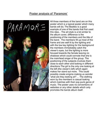
All three members of the band are on this
poster which is a typical poster which many
bands will do; The Beatles is a good
example of one of the bands that first used
this idea... The art style is a lot similar to
the album cover; difference is the
positioning of the members and the title of
the band. The members fill up most of the
frame and are well lit by the lighting and
with the low key lighting for the background
the members immediately catch the
viewer’s eyes, but the lighting is more
focused towards the female leaving no
shadows which could connote that she is
the main/lead singer of the group. The
positioning of the subjects involves them
close to each other and looking in different
directions.The girl is the only one looking at
the left (the viewer’s left) which again
makes her stand out more. This could
possibly create enigma making us wonder
‘what are they looking at?’… The clothing
worn by the members is casual looking
which matches with their pop punk genre of
music. The poster uses no conventions of
websites or any other details which only
promotes the bands album itself.