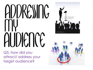
1. Q5, how did you
attract/ address your
target audience?
2. The measures I put in place to attract and address my target
audience changed as I went along with the production process
of my magazine. It changed because my target audience was
originally different to the one I have now, with my target
audience different the things I had to put into the magazine to
attract my audience changed as well. At first I was trying to
attract my audience through a free song on ITunes but
changed it to 2 free tickets to capital’s jingle bell ball because it
would appeal more to my target audience , of 15+, if they
could socialise with there friends. To gain feedback about my
magazine about what I should do to improve my magazine I
asked people in my target audience and some one outside of
my target audience to look at my front, contents and double
page spread and give me there honest opinion on what they
though was good and bad about my magazine. Asking
someone outside of my target audience meant that I got a
good scope of opinions on how to improve my magazine but
also possibly increase my target market
3. Audience Feedback
(outside of target audience)
Positive feedback Constructive criticism
• Follows conventions
• Cheap
• Clearly indicated
• Colours fit well together
• Image has a soft focus , matches with
colour scheme
• Plug and 5sos is clear
• Outlining of main feature story helps
it stand out
• Social media links
• Hearts on contents page
• Layout, clear and focus is on the
interview
• Artist looks approachable, makes you
want to read article
• The plus for more artists to big, looks like
part of the masthead
• Too many font styles.
• Gap at the bottom of front page, looks
top heavy
• Yellow righting hard to read- change
colours to pale pink and bright yellow
• Feature artist doesn’t have a soft focus
like main artist
4. Audience feedback(In target audience)
Positive feedback Constructive criticism
• All the fonts and logo fits well
• Footer is clear and easy to see
barcode, price and date
• Hearts on the contents page fit well
with the genre
• Conventional
• Colour scheme too pink
• Jagged edge on yellow colour
• Orange flush on one picture not
on them all
• Too much writing
• Arm needs to be the same
colour
• The arm covers some of the
writing on double page spread
5. The feedback I have received from the people I have asked has
allowed me to determine that from my magazine to attract my
audience more I have to look at my colour scheme more and
change it so that it fits my audience more and is easier to
read, edited my images so that they all look the same and don’t
look different in terms of soft and hard focus. Something that all of
the people I asked agreed on was that my magazine was
conventional and would fit in amongst the other magazines that
are also targeted at my chosen audience. One thing on my front
cover that I could change is the placement of my main feature
story as it is too far up the page leaving a gap at the bottom
making my magaizne look very top heavy.
Analysis of feedback