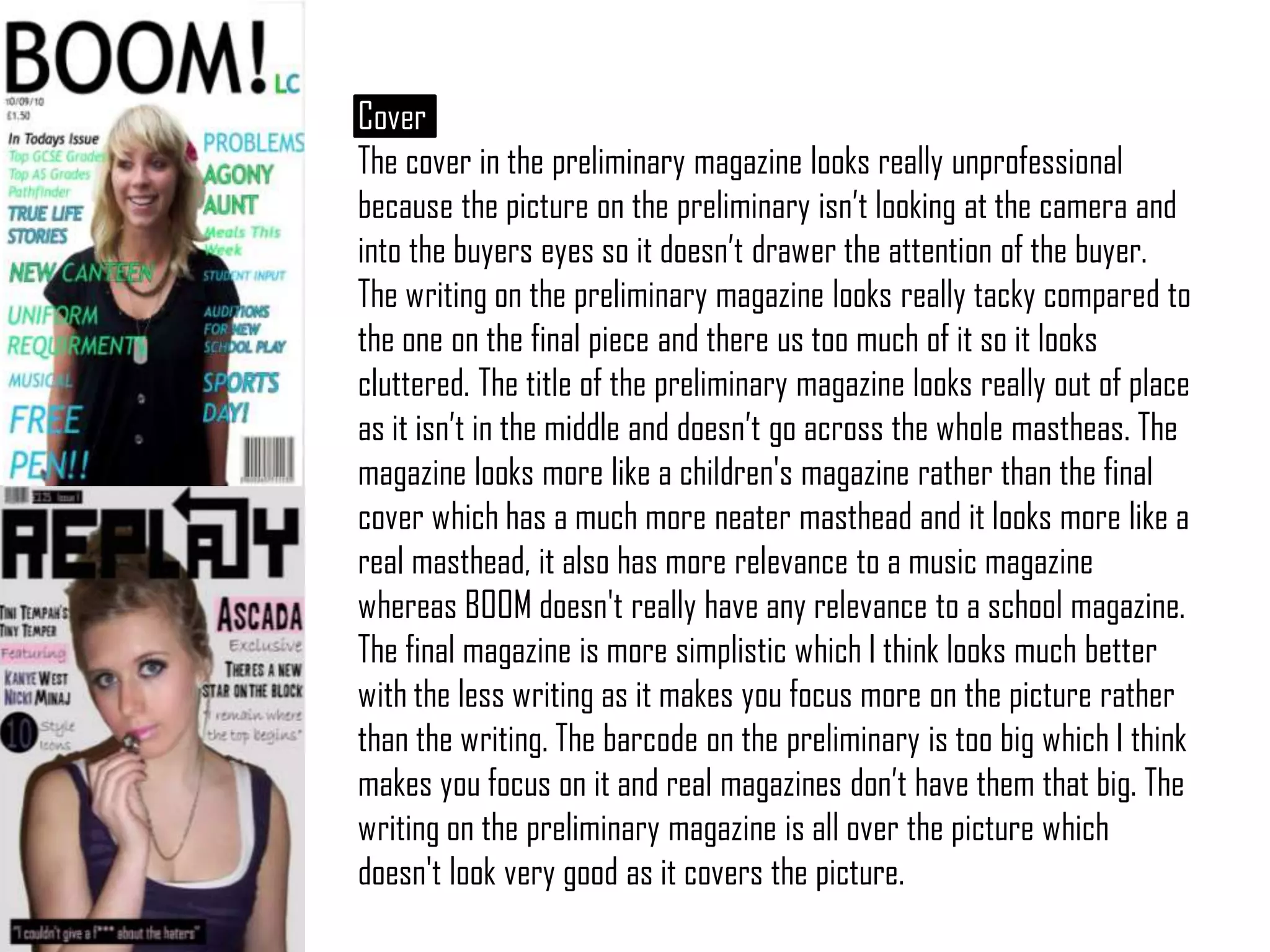
The preliminary magazine cover design is unprofessional and does not attract buyers' attention effectively. There is too much cluttered writing on the cover that distracts from the image. The title is placed oddly and does not fit across the whole masthead area well.
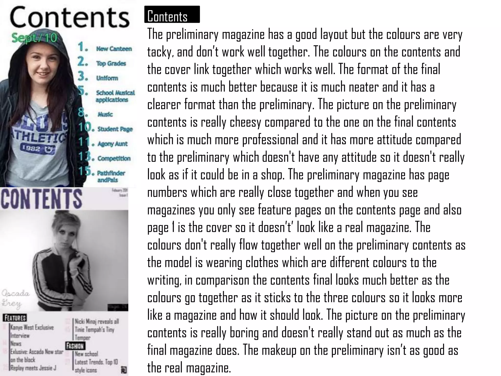
The preliminary contents page has a good layout but poor color choices that do not coordinate well. The magazine page numbers are too close together and include non-feature pages, which does not look like a real magazine.
The final magazine designs are superior with simpler, neater layouts and more coordinated colors that make the designs look more professional and like real magazines that could be found in stores.


![Production Phase[1]](https://cdn.slidesharecdn.com/ss_thumbnails/productionphase1-100401141413-phpapp01-thumbnail.jpg?width=640&height=640&fit=bounds)