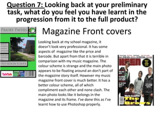
1. Magazine Front covers
Looking back at my school magazine, it
doesn’t look very professional. It has some
aspects of magazine like the price and
barcode. But apart from that it is terrible in
comparison with my music magazine. The
colour scheme is strange and the main photo
appears to be floating around an don't part of
the magazine story itself. However my music
magazine front cover is much better. It has a
better colour scheme, all of which
compliment each other and none clash. The
main photo looks like it belongs in the
magazine and its frame. I’ve done this as I’ve
learnt how to use Photoshop properly.
Question 7: Looking back at your preliminary
task, what do you feel you have learnt in the
progression from it to the full product?
2. Magazine Contents Pages
Looking back at my school magazine contents page I'm
honestly embarrassed with it. It’s pretty much a grid. It
shares very little aspects in common with a genuine
magazine. It had article titles and page numbers. That’s
basically all that can be seen hinting it is a magazine
contents page. However looking at my music
magazine, It’s much better. It looks like a genuine
magazine contents page. It shows all the aspects of
one: Masthead: realistic page numbers; pictures; Links
and subscription info. I've achieved this, by eventually
learning how to use Photoshop in a way that gives
positive outcomes when using the tools.