

Recommended
More Related Content
What's hot
What's hot (18)
Viewers also liked
Viewers also liked (19)
Similar to Feedback for the digipak
Similar to Feedback for the digipak (20)
More from Sam Benzie
More from Sam Benzie (20)
Recently uploaded
Recently uploaded (20)
Feedback for the digipak
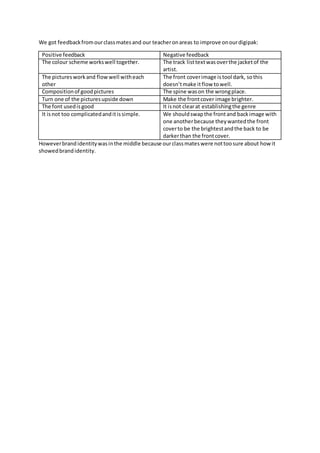
- 1. We got feedback from our class mates and our teacher on areas to improve on our digipak: Positive feedback Negative feedback The colour scheme works well together. The track list text was over the jacket of the artist. The pictures work and flow well with each other The front cover image is tool dark, so this doesn’t make it flow to well. Composition of good pictures The spine was on the wrong place. Turn one of the pictures upside down Make the front cover image brighter. The font used is good It is not clear at establishing the genre It is not too complicated and it is simple. We should swap the front and back image with one another because they wanted the front cover to be the brightest and the back to be darker than the front cover. However brand identity was in the middle because our class mates were not too sure about how it showed brand identity.