Downloaded 255 times
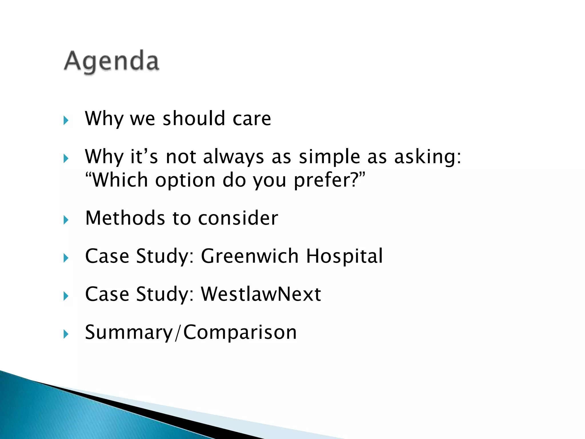

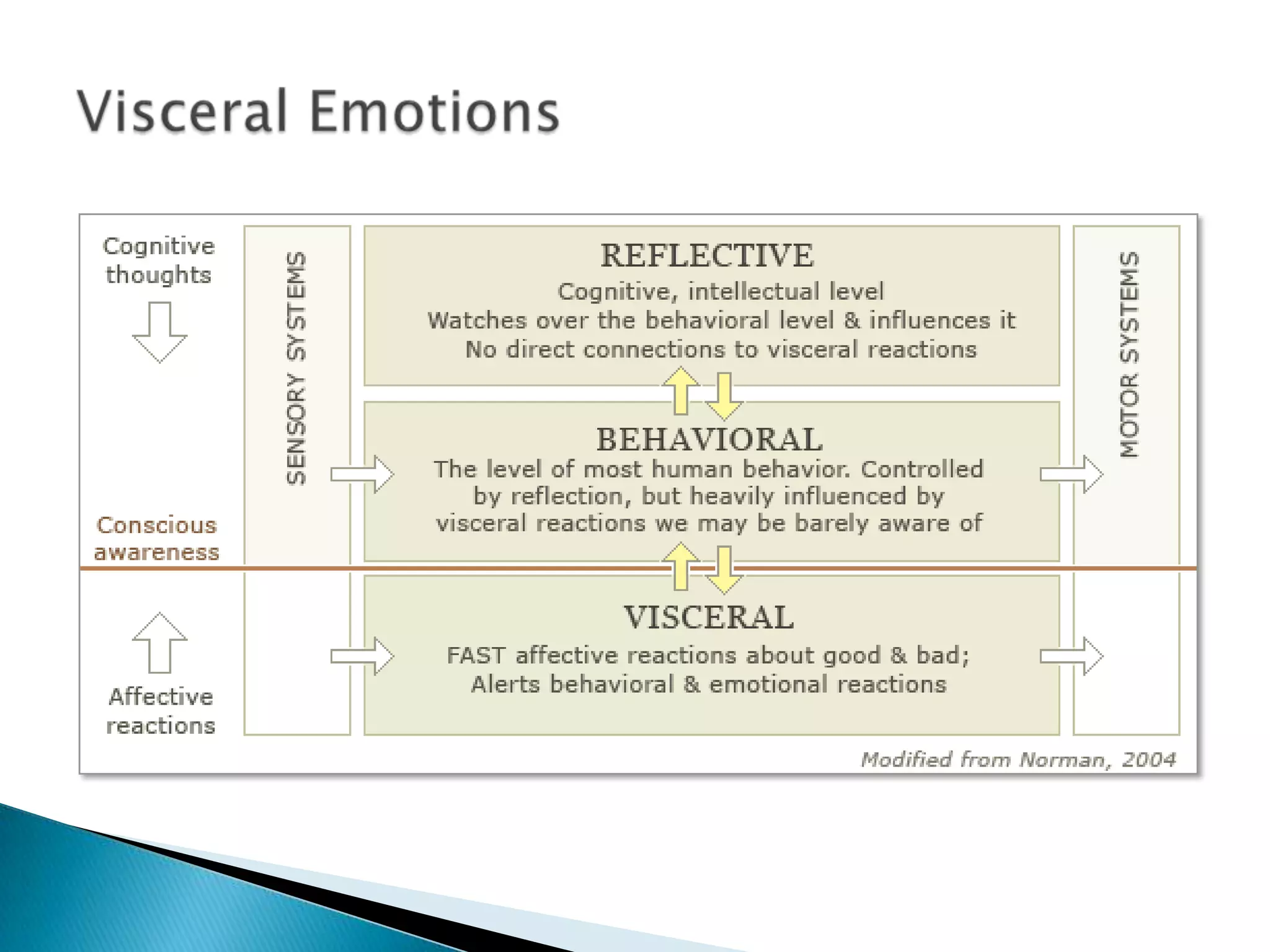
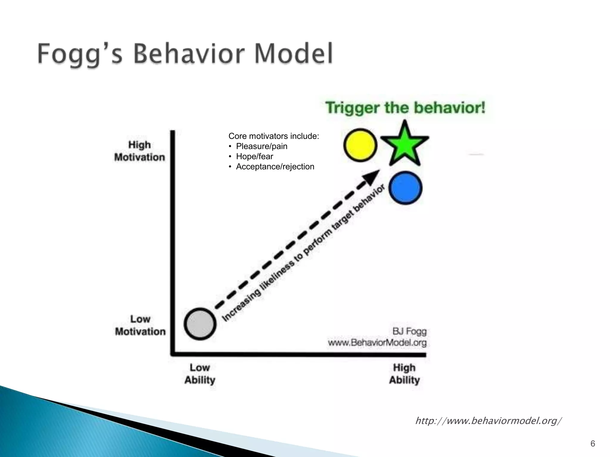
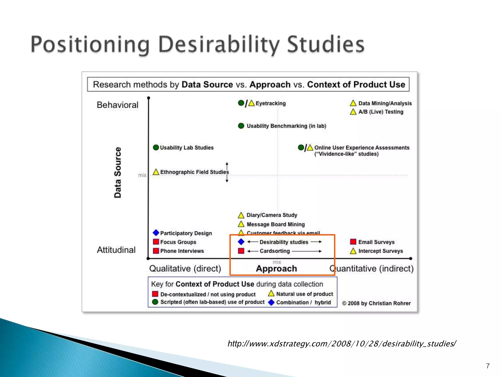

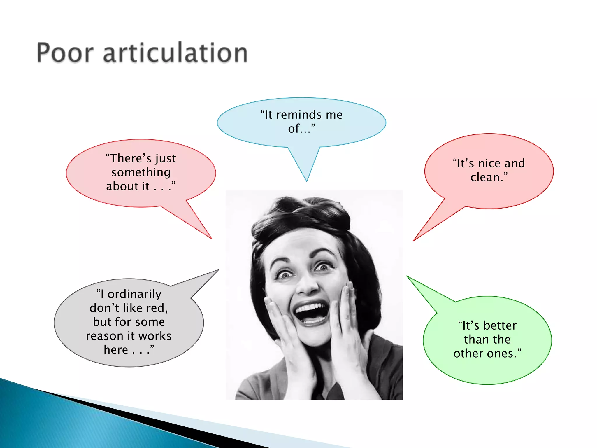
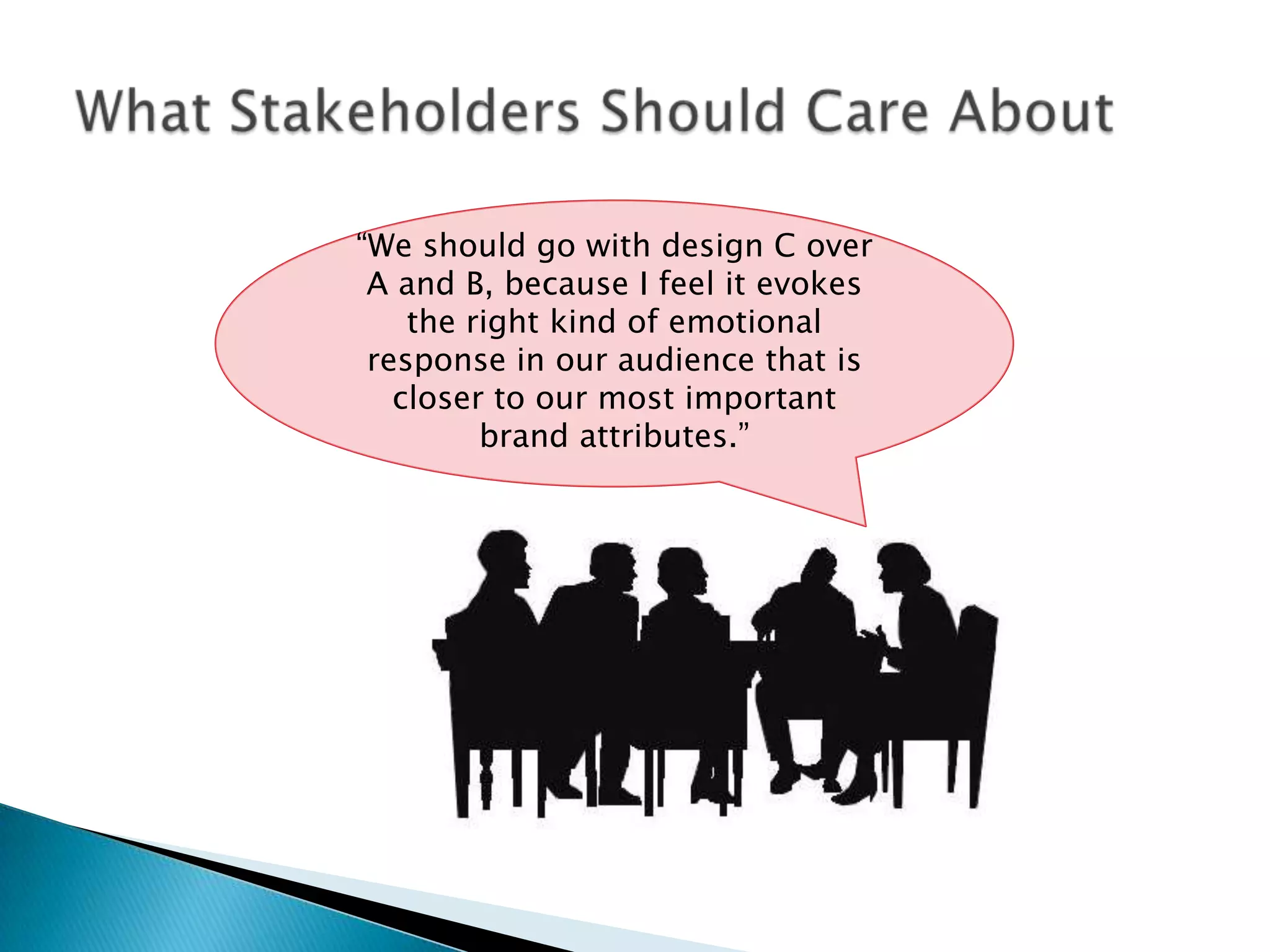
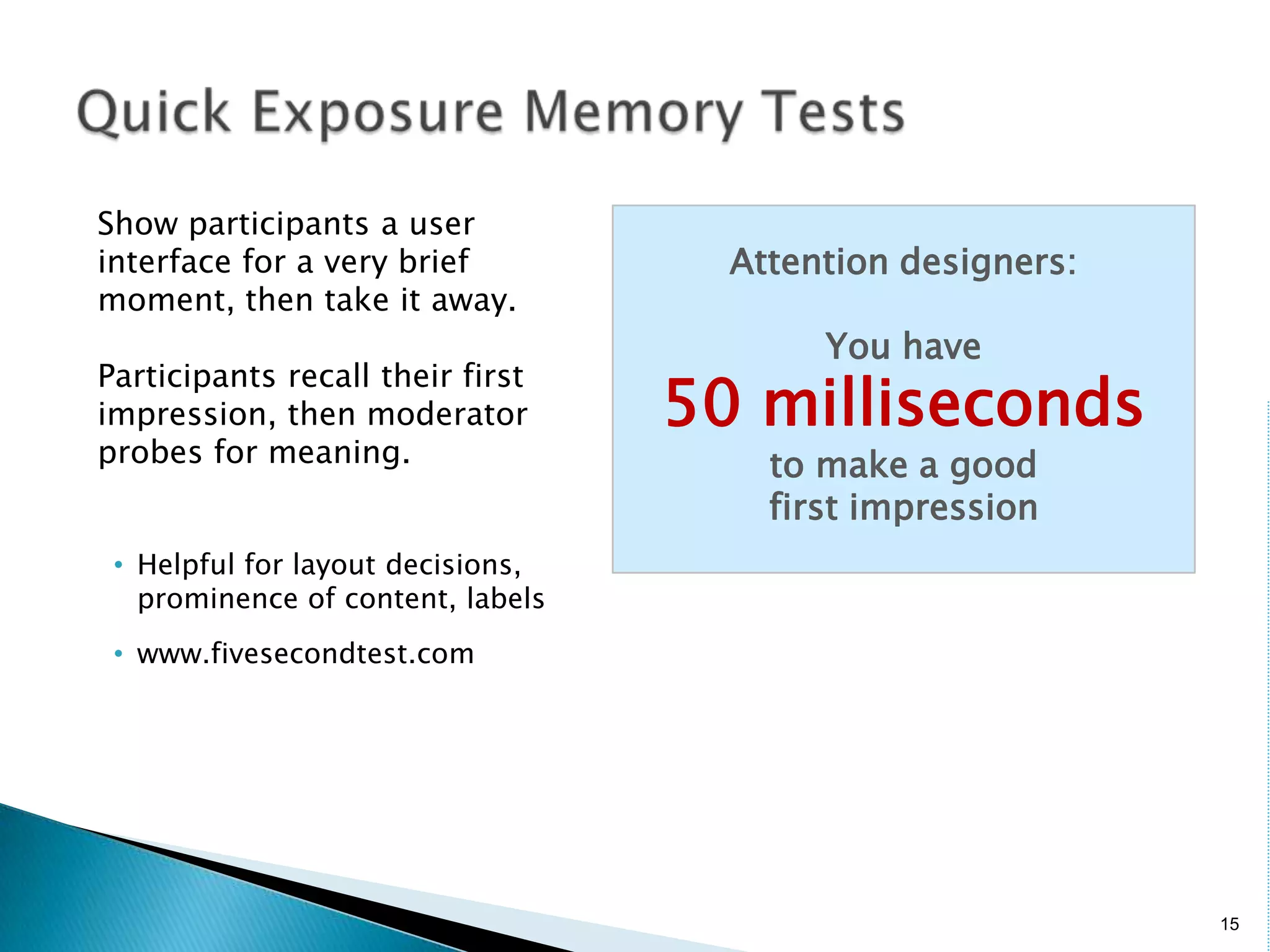
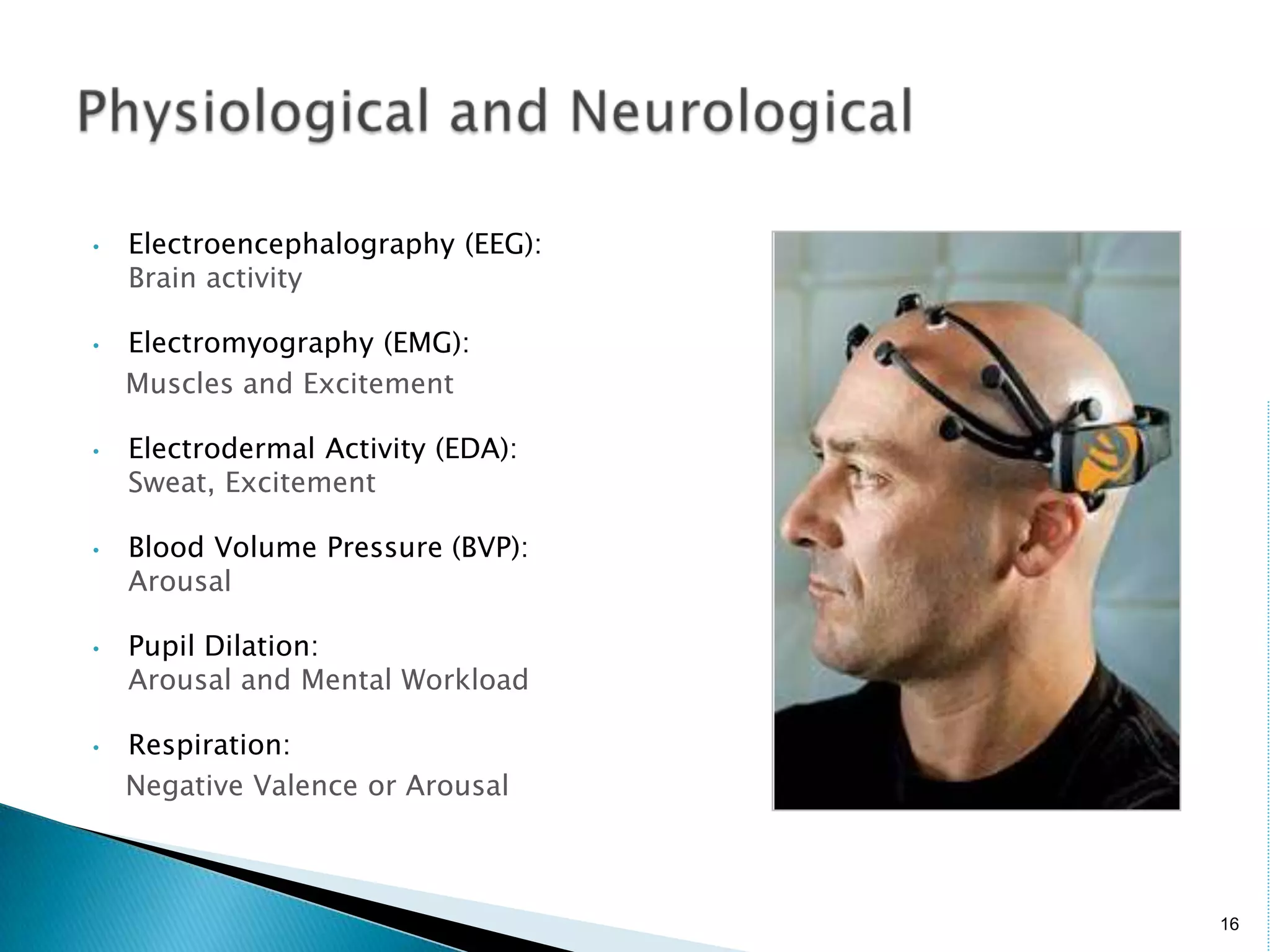
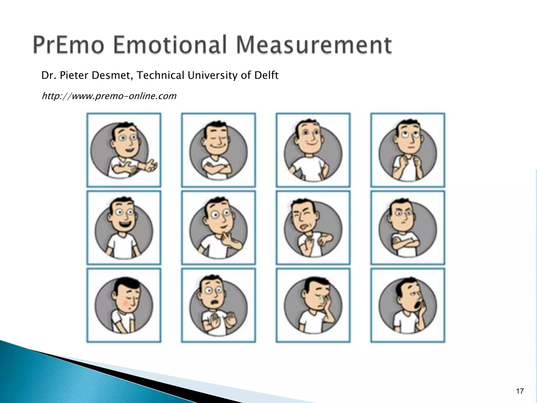
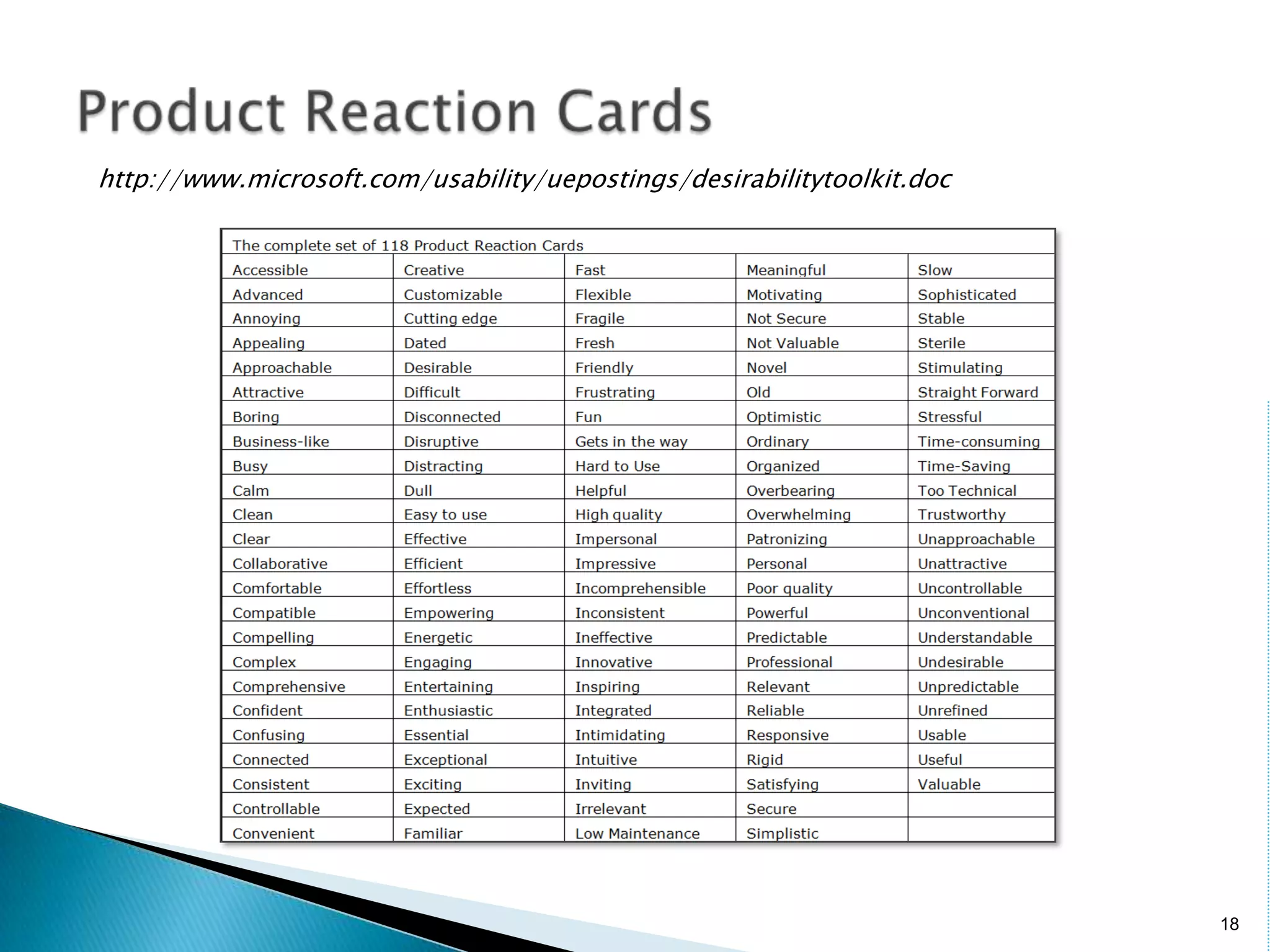

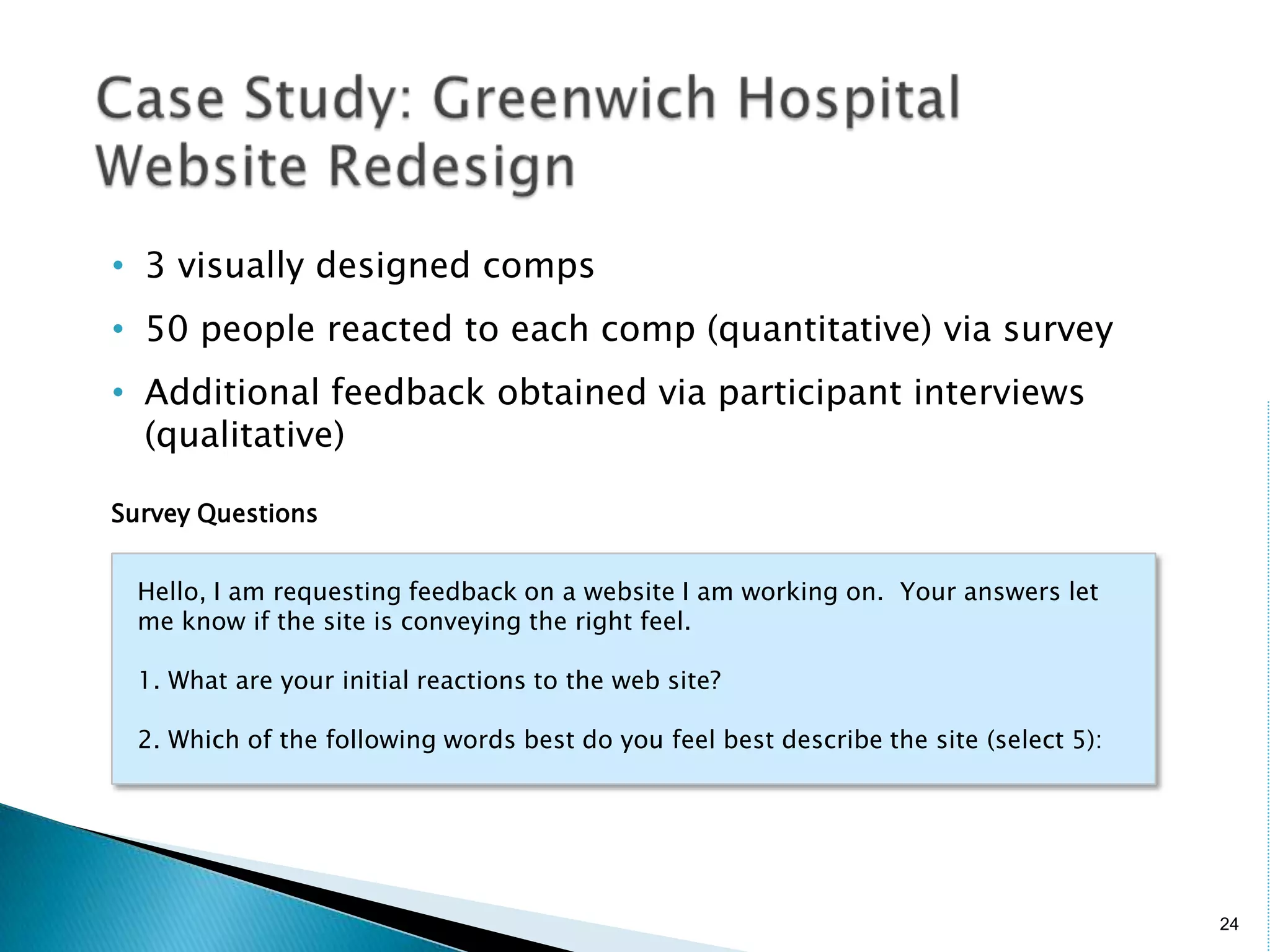
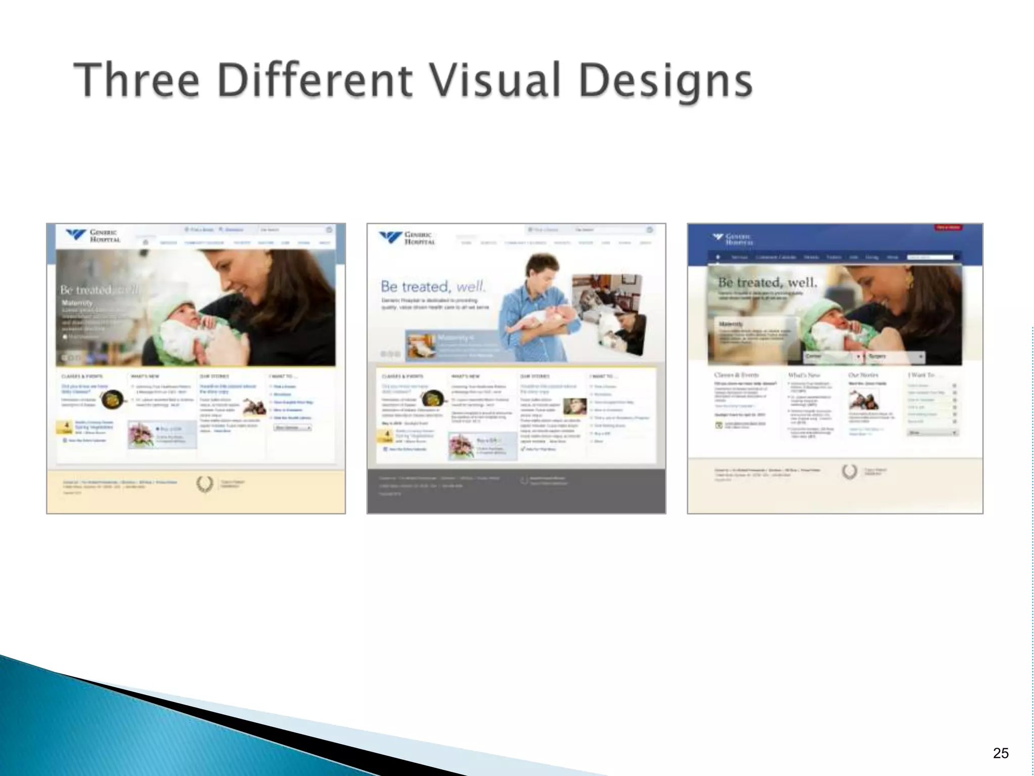
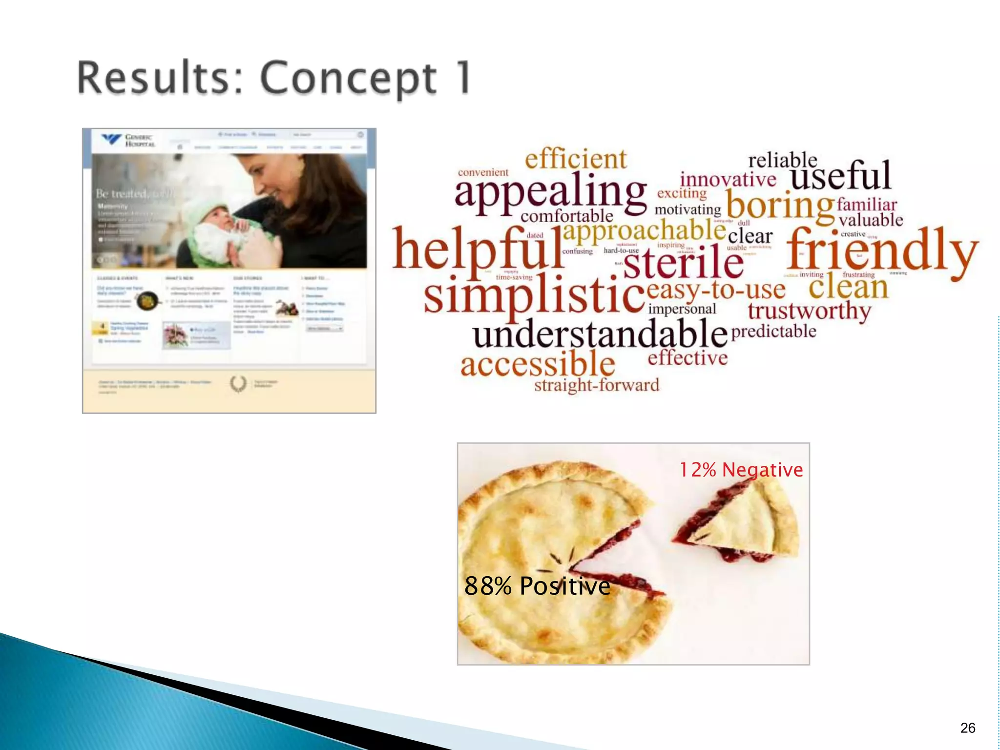
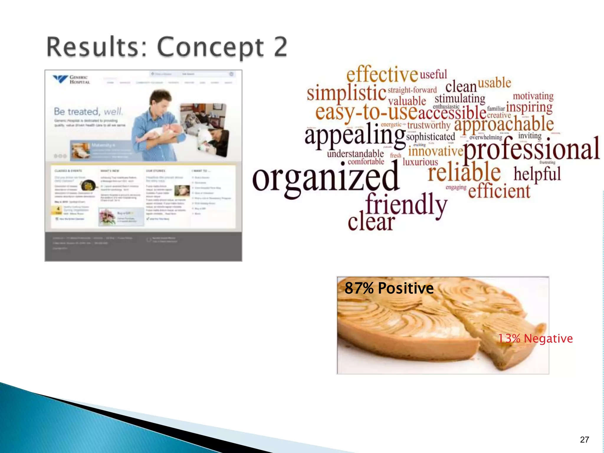
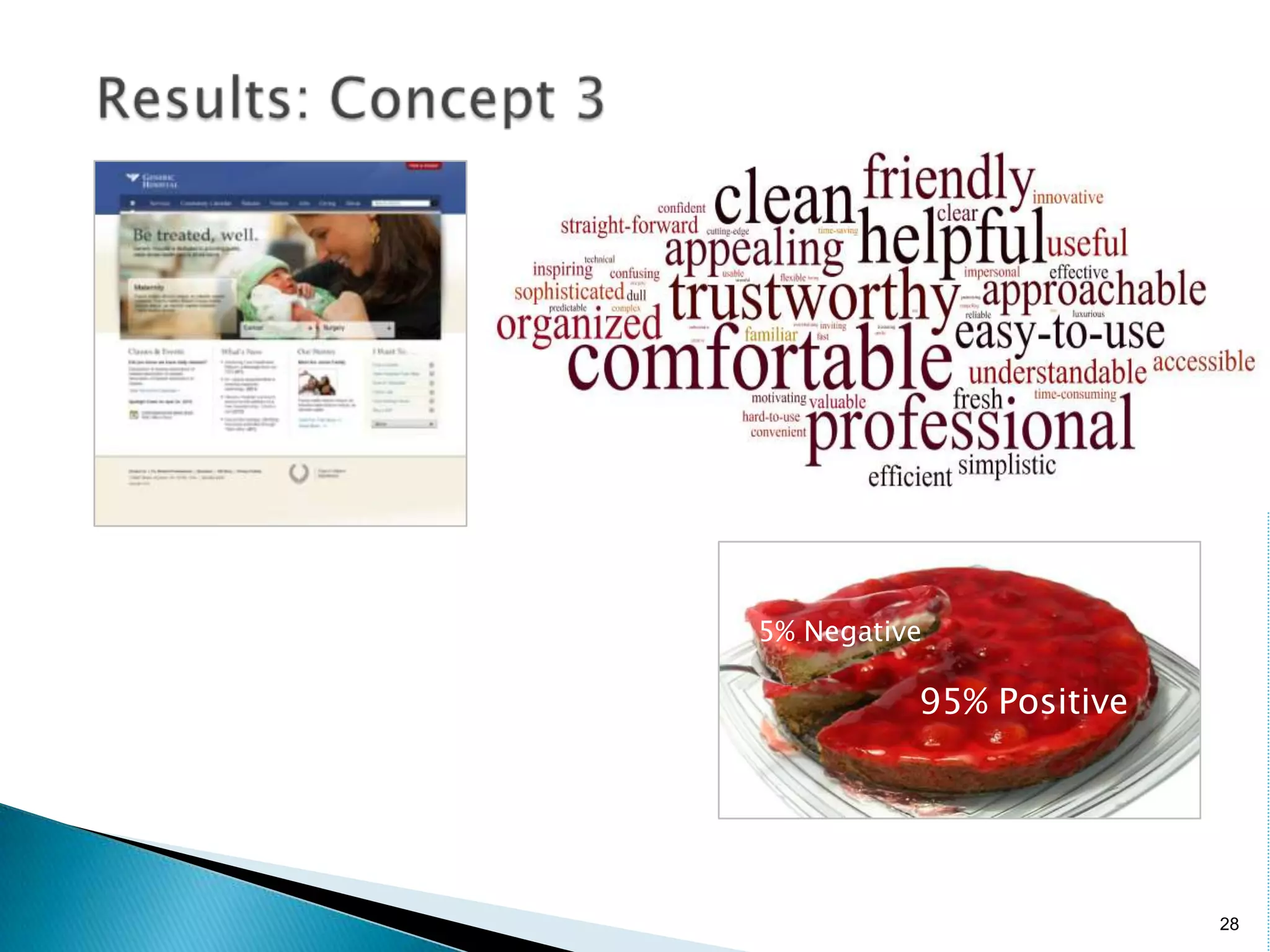
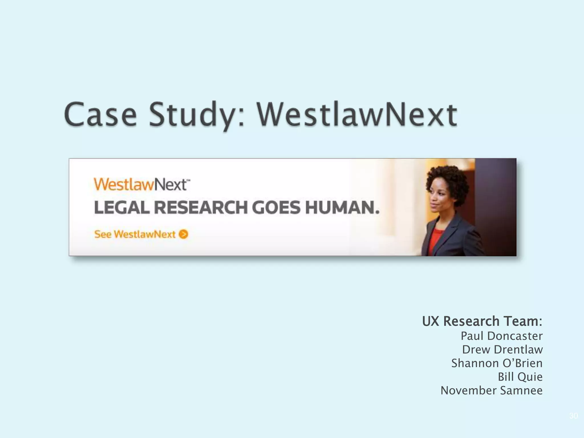
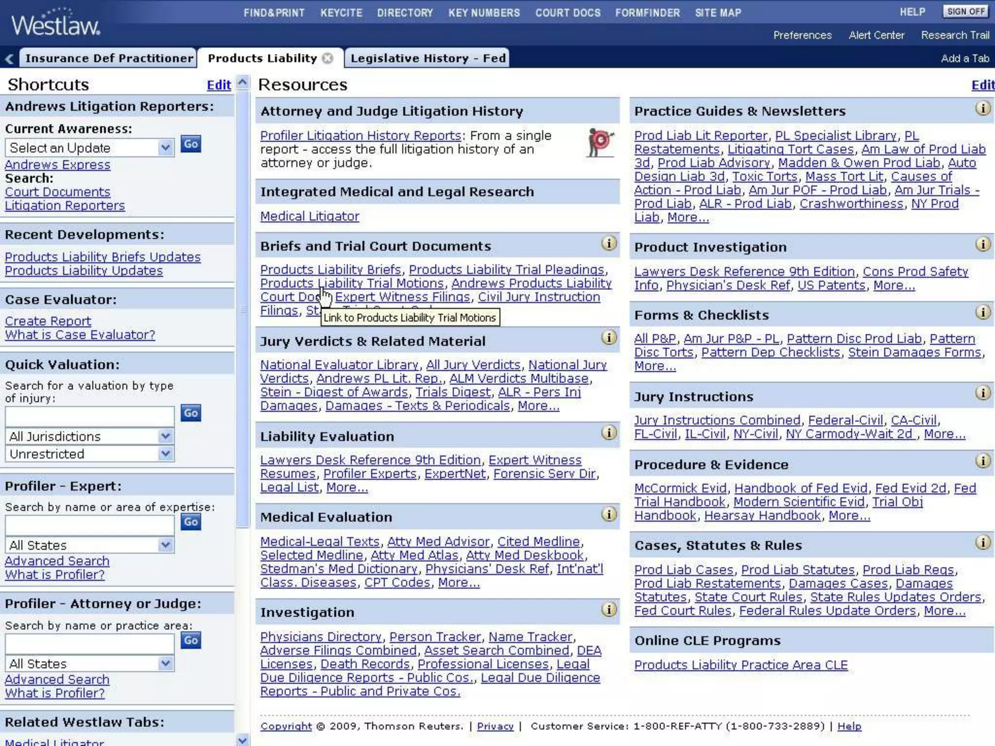
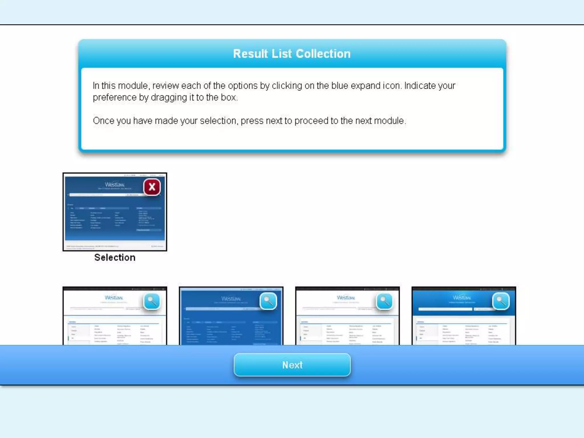
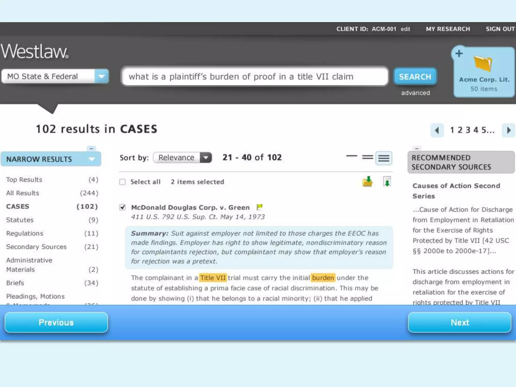
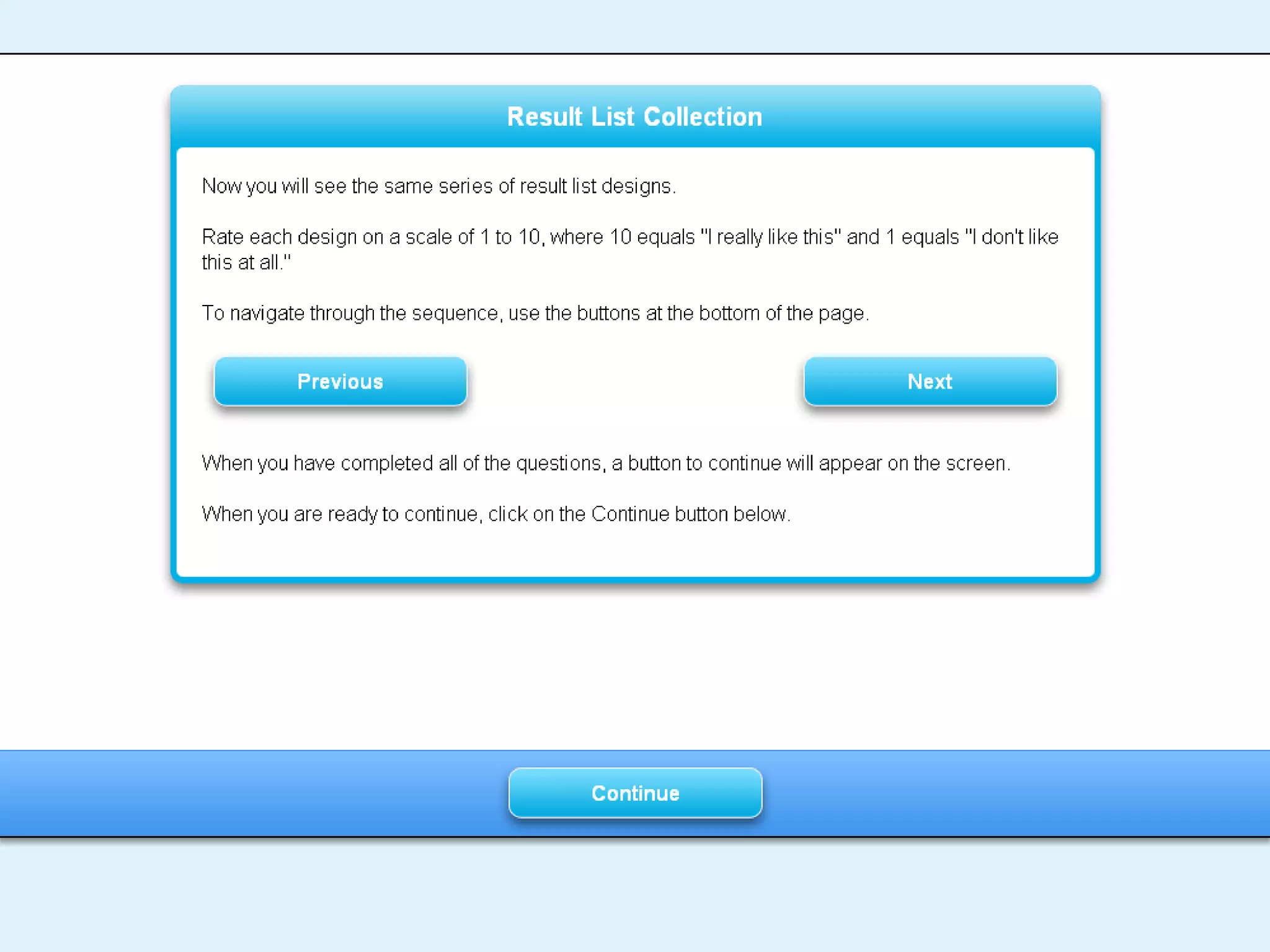
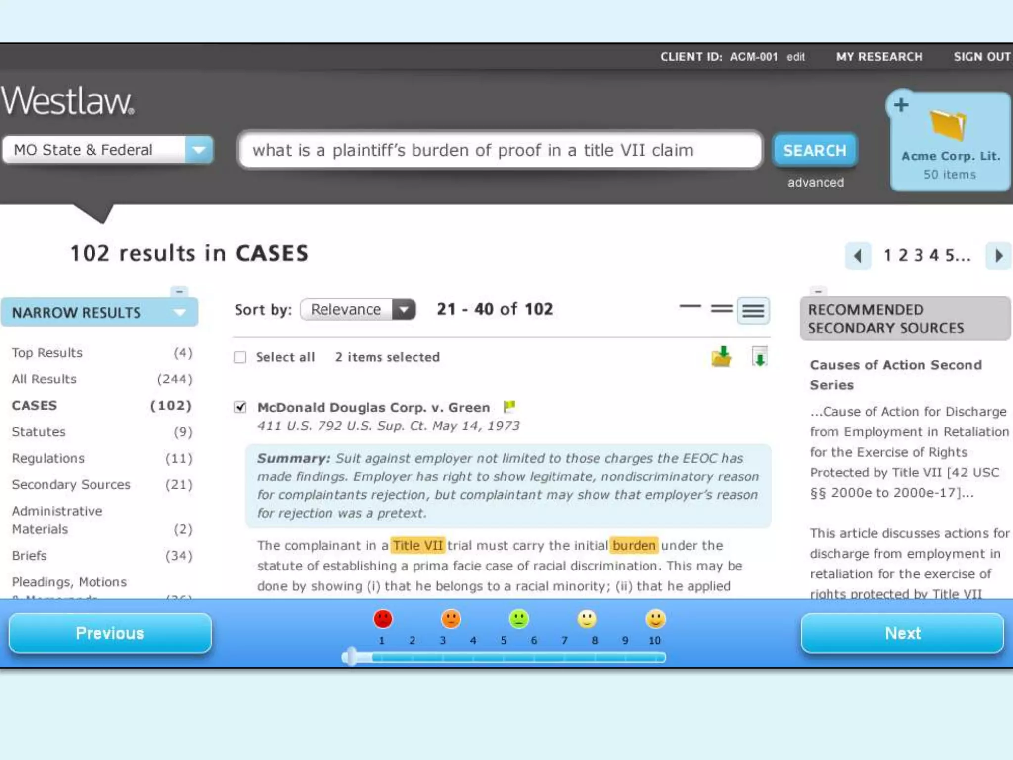
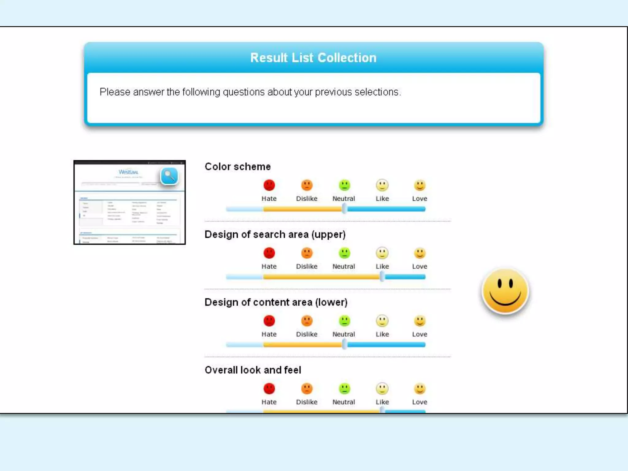
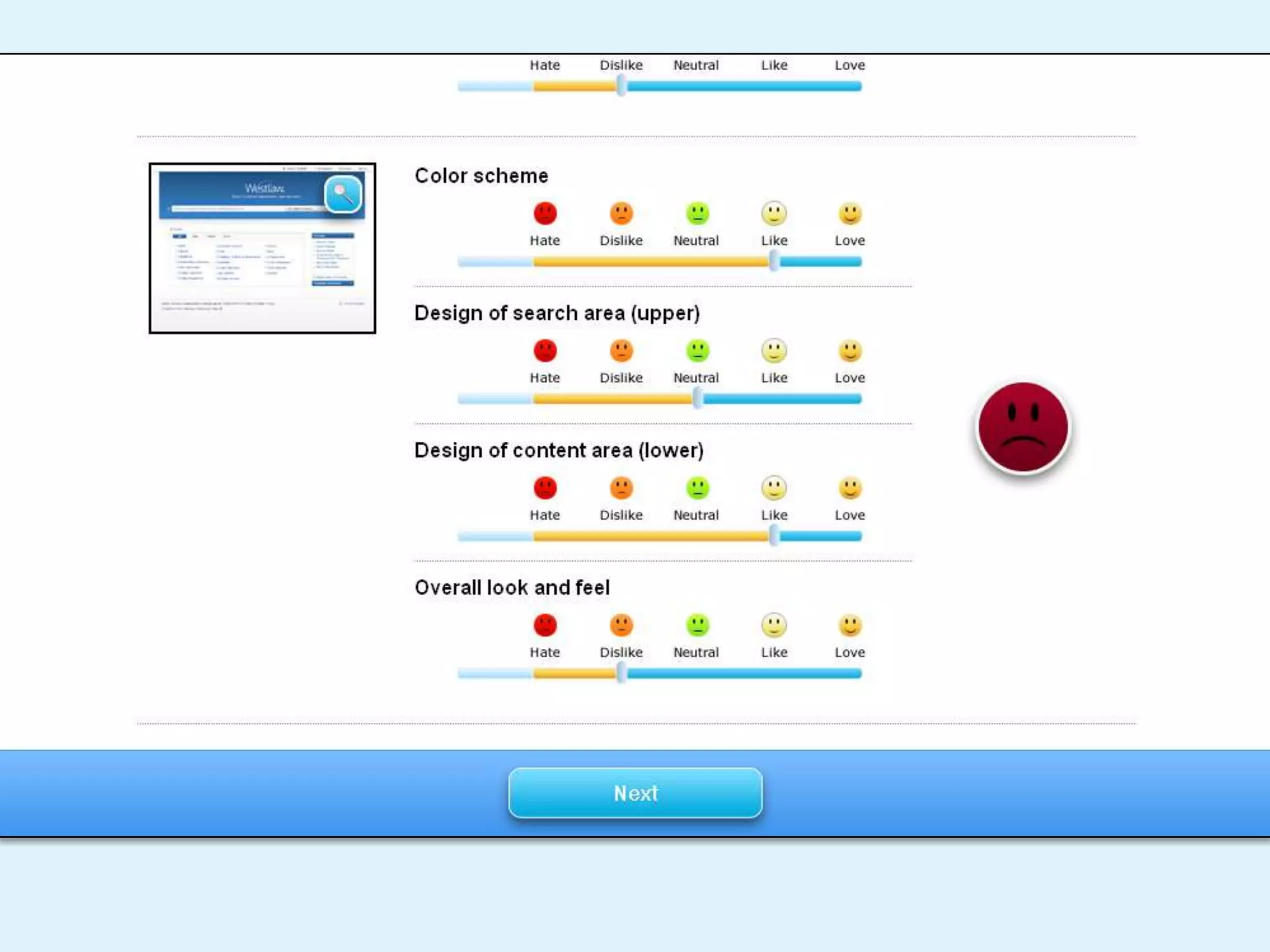
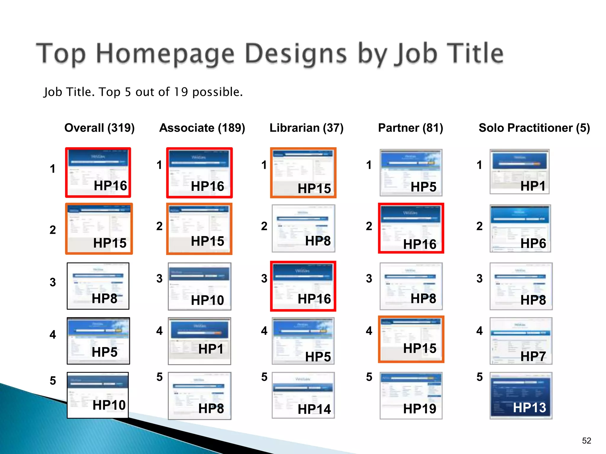
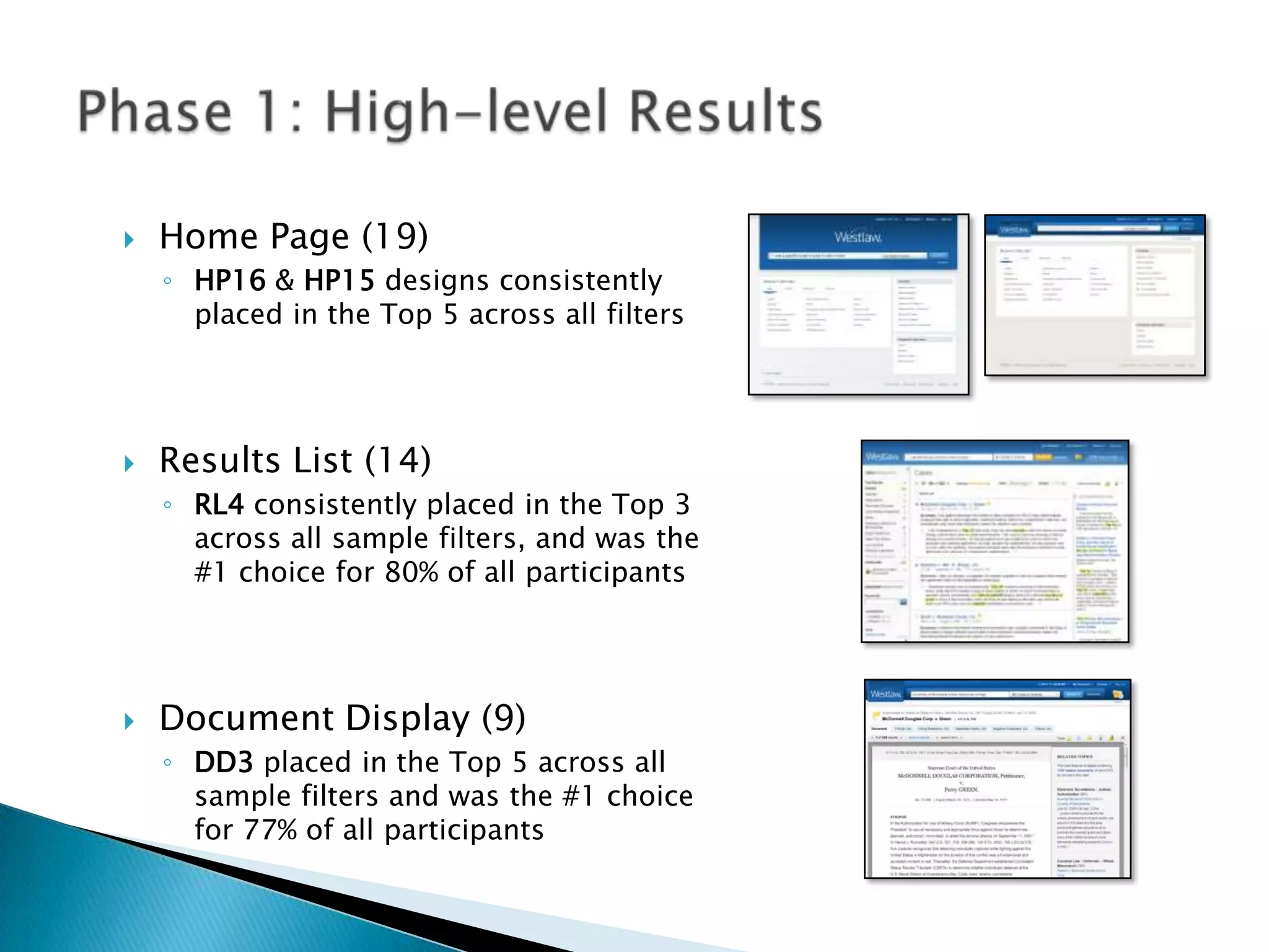
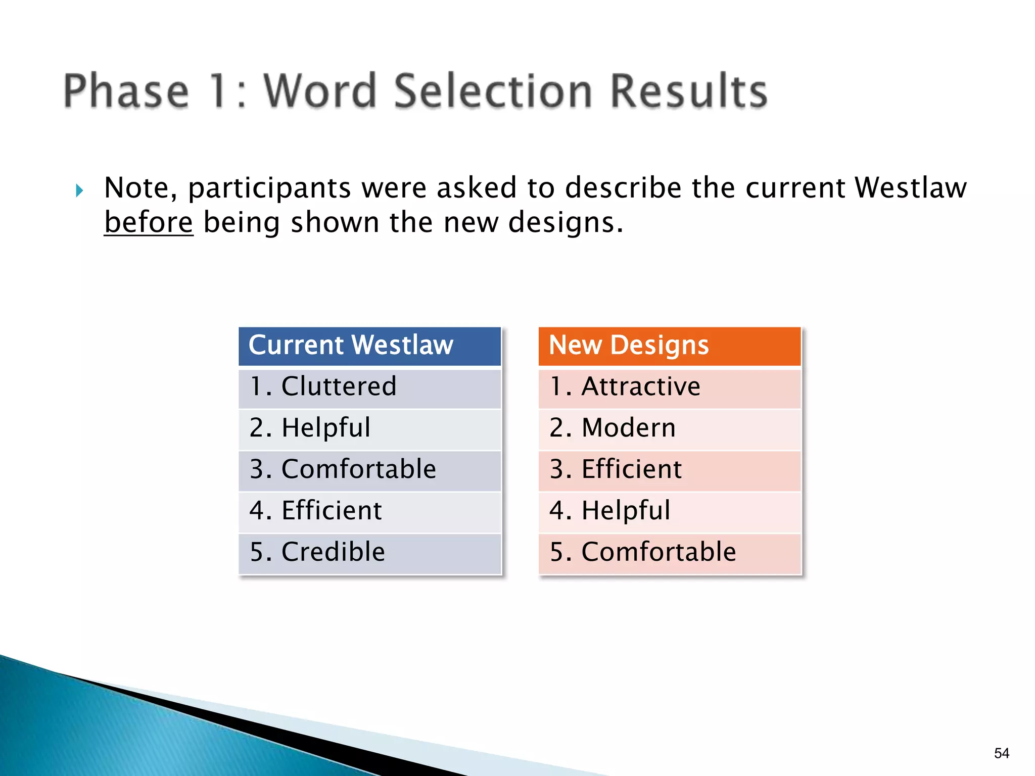
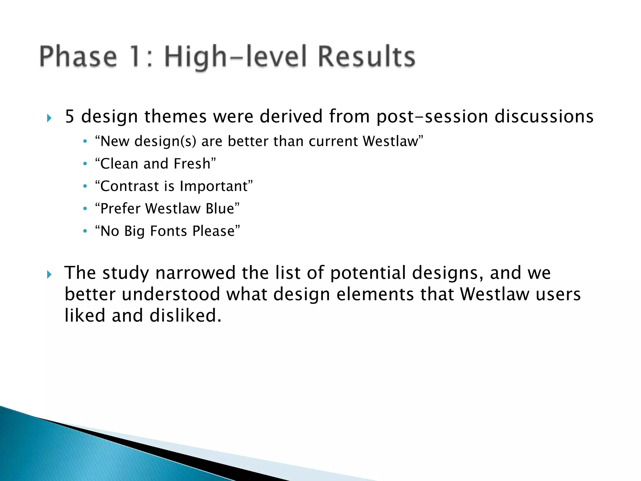
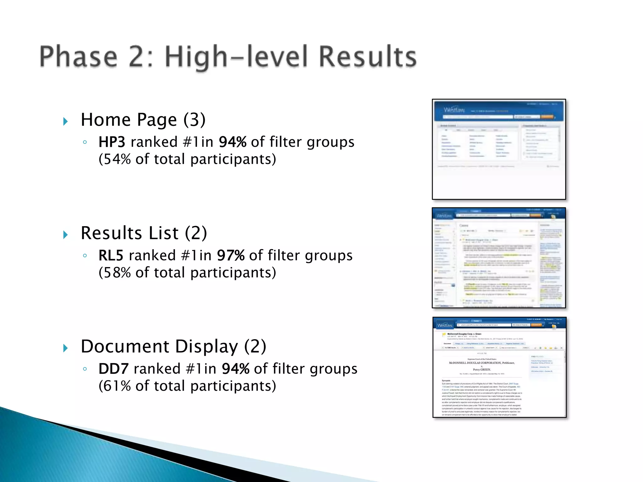
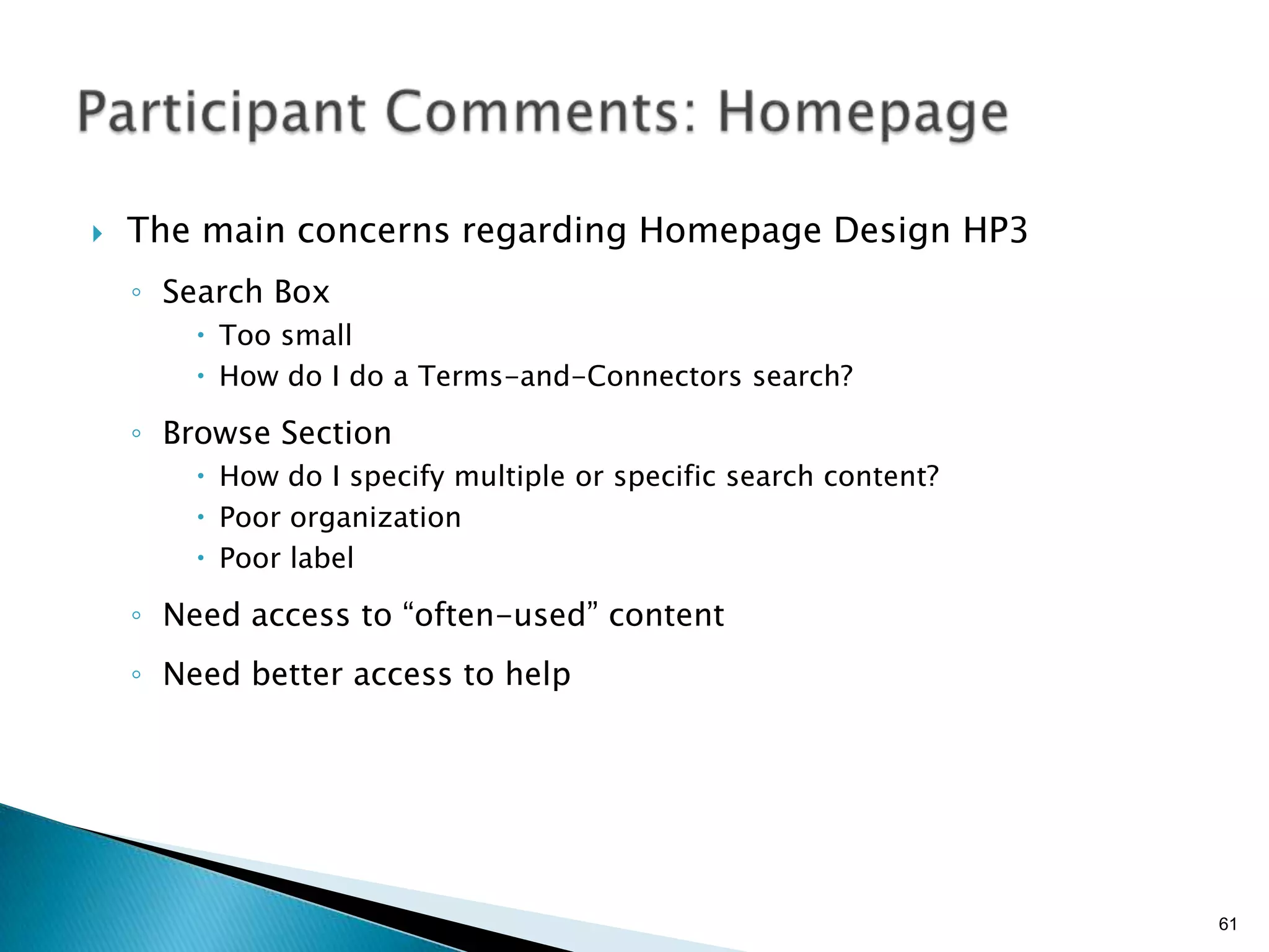
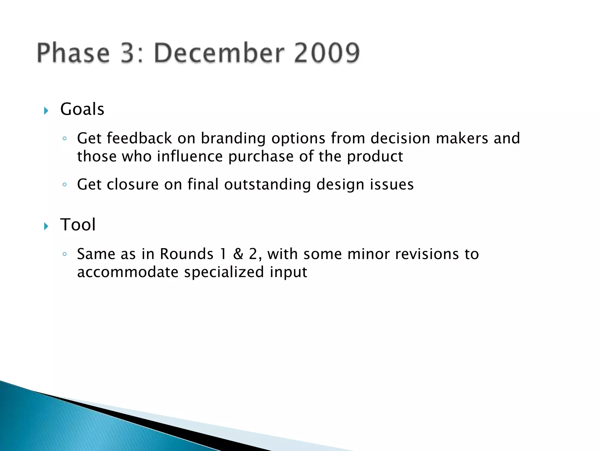
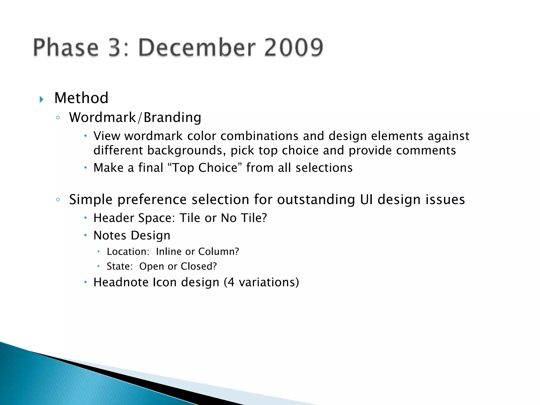
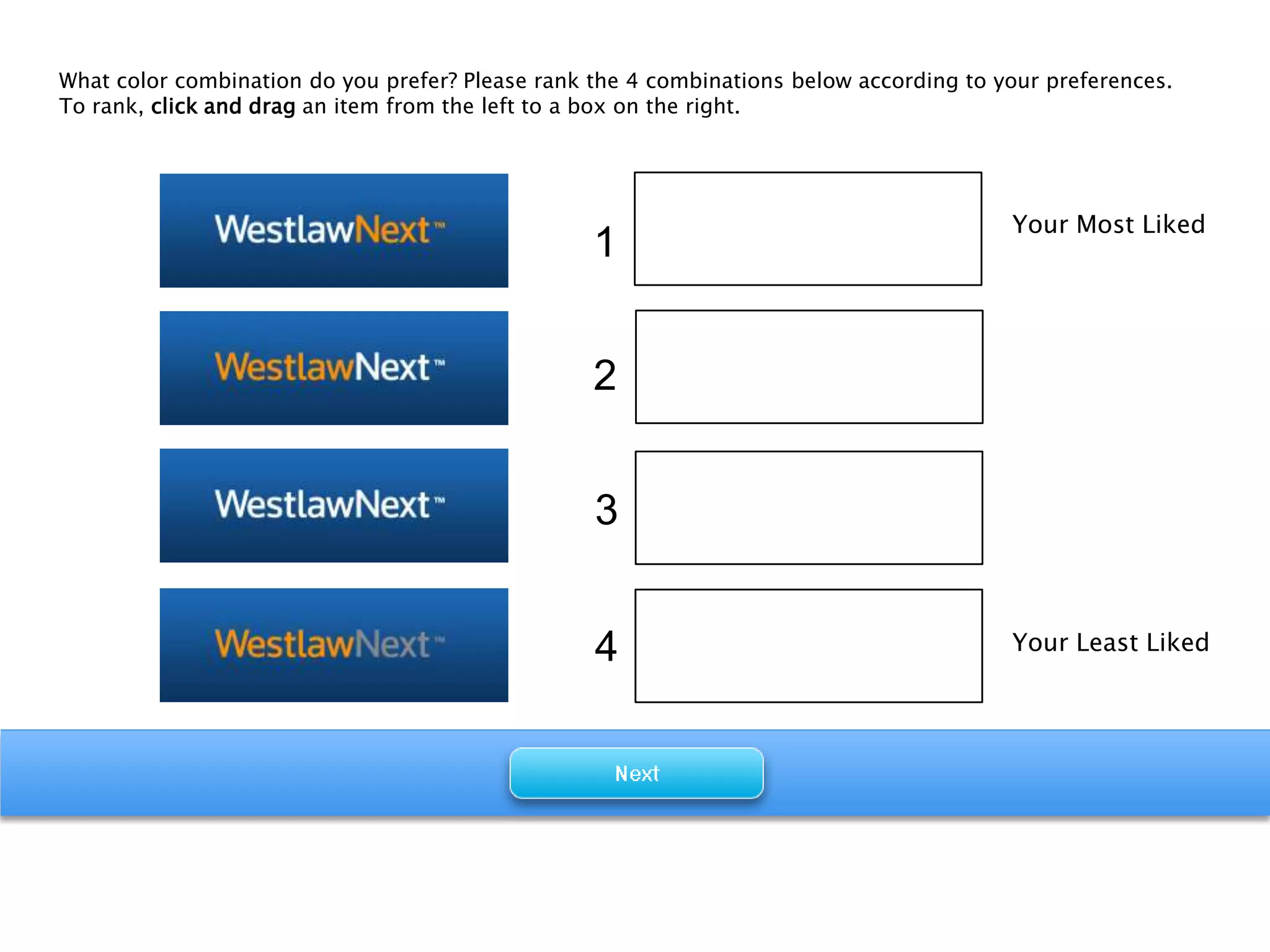
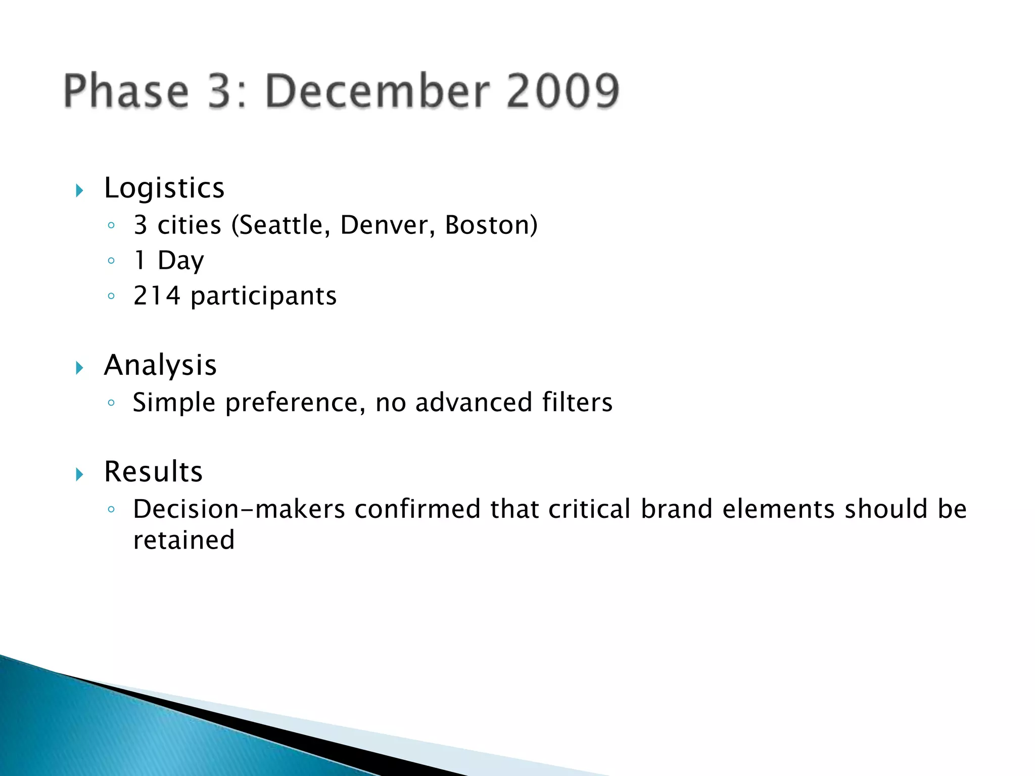
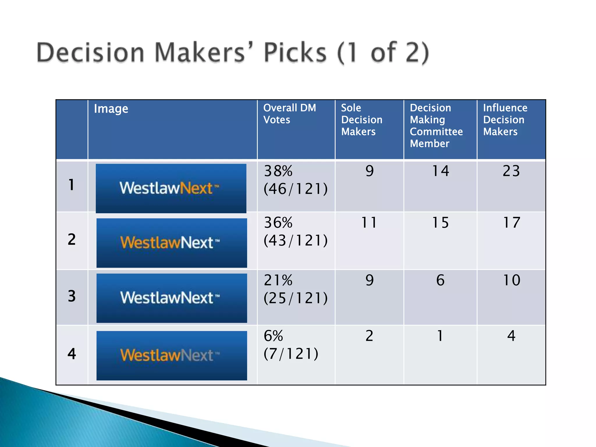
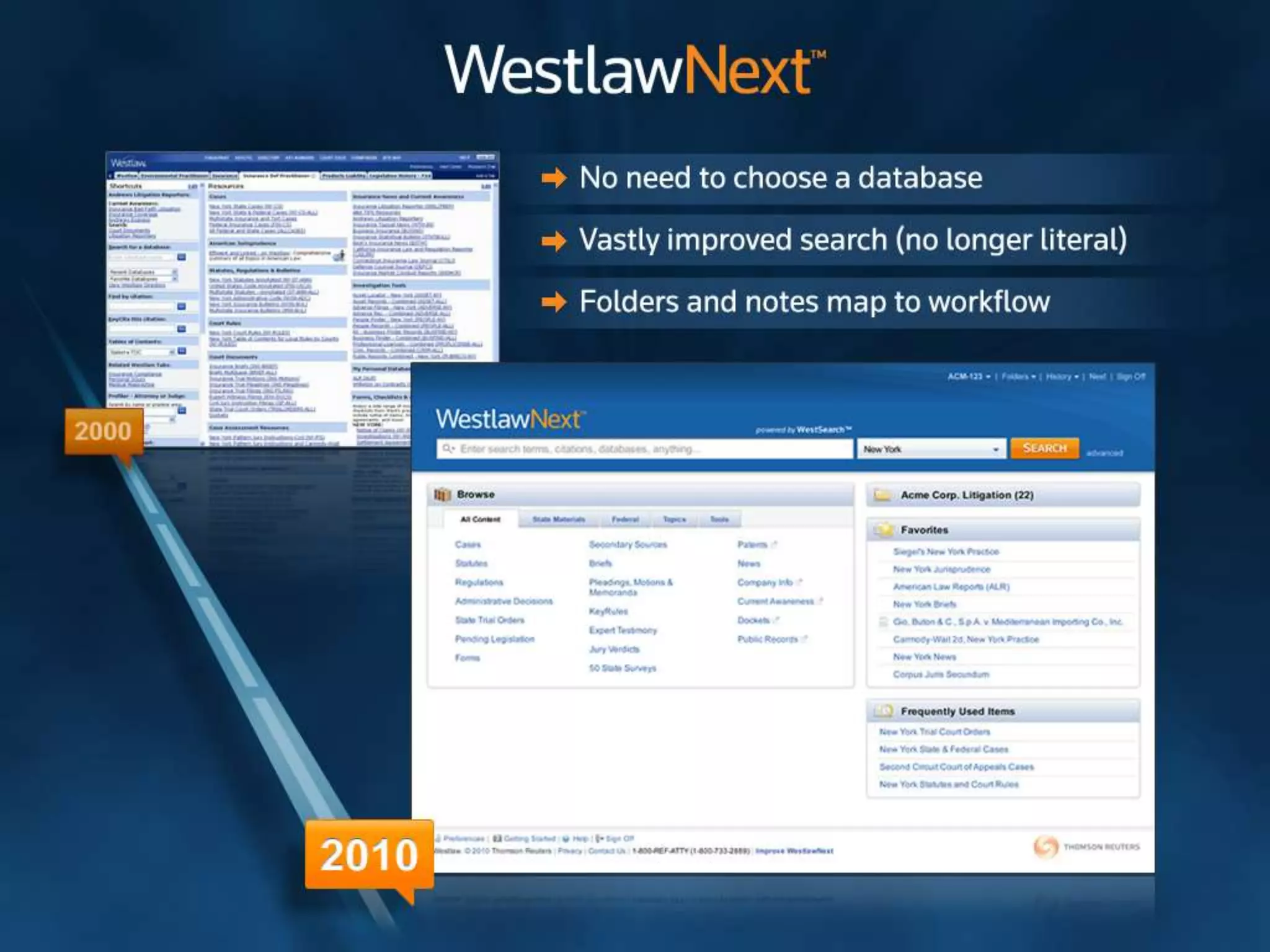
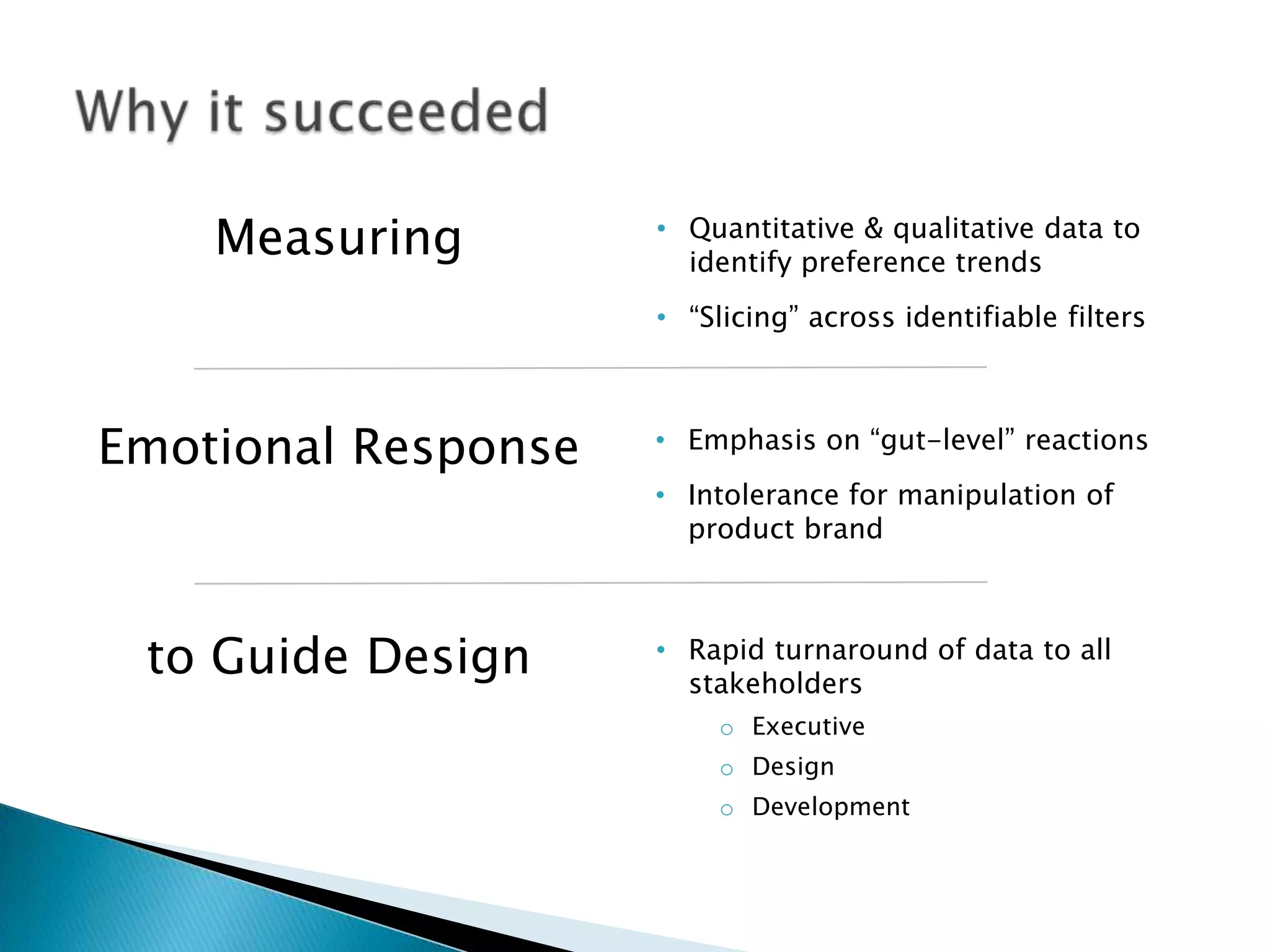
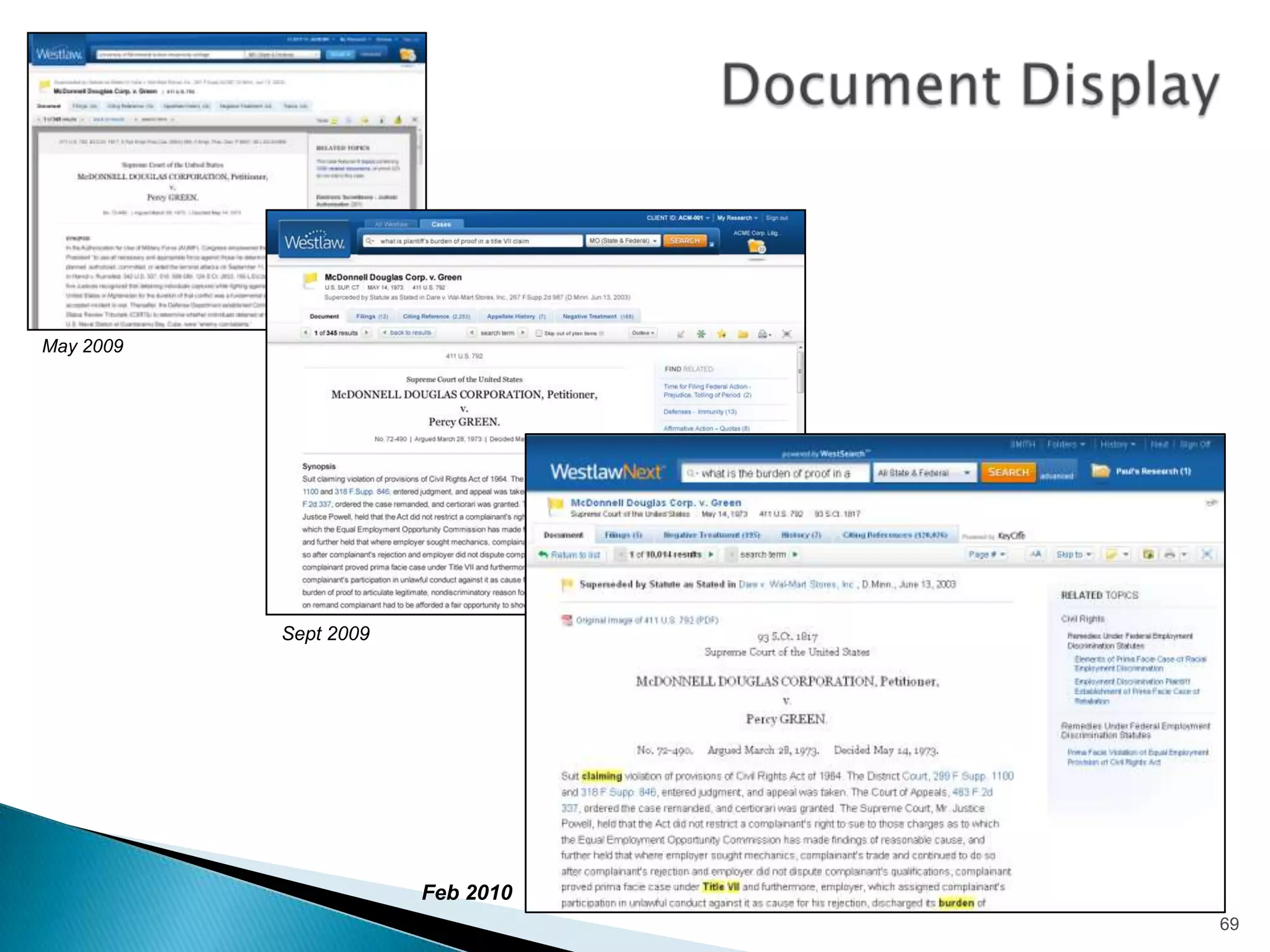
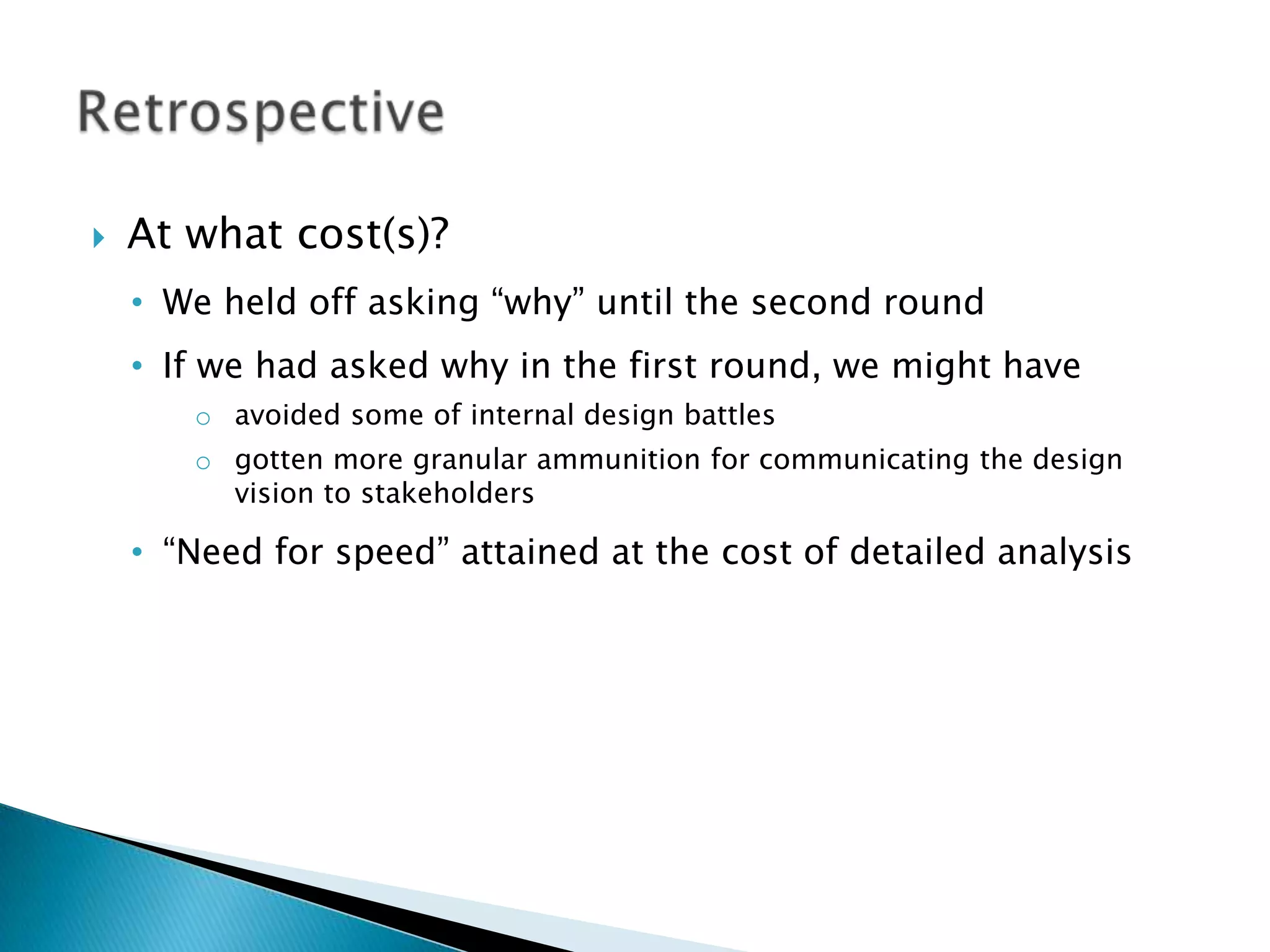
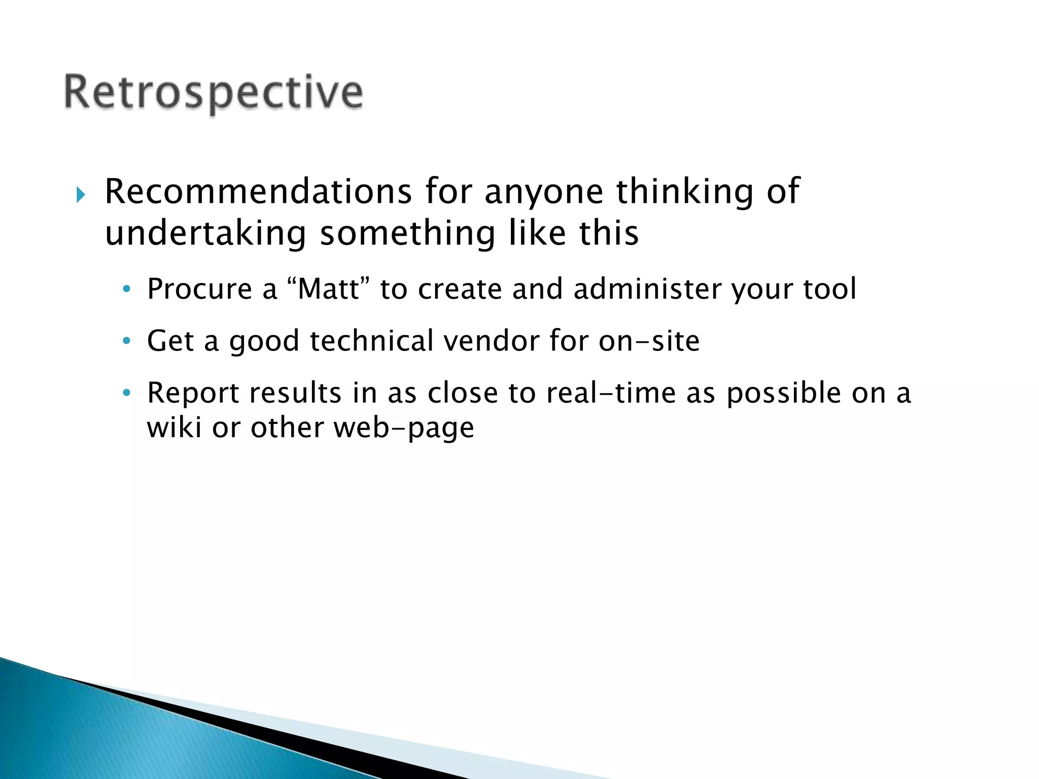
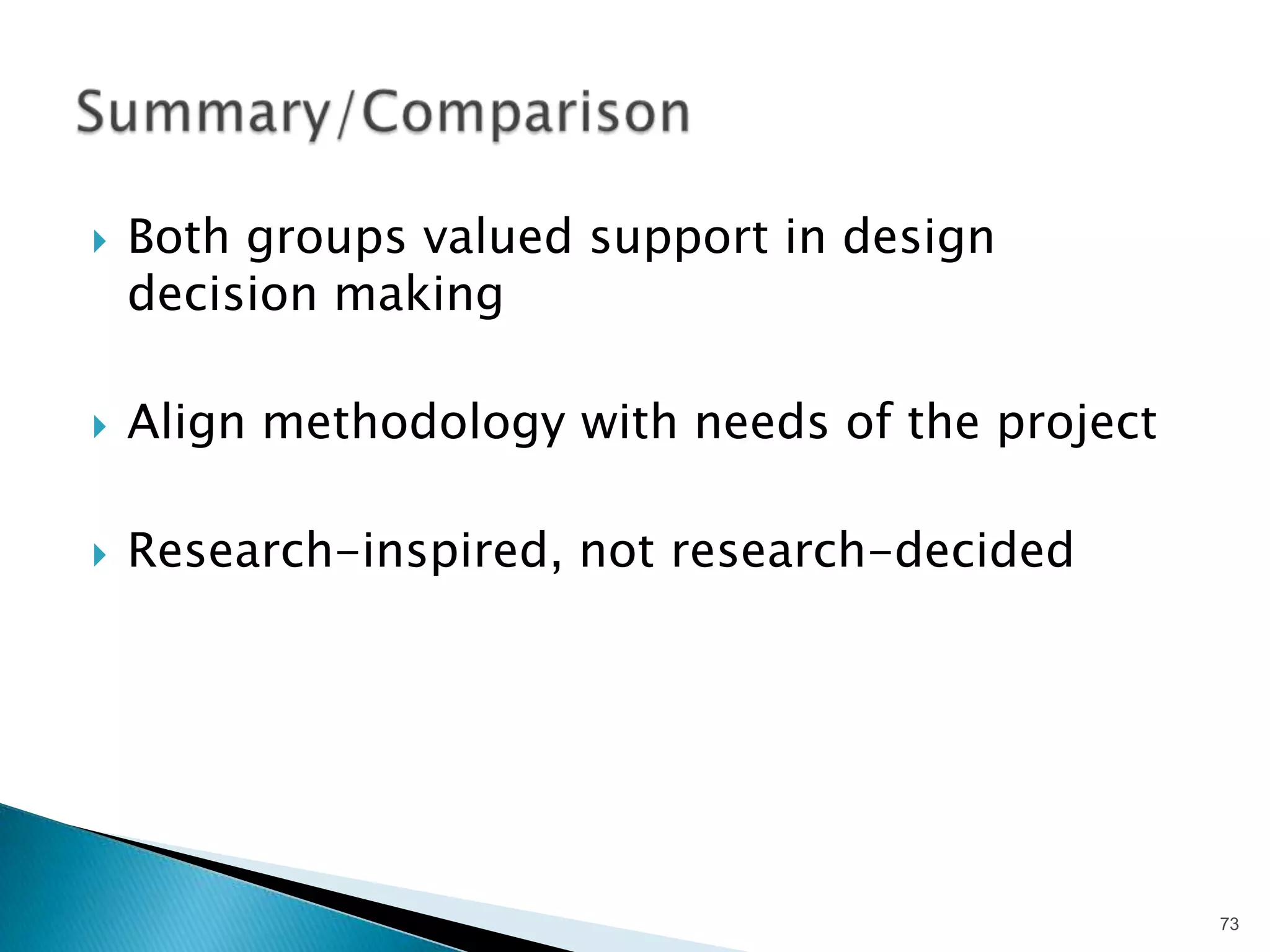


The document discusses preference and desirability testing as methods to measure emotional responses that guide design decisions. It highlights various methodologies, including case studies on Greenwich Hospital and WestlawNext, showcasing the importance of mixing qualitative and quantitative feedback to inform design choices. Key insights are shared on the necessity of understanding visceral emotions and stakeholder preferences in the design process.


![Conducting Usability Research with a Team of One [Revised: October 2009]](https://cdn.slidesharecdn.com/ss_thumbnails/kowalskiheweb2009aps7-091002163651-phpapp01-thumbnail.jpg?width=640&height=640&fit=bounds)


![WinRAR Crack 7.13 Final Mac Keygen 2026 Download [Latest] Software.pptx](https://cdn.slidesharecdn.com/ss_thumbnails/software-251207185858-eb450678-thumbnail.jpg?width=640&height=640&fit=bounds)

![Chapter4_Initiation_of_Sediment_Motion_v2[1].pptx](https://cdn.slidesharecdn.com/ss_thumbnails/chapter4initiationofsedimentmotionv21-251208223747-f94ef163-thumbnail.jpg?width=640&height=640&fit=bounds)


![CleanMyMac X v5.2.8 Crack for MacOS Full Version [Latest] pptx](https://cdn.slidesharecdn.com/ss_thumbnails/softwareoverview-251207194121-a81f0142-thumbnail.jpg?width=640&height=640&fit=bounds)
![Soundtoys Mac v5.5.5.0 Crack for MacOS Full Version [Latest] pptx](https://cdn.slidesharecdn.com/ss_thumbnails/softwareoverview-251207193711-91d8ae6b-thumbnail.jpg?width=640&height=640&fit=bounds)
![Wondershare Filmora 15.0.11 Crack for Mac Key Full Download [Latest] pptx](https://cdn.slidesharecdn.com/ss_thumbnails/software-251207184836-1d16ba16-thumbnail.jpg?width=640&height=640&fit=bounds)


![Driver Easy Pro Key 7.1.0.2641 Full Mac Crack Free Activated Download [2026]....](https://cdn.slidesharecdn.com/ss_thumbnails/software-251207185324-b2fb71b4-thumbnail.jpg?width=640&height=640&fit=bounds)


