
Recommended
More Related Content
What's hot
What's hot (20)
Viewers also liked
Viewers also liked (20)
Similar to Media Homework Article Analysis
Similar to Media Homework Article Analysis (20)
Recently uploaded
Recently uploaded (20)
Media Homework Article Analysis
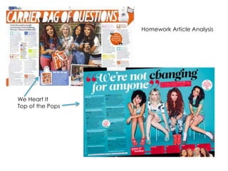
- 1. Homework Article Analysis We Heart It Top of the Pops
- 2. Conventions of a Teen Pop Magazine • Bright and colourful palette • Lots of photographs • Interviews are in Q&A form • Sans Serif fonts for main text - Not too bold for reading the article. • Serif fonts for headings - Harsher to have more effect on the reader. Bolder to have an impact.
- 3. Bright and Colourful Palette The use of bright and colourful colour palette helps the audience to identify the genre. The examples from ‘We Heart Pop’ and ‘Top of the Pops’ use pinks, blues and pastels to show domination of the target audience. The use of bright and colourful colour palette makes the pages look more visual.
- 4. Photographs Magazines aimed at young audiences such as teenagers use a lot of photographs. This keeps the page minimum in text and the fills up blank space.
- 5. Q&A Form Magazines aimed at a young audience tend to use Q&A’s as a simple form of interview which is easy to follow. The use of a Q&A keeps the response short and simple and does not require a lot of reading.
- 6. Categories of the interview Splash Pull Quote Headline Category Page number To help find the page from the contents. Webpage Links to the magazine’s website Subheading Interaction
- 7. Facts Pull Quote Subheading Exclusive
- 8. Category In the top left hand corner titles the artist/group this will help the reader to find the article they are looking for when flicking through the pages rather the looking at the contents page. This would incorporate well with my article as it would be a time saver for the reader as well as it being conventional of music magazines and most cases magazines in general.
- 9. Headline The headline doesn’t include the artist as such but is relevant to the interview type. The ‘Carrier bag of questions’ suggests a lucky dip arrangement of questions. Perhaps using questions from readers. This would not fit well with my magazine article as I intend to exaggerate the individual conducting a more formal type of interview.
- 10. Subheading The subheading ensures the reader that the questions are random and drawn from the bag. This informs the reader that any subject could occur adding a bit of mystery to the article. In Top of the Pops the subheading is used to welcome the group to the interview and magazine. This gives a general overview to the magazine’s intentions. This would be a good thing to include in my article as it would explain the article so the reader could choose to read it if they wish to.
- 11. Categories of the interview The categories of the interview breaks up the different topics. This will help the reader choose to reader questions and answers which has the most appeal to them. This wouldn’t be relevant or appropriate to my magazine as my questions are pre-set and does not overly branch out into categories.
- 12. Pull Quotes Something which is said in the interview which would interest the readers. In ‘We Heart Pop’ they used a pull quote to embrace the information the band member gave about one of their fellow band members. In Top of the Pops the pull quotes are used as a headline as well as small interesting facts and information. This would be a good addition to my article as it will highlight what might interest the reader.
- 13. Exclusive/Facts In Top of the Pops they exaggerated the fact they had an exclusive interview which informed the readers of new information. Displaying its ‘exclusive’ shows the pride the magazine has towards the group and to interest the reader.