2. First Draft- Ancillary 2
Soap Opera Poster:
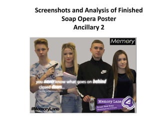
The below image is the first draft of my Ancillary 2 poster before I received any feedback. I wasn’t completely happy
with this draft as I felt it didn’t look as conventional as I had hoped for, and additionally didn’t stand out to the audience
as I had intended.
Feedback- the feedback I gained said similar, for example my teacher said that I could improve the text at the top as they
weren’t all the same size and the spacing was different resulting in my poster looking unprofessional. Another piece of
feedback suggested that I change the layout of the title ‘Memory Lane’. Feedback showed that the white banner behind
the text was too prominent on the page and didn’t suit the product I was making. I agreed with this as it wasn’t very
aesthetically pleasing and covered a lot of the characters and the mise en scene in the image.
3. Ancillary 2
Soap Opera Poster:
The image on the left was the next draft on my soap opera poster, for this I had used the E4 logo in the bottom right hand corner which
makes my product look conventional and aesthetically pleasing to the audience. It gives the audience the channel name, the soap name
and the day and time of the soap without it dominating the page. This is important as this was not the main aspect of my product that
would attract my target audience. It allowed me to have more room for my image and made the poster look youthful. By this point, I
had additionally chosen to change the arrangement of characters on the poster. I felt as though the characters needed to be closer
together so it looked like their lives intertwined with each other. I believe I was successful in doing this as the audience can now gain a
better sense of personal identity with the characters as they are so much closer to the front of the poster. Swapping the arrangement of
the characters was additionally very successful as I felt they needed to be boy girl boy girl in order for the audience to recognise the
contrasting character types. The layout of the characters made the females look weak and vulnerable as they’re standing behind the
boys and additionally allowed the males to be more dominant and superior on the page.
The image on the right hand side was a further updated version of my poster. A lot of this one stayed the same, however I did add a
hashtag to the bottom of the page in the hope that this would attract a youthful audience. I additionally ensured I included a hashtag as
this meant that the audience would be able to connect with the soap and find out more using their own choice of media that can be
accessed on a number of platforms.
4. Final Draft
Ancillary 2- soap opera poster:
Once I had completed the previous draft, I then received more feedback from both peers and my teacher who suggested that
I needed to include a logo specific to the production that would appeal to a youthful audience. In this previous draft I had
created a logo however the logo looked unprofessional and didn’t appeal exclusively to a young target audience. On my final
draft I decided that I needed to alter my logo and therefore chose to include black, white and yellow as they are colours that
appeal to my target audience. I checked this by asking some peers from within my target audience who were working on
their media projects at the time. I feel as though this was successful as they all stated that the colours, font and style of this
logo appealed to them and that it looked more professional and conventional than my previous logo had. I feel happy that
my poster would now appeal to my target audience of 16 to 25 year olds and that it is conventional of my chosen
broadcaster E4.