Salient Features of India constitution especially power and functions
Magazine adverts
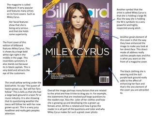
1. The magazine is called
Billboard. It very popular
and features many artists
on its front covers. Such as
Miley Cyrus.
The front cover of this
edition of billboard
features Miley Cyrus. This
is shows by a large bold
white sign right in the
middle in the page. This
resembles symmetry. It
also stands out because
its in block capitals. This is
very bold and attracts the
eye of the customers.
Another symbol that the
artist is called Miley Cyrus is
that she is holding a large M.
Also the way she is holding
the M Is symbolic to a very
powerful and highly
respected young adult.
Her facial features
show that she is
being very serious
and that she holds
some superiority.
Another great element of
this cover is that the way
they have enhanced the
image to make you look at
her direct face. This direct
mode of address really
catches people eyes and this
is what you want on the
front of a magazine cover.
The black clothing she is
wearing and the dull
purple back ground really
adds to the affect of
enhancing her face and
that’s the one element of
the cover you are attracted
to.
The small yellow writing under the
bold white. Its says “the queen of
tween grows up.. But will her fans
follow” This is tells us that she had
a large back ground in a teen TV or
music industry. It is also showing
that its questioning weather the
teens will follow her with her new
grown up act. This is a very juicy
headliner and really gets peoples
attention.
Overall the image portrays many factors that are related
to the artist and how it tries to drag you in. For example,
the statements that are involved pull large questions to
the readers eye. Also the color of her clothes and how
she is growing up and developing into a grown up
female artist. All this is related and how it grips the
reader in is all part of the questions and color and why
Miley Cyrus makes for such a great cover photo.
2. The artists name in bold
white to stand out to the
customers
The blue sky back ground
emphasis this effect and
attracts the eye even
more.
The advert even twists
this eye catching effect
around by putting the
words in blue on her
white top.
The red hair is great
because it stands out to
the viewer of the advert.
In a way it’s a trade
mark so people know its
her. Therefore making a
similarity to the
customers.
Another part of this image that
stands out is the contrast of
her pale face to the red hair.
This also makes her seem very
important and authoritative to
the image.
She also gives a very clear
direct mode of address. This is
very eye catching and great for
an advert because it makes
you believe that she is
focusing on you and just you.
There is also in addison information
on the advert to when the album is
coming out and as we can see its
carrying on the effect of the blue
letters on the white back ground
shirt. There is also information on
what songs feature in the album.
These songs are great to feature
because they are ones that are her
top sellers.
They have also posted
where the album can be
brought. Also the
production company is on
the bottom right.
The background makes a large
element in this photo. As its very
eye catching. The photo is very
misleading though. This is because
the songs are very dark such as
“born to die” witch is featured in
this album. This juxtaposition is
great to entice the viewer. This also
might be another reason she has
rather dark eyes in this photo. This
could represent the
3. The artists name is in the
biggest font at the top and
the center of the page.
The Blue print 3 is the name
of the album witch is under
but in a lot smaller writing.
The center of the image is
been very smartly the only
color on the page. This is very
eye catching to the customers
and makes you want to carry
on reading. It also very
recognizable to the viewer
after jay z has a common
theme to put lines in his
album covers. This makes it
recognizable to the customer
and comfortable because they
feel a since of familiarity.
The plain background is
great because it really
emphasizes the red in the
image. Its also really shows
the name of the artist and
the name of the album. This
s such a great way to catch
customers in to look and
remember the album cover.
Here it s also some more
information on when the
album is being realize. It
also is the same color,
which makes it stand out
by counteracts that by
making them so small.
Witch tells us its
important but
understated.
In the cover it also
displays the record
company as well. Aslo
shows his website here
where you can purchase
items of clothing and find
out about more info.
Such as tour dates ect.
In the center of the image is
also shows us a stack of load
of different instruments.
However they are hidden by
the red striped and are
blended in by the same white
paint as the back. This could
interoperate that yet jay-z is a
rapper and that’s what he is
known for but it also means
that he puts a lot of heart and
soul into it therefore making it
not just rap, yet music.
Another theory is that the red
stands for the rap and why
everyone considers it bad and
negative and to show that the
music is white therefore
symbolizing purity and putting
these together and showing the
contrast.
4. This is the tour
photo for Chase
and status.
As you can see the writing is
very bold and it very distinct
and colorful. This is very
attractive and draws people in.
The effect of the back ground
also plays a key part in making
the yellow stand out even
more.
All the key information is
in a bright yellow. This is
information that they
really want to advertise.
It makes it very eye
catching for the observer
and makes you want to
read on.
The center of the
image in the back is
a British bulldog.
This infers to the
observer that they
are a British band.
The old fashioned back
ground could take the
hint of old fashioned
twist to a new and
upcoming electronic DJ
team. This juxtaposition
is great and incises
anyone who knows or
has herd o their music.
There is extra information is
under the large and key
information is tour dates to
where they are visiting. Where
they can get more information
about tour dates and more
about the band. Also where they
can purchase their songs.
Their album cover photo is
also in in the bottom left
witch also promotes the
same photo as seen in this
tour dates add.
The production company is
on the far bottom right.
Witch also promotes them
however small and where its
placed.
5. The magazine is called
Billboard. It is very
popular and features
many famous and
successful artists on its
front covers. Such as
Adele.
The direct mode of
address is very eye
catching here. With also a
symmetrical design which
also attracts the reader.
The contrast of color on
this page is very clear
what the designs have
tried to do. The black
background and the
contrast of the almost
white color of Adele's
face really makes her
stand out.
The different colors
around the artist really
attracts you. Makes
you want to carry on
reading as the bits that
come off the larger
words look like wheat
crop. This makes it
seem that Adele is just
going to grow and her
music carrier will
venture around the
world.
The symmetrical
appearance of Adele's
face also centers her in
the front of the page and
looks great and attracts
people. Also makes her
the center of the page
which is what the advert
aimed for.
The way the mag says “the year in
music” means that this year has
been incredible for Adele and
carries on to be therefore read on.
This makes people interested and
using such an inspirational face
like Adele that people look up to.