SlideShare a Scribd company logo
the 960 grid
system
Easy codes, complex layouts
What is it?
• Ready-made CSS file
• Make grid-based layouts within 960px
• Cross-browser compatible
• Three versions: 12-col, 16-col, 24-col
• No need to compute widths
How to get started
• Create mock-up wireframes for your site,
  using either 12, 16, or 24 columns
• Link the reset CSS file
   <link	
  rel="stylesheet"	
  href="css/reset.css"	
  />

• Link the CSS file of the 960 grid
   <link	
  rel="stylesheet"	
  href="css/960.css"	
  />
choose a
  container grid

<div	
  class=“container_12”>


<div	
  class=“container_16”>
use class
    names to give
   column widths
<div	
  class=“grid_12”>

<div	
  class=“grid_11”>

<div	
  class=“grid_2”>

<div	
  class=“grid_7”>

<div	
  class=“grid_4”>
use class
    names to give
   column widths
<div	
  class=“grid_12”>

<div	
  class=“grid_11”>

<div	
  class=“grid_2”>

<div	
  class=“grid_7”>

<div	
  class=“grid_4”>
use class
    names to give
   column widths
<div	
  class=“grid_12”>

<div	
  class=“grid_11”>

<div	
  class=“grid_2”>

<div	
  class=“grid_7”>

<div	
  class=“grid_4”>
use class
    names to give
   column widths
<div	
  class=“grid_12”>

<div	
  class=“grid_11”>

<div	
  class=“grid_2”>

<div	
  class=“grid_7”>

<div	
  class=“grid_4”>
use class
    names to give
   column widths
<div	
  class=“grid_12”>

<div	
  class=“grid_11”>

<div	
  class=“grid_2”>

<div	
  class=“grid_7”>

<div	
  class=“grid_4”>
use class
    names to give
   column widths
<div	
  class=“grid_12”>

<div	
  class=“grid_11”>

<div	
  class=“grid_2”>

<div	
  class=“grid_7”>

<div	
  class=“grid_4”>
use class
    names to give
   column widths
<div	
  class=“grid_12”>

<div	
  class=“grid_11”>

<div	
  class=“grid_2”>

<div	
  class=“grid_7”>

<div	
  class=“grid_4”>
use class
    names to give
   column widths
<div	
  class=“grid_12”>

<div	
  class=“grid_11”>

<div	
  class=“grid_2”>

<div	
  class=“grid_7”>

<div	
  class=“grid_4”>
use class
    names to give
   column widths
<div	
  class=“grid_12”>

<div	
  class=“grid_11”>

<div	
  class=“grid_2”>

<div	
  class=“grid_7”>

<div	
  class=“grid_4”>
use class
    names to give
   column widths
<div	
  class=“grid_12”>

<div	
  class=“grid_11”>

<div	
  class=“grid_2”>

<div	
  class=“grid_7”>

<div	
  class=“grid_4”>
use class
    names to give
   column widths
<div	
  class=“grid_12”>

<div	
  class=“grid_11”>

<div	
  class=“grid_2”>

<div	
  class=“grid_7”>

<div	
  class=“grid_4”>
use class
    names to give
   column widths
<div	
  class=“grid_12”>

<div	
  class=“grid_11”>

<div	
  class=“grid_2”>

<div	
  class=“grid_7”>

<div	
  class=“grid_4”>
use class
    names to give
   column widths
<div	
  class=“grid_12”>

<div	
  class=“grid_11”>

<div	
  class=“grid_2”>

<div	
  class=“grid_7”>

<div	
  class=“grid_4”>
use class
    names to give
   column widths
<div	
  class=“grid_12”>

<div	
  class=“grid_11”>

<div	
  class=“grid_2”>

<div	
  class=“grid_7”>

<div	
  class=“grid_4”>
use class
    names to give
   column widths
<div	
  class=“grid_12”>

<div	
  class=“grid_11”>

<div	
  class=“grid_2”>

<div	
  class=“grid_7”>

<div	
  class=“grid_4”>
use class
    names to give
   column widths
<div	
  class=“grid_12”>

<div	
  class=“grid_11”>

<div	
  class=“grid_2”>

<div	
  class=“grid_7”>

<div	
  class=“grid_4”>
use class
    names to give
   column widths
<div	
  class=“grid_12”>

<div	
  class=“grid_11”>

<div	
  class=“grid_2”>

<div	
  class=“grid_7”>

<div	
  class=“grid_4”>
use class
    names to give
   column widths
<div	
  class=“grid_12”>

<div	
  class=“grid_11”>

<div	
  class=“grid_2”>

<div	
  class=“grid_7”>

<div	
  class=“grid_4”>
use class
    names to give
   column widths
<div	
  class=“grid_12”>

<div	
  class=“grid_11”>

<div	
  class=“grid_2”>

<div	
  class=“grid_7”>

<div	
  class=“grid_4”>
use class
    names to give
   column widths
<div	
  class=“grid_12”>

<div	
  class=“grid_11”>

<div	
  class=“grid_2”>

<div	
  class=“grid_7”>

<div	
  class=“grid_4”>
use class
    names to give
   column widths
<div	
  class=“grid_12”>

<div	
  class=“grid_11”>

<div	
  class=“grid_2”>

<div	
  class=“grid_7”>

<div	
  class=“grid_4”>
ADD a CLEAR DIV
 after each row

<div	
  class=“clear”>


<div	
  class=“clear”>
move divs by pulling and pushing


<div	
  class=“grid_3	
  push_1”>   <div	
  class=“grid_3	
  pull_1”>
Add white spaces by using prefix/suffix


                                           3-column space


<div	
  class=“grid_6	
  suffix_3”>   OR   <div	
  class=“grid_3	
  prefix_3”>
Avoid double-margins using alpha/omega


<div	
  class="grid_4">            <div	
  class="grid_5">           <div	
  class="grid_3">
	
  	
  <div	
  class="grid_4">    	
  	
  <div	
  class="grid_3">   	
  	
  <h1>3-­‐col</h1>


  <h1>4-­‐col</h1>   	
  	
  	
   <h1>3-­‐col</h1>     </div>
	
  	
  </div>                     	
  	
  </div>
	
  	
  <div	
  class="grid_4">    	
  	
  <div	
  class="grid_2">


   <h1>4-­‐col</h1>      	
  	
  	
   <h1>2-­‐col</h1>
	
  	
  </div>                     	
  	
  </div>
</div>                             	
  	
  <div	
  class="grid_1">


   <h1>1-­‐col</h1>
                                   	
  	
  </div>
                                   	
  	
  <div	
  class="grid_4">


   <h1>4-­‐col</h1>
                                   	
  	
  </div>
                                   </div>
Avoid double-margins using alpha/omega


<div	
  class="grid_4">            <div	
  class="grid_5">           <div	
  class="grid_3">
	
  	
  <div	
  class="grid_4">    	
  	
  <div	
  class="grid_3">   	
  	
  <h1>3-­‐col</h1>


  <h1>4-­‐col</h1>   	
  	
  	
   <h1>3-­‐col</h1>     </div>
	
  	
  </div>                     	
  	
  </div>
	
  	
  <div	
  class="grid_4">    	
  	
  <div	
  class="grid_2">


   <h1>4-­‐col</h1>      	
  	
  	
   <h1>2-­‐col</h1>
	
  	
  </div>                     	
  	
  </div>
</div>                             	
  	
  <div	
  class="grid_1">


   <h1>1-­‐col</h1>
                                   	
  	
  </div>
                                   	
  	
  <div	
  class="grid_4">


   <h1>4-­‐col</h1>
double margins!!                   	
  	
  </div>
                                   </div>
Avoid double-margins using alpha/omega


        <div	
  class="grid_4">
        	
  	
  <div	
  class="grid_4	
  alpha	
  omega">


  <h1>4-­‐col</h1>
        	
  	
  </div>
        	
  	
  <div	
  class="grid_4	
  alpha	
  omega">


                 <h1>4-­‐col</h1>
        	
  	
  </div>
        </div>
Avoid double-margins using alpha/omega


                <div	
  class="grid_4">
                	
  	
  <div	
  class="grid_4	
  alpha	
  omega">


  <h1>4-­‐col</h1>
alpha:          	
  	
  </div>
no left margin  	
  	
  <div	
  class="grid_4	
  alpha	
  omega">
omega:	


                         <h1>4-­‐col</h1>
no right margin 	
  	
  </div>
                </div>
Avoid double-margins using alpha/omega


<div	
  class="grid_5">                    	
  	
  <div	
  class="grid_1	
  alpha">
	
  	
  <div	
  class="grid_3	
  alpha">   	
  	
  	
  <h1>1-­‐col</h1>


  <h1>3-­‐col</h1>               	
  	
  </div>
	
  	
  </div>                             	
  	
  <div	
  class="grid_4	
  omega">
	
  	
  <div	
  class="grid_2	
  omega">   	
  	
  	
  <h1>4-­‐col</h1>


  <h1>2-­‐col</h1>               	
  	
  </div>
	
  	
  </div>                             </div>
everything adds up
everything adds up
•   All row widths should always add up to its
    container div
everything adds up
•   All row widths should always add up to its
    container div
•   For a 12-col grid:
    <div	
  class=“grid_3	
  suffix_1”>
    <div	
  class=“grid_7”>
    <div	
  class=“grid_1”>
everything adds up
•   All row widths should always add up to its
    container div
•   For a 12-col grid:
    <div	
  class=“grid_3	
  suffix_1”>
                                          3+1+7+1=12
    <div	
  class=“grid_7”>
    <div	
  class=“grid_1”>
everything adds up
•   All row widths should always add up to its
    container div
•   For a 12-col grid:
    <div	
  class=“grid_3	
  suffix_1”>
                                          3+1+7+1=12
    <div	
  class=“grid_7”>
    <div	
  class=“grid_1”>
•   For a 16-col grid:
    <div	
  class=“grid_5”>
    <div	
  class=“grid_2	
  prefix_1”>
    <div	
  class=“grid_2	
  prefix_1”>
    <div	
  class=“grid_2”>
    <div	
  class=“grid_3”>
everything adds up
•   All row widths should always add up to its
    container div
•   For a 12-col grid:
    <div	
  class=“grid_3	
  suffix_1”>
                                          3+1+7+1=12
    <div	
  class=“grid_7”>
    <div	
  class=“grid_1”>
•   For a 16-col grid:
                                              5+2+1+
    <div	
  class=“grid_5”>
    <div	
  class=“grid_2	
  prefix_1”>      2+1+2+3
    <div	
  class=“grid_2	
  prefix_1”>        =16
    <div	
  class=“grid_2”>
    <div	
  class=“grid_3”>
REVIEW 960
• Link your HTML to the 960 CSS files
• Choose your container grid type
  <div	
  class=“container_12”>

• Add widths to your divs using grid
  <div	
  class=“grid_5”>	
  
  <div	
  class=“grid_12”>

• Use clear divs after each row
  <div	
  class=“clear”>
REVIEW 960
• Move divs using push and pull
  <div	
  class=“grid_5	
  push_2”>
  <div	
  class=“grid_7	
  pull_1”>

• Add white space using prefix and suffix
  <div	
  class=“grid_11	
  prefix_1”>
  <div	
  class=“grid_9	
  suffix_3”>

• Remove margins using alpha and omega
  <div	
  class=“grid_6	
  alpha”>
  <div	
  class=“grid_3	
  omega”>
Speedtest 01

<!-­‐-­‐	
  CONTAINER	
  -­‐-­‐>
<div	
  class="container_16">
Speedtest 02
<!-­‐-­‐	
  SIDEBAR	
  -­‐-­‐>
<div	
  class="grid_4">
<!-­‐-­‐	
  ALL	
  CONTENT	
  -­‐-­‐>
<div	
  class="grid_12">
Speedtest 03

div.container_16{
background:#CCCCCC;
}
Speedtest 04

<!-­‐-­‐	
  PHOTO	
  -­‐-­‐>
<div	
  class="grid_4	
  prefix_8	
  alpha	
  
omega">
Speedtest 05
<!-­‐-­‐	
  SUB1	
  -­‐-­‐>
<div	
  class="grid_4	
  alpha">
<!-­‐-­‐	
  SUB2	
  -­‐-­‐>
<div	
  class="grid_4">
<!-­‐-­‐	
  SUB3	
  -­‐-­‐>
<div	
  class="grid_4	
  omega">

More Related Content

Viewers also liked

960 Grid System - A hands-on introduction
960 Grid System -  A hands-on introduction960 Grid System -  A hands-on introduction
960 Grid System - A hands-on introduction
Mario Hernandez
 
What is grid system
What is grid systemWhat is grid system
What is grid systemchetankane
 
Thinking about Design
Thinking about DesignThinking about Design
Thinking about Design
Bas Leurs
 
Grid Based Layout
Grid Based LayoutGrid Based Layout
Grid Based Layout
gordonbrander
 
Design Scripts: Designing (inter)action with intent
Design Scripts: Designing (inter)action with intent Design Scripts: Designing (inter)action with intent
Design Scripts: Designing (inter)action with intent Bas Leurs
 
Grid Systems: Building Blocks to a Better User Experience
Grid Systems: Building Blocks to a Better User ExperienceGrid Systems: Building Blocks to a Better User Experience
Grid Systems: Building Blocks to a Better User Experience
Dustin DiTommaso
 
Design Theory - Lecture 03: Design as Learning / Methods & Tools
Design Theory - Lecture 03: Design as Learning / Methods & ToolsDesign Theory - Lecture 03: Design as Learning / Methods & Tools
Design Theory - Lecture 03: Design as Learning / Methods & ToolsBas Leurs
 
Modernist Typography and the Swiss grid - Carlo Giannasca
Modernist Typography and the Swiss grid - Carlo GiannascaModernist Typography and the Swiss grid - Carlo Giannasca
Modernist Typography and the Swiss grid - Carlo Giannasca
FrostSydney
 
Métodos Proyectuales - Christopher Jones
Métodos Proyectuales - Christopher JonesMétodos Proyectuales - Christopher Jones
Métodos Proyectuales - Christopher Jones
Mariana CS
 
자주 사용되는 UI 패턴(컴포넌트) 과 UI 레이아웃
자주 사용되는 UI 패턴(컴포넌트) 과 UI 레이아웃자주 사용되는 UI 패턴(컴포넌트) 과 UI 레이아웃
자주 사용되는 UI 패턴(컴포넌트) 과 UI 레이아웃
Dongsik Yang
 
Design Theory - Lecture 02: Design processes & Problem solving
Design Theory - Lecture 02: Design processes & Problem solvingDesign Theory - Lecture 02: Design processes & Problem solving
Design Theory - Lecture 02: Design processes & Problem solvingBas Leurs
 
Design theory - Lecture 04: Design Expertise / Design Thinking / Key concepts
Design theory - Lecture 04: Design Expertise / Design Thinking / Key conceptsDesign theory - Lecture 04: Design Expertise / Design Thinking / Key concepts
Design theory - Lecture 04: Design Expertise / Design Thinking / Key conceptsBas Leurs
 
Theory of design
Theory of designTheory of design
Theory of design
Manish Jain Luhadia
 
Design Theory - Lecture 01: What is design?
Design Theory - Lecture 01: What is design?Design Theory - Lecture 01: What is design?
Design Theory - Lecture 01: What is design?Bas Leurs
 
Grid Systems
Grid SystemsGrid Systems
Grid Systems
Bas Leurs
 

Viewers also liked (15)

960 Grid System - A hands-on introduction
960 Grid System -  A hands-on introduction960 Grid System -  A hands-on introduction
960 Grid System - A hands-on introduction
 
What is grid system
What is grid systemWhat is grid system
What is grid system
 
Thinking about Design
Thinking about DesignThinking about Design
Thinking about Design
 
Grid Based Layout
Grid Based LayoutGrid Based Layout
Grid Based Layout
 
Design Scripts: Designing (inter)action with intent
Design Scripts: Designing (inter)action with intent Design Scripts: Designing (inter)action with intent
Design Scripts: Designing (inter)action with intent
 
Grid Systems: Building Blocks to a Better User Experience
Grid Systems: Building Blocks to a Better User ExperienceGrid Systems: Building Blocks to a Better User Experience
Grid Systems: Building Blocks to a Better User Experience
 
Design Theory - Lecture 03: Design as Learning / Methods & Tools
Design Theory - Lecture 03: Design as Learning / Methods & ToolsDesign Theory - Lecture 03: Design as Learning / Methods & Tools
Design Theory - Lecture 03: Design as Learning / Methods & Tools
 
Modernist Typography and the Swiss grid - Carlo Giannasca
Modernist Typography and the Swiss grid - Carlo GiannascaModernist Typography and the Swiss grid - Carlo Giannasca
Modernist Typography and the Swiss grid - Carlo Giannasca
 
Métodos Proyectuales - Christopher Jones
Métodos Proyectuales - Christopher JonesMétodos Proyectuales - Christopher Jones
Métodos Proyectuales - Christopher Jones
 
자주 사용되는 UI 패턴(컴포넌트) 과 UI 레이아웃
자주 사용되는 UI 패턴(컴포넌트) 과 UI 레이아웃자주 사용되는 UI 패턴(컴포넌트) 과 UI 레이아웃
자주 사용되는 UI 패턴(컴포넌트) 과 UI 레이아웃
 
Design Theory - Lecture 02: Design processes & Problem solving
Design Theory - Lecture 02: Design processes & Problem solvingDesign Theory - Lecture 02: Design processes & Problem solving
Design Theory - Lecture 02: Design processes & Problem solving
 
Design theory - Lecture 04: Design Expertise / Design Thinking / Key concepts
Design theory - Lecture 04: Design Expertise / Design Thinking / Key conceptsDesign theory - Lecture 04: Design Expertise / Design Thinking / Key concepts
Design theory - Lecture 04: Design Expertise / Design Thinking / Key concepts
 
Theory of design
Theory of designTheory of design
Theory of design
 
Design Theory - Lecture 01: What is design?
Design Theory - Lecture 01: What is design?Design Theory - Lecture 01: What is design?
Design Theory - Lecture 01: What is design?
 
Grid Systems
Grid SystemsGrid Systems
Grid Systems
 

Similar to 960 Grid System

The Responsive Grid & You: Extending Your WordPress Site Across Multiple Dev...
The Responsive Grid & You:  Extending Your WordPress Site Across Multiple Dev...The Responsive Grid & You:  Extending Your WordPress Site Across Multiple Dev...
The Responsive Grid & You: Extending Your WordPress Site Across Multiple Dev...
Jeremy Fuksa
 
CSS Grid Changes Everything About Web Layouts: WordCamp Europe 2017
CSS Grid Changes Everything About Web Layouts: WordCamp Europe 2017CSS Grid Changes Everything About Web Layouts: WordCamp Europe 2017
CSS Grid Changes Everything About Web Layouts: WordCamp Europe 2017
Morten Rand-Hendriksen
 
Intro to Bootstrap
Intro to BootstrapIntro to Bootstrap
Intro to Bootstrap
kjkleindorfer
 
Introduction to CSS Grid
Introduction to CSS GridIntroduction to CSS Grid
Introduction to CSS Grid
Kara Luton
 
CSS Flexbox and Grid: The future of website layouts - DN Scrum Breakfast - Au...
CSS Flexbox and Grid: The future of website layouts - DN Scrum Breakfast - Au...CSS Flexbox and Grid: The future of website layouts - DN Scrum Breakfast - Au...
CSS Flexbox and Grid: The future of website layouts - DN Scrum Breakfast - Au...
Scrum Breakfast Vietnam
 
Web I - 07 - CSS Frameworks
Web I - 07 - CSS FrameworksWeb I - 07 - CSS Frameworks
Web I - 07 - CSS Frameworks
Randy Connolly
 
World of CSS Grid
World of CSS GridWorld of CSS Grid
World of CSS Grid
Elad Shechter
 
Google Developers Experts Summit 2017 - CSS Layout
Google Developers Experts Summit 2017 - CSS Layout Google Developers Experts Summit 2017 - CSS Layout
Google Developers Experts Summit 2017 - CSS Layout
Rachel Andrew
 
Material design
Material designMaterial design
Material design
Mathi Rajalingam
 
Pemrograman Web 4 - Bootstrap 3
Pemrograman Web 4 - Bootstrap 3Pemrograman Web 4 - Bootstrap 3
Pemrograman Web 4 - Bootstrap 3
Nur Fadli Utomo
 
Copy of-a-walk-around-westfall-plaza
Copy of-a-walk-around-westfall-plazaCopy of-a-walk-around-westfall-plaza
Copy of-a-walk-around-westfall-plazahelgawerth
 
Daliy juice
Daliy juiceDaliy juice
Daliy juice
ibrahimahmad78
 
bootstrap.pptx
bootstrap.pptxbootstrap.pptx
bootstrap.pptx
Libin51
 
Bootstrap 3 Cheat Sheet PDF Reference
Bootstrap 3 Cheat Sheet PDF ReferenceBootstrap 3 Cheat Sheet PDF Reference
Bootstrap 3 Cheat Sheet PDF Reference
Bootstrap Creative
 
Introduction to CSS Grid
Introduction to CSS GridIntroduction to CSS Grid
Introduction to CSS Grid
Kara Luton
 
Twitter bootstrap
Twitter bootstrapTwitter bootstrap
Twitter bootstrapdennisdc
 
The multicolumn challenge: accepted!
The multicolumn challenge: accepted!The multicolumn challenge: accepted!
The multicolumn challenge: accepted!
Lorena Ramonda
 
Gaurav Jatav , BCA Third Year
Gaurav Jatav , BCA Third YearGaurav Jatav , BCA Third Year
Gaurav Jatav , BCA Third Year
Dezyneecole
 
Bootstrap PPT by Mukesh
Bootstrap PPT by MukeshBootstrap PPT by Mukesh
Bootstrap PPT by Mukesh
Mukesh Kumar
 

Similar to 960 Grid System (20)

The Responsive Grid & You: Extending Your WordPress Site Across Multiple Dev...
The Responsive Grid & You:  Extending Your WordPress Site Across Multiple Dev...The Responsive Grid & You:  Extending Your WordPress Site Across Multiple Dev...
The Responsive Grid & You: Extending Your WordPress Site Across Multiple Dev...
 
CSS Grid Changes Everything About Web Layouts: WordCamp Europe 2017
CSS Grid Changes Everything About Web Layouts: WordCamp Europe 2017CSS Grid Changes Everything About Web Layouts: WordCamp Europe 2017
CSS Grid Changes Everything About Web Layouts: WordCamp Europe 2017
 
Intro to Bootstrap
Intro to BootstrapIntro to Bootstrap
Intro to Bootstrap
 
Introduction to CSS Grid
Introduction to CSS GridIntroduction to CSS Grid
Introduction to CSS Grid
 
CSS Flexbox and Grid: The future of website layouts - DN Scrum Breakfast - Au...
CSS Flexbox and Grid: The future of website layouts - DN Scrum Breakfast - Au...CSS Flexbox and Grid: The future of website layouts - DN Scrum Breakfast - Au...
CSS Flexbox and Grid: The future of website layouts - DN Scrum Breakfast - Au...
 
Web I - 07 - CSS Frameworks
Web I - 07 - CSS FrameworksWeb I - 07 - CSS Frameworks
Web I - 07 - CSS Frameworks
 
World of CSS Grid
World of CSS GridWorld of CSS Grid
World of CSS Grid
 
Google Developers Experts Summit 2017 - CSS Layout
Google Developers Experts Summit 2017 - CSS Layout Google Developers Experts Summit 2017 - CSS Layout
Google Developers Experts Summit 2017 - CSS Layout
 
Material design
Material designMaterial design
Material design
 
Pemrograman Web 4 - Bootstrap 3
Pemrograman Web 4 - Bootstrap 3Pemrograman Web 4 - Bootstrap 3
Pemrograman Web 4 - Bootstrap 3
 
Copy of-a-walk-around-westfall-plaza
Copy of-a-walk-around-westfall-plazaCopy of-a-walk-around-westfall-plaza
Copy of-a-walk-around-westfall-plaza
 
Daliy juice
Daliy juiceDaliy juice
Daliy juice
 
bootstrap.pptx
bootstrap.pptxbootstrap.pptx
bootstrap.pptx
 
Bootstrap 3 Cheat Sheet PDF Reference
Bootstrap 3 Cheat Sheet PDF ReferenceBootstrap 3 Cheat Sheet PDF Reference
Bootstrap 3 Cheat Sheet PDF Reference
 
Introduction to CSS Grid
Introduction to CSS GridIntroduction to CSS Grid
Introduction to CSS Grid
 
Twitter bootstrap
Twitter bootstrapTwitter bootstrap
Twitter bootstrap
 
The multicolumn challenge: accepted!
The multicolumn challenge: accepted!The multicolumn challenge: accepted!
The multicolumn challenge: accepted!
 
Gaurav Jatav , BCA Third Year
Gaurav Jatav , BCA Third YearGaurav Jatav , BCA Third Year
Gaurav Jatav , BCA Third Year
 
Bootstrap PPT by Mukesh
Bootstrap PPT by MukeshBootstrap PPT by Mukesh
Bootstrap PPT by Mukesh
 
Capstone Website Code
Capstone Website CodeCapstone Website Code
Capstone Website Code
 

More from Gerson Abesamis

YMSAT Project Proposal Form
YMSAT Project Proposal FormYMSAT Project Proposal Form
YMSAT Project Proposal Form
Gerson Abesamis
 
YMSAT Student Primer
YMSAT Student PrimerYMSAT Student Primer
YMSAT Student Primer
Gerson Abesamis
 
Photography Orientation 11-12
Photography Orientation 11-12Photography Orientation 11-12
Photography Orientation 11-12Gerson Abesamis
 
WebDev2 Orientation 11-12
WebDev2 Orientation 11-12WebDev2 Orientation 11-12
WebDev2 Orientation 11-12Gerson Abesamis
 
Pinhole photography vale
Pinhole photography valePinhole photography vale
Pinhole photography valeGerson Abesamis
 
CSS Box Model and Dimensions
CSS Box Model and DimensionsCSS Box Model and Dimensions
CSS Box Model and DimensionsGerson Abesamis
 
Information Architecture
Information ArchitectureInformation Architecture
Information ArchitectureGerson Abesamis
 

More from Gerson Abesamis (20)

YMSAT Project Proposal Form
YMSAT Project Proposal FormYMSAT Project Proposal Form
YMSAT Project Proposal Form
 
YMSAT Student Primer
YMSAT Student PrimerYMSAT Student Primer
YMSAT Student Primer
 
Final Project
Final ProjectFinal Project
Final Project
 
CSS Box Model
CSS Box ModelCSS Box Model
CSS Box Model
 
Photography Orientation 11-12
Photography Orientation 11-12Photography Orientation 11-12
Photography Orientation 11-12
 
WebDev2 Orientation 11-12
WebDev2 Orientation 11-12WebDev2 Orientation 11-12
WebDev2 Orientation 11-12
 
Photography Class 11-12
Photography Class 11-12Photography Class 11-12
Photography Class 11-12
 
Prewar report
Prewar reportPrewar report
Prewar report
 
Typo Graphics
Typo GraphicsTypo Graphics
Typo Graphics
 
Web Typography
Web TypographyWeb Typography
Web Typography
 
Typographic Contrast
Typographic ContrastTypographic Contrast
Typographic Contrast
 
WebDev Template Finals
WebDev Template FinalsWebDev Template Finals
WebDev Template Finals
 
Css positioning
Css positioningCss positioning
Css positioning
 
Pinhole photography vale
Pinhole photography valePinhole photography vale
Pinhole photography vale
 
CSS Box Model and Dimensions
CSS Box Model and DimensionsCSS Box Model and Dimensions
CSS Box Model and Dimensions
 
Interface Design
Interface DesignInterface Design
Interface Design
 
CSS Lists and Tables
CSS Lists and TablesCSS Lists and Tables
CSS Lists and Tables
 
CSS Refresher
CSS RefresherCSS Refresher
CSS Refresher
 
Intro to HTML
Intro to HTMLIntro to HTML
Intro to HTML
 
Information Architecture
Information ArchitectureInformation Architecture
Information Architecture
 

Recently uploaded

Pushing the limits of ePRTC: 100ns holdover for 100 days
Pushing the limits of ePRTC: 100ns holdover for 100 daysPushing the limits of ePRTC: 100ns holdover for 100 days
Pushing the limits of ePRTC: 100ns holdover for 100 days
Adtran
 
UiPath Test Automation using UiPath Test Suite series, part 5
UiPath Test Automation using UiPath Test Suite series, part 5UiPath Test Automation using UiPath Test Suite series, part 5
UiPath Test Automation using UiPath Test Suite series, part 5
DianaGray10
 
Climate Impact of Software Testing at Nordic Testing Days
Climate Impact of Software Testing at Nordic Testing DaysClimate Impact of Software Testing at Nordic Testing Days
Climate Impact of Software Testing at Nordic Testing Days
Kari Kakkonen
 
Elizabeth Buie - Older adults: Are we really designing for our future selves?
Elizabeth Buie - Older adults: Are we really designing for our future selves?Elizabeth Buie - Older adults: Are we really designing for our future selves?
Elizabeth Buie - Older adults: Are we really designing for our future selves?
Nexer Digital
 
GraphSummit Singapore | Graphing Success: Revolutionising Organisational Stru...
GraphSummit Singapore | Graphing Success: Revolutionising Organisational Stru...GraphSummit Singapore | Graphing Success: Revolutionising Organisational Stru...
GraphSummit Singapore | Graphing Success: Revolutionising Organisational Stru...
Neo4j
 
Epistemic Interaction - tuning interfaces to provide information for AI support
Epistemic Interaction - tuning interfaces to provide information for AI supportEpistemic Interaction - tuning interfaces to provide information for AI support
Epistemic Interaction - tuning interfaces to provide information for AI support
Alan Dix
 
Observability Concepts EVERY Developer Should Know -- DeveloperWeek Europe.pdf
Observability Concepts EVERY Developer Should Know -- DeveloperWeek Europe.pdfObservability Concepts EVERY Developer Should Know -- DeveloperWeek Europe.pdf
Observability Concepts EVERY Developer Should Know -- DeveloperWeek Europe.pdf
Paige Cruz
 
Securing your Kubernetes cluster_ a step-by-step guide to success !
Securing your Kubernetes cluster_ a step-by-step guide to success !Securing your Kubernetes cluster_ a step-by-step guide to success !
Securing your Kubernetes cluster_ a step-by-step guide to success !
KatiaHIMEUR1
 
Goodbye Windows 11: Make Way for Nitrux Linux 3.5.0!
Goodbye Windows 11: Make Way for Nitrux Linux 3.5.0!Goodbye Windows 11: Make Way for Nitrux Linux 3.5.0!
Goodbye Windows 11: Make Way for Nitrux Linux 3.5.0!
SOFTTECHHUB
 
DevOps and Testing slides at DASA Connect
DevOps and Testing slides at DASA ConnectDevOps and Testing slides at DASA Connect
DevOps and Testing slides at DASA Connect
Kari Kakkonen
 
GridMate - End to end testing is a critical piece to ensure quality and avoid...
GridMate - End to end testing is a critical piece to ensure quality and avoid...GridMate - End to end testing is a critical piece to ensure quality and avoid...
GridMate - End to end testing is a critical piece to ensure quality and avoid...
ThomasParaiso2
 
UiPath Test Automation using UiPath Test Suite series, part 6
UiPath Test Automation using UiPath Test Suite series, part 6UiPath Test Automation using UiPath Test Suite series, part 6
UiPath Test Automation using UiPath Test Suite series, part 6
DianaGray10
 
GraphSummit Singapore | Enhancing Changi Airport Group's Passenger Experience...
GraphSummit Singapore | Enhancing Changi Airport Group's Passenger Experience...GraphSummit Singapore | Enhancing Changi Airport Group's Passenger Experience...
GraphSummit Singapore | Enhancing Changi Airport Group's Passenger Experience...
Neo4j
 
zkStudyClub - Reef: Fast Succinct Non-Interactive Zero-Knowledge Regex Proofs
zkStudyClub - Reef: Fast Succinct Non-Interactive Zero-Knowledge Regex ProofszkStudyClub - Reef: Fast Succinct Non-Interactive Zero-Knowledge Regex Proofs
zkStudyClub - Reef: Fast Succinct Non-Interactive Zero-Knowledge Regex Proofs
Alex Pruden
 
RESUME BUILDER APPLICATION Project for students
RESUME BUILDER APPLICATION Project for studentsRESUME BUILDER APPLICATION Project for students
RESUME BUILDER APPLICATION Project for students
KAMESHS29
 
National Security Agency - NSA mobile device best practices
National Security Agency - NSA mobile device best practicesNational Security Agency - NSA mobile device best practices
National Security Agency - NSA mobile device best practices
Quotidiano Piemontese
 
Enchancing adoption of Open Source Libraries. A case study on Albumentations.AI
Enchancing adoption of Open Source Libraries. A case study on Albumentations.AIEnchancing adoption of Open Source Libraries. A case study on Albumentations.AI
Enchancing adoption of Open Source Libraries. A case study on Albumentations.AI
Vladimir Iglovikov, Ph.D.
 
みなさんこんにちはこれ何文字まで入るの?40文字以下不可とか本当に意味わからないけどこれ限界文字数書いてないからマジでやばい文字数いけるんじゃないの?えこ...
みなさんこんにちはこれ何文字まで入るの?40文字以下不可とか本当に意味わからないけどこれ限界文字数書いてないからマジでやばい文字数いけるんじゃないの?えこ...みなさんこんにちはこれ何文字まで入るの?40文字以下不可とか本当に意味わからないけどこれ限界文字数書いてないからマジでやばい文字数いけるんじゃないの?えこ...
みなさんこんにちはこれ何文字まで入るの?40文字以下不可とか本当に意味わからないけどこれ限界文字数書いてないからマジでやばい文字数いけるんじゃないの?えこ...
名前 です男
 
GraphSummit Singapore | Neo4j Product Vision & Roadmap - Q2 2024
GraphSummit Singapore | Neo4j Product Vision & Roadmap - Q2 2024GraphSummit Singapore | Neo4j Product Vision & Roadmap - Q2 2024
GraphSummit Singapore | Neo4j Product Vision & Roadmap - Q2 2024
Neo4j
 
A tale of scale & speed: How the US Navy is enabling software delivery from l...
A tale of scale & speed: How the US Navy is enabling software delivery from l...A tale of scale & speed: How the US Navy is enabling software delivery from l...
A tale of scale & speed: How the US Navy is enabling software delivery from l...
sonjaschweigert1
 

Recently uploaded (20)

Pushing the limits of ePRTC: 100ns holdover for 100 days
Pushing the limits of ePRTC: 100ns holdover for 100 daysPushing the limits of ePRTC: 100ns holdover for 100 days
Pushing the limits of ePRTC: 100ns holdover for 100 days
 
UiPath Test Automation using UiPath Test Suite series, part 5
UiPath Test Automation using UiPath Test Suite series, part 5UiPath Test Automation using UiPath Test Suite series, part 5
UiPath Test Automation using UiPath Test Suite series, part 5
 
Climate Impact of Software Testing at Nordic Testing Days
Climate Impact of Software Testing at Nordic Testing DaysClimate Impact of Software Testing at Nordic Testing Days
Climate Impact of Software Testing at Nordic Testing Days
 
Elizabeth Buie - Older adults: Are we really designing for our future selves?
Elizabeth Buie - Older adults: Are we really designing for our future selves?Elizabeth Buie - Older adults: Are we really designing for our future selves?
Elizabeth Buie - Older adults: Are we really designing for our future selves?
 
GraphSummit Singapore | Graphing Success: Revolutionising Organisational Stru...
GraphSummit Singapore | Graphing Success: Revolutionising Organisational Stru...GraphSummit Singapore | Graphing Success: Revolutionising Organisational Stru...
GraphSummit Singapore | Graphing Success: Revolutionising Organisational Stru...
 
Epistemic Interaction - tuning interfaces to provide information for AI support
Epistemic Interaction - tuning interfaces to provide information for AI supportEpistemic Interaction - tuning interfaces to provide information for AI support
Epistemic Interaction - tuning interfaces to provide information for AI support
 
Observability Concepts EVERY Developer Should Know -- DeveloperWeek Europe.pdf
Observability Concepts EVERY Developer Should Know -- DeveloperWeek Europe.pdfObservability Concepts EVERY Developer Should Know -- DeveloperWeek Europe.pdf
Observability Concepts EVERY Developer Should Know -- DeveloperWeek Europe.pdf
 
Securing your Kubernetes cluster_ a step-by-step guide to success !
Securing your Kubernetes cluster_ a step-by-step guide to success !Securing your Kubernetes cluster_ a step-by-step guide to success !
Securing your Kubernetes cluster_ a step-by-step guide to success !
 
Goodbye Windows 11: Make Way for Nitrux Linux 3.5.0!
Goodbye Windows 11: Make Way for Nitrux Linux 3.5.0!Goodbye Windows 11: Make Way for Nitrux Linux 3.5.0!
Goodbye Windows 11: Make Way for Nitrux Linux 3.5.0!
 
DevOps and Testing slides at DASA Connect
DevOps and Testing slides at DASA ConnectDevOps and Testing slides at DASA Connect
DevOps and Testing slides at DASA Connect
 
GridMate - End to end testing is a critical piece to ensure quality and avoid...
GridMate - End to end testing is a critical piece to ensure quality and avoid...GridMate - End to end testing is a critical piece to ensure quality and avoid...
GridMate - End to end testing is a critical piece to ensure quality and avoid...
 
UiPath Test Automation using UiPath Test Suite series, part 6
UiPath Test Automation using UiPath Test Suite series, part 6UiPath Test Automation using UiPath Test Suite series, part 6
UiPath Test Automation using UiPath Test Suite series, part 6
 
GraphSummit Singapore | Enhancing Changi Airport Group's Passenger Experience...
GraphSummit Singapore | Enhancing Changi Airport Group's Passenger Experience...GraphSummit Singapore | Enhancing Changi Airport Group's Passenger Experience...
GraphSummit Singapore | Enhancing Changi Airport Group's Passenger Experience...
 
zkStudyClub - Reef: Fast Succinct Non-Interactive Zero-Knowledge Regex Proofs
zkStudyClub - Reef: Fast Succinct Non-Interactive Zero-Knowledge Regex ProofszkStudyClub - Reef: Fast Succinct Non-Interactive Zero-Knowledge Regex Proofs
zkStudyClub - Reef: Fast Succinct Non-Interactive Zero-Knowledge Regex Proofs
 
RESUME BUILDER APPLICATION Project for students
RESUME BUILDER APPLICATION Project for studentsRESUME BUILDER APPLICATION Project for students
RESUME BUILDER APPLICATION Project for students
 
National Security Agency - NSA mobile device best practices
National Security Agency - NSA mobile device best practicesNational Security Agency - NSA mobile device best practices
National Security Agency - NSA mobile device best practices
 
Enchancing adoption of Open Source Libraries. A case study on Albumentations.AI
Enchancing adoption of Open Source Libraries. A case study on Albumentations.AIEnchancing adoption of Open Source Libraries. A case study on Albumentations.AI
Enchancing adoption of Open Source Libraries. A case study on Albumentations.AI
 
みなさんこんにちはこれ何文字まで入るの?40文字以下不可とか本当に意味わからないけどこれ限界文字数書いてないからマジでやばい文字数いけるんじゃないの?えこ...
みなさんこんにちはこれ何文字まで入るの?40文字以下不可とか本当に意味わからないけどこれ限界文字数書いてないからマジでやばい文字数いけるんじゃないの?えこ...みなさんこんにちはこれ何文字まで入るの?40文字以下不可とか本当に意味わからないけどこれ限界文字数書いてないからマジでやばい文字数いけるんじゃないの?えこ...
みなさんこんにちはこれ何文字まで入るの?40文字以下不可とか本当に意味わからないけどこれ限界文字数書いてないからマジでやばい文字数いけるんじゃないの?えこ...
 
GraphSummit Singapore | Neo4j Product Vision & Roadmap - Q2 2024
GraphSummit Singapore | Neo4j Product Vision & Roadmap - Q2 2024GraphSummit Singapore | Neo4j Product Vision & Roadmap - Q2 2024
GraphSummit Singapore | Neo4j Product Vision & Roadmap - Q2 2024
 
A tale of scale & speed: How the US Navy is enabling software delivery from l...
A tale of scale & speed: How the US Navy is enabling software delivery from l...A tale of scale & speed: How the US Navy is enabling software delivery from l...
A tale of scale & speed: How the US Navy is enabling software delivery from l...
 

960 Grid System

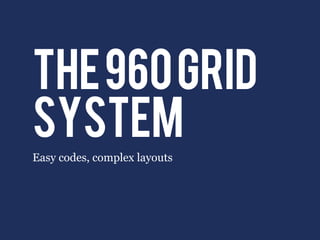
  • 1. the 960 grid system Easy codes, complex layouts
  • 2. What is it? • Ready-made CSS file • Make grid-based layouts within 960px • Cross-browser compatible • Three versions: 12-col, 16-col, 24-col • No need to compute widths
  • 3. How to get started • Create mock-up wireframes for your site, using either 12, 16, or 24 columns • Link the reset CSS file <link  rel="stylesheet"  href="css/reset.css"  /> • Link the CSS file of the 960 grid <link  rel="stylesheet"  href="css/960.css"  />
  • 4. choose a container grid <div  class=“container_12”> <div  class=“container_16”>
  • 5. use class names to give column widths <div  class=“grid_12”> <div  class=“grid_11”> <div  class=“grid_2”> <div  class=“grid_7”> <div  class=“grid_4”>
  • 6. use class names to give column widths <div  class=“grid_12”> <div  class=“grid_11”> <div  class=“grid_2”> <div  class=“grid_7”> <div  class=“grid_4”>
  • 7. use class names to give column widths <div  class=“grid_12”> <div  class=“grid_11”> <div  class=“grid_2”> <div  class=“grid_7”> <div  class=“grid_4”>
  • 8. use class names to give column widths <div  class=“grid_12”> <div  class=“grid_11”> <div  class=“grid_2”> <div  class=“grid_7”> <div  class=“grid_4”>
  • 9. use class names to give column widths <div  class=“grid_12”> <div  class=“grid_11”> <div  class=“grid_2”> <div  class=“grid_7”> <div  class=“grid_4”>
  • 10. use class names to give column widths <div  class=“grid_12”> <div  class=“grid_11”> <div  class=“grid_2”> <div  class=“grid_7”> <div  class=“grid_4”>
  • 11. use class names to give column widths <div  class=“grid_12”> <div  class=“grid_11”> <div  class=“grid_2”> <div  class=“grid_7”> <div  class=“grid_4”>
  • 12. use class names to give column widths <div  class=“grid_12”> <div  class=“grid_11”> <div  class=“grid_2”> <div  class=“grid_7”> <div  class=“grid_4”>
  • 13. use class names to give column widths <div  class=“grid_12”> <div  class=“grid_11”> <div  class=“grid_2”> <div  class=“grid_7”> <div  class=“grid_4”>
  • 14. use class names to give column widths <div  class=“grid_12”> <div  class=“grid_11”> <div  class=“grid_2”> <div  class=“grid_7”> <div  class=“grid_4”>
  • 15. use class names to give column widths <div  class=“grid_12”> <div  class=“grid_11”> <div  class=“grid_2”> <div  class=“grid_7”> <div  class=“grid_4”>
  • 16. use class names to give column widths <div  class=“grid_12”> <div  class=“grid_11”> <div  class=“grid_2”> <div  class=“grid_7”> <div  class=“grid_4”>
  • 17. use class names to give column widths <div  class=“grid_12”> <div  class=“grid_11”> <div  class=“grid_2”> <div  class=“grid_7”> <div  class=“grid_4”>
  • 18. use class names to give column widths <div  class=“grid_12”> <div  class=“grid_11”> <div  class=“grid_2”> <div  class=“grid_7”> <div  class=“grid_4”>
  • 19. use class names to give column widths <div  class=“grid_12”> <div  class=“grid_11”> <div  class=“grid_2”> <div  class=“grid_7”> <div  class=“grid_4”>
  • 20. use class names to give column widths <div  class=“grid_12”> <div  class=“grid_11”> <div  class=“grid_2”> <div  class=“grid_7”> <div  class=“grid_4”>
  • 21. use class names to give column widths <div  class=“grid_12”> <div  class=“grid_11”> <div  class=“grid_2”> <div  class=“grid_7”> <div  class=“grid_4”>
  • 22. use class names to give column widths <div  class=“grid_12”> <div  class=“grid_11”> <div  class=“grid_2”> <div  class=“grid_7”> <div  class=“grid_4”>
  • 23. use class names to give column widths <div  class=“grid_12”> <div  class=“grid_11”> <div  class=“grid_2”> <div  class=“grid_7”> <div  class=“grid_4”>
  • 24. use class names to give column widths <div  class=“grid_12”> <div  class=“grid_11”> <div  class=“grid_2”> <div  class=“grid_7”> <div  class=“grid_4”>
  • 25. use class names to give column widths <div  class=“grid_12”> <div  class=“grid_11”> <div  class=“grid_2”> <div  class=“grid_7”> <div  class=“grid_4”>
  • 26. ADD a CLEAR DIV after each row <div  class=“clear”> <div  class=“clear”>
  • 27. move divs by pulling and pushing <div  class=“grid_3  push_1”> <div  class=“grid_3  pull_1”>
  • 28. Add white spaces by using prefix/suffix 3-column space <div  class=“grid_6  suffix_3”> OR <div  class=“grid_3  prefix_3”>
  • 30. Avoid double-margins using alpha/omega <div  class="grid_4"> <div  class="grid_5"> <div  class="grid_3">    <div  class="grid_4">    <div  class="grid_3">    <h1>3-­‐col</h1>        <h1>4-­‐col</h1>       <h1>3-­‐col</h1> </div>    </div>    </div>    <div  class="grid_4">    <div  class="grid_2">       <h1>4-­‐col</h1>       <h1>2-­‐col</h1>    </div>    </div> </div>    <div  class="grid_1">       <h1>1-­‐col</h1>    </div>    <div  class="grid_4">       <h1>4-­‐col</h1>    </div> </div>
  • 31. Avoid double-margins using alpha/omega <div  class="grid_4"> <div  class="grid_5"> <div  class="grid_3">    <div  class="grid_4">    <div  class="grid_3">    <h1>3-­‐col</h1>        <h1>4-­‐col</h1>       <h1>3-­‐col</h1> </div>    </div>    </div>    <div  class="grid_4">    <div  class="grid_2">       <h1>4-­‐col</h1>       <h1>2-­‐col</h1>    </div>    </div> </div>    <div  class="grid_1">       <h1>1-­‐col</h1>    </div>    <div  class="grid_4">       <h1>4-­‐col</h1>    </div> </div>
  • 32. Avoid double-margins using alpha/omega <div  class="grid_4"> <div  class="grid_5"> <div  class="grid_3">    <div  class="grid_4">    <div  class="grid_3">    <h1>3-­‐col</h1>        <h1>4-­‐col</h1>       <h1>3-­‐col</h1> </div>    </div>    </div>    <div  class="grid_4">    <div  class="grid_2">       <h1>4-­‐col</h1>       <h1>2-­‐col</h1>    </div>    </div> </div>    <div  class="grid_1">       <h1>1-­‐col</h1>    </div>    <div  class="grid_4">       <h1>4-­‐col</h1>    </div> </div>
  • 33. Avoid double-margins using alpha/omega <div  class="grid_4"> <div  class="grid_5"> <div  class="grid_3">    <div  class="grid_4">    <div  class="grid_3">    <h1>3-­‐col</h1>        <h1>4-­‐col</h1>       <h1>3-­‐col</h1> </div>    </div>    </div>    <div  class="grid_4">    <div  class="grid_2">       <h1>4-­‐col</h1>       <h1>2-­‐col</h1>    </div>    </div> </div>    <div  class="grid_1">       <h1>1-­‐col</h1>    </div>    <div  class="grid_4">       <h1>4-­‐col</h1> double margins!!    </div> </div>
  • 34. Avoid double-margins using alpha/omega <div  class="grid_4">    <div  class="grid_4  alpha  omega">        <h1>4-­‐col</h1>    </div>    <div  class="grid_4  alpha  omega">       <h1>4-­‐col</h1>    </div> </div>
  • 35. Avoid double-margins using alpha/omega <div  class="grid_4">    <div  class="grid_4  alpha  omega">        <h1>4-­‐col</h1>    </div>    <div  class="grid_4  alpha  omega">       <h1>4-­‐col</h1>    </div> </div>
  • 36. Avoid double-margins using alpha/omega <div  class="grid_4">    <div  class="grid_4  alpha  omega">        <h1>4-­‐col</h1> alpha:    </div> no left margin    <div  class="grid_4  alpha  omega"> omega:         <h1>4-­‐col</h1> no right margin    </div> </div>
  • 37. Avoid double-margins using alpha/omega <div  class="grid_5">    <div  class="grid_1  alpha">    <div  class="grid_3  alpha">      <h1>1-­‐col</h1>      <h1>3-­‐col</h1>    </div>    </div>    <div  class="grid_4  omega">    <div  class="grid_2  omega">      <h1>4-­‐col</h1>      <h1>2-­‐col</h1>    </div>    </div> </div>
  • 38. Avoid double-margins using alpha/omega <div  class="grid_5">    <div  class="grid_1  alpha">    <div  class="grid_3  alpha">      <h1>1-­‐col</h1>      <h1>3-­‐col</h1>    </div>    </div>    <div  class="grid_4  omega">    <div  class="grid_2  omega">      <h1>4-­‐col</h1>      <h1>2-­‐col</h1>    </div>    </div> </div>
  • 39. Avoid double-margins using alpha/omega <div  class="grid_5">    <div  class="grid_1  alpha">    <div  class="grid_3  alpha">      <h1>1-­‐col</h1>      <h1>3-­‐col</h1>    </div>    </div>    <div  class="grid_4  omega">    <div  class="grid_2  omega">      <h1>4-­‐col</h1>      <h1>2-­‐col</h1>    </div>    </div> </div>
  • 40. Avoid double-margins using alpha/omega <div  class="grid_5">    <div  class="grid_1  alpha">    <div  class="grid_3  alpha">      <h1>1-­‐col</h1>      <h1>3-­‐col</h1>    </div>    </div>    <div  class="grid_4  omega">    <div  class="grid_2  omega">      <h1>4-­‐col</h1>      <h1>2-­‐col</h1>    </div>    </div> </div>
  • 41. Avoid double-margins using alpha/omega <div  class="grid_5">    <div  class="grid_1  alpha">    <div  class="grid_3  alpha">      <h1>1-­‐col</h1>      <h1>3-­‐col</h1>    </div>    </div>    <div  class="grid_4  omega">    <div  class="grid_2  omega">      <h1>4-­‐col</h1>      <h1>2-­‐col</h1>    </div>    </div> </div>
  • 42. Avoid double-margins using alpha/omega <div  class="grid_5">    <div  class="grid_1  alpha">    <div  class="grid_3  alpha">      <h1>1-­‐col</h1>      <h1>3-­‐col</h1>    </div>    </div>    <div  class="grid_4  omega">    <div  class="grid_2  omega">      <h1>4-­‐col</h1>      <h1>2-­‐col</h1>    </div>    </div> </div>
  • 43. Avoid double-margins using alpha/omega <div  class="grid_5">    <div  class="grid_1  alpha">    <div  class="grid_3  alpha">      <h1>1-­‐col</h1>      <h1>3-­‐col</h1>    </div>    </div>    <div  class="grid_4  omega">    <div  class="grid_2  omega">      <h1>4-­‐col</h1>      <h1>2-­‐col</h1>    </div>    </div> </div>
  • 44. Avoid double-margins using alpha/omega <div  class="grid_5">    <div  class="grid_1  alpha">    <div  class="grid_3  alpha">      <h1>1-­‐col</h1>      <h1>3-­‐col</h1>    </div>    </div>    <div  class="grid_4  omega">    <div  class="grid_2  omega">      <h1>4-­‐col</h1>      <h1>2-­‐col</h1>    </div>    </div> </div>
  • 45. Avoid double-margins using alpha/omega <div  class="grid_5">    <div  class="grid_1  alpha">    <div  class="grid_3  alpha">      <h1>1-­‐col</h1>      <h1>3-­‐col</h1>    </div>    </div>    <div  class="grid_4  omega">    <div  class="grid_2  omega">      <h1>4-­‐col</h1>      <h1>2-­‐col</h1>    </div>    </div> </div>
  • 47. everything adds up • All row widths should always add up to its container div
  • 48. everything adds up • All row widths should always add up to its container div • For a 12-col grid: <div  class=“grid_3  suffix_1”> <div  class=“grid_7”> <div  class=“grid_1”>
  • 49. everything adds up • All row widths should always add up to its container div • For a 12-col grid: <div  class=“grid_3  suffix_1”> 3+1+7+1=12 <div  class=“grid_7”> <div  class=“grid_1”>
  • 50. everything adds up • All row widths should always add up to its container div • For a 12-col grid: <div  class=“grid_3  suffix_1”> 3+1+7+1=12 <div  class=“grid_7”> <div  class=“grid_1”> • For a 16-col grid: <div  class=“grid_5”> <div  class=“grid_2  prefix_1”> <div  class=“grid_2  prefix_1”> <div  class=“grid_2”> <div  class=“grid_3”>
  • 51. everything adds up • All row widths should always add up to its container div • For a 12-col grid: <div  class=“grid_3  suffix_1”> 3+1+7+1=12 <div  class=“grid_7”> <div  class=“grid_1”> • For a 16-col grid: 5+2+1+ <div  class=“grid_5”> <div  class=“grid_2  prefix_1”> 2+1+2+3 <div  class=“grid_2  prefix_1”> =16 <div  class=“grid_2”> <div  class=“grid_3”>
  • 52. REVIEW 960 • Link your HTML to the 960 CSS files • Choose your container grid type <div  class=“container_12”> • Add widths to your divs using grid <div  class=“grid_5”>   <div  class=“grid_12”> • Use clear divs after each row <div  class=“clear”>
  • 53. REVIEW 960 • Move divs using push and pull <div  class=“grid_5  push_2”> <div  class=“grid_7  pull_1”> • Add white space using prefix and suffix <div  class=“grid_11  prefix_1”> <div  class=“grid_9  suffix_3”> • Remove margins using alpha and omega <div  class=“grid_6  alpha”> <div  class=“grid_3  omega”>
  • 54.
  • 55.
  • 56. Speedtest 01 <!-­‐-­‐  CONTAINER  -­‐-­‐> <div  class="container_16">
  • 57.
  • 58. Speedtest 02 <!-­‐-­‐  SIDEBAR  -­‐-­‐> <div  class="grid_4"> <!-­‐-­‐  ALL  CONTENT  -­‐-­‐> <div  class="grid_12">
  • 59.
  • 61.
  • 62. Speedtest 04 <!-­‐-­‐  PHOTO  -­‐-­‐> <div  class="grid_4  prefix_8  alpha   omega">
  • 63.
  • 64. Speedtest 05 <!-­‐-­‐  SUB1  -­‐-­‐> <div  class="grid_4  alpha"> <!-­‐-­‐  SUB2  -­‐-­‐> <div  class="grid_4"> <!-­‐-­‐  SUB3  -­‐-­‐> <div  class="grid_4  omega">