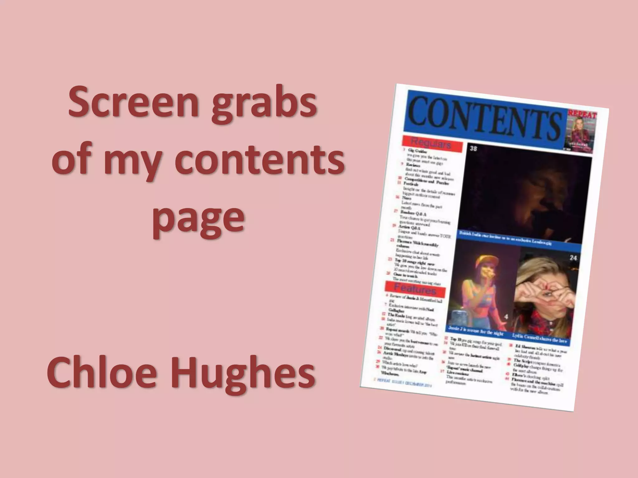
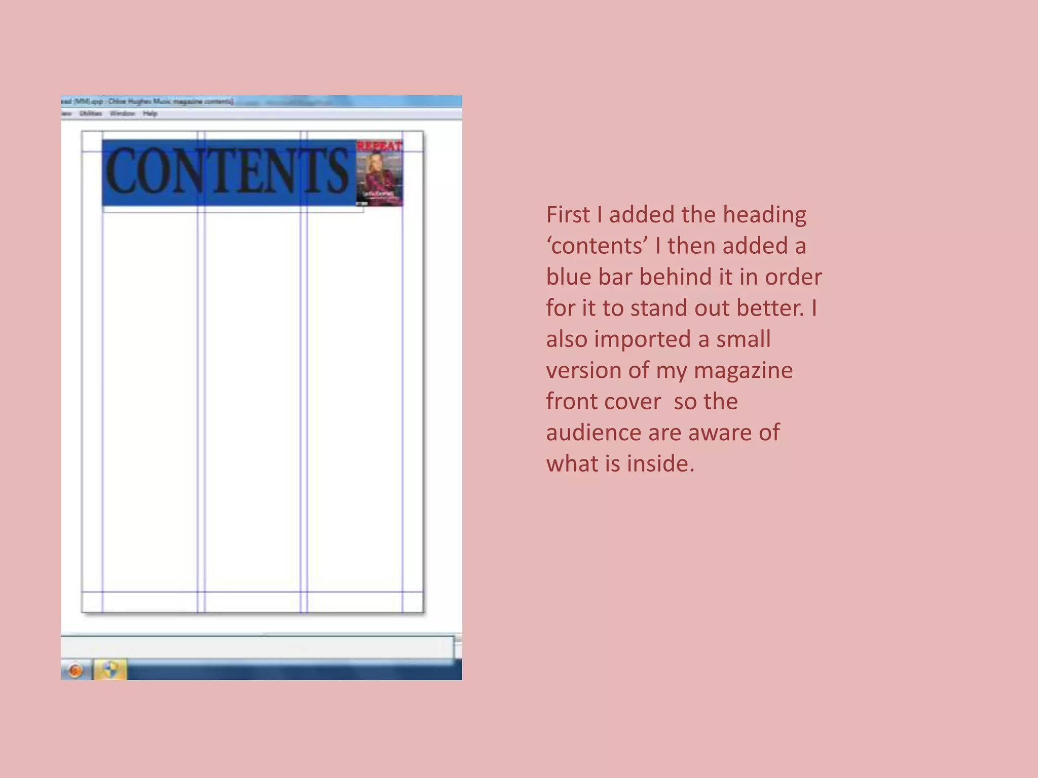
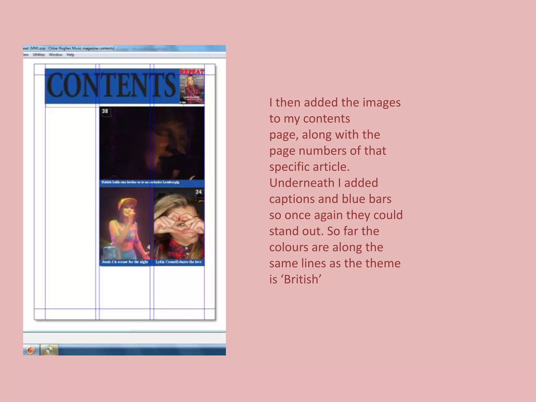
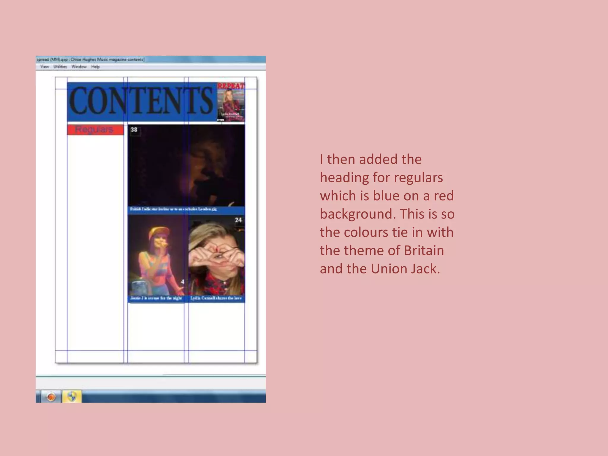
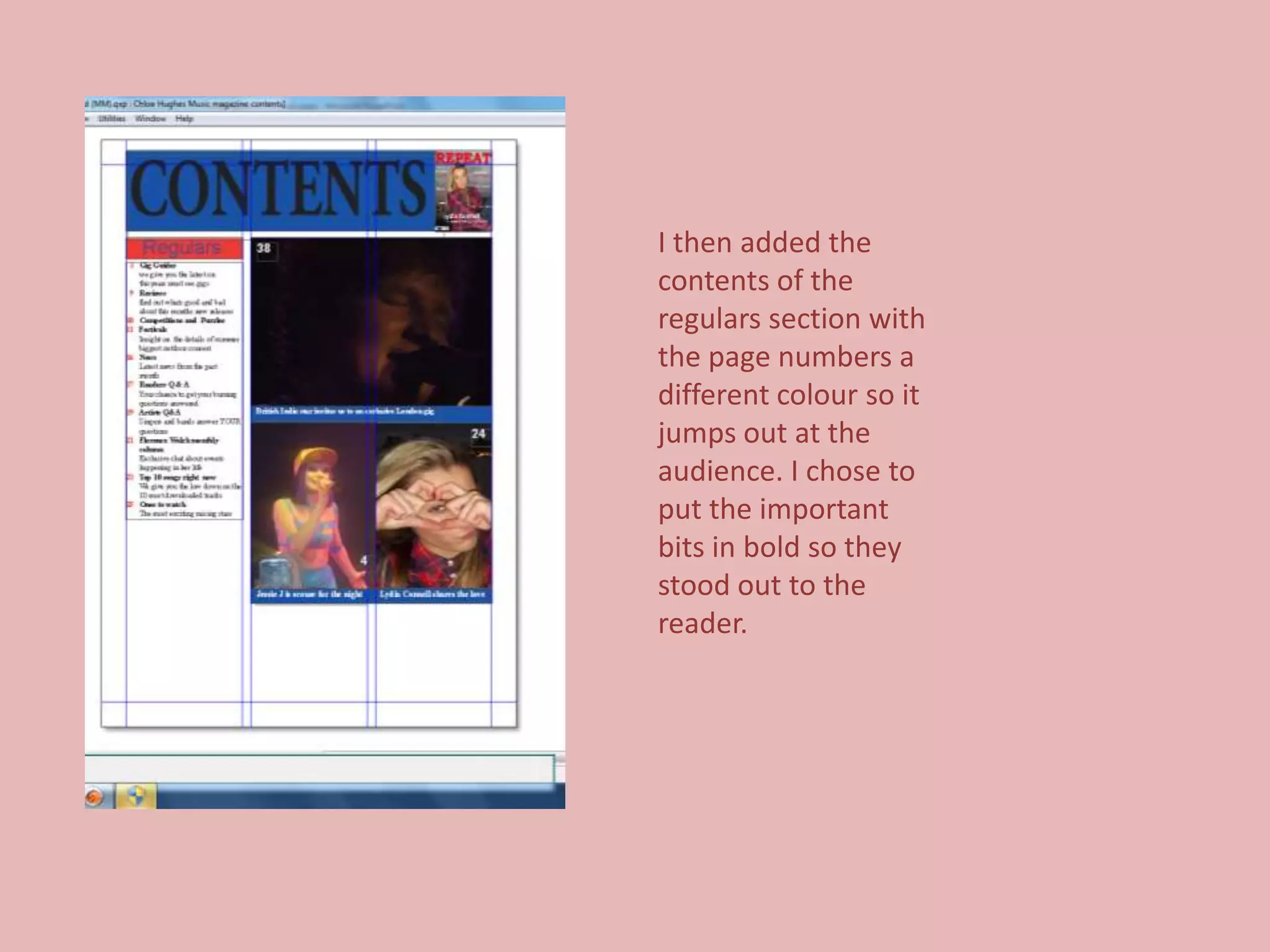
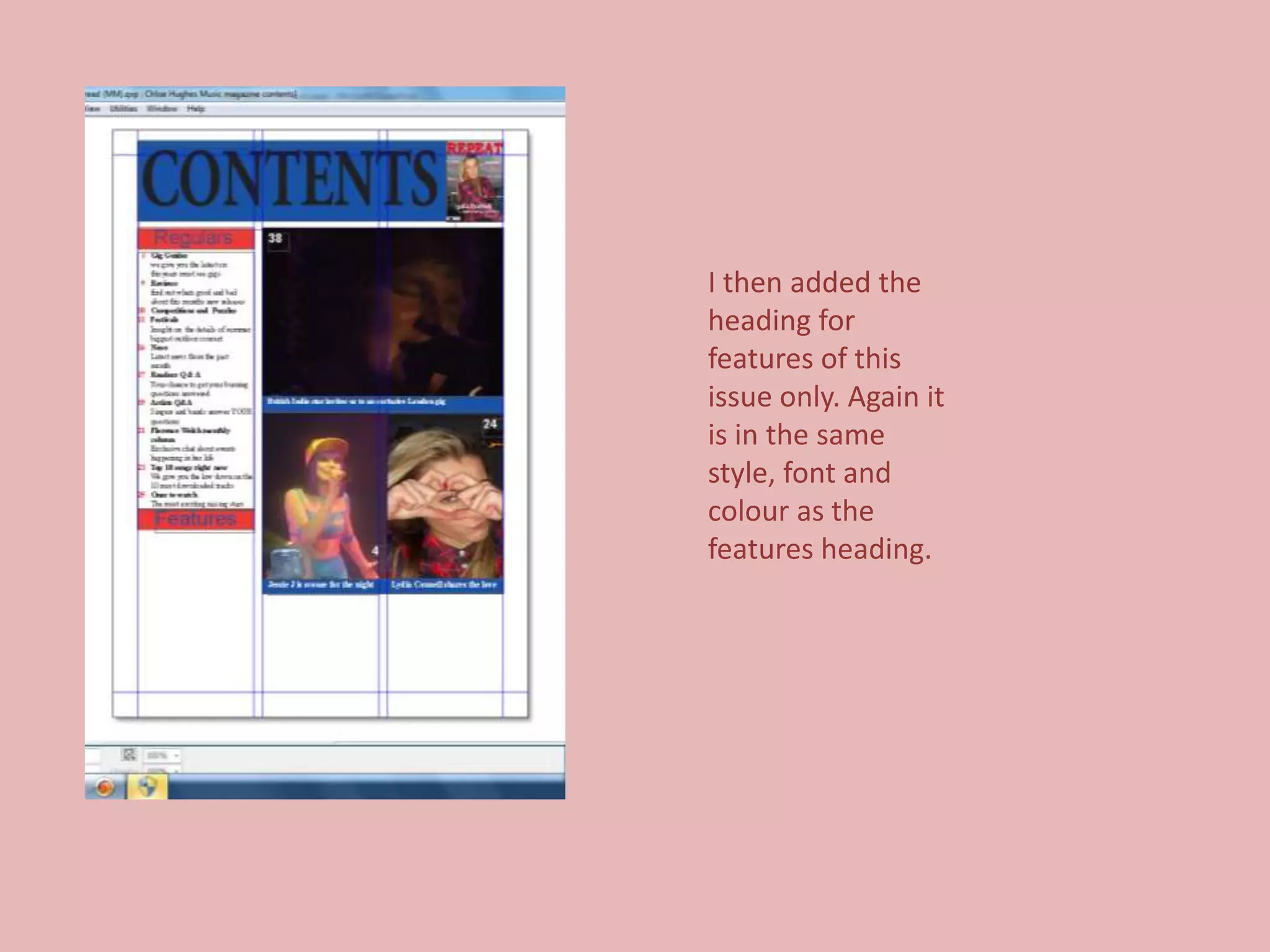
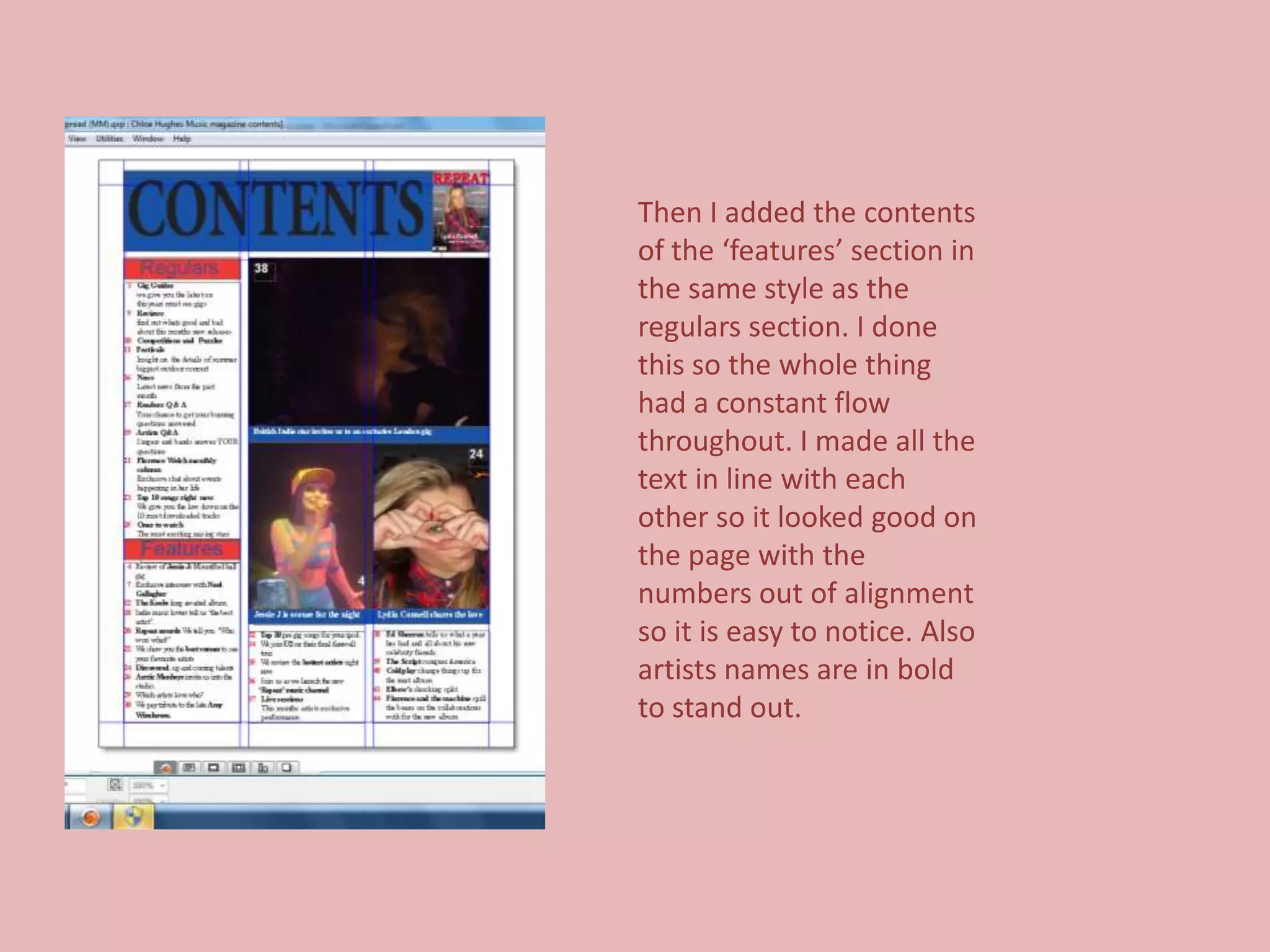
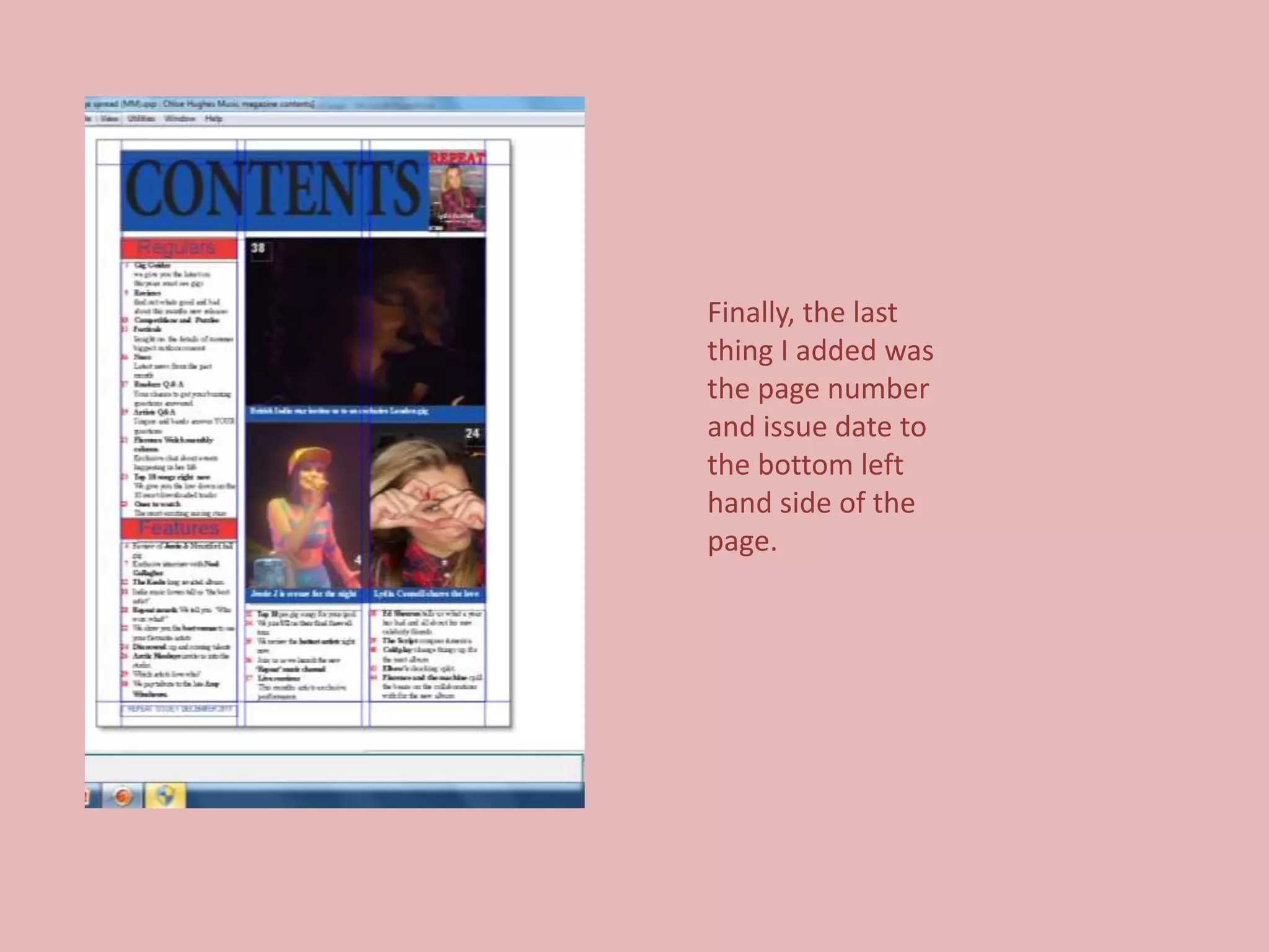
Screen grabs
of my contents
     page


Chloe Hughes
First I added the heading
‘contents’ I then added a
blue bar behind it in order
for it to stand out better. I
also imported a small
version of my magazine
front cover so the
audience are aware of
what is inside.
I then added the images
to my contents
page, along with the
page numbers of that
specific article.
Underneath I added
captions and blue bars
so once again they could
stand out. So far the
colours are along the
same lines as the theme
is ‘British’
I then added the
heading for regulars
which is blue on a red
background. This is so
the colours tie in with
the theme of Britain
and the Union Jack.
I then added the
contents of the
regulars section with
the page numbers a
different colour so it
jumps out at the
audience. I chose to
put the important
bits in bold so they
stood out to the
reader.
I then added the
heading for
features of this
issue only. Again it
is in the same
style, font and
colour as the
features heading.
Then I added the contents
of the ‘features’ section in
the same style as the
regulars section. I done
this so the whole thing
had a constant flow
throughout. I made all the
text in line with each
other so it looked good on
the page with the
numbers out of alignment
so it is easy to notice. Also
artists names are in bold
to stand out.
Finally, the last
thing I added was
the page number
and issue date to
the bottom left
hand side of the
page.

Screen grabs of contents page

  • 1.
    Screen grabs of mycontents page Chloe Hughes
  • 2.
    First I addedthe heading ‘contents’ I then added a blue bar behind it in order for it to stand out better. I also imported a small version of my magazine front cover so the audience are aware of what is inside.
  • 3.
    I then addedthe images to my contents page, along with the page numbers of that specific article. Underneath I added captions and blue bars so once again they could stand out. So far the colours are along the same lines as the theme is ‘British’
  • 4.
    I then addedthe heading for regulars which is blue on a red background. This is so the colours tie in with the theme of Britain and the Union Jack.
  • 5.
    I then addedthe contents of the regulars section with the page numbers a different colour so it jumps out at the audience. I chose to put the important bits in bold so they stood out to the reader.
  • 6.
    I then addedthe heading for features of this issue only. Again it is in the same style, font and colour as the features heading.
  • 7.
    Then I addedthe contents of the ‘features’ section in the same style as the regulars section. I done this so the whole thing had a constant flow throughout. I made all the text in line with each other so it looked good on the page with the numbers out of alignment so it is easy to notice. Also artists names are in bold to stand out.
  • 8.
    Finally, the last thingI added was the page number and issue date to the bottom left hand side of the page.