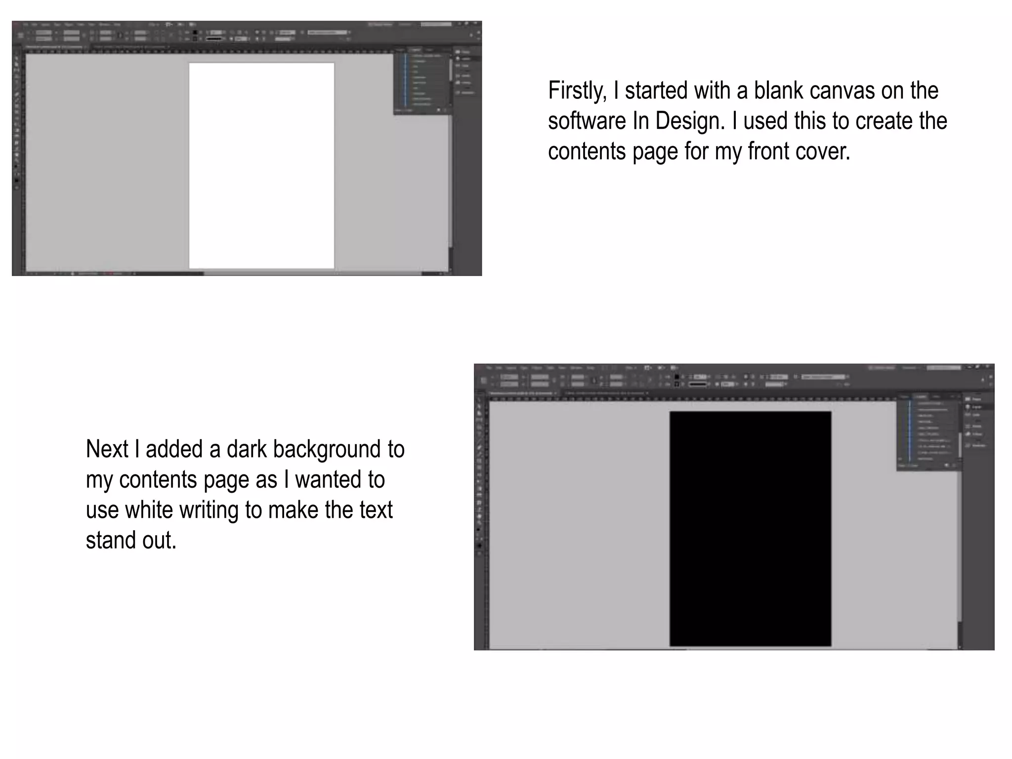
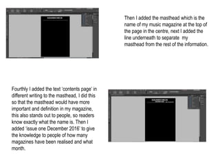
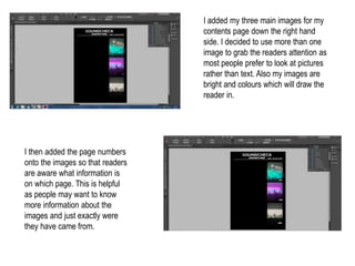
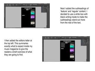
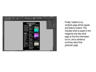
Firstly, I started with a blank canvas on the
software In Design. I used this to create the
contents page for my front cover.
Next I added a dark background to
my contents page as I wanted to
use white writing to make the text
stand out.
Then I added the masthead which is the
name of my music magazine at the top of
the page in the centre, next I added the
line underneath to separate my
masthead from the rest of the information.
Fourthly I added the text ‘contents page’ in
different writing to the masthead, I did this
so that the masthead would have more
important and definition in my magazine,
this also stands out to people, so readers
know exactly what the name is. Then I
added ‘issue one December 2016’ to give
the knowledge to people of how many
magazines have been realised and what
month.
I added my three main images for my
contents page down the right hand
side. I decided to use more than one
image to grab the readers attention as
most people prefer to look at pictures
rather than text. Also my images are
bright and colours which will draw the
reader in.
I then added the page numbers
onto the images so that readers
are aware what information is
on which page. This is helpful
as people may want to know
more information about the
images and just exactly were
they have came from.
Next I added the subheadings of
‘feature’ and ‘regular’ content. I
decided to use a white box with
black writing inside to make the
subheadings stand out more
from the rest of the text.
I then added the editors letter at
the top left. This summaries
exactly what to expect inside my
music magazine to give the
readers a brief overview of what
they are going to find.
Finally I added to my
contents page all the regular
and feature content. This
included what to expect in the
magazine and also what
page to find this information
out on, and a sentence
summary about that
particular page.

Screengrabs for my contents page

  • 1.
    Firstly, I startedwith a blank canvas on the software In Design. I used this to create the contents page for my front cover. Next I added a dark background to my contents page as I wanted to use white writing to make the text stand out.
  • 2.
    Then I addedthe masthead which is the name of my music magazine at the top of the page in the centre, next I added the line underneath to separate my masthead from the rest of the information. Fourthly I added the text ‘contents page’ in different writing to the masthead, I did this so that the masthead would have more important and definition in my magazine, this also stands out to people, so readers know exactly what the name is. Then I added ‘issue one December 2016’ to give the knowledge to people of how many magazines have been realised and what month.
  • 3.
    I added mythree main images for my contents page down the right hand side. I decided to use more than one image to grab the readers attention as most people prefer to look at pictures rather than text. Also my images are bright and colours which will draw the reader in. I then added the page numbers onto the images so that readers are aware what information is on which page. This is helpful as people may want to know more information about the images and just exactly were they have came from.
  • 4.
    Next I addedthe subheadings of ‘feature’ and ‘regular’ content. I decided to use a white box with black writing inside to make the subheadings stand out more from the rest of the text. I then added the editors letter at the top left. This summaries exactly what to expect inside my music magazine to give the readers a brief overview of what they are going to find.
  • 5.
    Finally I addedto my contents page all the regular and feature content. This included what to expect in the magazine and also what page to find this information out on, and a sentence summary about that particular page.