For my contents page I stuck
to a grey background for
continuity. I chose to work
primarily on my header at
first, and created a bold
black banner with white
capital text of ‘CONTENTS’.
To break up the page and
make this title stand out to
attract the reader. I also
added small text in the
corner of the date, issue
number and magazine
website for a professional
appearance. In addition I
used a concert photo similar
to the image used on the
front cover of the same artist
to keep up a theme and
content continutity.
For this second version I
made a few tweaks to the
page. I kept the background
the same, however to break
the page up into sections
added slim grey lines to help
separate different areas of
focus. I added a white text
box with a red number to
highlight the page this article
would feature on and look
neat whilst being easy to see.
I also added a red header
where I would title ‘Features’
to attract the reader and
suggest the contents of that
column. I also added the
acappella masthead in small
on the bottom left corner as I
have seen many music
magazines do, along with
the issue date.

Contents page drafts

  • 2.
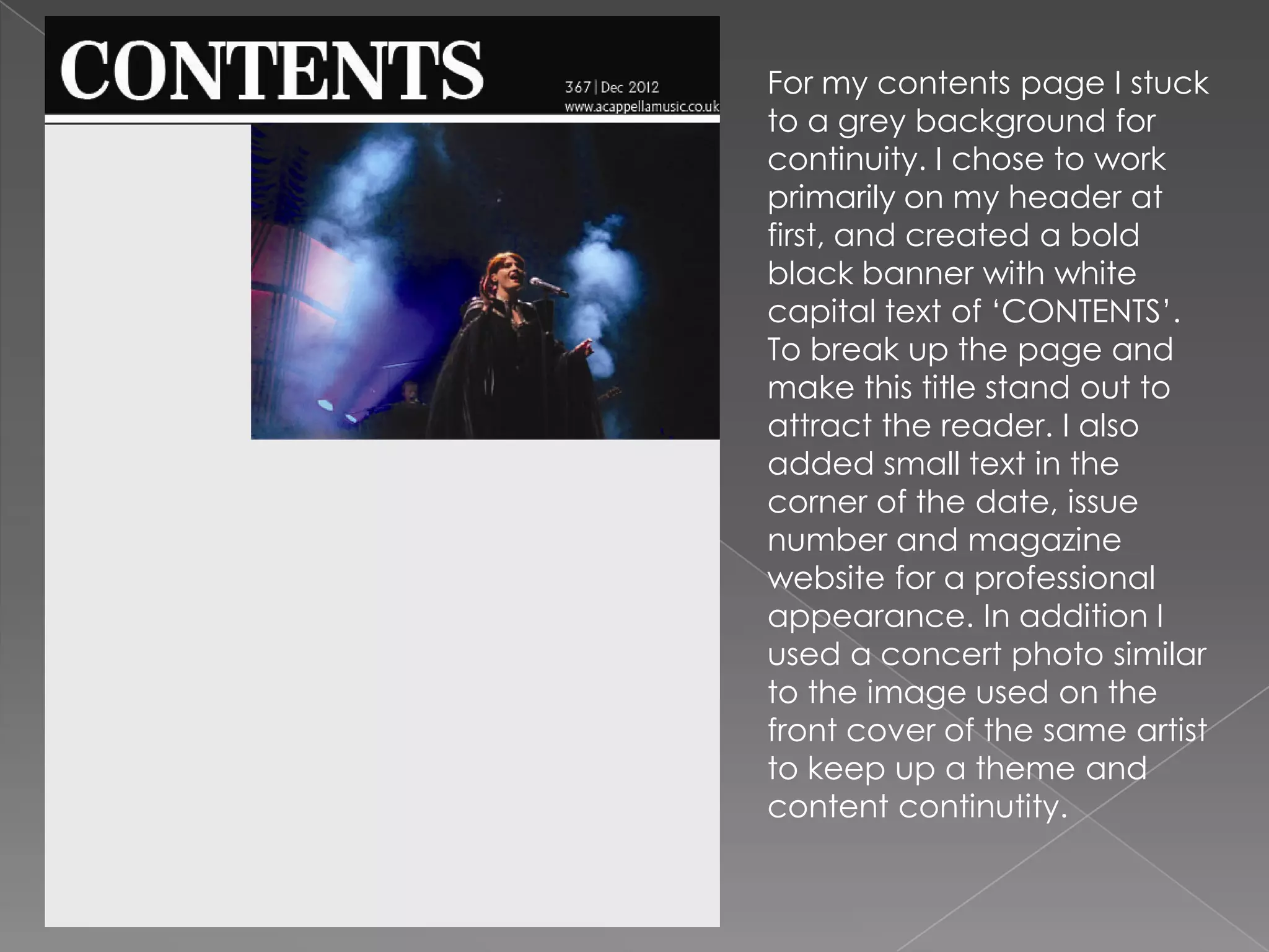
    For my contentspage I stuck to a grey background for continuity. I chose to work primarily on my header at first, and created a bold black banner with white capital text of ‘CONTENTS’. To break up the page and make this title stand out to attract the reader. I also added small text in the corner of the date, issue number and magazine website for a professional appearance. In addition I used a concert photo similar to the image used on the front cover of the same artist to keep up a theme and content continutity.
  • 3.
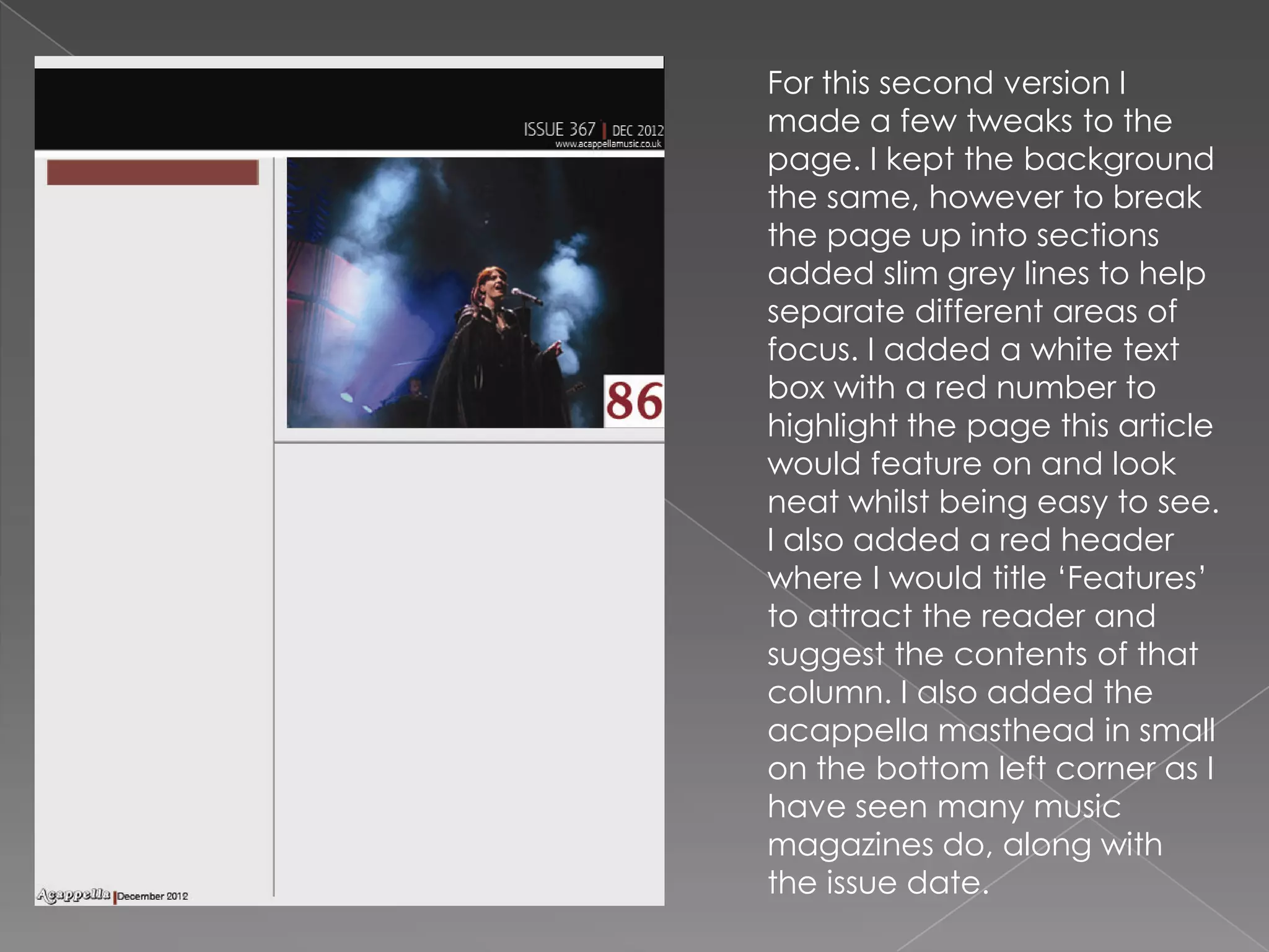
    For this secondversion I made a few tweaks to the page. I kept the background the same, however to break the page up into sections added slim grey lines to help separate different areas of focus. I added a white text box with a red number to highlight the page this article would feature on and look neat whilst being easy to see. I also added a red header where I would title ‘Features’ to attract the reader and suggest the contents of that column. I also added the acappella masthead in small on the bottom left corner as I have seen many music magazines do, along with the issue date.