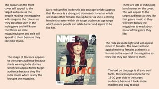
1. The colours on the front
cover will appeal to the
target audience as the
people reading the magazine
will recognise the colours as
they are often seen in the
indie genre and will know
that this is an indie
magazine/cover and so it will
appeal to them because they
like indie music.
Dark red signifies leadership and courage which suggests
that Florence is a strong and dominant character which
will make other females look up to her as she is a strong
female character within the target audiences age range
which means people can relate to her and aspire to be
like her.
The reds are quite light and will appeal
more to females. The cover will also
appeal more to females as there is a
female on the cover of the magazine so
they feel they can relate to them.
The image of Florence appeals
to the target audience because
she is wearing indie clothes
which will appeal to the target
audience because they like
indie music which is why the
brought the magazine.
There are lots of indie/rock
band names on the cover.
This will appeal to the
target audience as they like
that genre music so they
will want to buy the
magazines to read about
music of the genre they
like.
The text on the page is all sans serif
fonts. This will appeal more to the
16-30 year olds in the target
audience because it looks more
modern and easy to read.
2. The colours black, white, and red are
associated more with rock than indie, but
still will appeal to the target audience as the
magazine is mainly rock and indie so people
who prefer indie will still like the magazine.
The colours will appeal to the audience
because it is associated.
The box-out on the left contains a list
of rock/indie bands. This will appeal
to the target audience as they can
see who is featured in the magazine
and recognise artists that they like
and also discover new artists that
will appeal to them. The artists in the
magazine have been specially chosen
so that they will appeal to the target
audience.
The text on this page is also mainly sans-serif
which appeals to the target
audience because it is easier to read and
looks more modern.
There is a picture of a member of the
Ting Tings who is wearing rock style
clothing. This will appeal to the target
audience because they will recognise
the style and can relate to it because
they wear those clothes too. The image
takes up a lot of the page which will also
appeal to a younger audience as they
prefer to look at pictures rather than
read big blocks of text.
3. The serif font on ‘got the
love’ appeals to the
female target audience
because it looks more
girly and sophisticated
which appeals to them as
more feminine and sans-serif
fonts are more
masculine so the serif
font indicates that it is
targeted at females.
The red connotes love and
passion which will appeal to
the female target audience
because they are more into
love and romance than males
and so will be attracted more
to the pops of red that are on
the page.
The serif font also appeals to the target
audience because it is more modern
and easy to read which will appeal to
the younger audience.
The mode of address is
informal as there isn’t a capital
on ‘got the love’ which will
appeal to the target audience
as they prefer to read more
casual things rather than
something that is hard to read
as they won’t stay interested.
The long shot of the
woman will appeal to
the female target
audience as they can
look up to her and look
and copy the clothes
she is wearing because
she is powerful and
people want to be like
her.