Best Rate (Hyderabad) Call Girls Jahanuma ⟟ 8250192130 ⟟ High Class Call Girl...
Ancillary analysis 3 & 4
1. Typography
The use of a sans serif fontforthe cover story
aboutAmericanHorror Storyand whole
magazine coversuggeststhatthe showand
magazine isnewandmodernand soit will appeal
to teenagersandyoungadults.Thisboth
encouragespotentialreaderstobuythe
magazine andencouragesthemtoreadthe story
aboutthe showbecause itistargetedat the same
audience asthe magazine.Red,white andblack
are the dominantfontcoloursonthe front cover
as theylinktothe “horror” theme of the TV show
that the coverstory isabout.This alsogivesan
insighttothose whohave neverseenthe show as
it tellsthemwhatitislike throughthe font
colours.The name of the TV showhas the largest
fontsize excludingthe magazine name,signalling
itsimportance.The white alsoallowsitto
contrast fromthe actress’black dress,makingit
standout furtherso more people will take an
interestinit.
Images
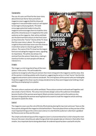
The image is a mid-longshotof twoof the main
actress’inthe series.Thiswillenablethe
audience torecognise whotheyare andare thenmore intriguedinthe magazine andthe story.One
of the womenisholdingaplatterwithahead on,suggestingthe seriesisinfact‘horror’like the title
suggestsandcontainssome violence anddeath.The smilingfacesof the womenwhoare holdingthe
headalsosuggeststhe showisquite creepyandabnormal as theyseemhappytobe holdinga head
and theyare displayingitona platter.
Colour
The main coloursusedare red,white andblack.These colourscontrastand workwell togetherand
alsocreate a horror theme.The colourredconnotesdanger andso the audience immediately
become fearful of the womanwearingred.Blackconnotesmysteryandsothe audience also
become intriguedbythe womanwearingblackand sowantto read the magazine article andmay
alsowant to watchthe show.
Layout
The magazine coverusesthe rule of thirdseffectivelybyplacingthe twomainactresses’facesonthe
focuspointsalongwiththe magazine title behindthem.Theseare placedhere astheyare two of the
mostimportantthingsonthe entire coverandso itis vital thatthe audience’sattentionisgrabbed
by these assoonas theysee the cover.
The simple andorderedlayoutof the magazine coverisunconventional butisvital tokeepthe main
focuson the cover storytheyare advertisingsothatmore people take aninterestinthatratherthan
smaller,lessimportantstoriesbeingadvertised.Anorderedlayouthasbeenusedwithonlythe
2. coverstory beingadvertisedsothatthe image iseasyto see as there isa lot of interestingaspects
that couldbe missedif textwasplacedinthe foreground.
Conventionsof formandgenre
Thismagazine coverisconventional asithasthe mastheadacrossthe top and hasthe coverstory
title inthe secondlargestfonttosignifyitsimportance.The use of colourisconventionalforthe
horror genre as eachcolourconnotesthingssuchas death,violence andgore,all of whichare
associatedwiththe horrorgenre andis whatthe audience wouldexpecttosee ina horror show.
A longshot,however,isunconventional foramagazine cover.Theyoftenleavetoomuchempty
space whichmeansclose upsare favouredmore butbecause of the complexityandnumberof
characters inthe shot,a mid-longshotwasessential andstill suitsthe cover.
Typography
All the fontsonthe magazine coverare sansserif
whichindicatestothe audience thatthe magazine is
modernandwill therefore appeal toayounger
audience.Usingthisfontalsoindicatesthatthe film
featuredonthe frontis new.Puttingthe whole cover
storyin capital lettersindicatestothe audience that
the filmisveryaggressive andmasculine.However,
usingcapital lettersalsomeansitstandsoutagainst
the mastheadandother storiesatthe top of the
magazine.The name of the filmbeingfeaturedisthe
secondlargestfontonthe page,afterthe masthead,
signallingthatitisimportantandso the readerwill
automaticallylookhere.The majorityof the texton
the magazine coveriswhite,meaningitcontrastswith
the dark image andbackgroundso it standsout more
and grabs the reader’s attention.
Images
The image is of an anonymouspersondressedina
blackcloak witha scary ghostmask concealingthe
face.Thisfrightensthe audience asthe personunderthe maskisn’tknown.Thisclose upof the
cloakedpersoninthe maskcoversthe majorityof the coverand leavesonlyasmall sectionof
background.Usingthismask alsomeansthe audience whohave seenScreambeforerecognise the
maskand immediatelyknowwhatthe coverstoryisaboutbecause thatmask isalwaysassociated
withthe Screamfilms.
Colour
The main coloursare black,white anda deepred.The deepredcolouris similartothe colourof
bloodandsince it isusedinthe background,the audience associate the filmwithbloodand
therefore gore andviolence. Blackconnotesmysteryandaddsto the audience’sfearaboutwhois
behindthe mask. The coloursare also veryconventionalforhorrorfilmcoloursandso people will
3. quickly knowthatthe filmisa horror and are more likelytoreaditknowingitisa genre of filmthey
enjoytowatch.
Layout
The magazine coverusesthe route of the eye effectivelybyplacingall the importantinformationon
the route.The mastheadandmainimage are the twomostimportantthingsonthe page and have
beenplaceddirectlyonthe route sothat the audience seesitstraightawayatfirstglance.This
meanstheyare more likelytopickthe magazine upandreadit if theysee somethinginteresting
instantly.The layoutof the magazine coverisveryorderedandnothingmakesthe image difficultto
see.Thishasbeendone sothat the audience canclearlysee the image andknow whatit iswithout
lotsof storiescoveringitandtakingawaythe fearthe image can cause.
Conventionsof formandgenre
The magazine isveryconventional forthe horrorgenre asit usesthe scary aspectof the filmasthe
focal pointof the cover.The use of colourisalso extremelyconventional forthe horrorgenre asred,
white andblackare almostalwaysusedinthe filmandinthe marketingof the filmas theyhave
alwaysbeenassociatedwiththe genre due totheirdarkconnotations.
A close upis alsoconventional foramagazine asitallowsthe audience tosee whothe personis
clearlywithoutleavinglotsof backgroundspace whichcanmake a magazine coverlook
unprofessional.