1. PRODUCTION-SCREEN SHOTS OF
MY CONTENTS PAGE
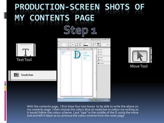
Text Tool
Move Tool
With the contents page, I first drew four text boxes to be able to write the above on
my contents page. I then choose the colour blue on swatches to colour my writing so
it would follow the colour scheme. I put “ope” in the middle of the D using the move
tool and left it black as to continue the colour scheme from the cover page.
2. Here I have used the same tools I used to create and place the masthead, title
and date. Here I have written down the feature and regular articles that would
appear in the magazine. Once again using the same colour scheme as my cover page.
I also added an editor’s note at the bottom of the second column.
3. Rectangle
Tool
Tools used to import
image and text into
InDesign.
Next I added my images using file and place. Using the rectangle tool I was able
to draw boxes and place them where a picture would go. Using this tool made it
easier for me to have my pictures exactly the way I wanted them and the size I
wanted them. As when I place them in the boxes they would automatically re-adjust
the size, width and length of the picture.
4. The Next thing I did was to add my page numbers. Once again using the
same tools I had used previously when creating text (text box and move
tool) I was able to create and place my page numbers. Using swatches I was
able to colour the writing blue to follow my colour scheme.
5. Tools used to make
background image
lighter
The last thing I did to complete my contents page was to add a background. I did this
by once again drawing a rectangle box of the appropriate size then I placed it in and
sent it to the back. As you can tell the background image is much lighter than the
fronted features of the contents page. I did this by going onto effects than onto
transparency and reducing the transparency.