👉Chandigarh Call Girls 👉9878799926👉Just Call👉Chandigarh Call Girl In Chandiga...
Magazine advert analysis
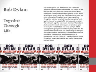
1. Like most magazine ads, the first thing that catches an audiences eye on this is the artists name. This is done by the bold font and dark colour that starkly contrasts the white background. This effectively draws a reader in as they would recognize the artist’s name, and therefore read on to the rest of the information. The album name is also highlighted through the both the same bold blue, but also with a ‘scroll-type’ red banner across part of it- giving a variety of colours that both work together and draw in attention. The mid-shot photo across the middle of the page is of something quite unusual, plus due to it’s back and white quality is at first unrecognizable, giving the ad a bit of mystery and makes the audience want to look closer. The simple design of the layout actually works better than a more cluttered spread, as all the information is easy to read, without being boring or uninteresting. The font carries on a theme of bold but simple throughout, tying in well together and making the age look neat and stylish. Bob Dylan- Together Through Life
2. Funeral Party- Golden Age Of Nowhere Once again, the band name- which would easily be the most recognizable element for a would-be buyer- is the main focus of the ad, followed closely by the large, slightly fish-eye type, black and white image of the band itself, on stage. This again looks interesting and exciting, while also aiming at people who may recognize them. The black, white and gold colour scheme fit well with the ‘rock’ genre of the band- instead of the bright colours a ‘pop’ band would go for- as it looks to be something ‘special’- especially with the connotations connected to the colour gold. The regimented font used throughout the whole ad adds a reoccurring theme that also makes the simple layout look more eye-catching- especially with the bolder colours on the band name and the date of the albums release- two of the most important pieces of information.
3. Souls Of Mischief- That’s When Ya Lost The graffiti-type image and font are easily the most striking things about this ad; along with the bright blue backdrop and stark white colour in contrast. The font used, a hand-written, graffiti style, implies a bit of fun and immaturity within this band and indeed the album, along with the eye-catching cartoon type image. The bright blue background works well with the white, as the contrast makes it both more striking and readable. The complete simplicity in the use of image and of layout effectively makes the ad- and therefore the album- look modern and stylish, something that would fit in with the target audiences wants.