Downloaded 565 times
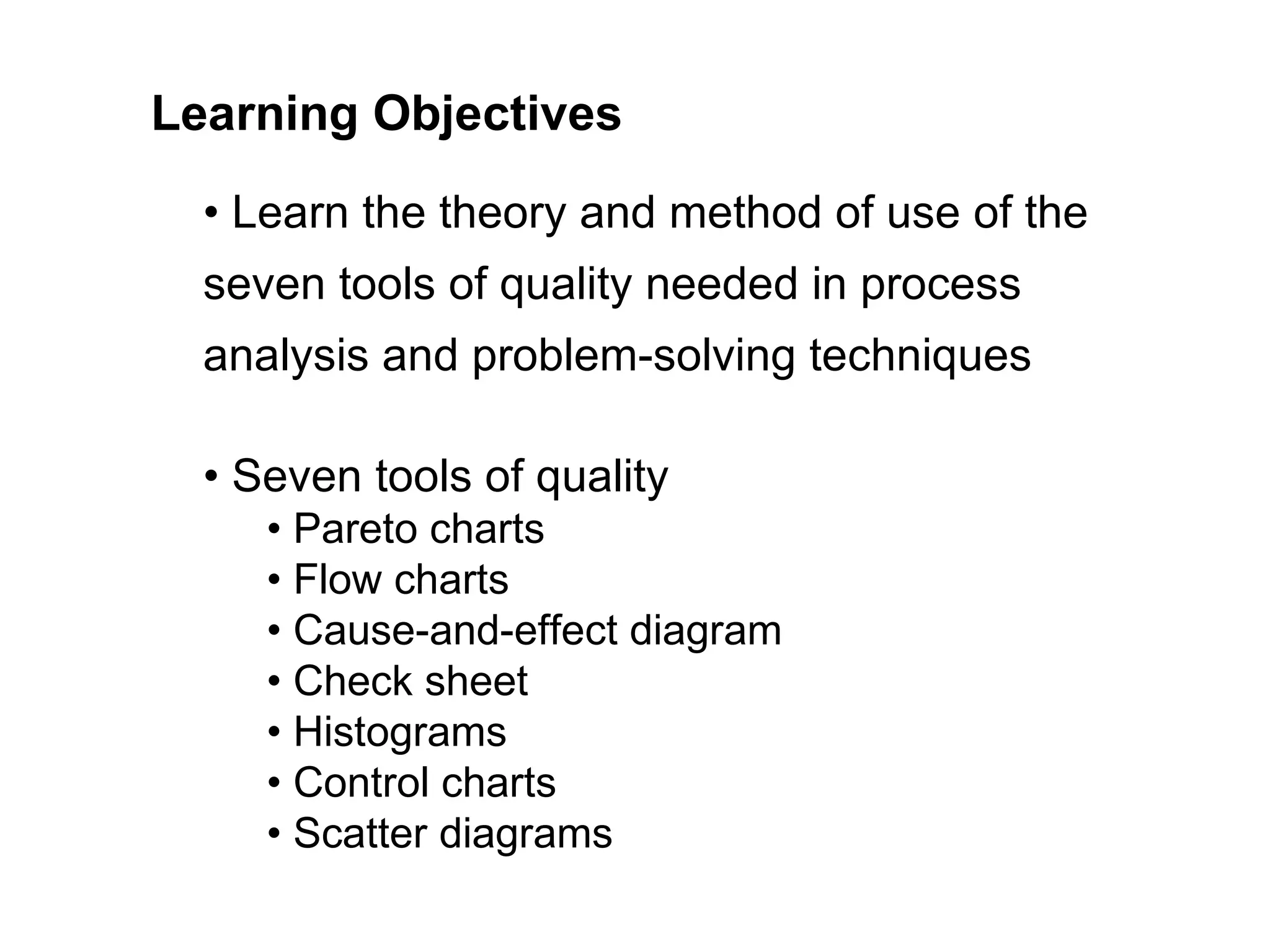

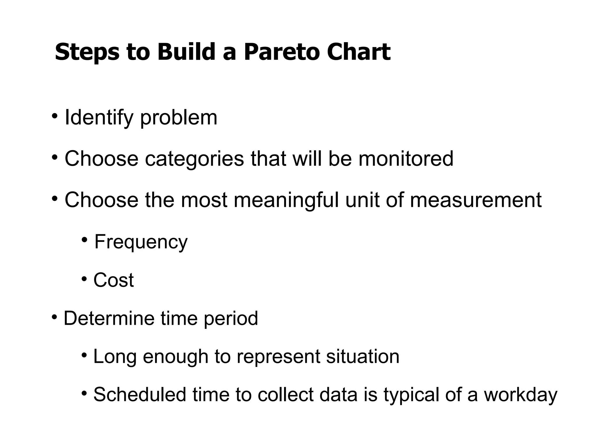
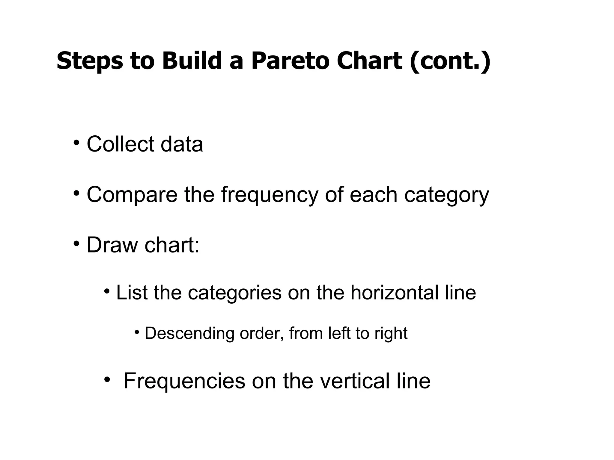
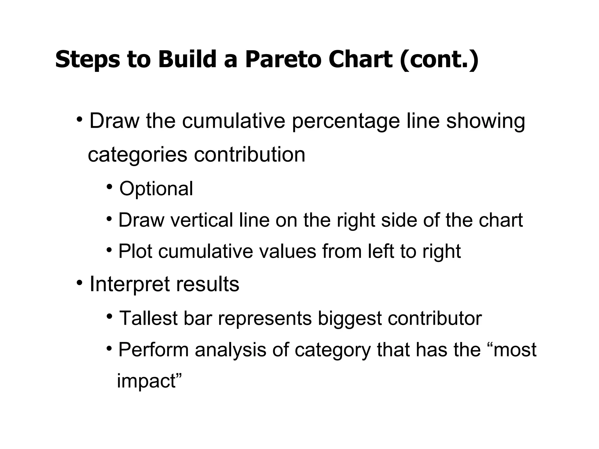
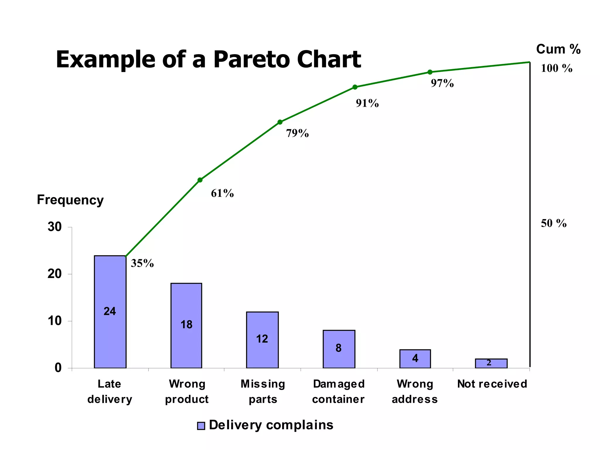
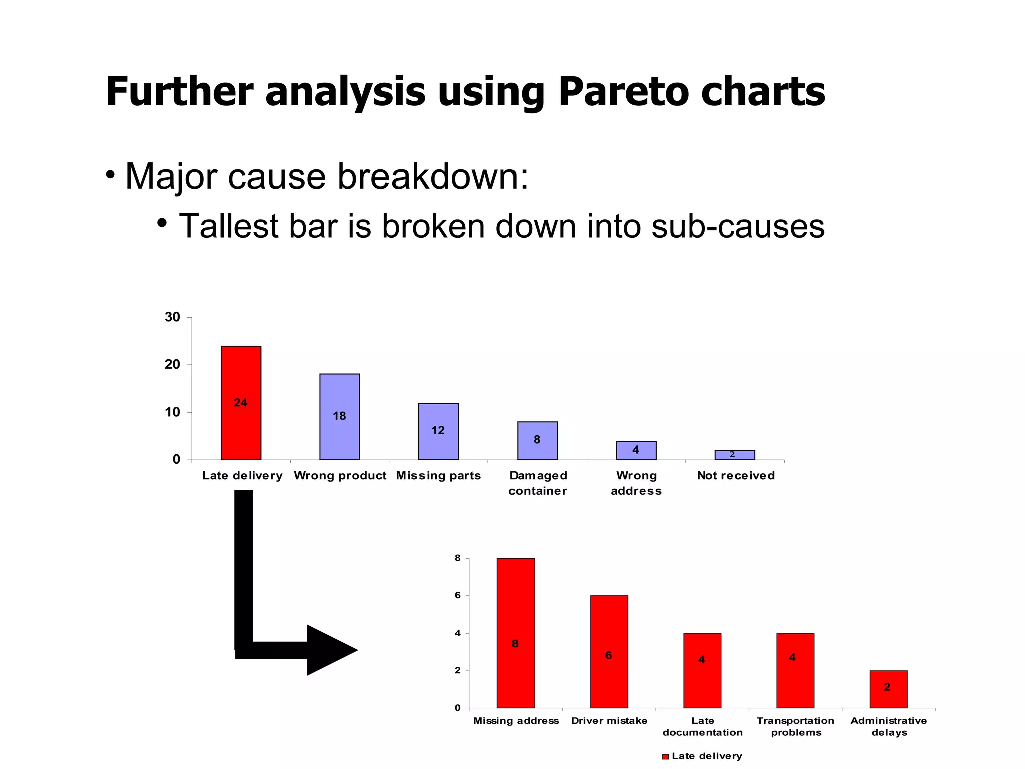
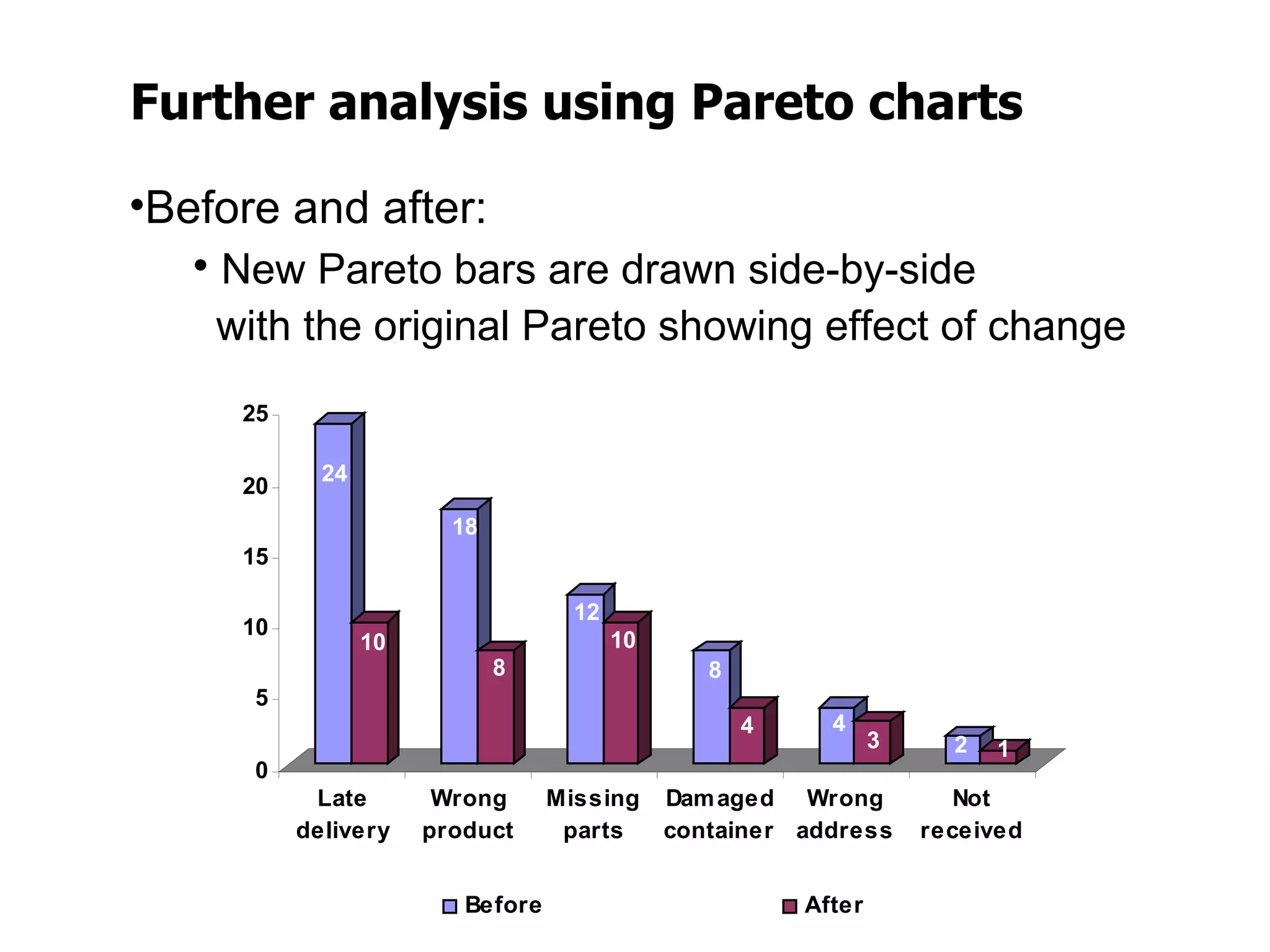
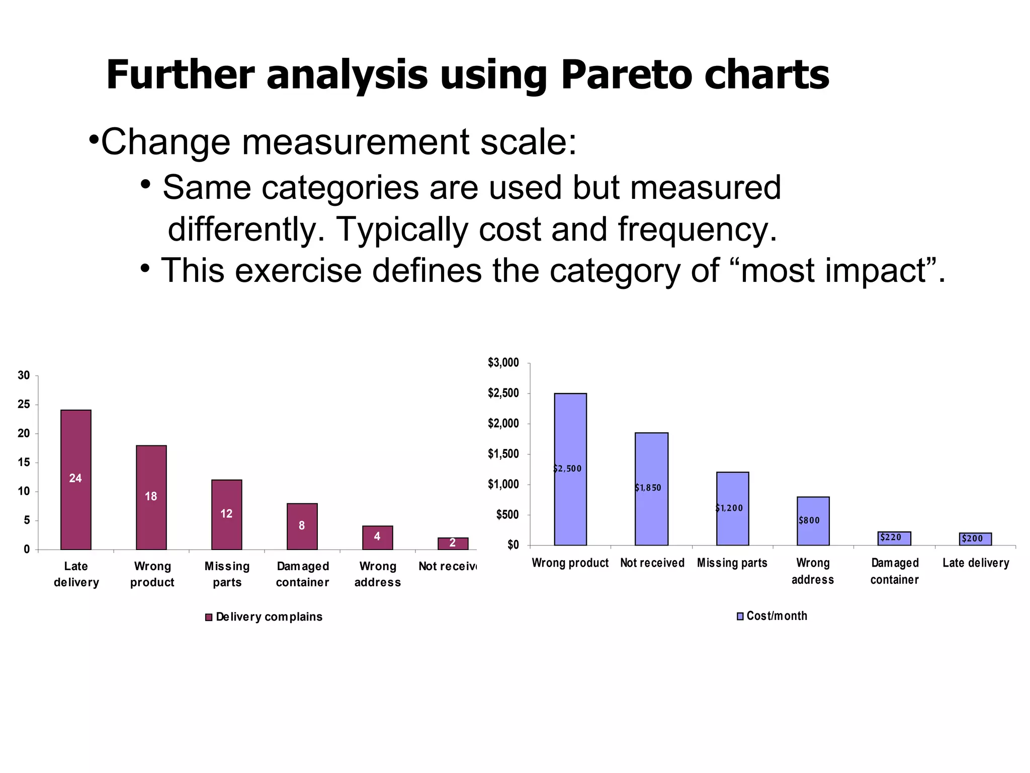
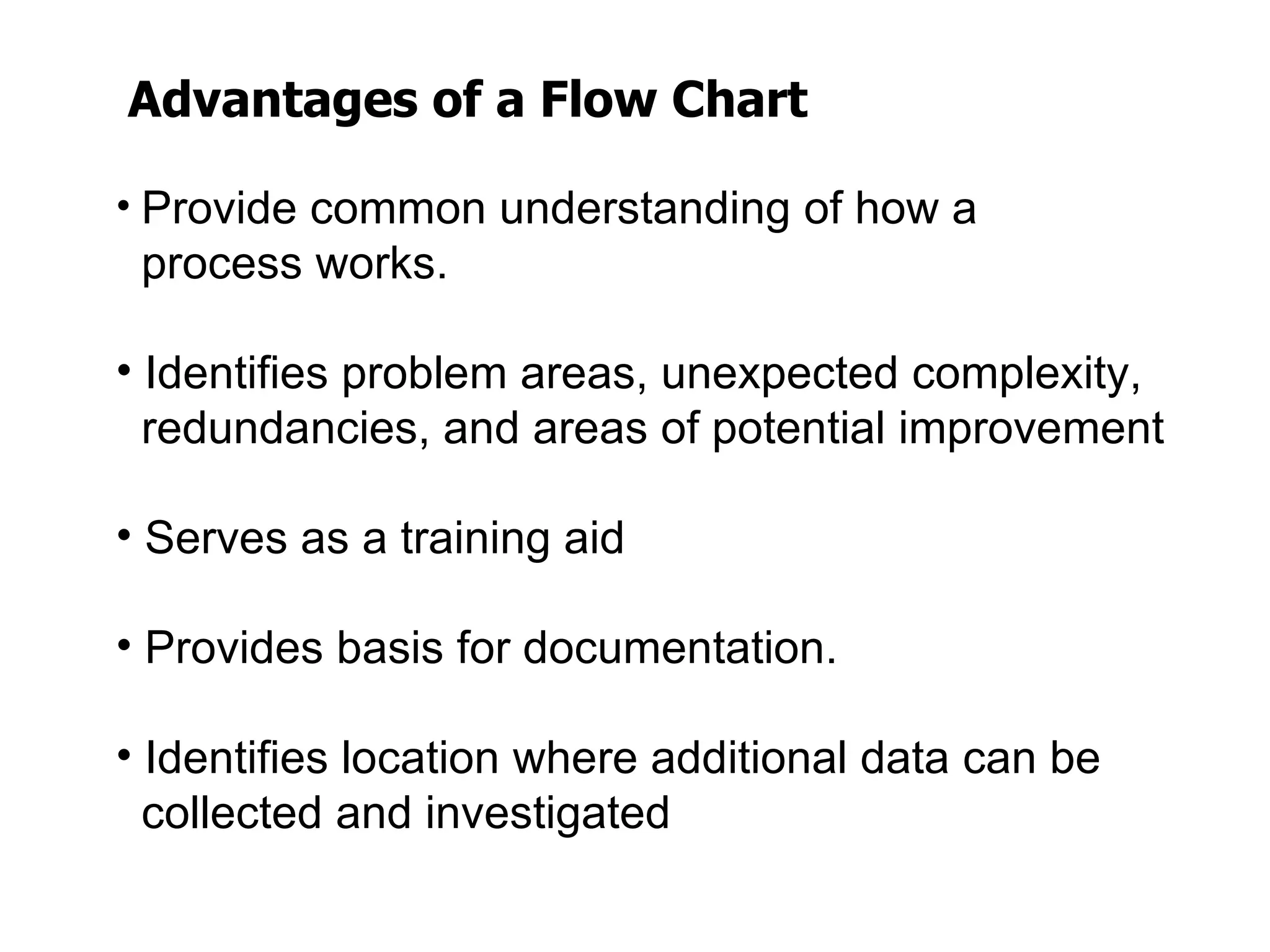
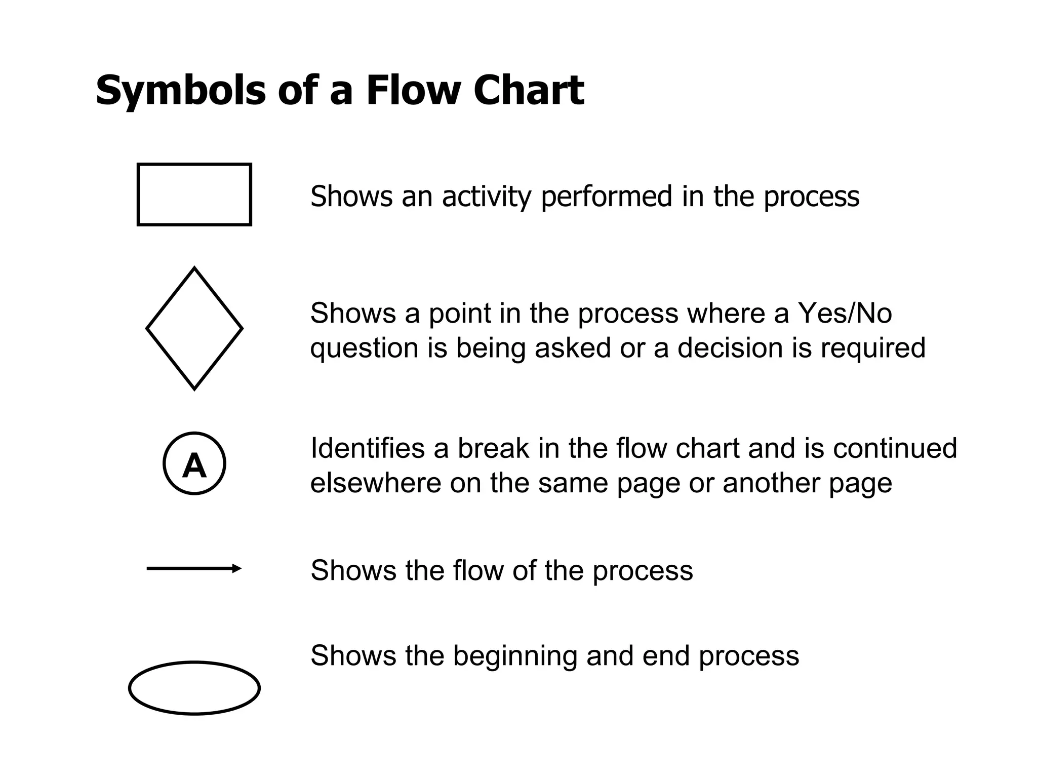
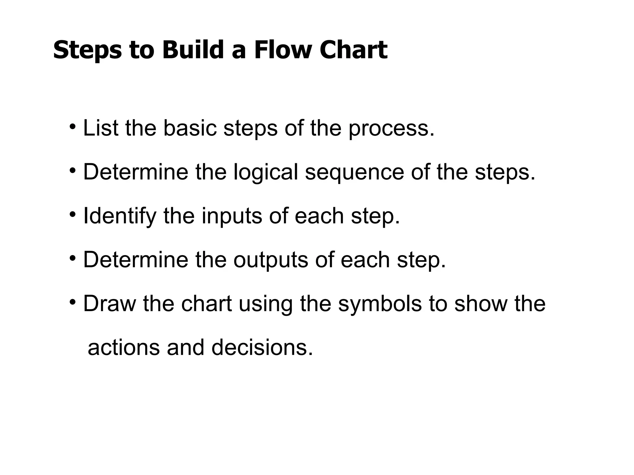
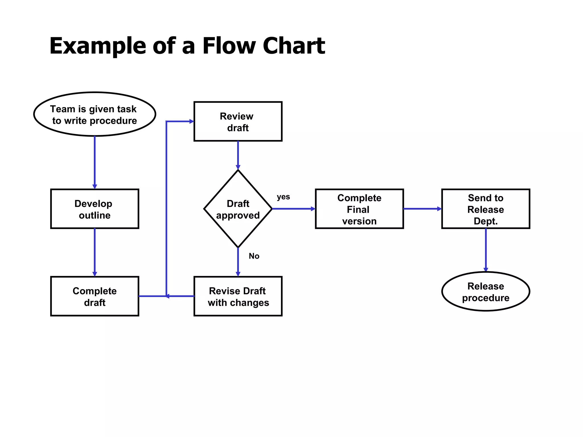
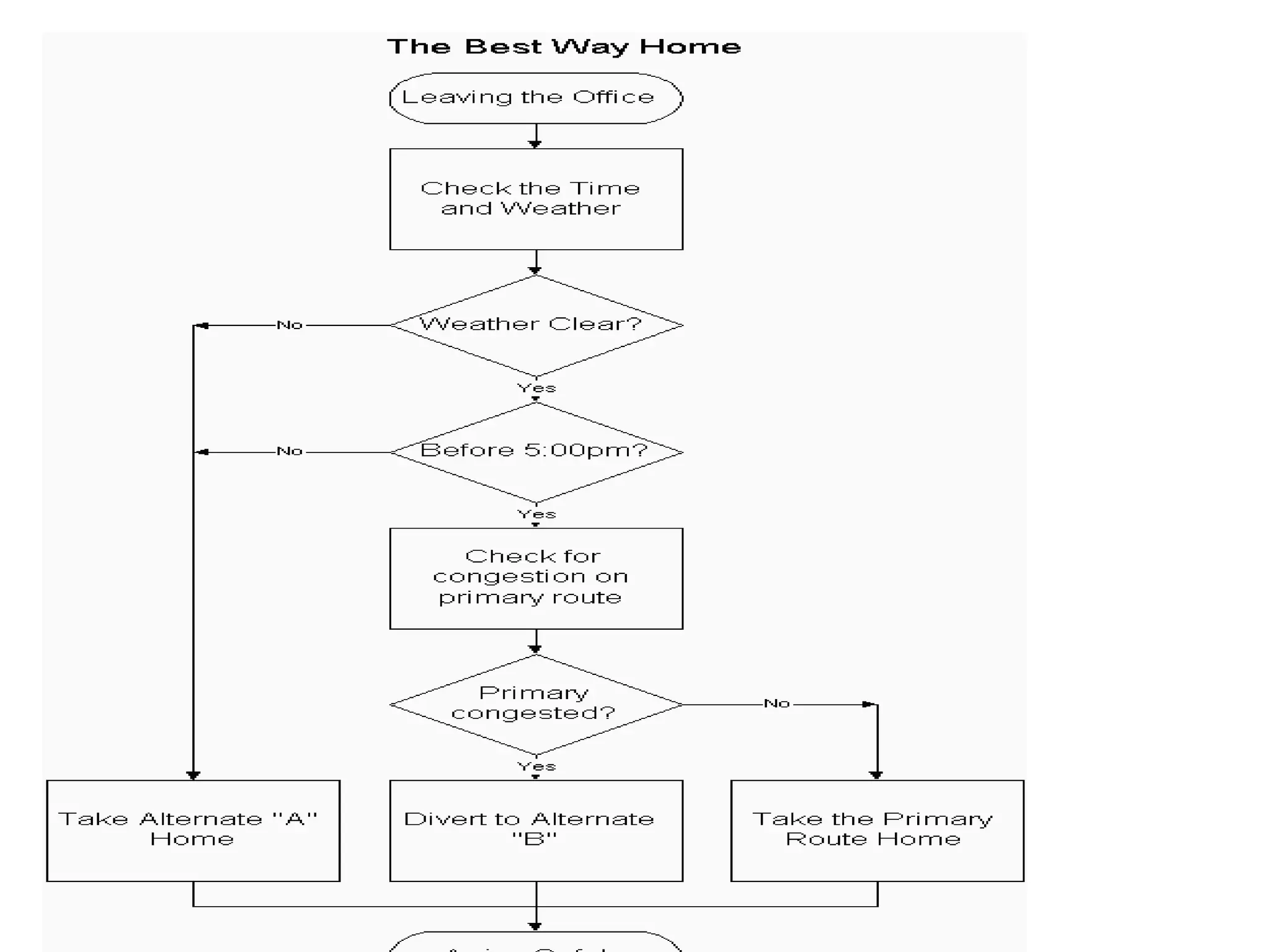
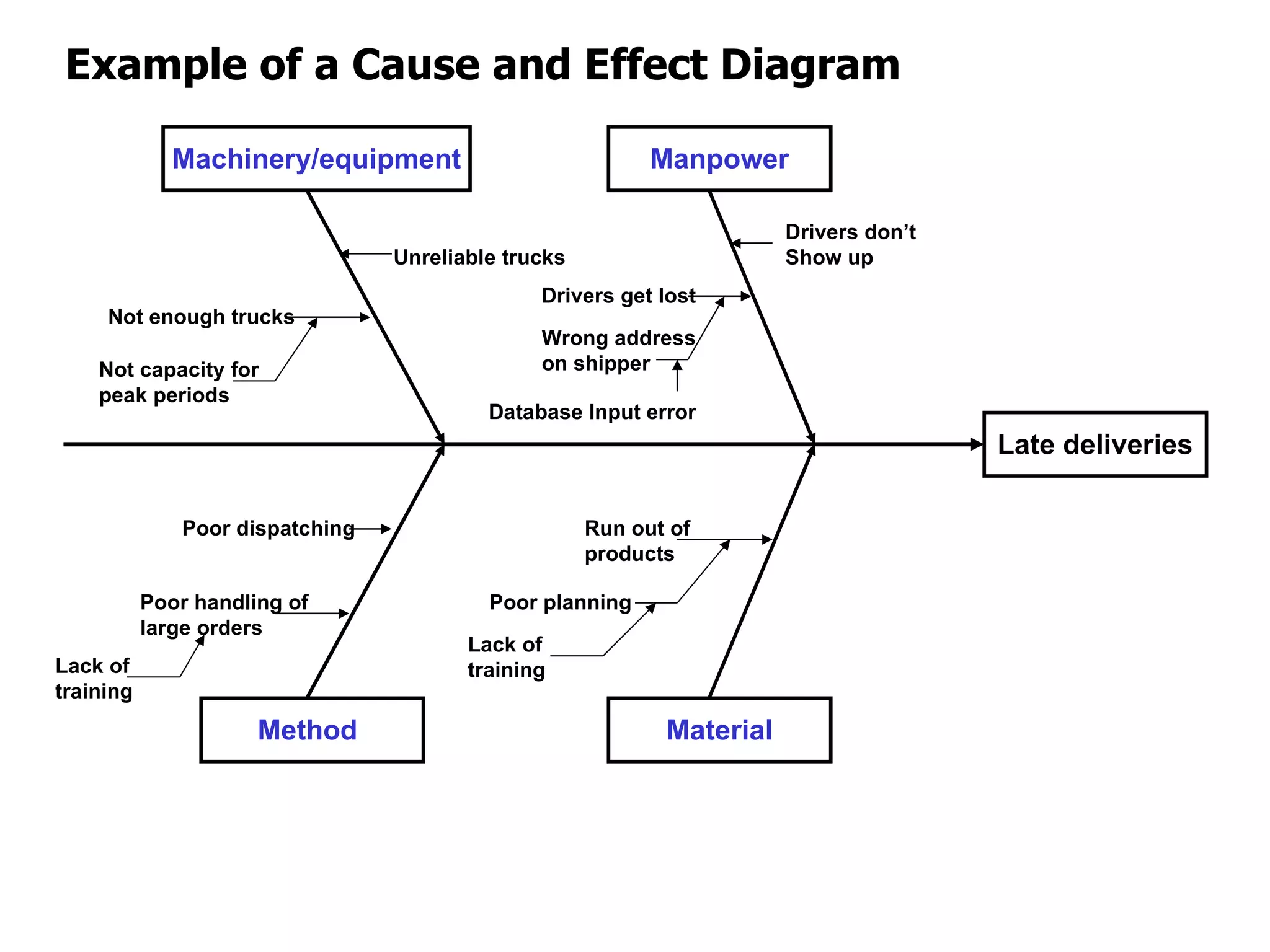
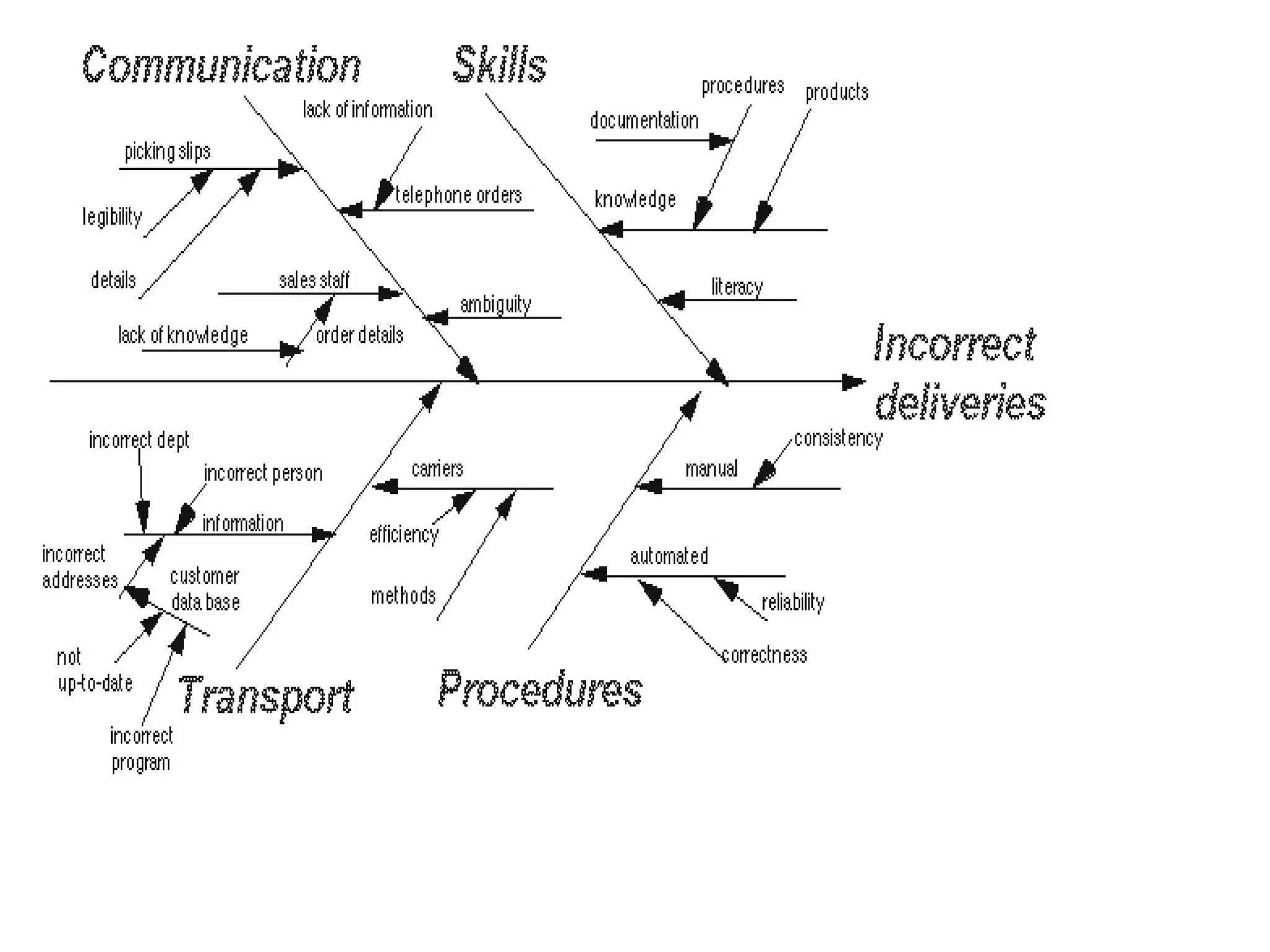
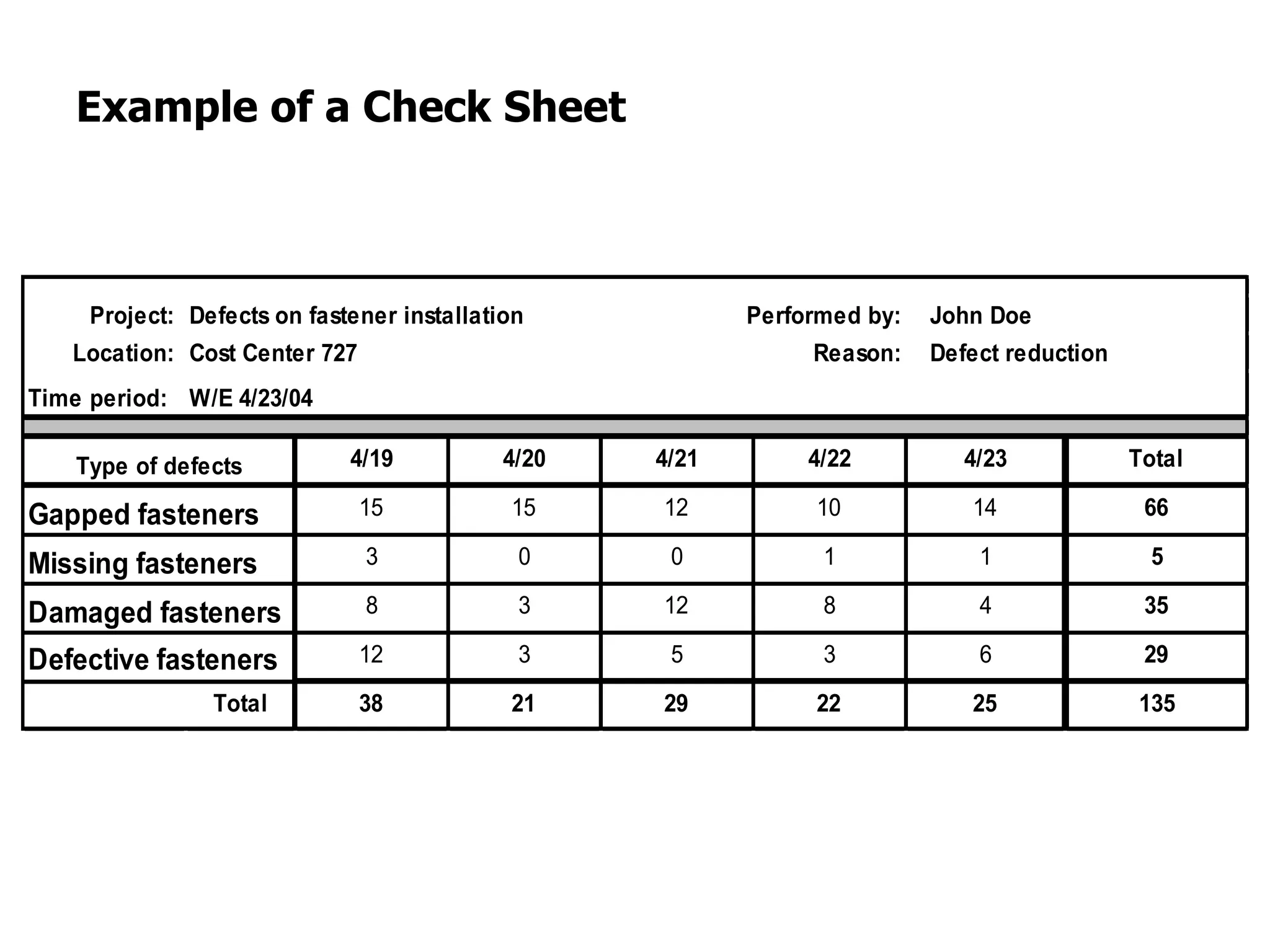
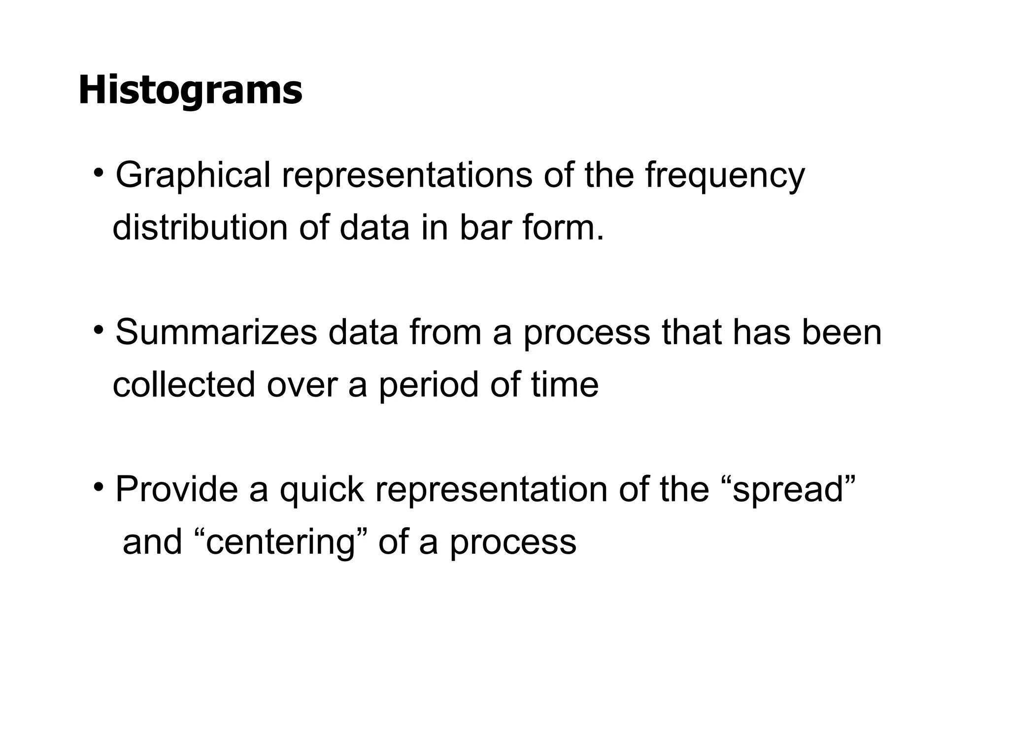
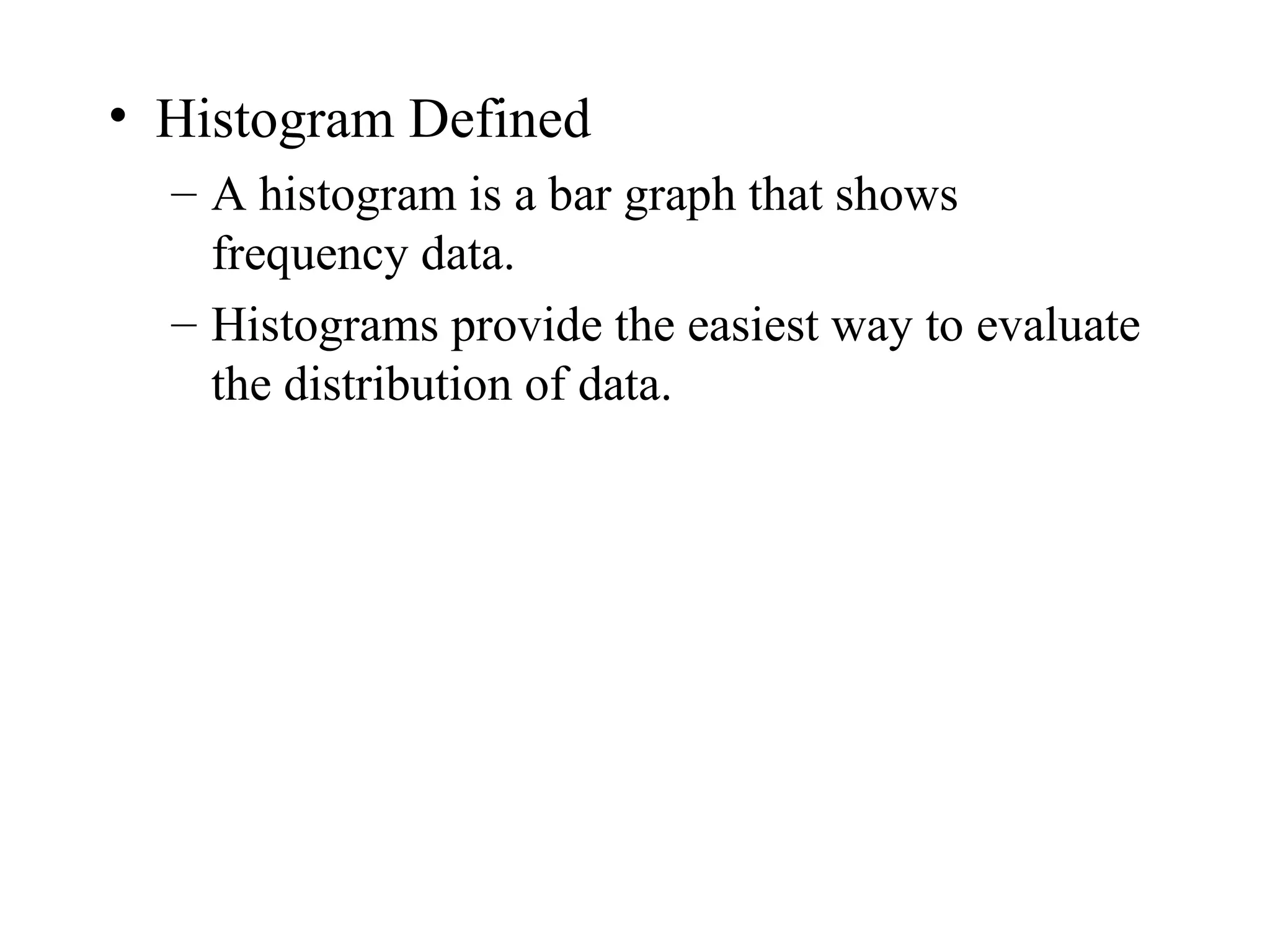
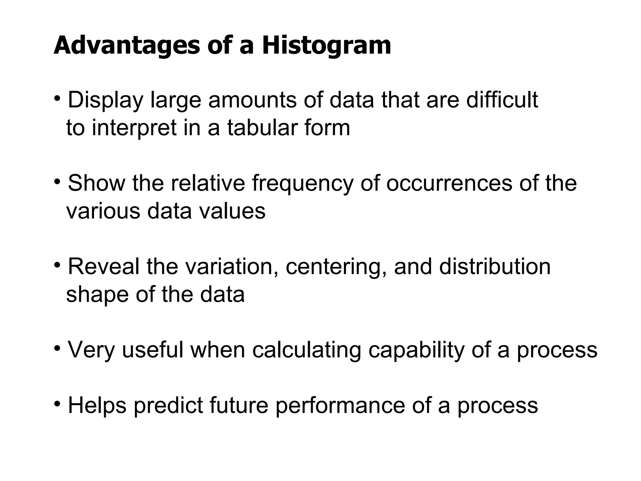
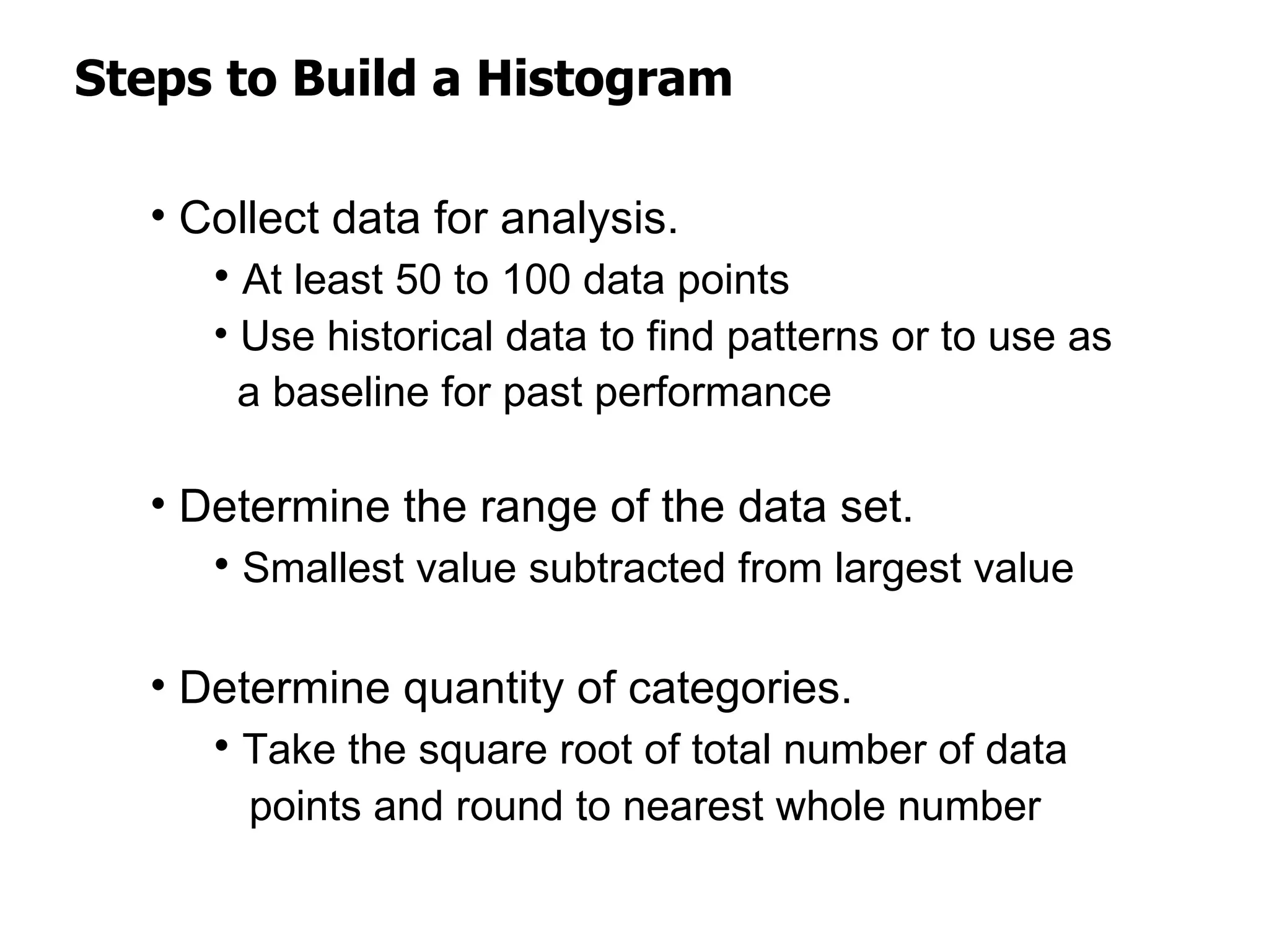
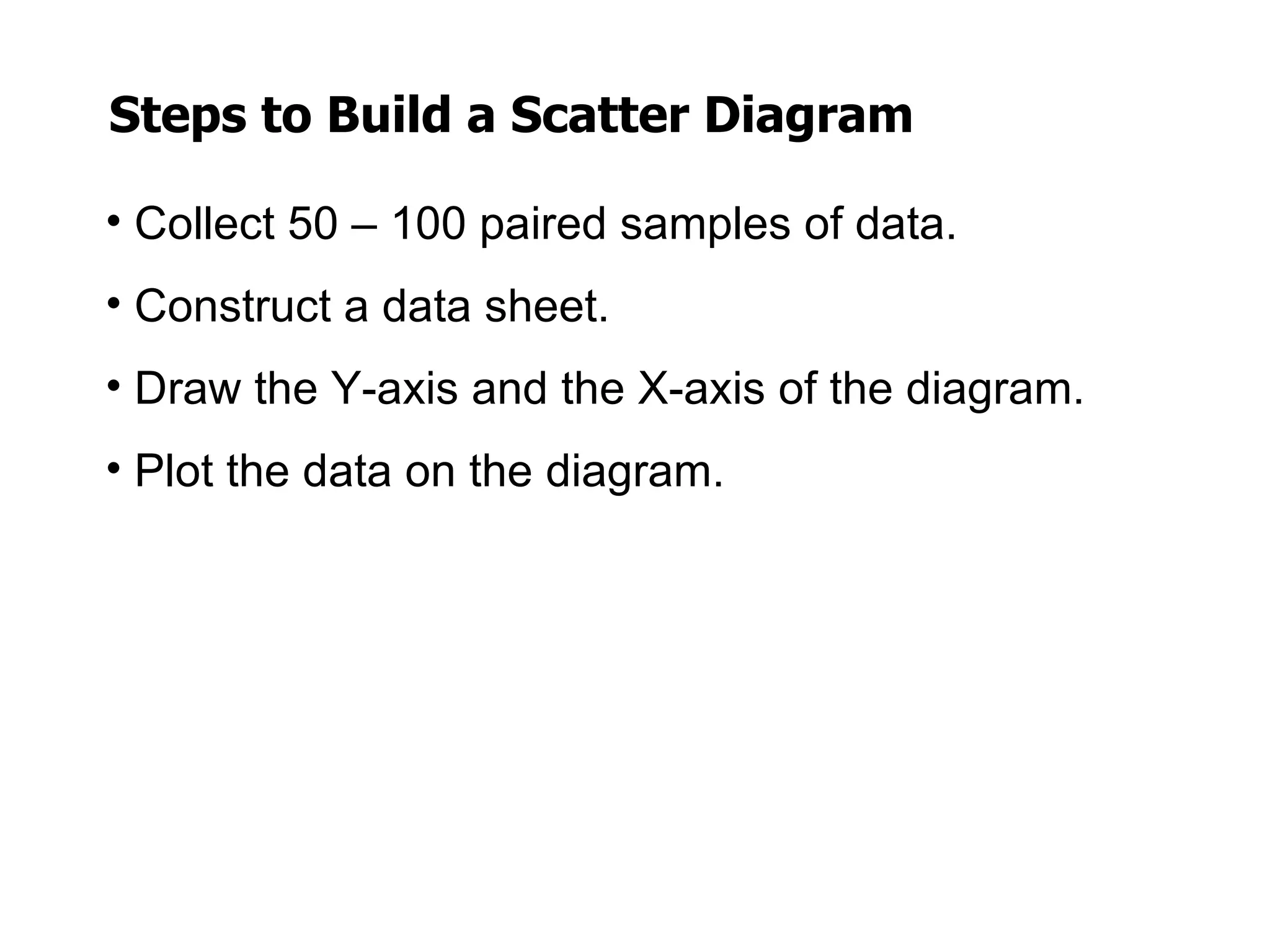
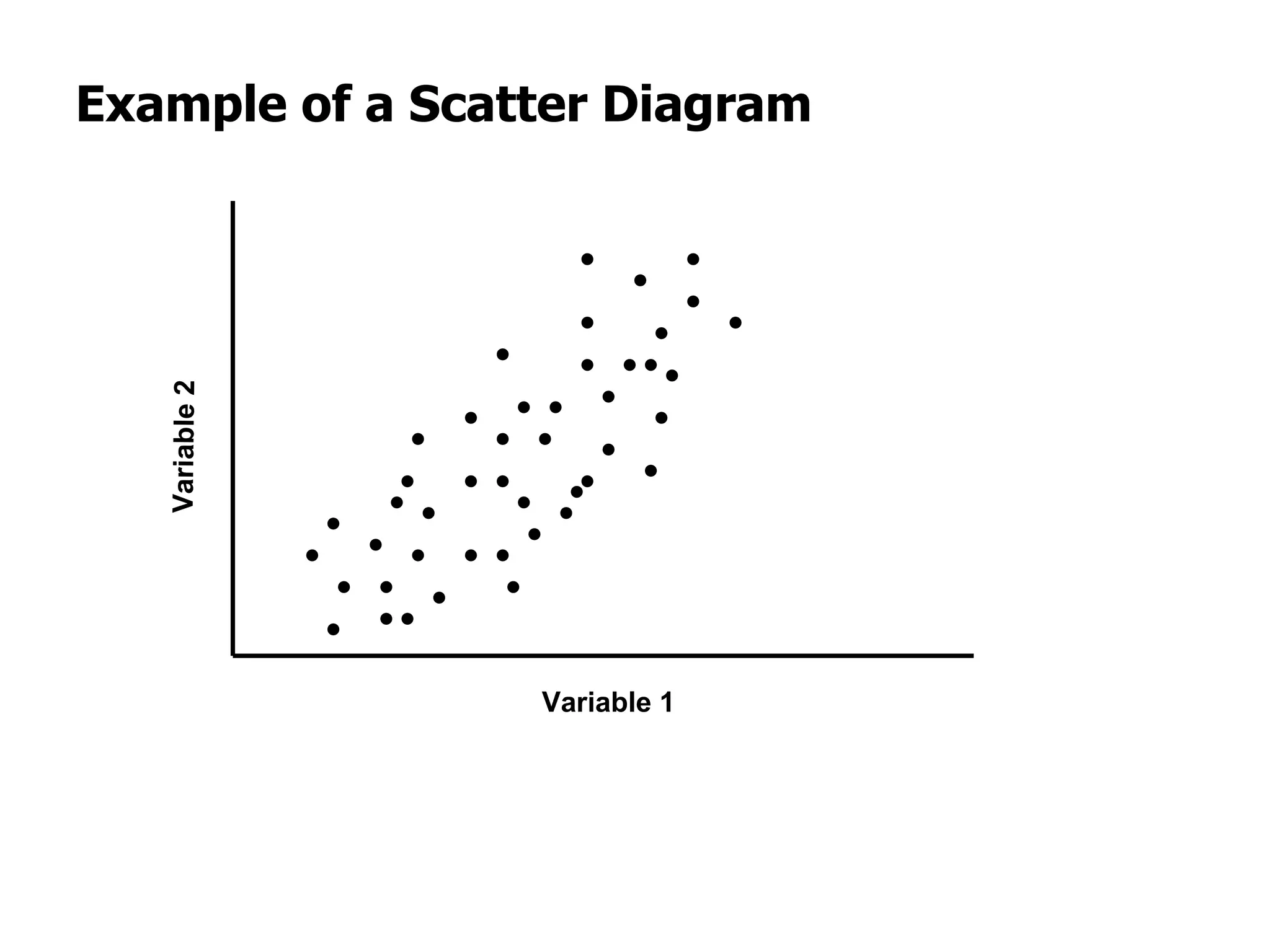
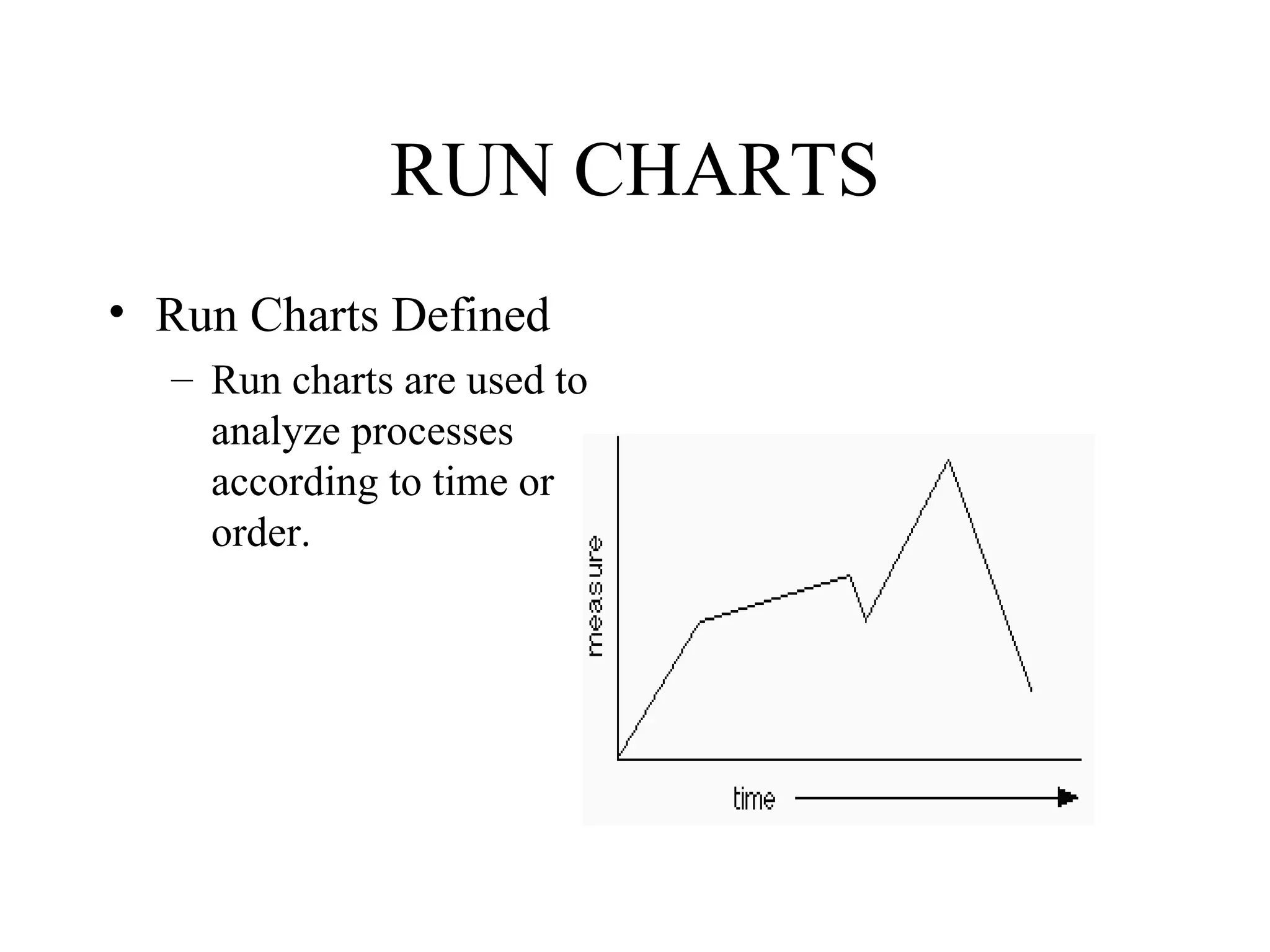

This document discusses quality assurance tools, specifically the seven basic tools of quality: Pareto charts, flow charts, cause-and-effect diagrams, check sheets, histograms, control charts, and scatter diagrams. It provides definitions and explanations of each tool, including their advantages and the basic steps to construct them. The purpose of these tools is to help analyze processes, identify problems, find their causes, and determine solutions to improve quality.


![Vibe Coding vs. Spec-Driven Development [Free Meetup]](https://cdn.slidesharecdn.com/ss_thumbnails/vibecodingvsspecdrivendevelopment-251209105622-43f455e7-thumbnail.jpg?width=640&height=640&fit=bounds)


