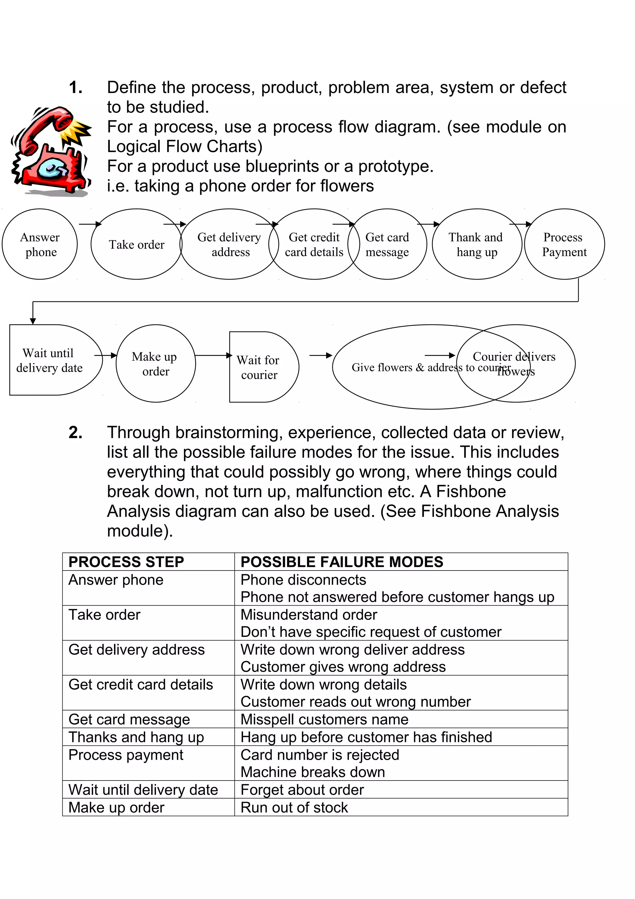
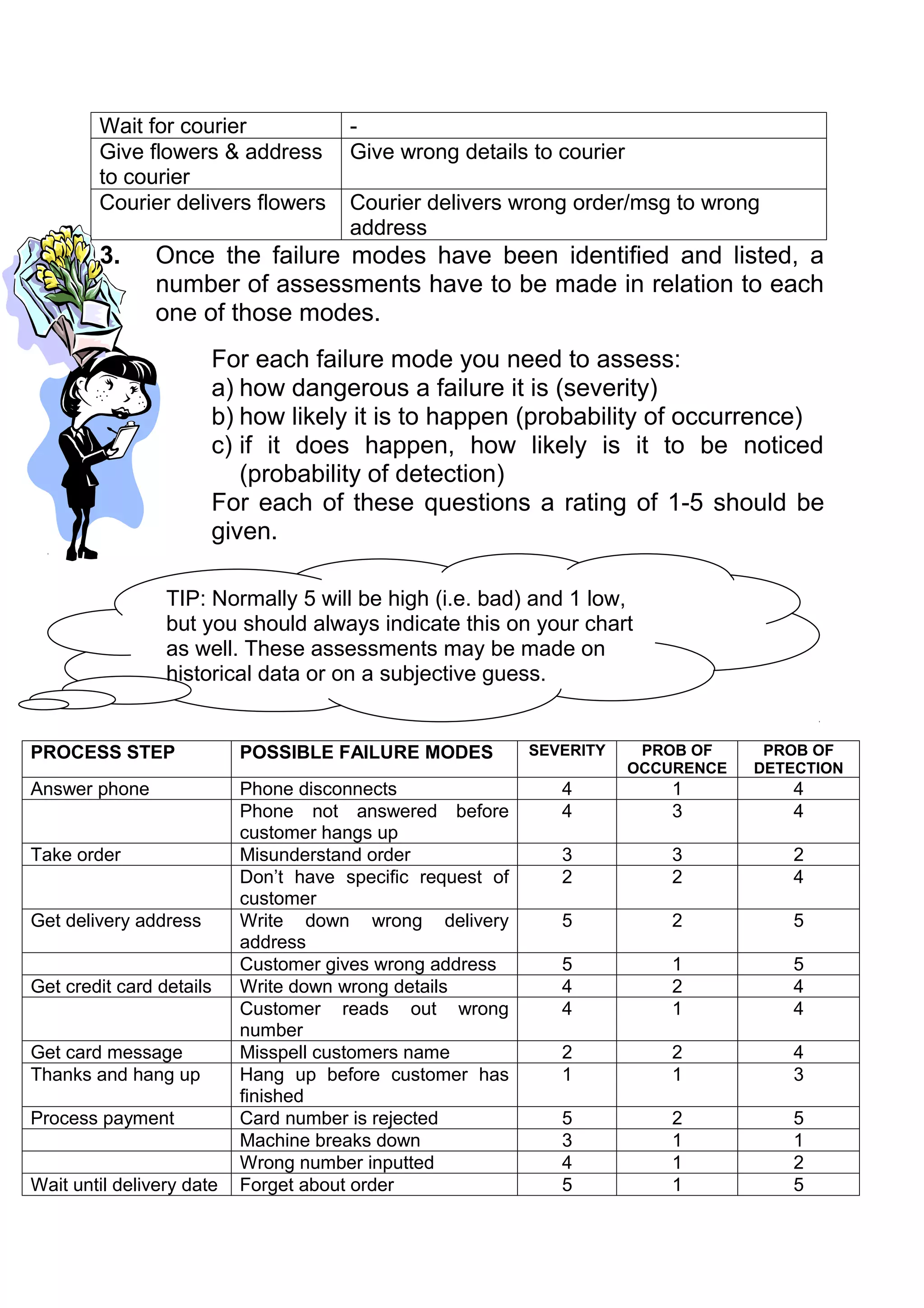
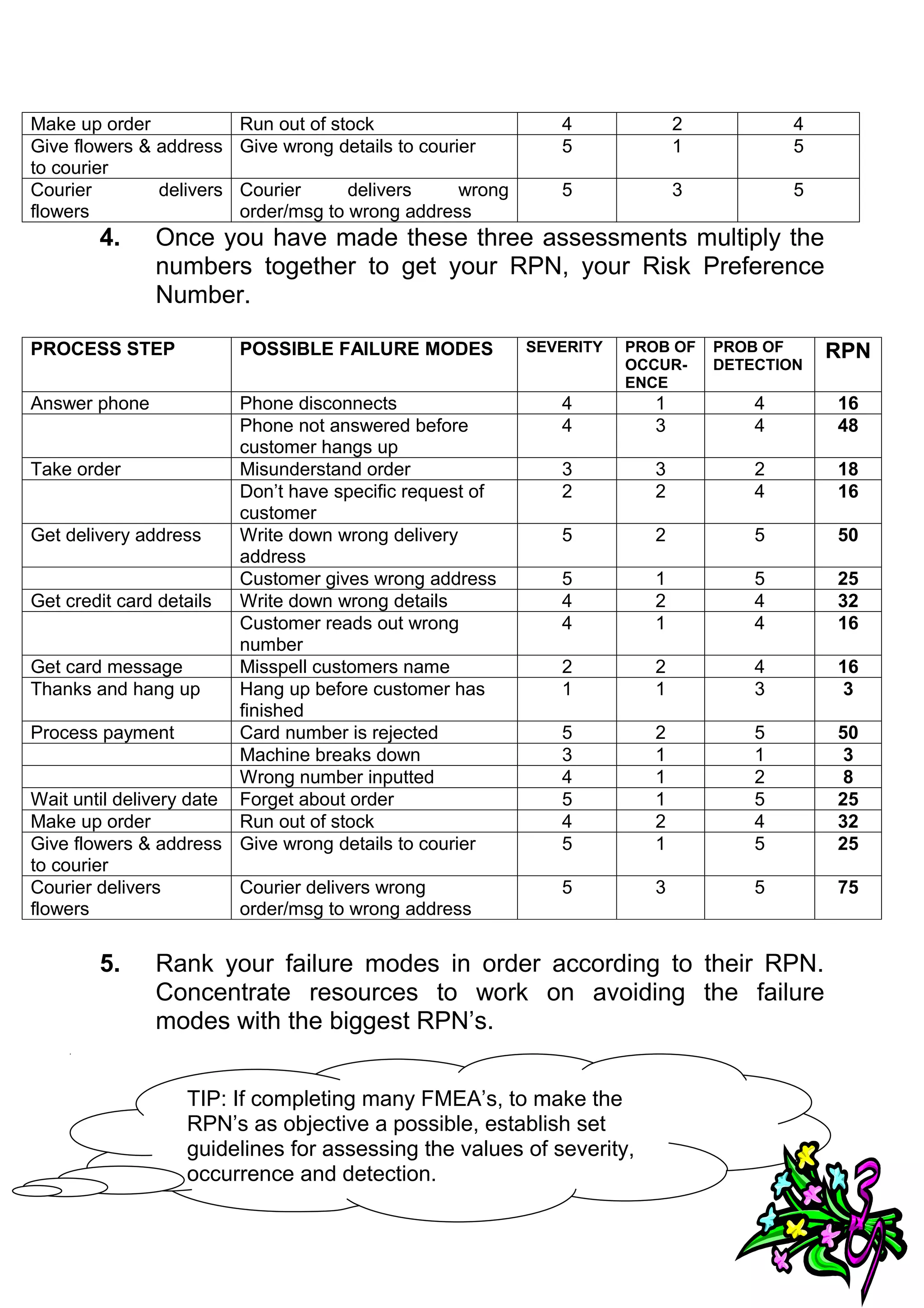
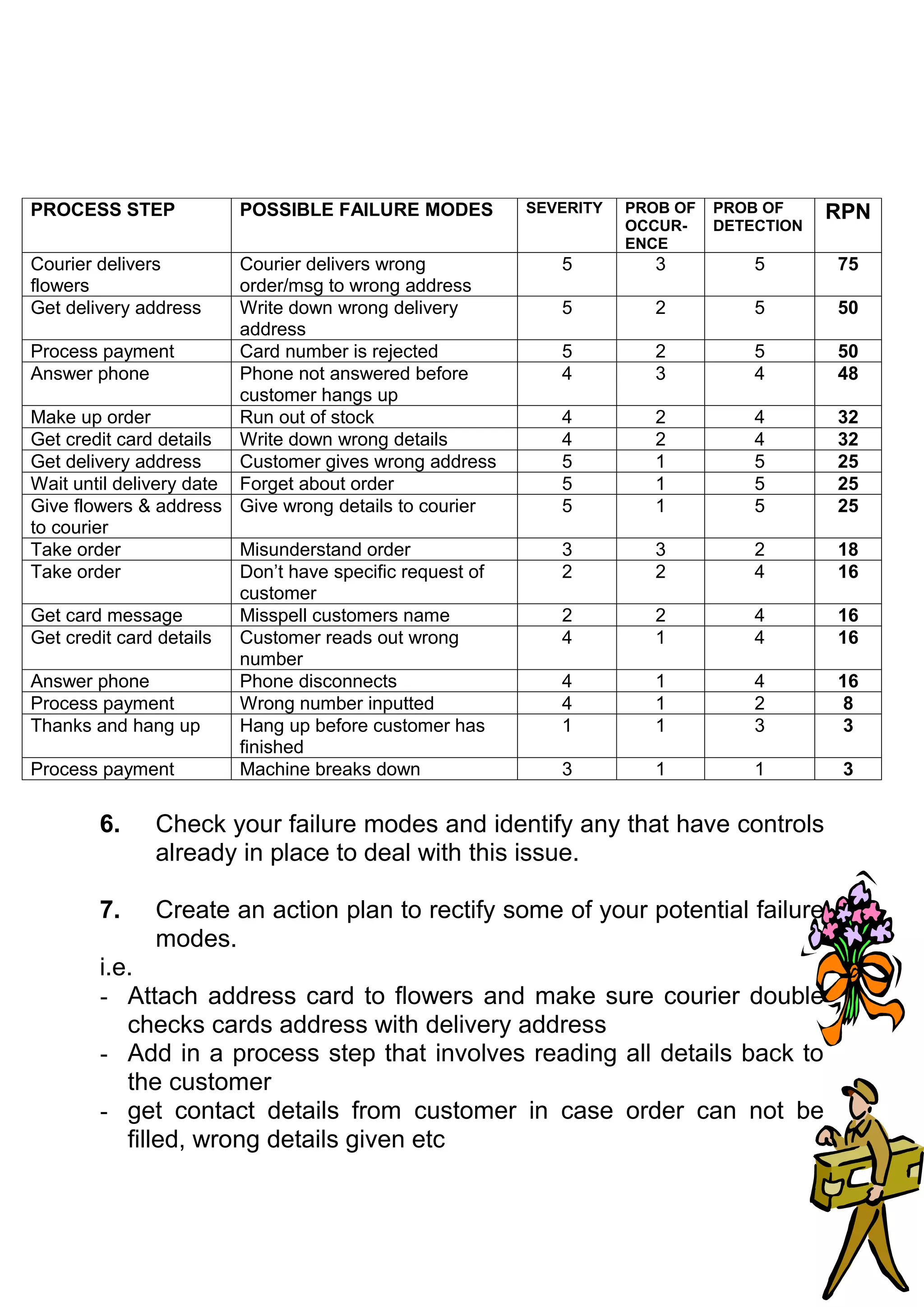
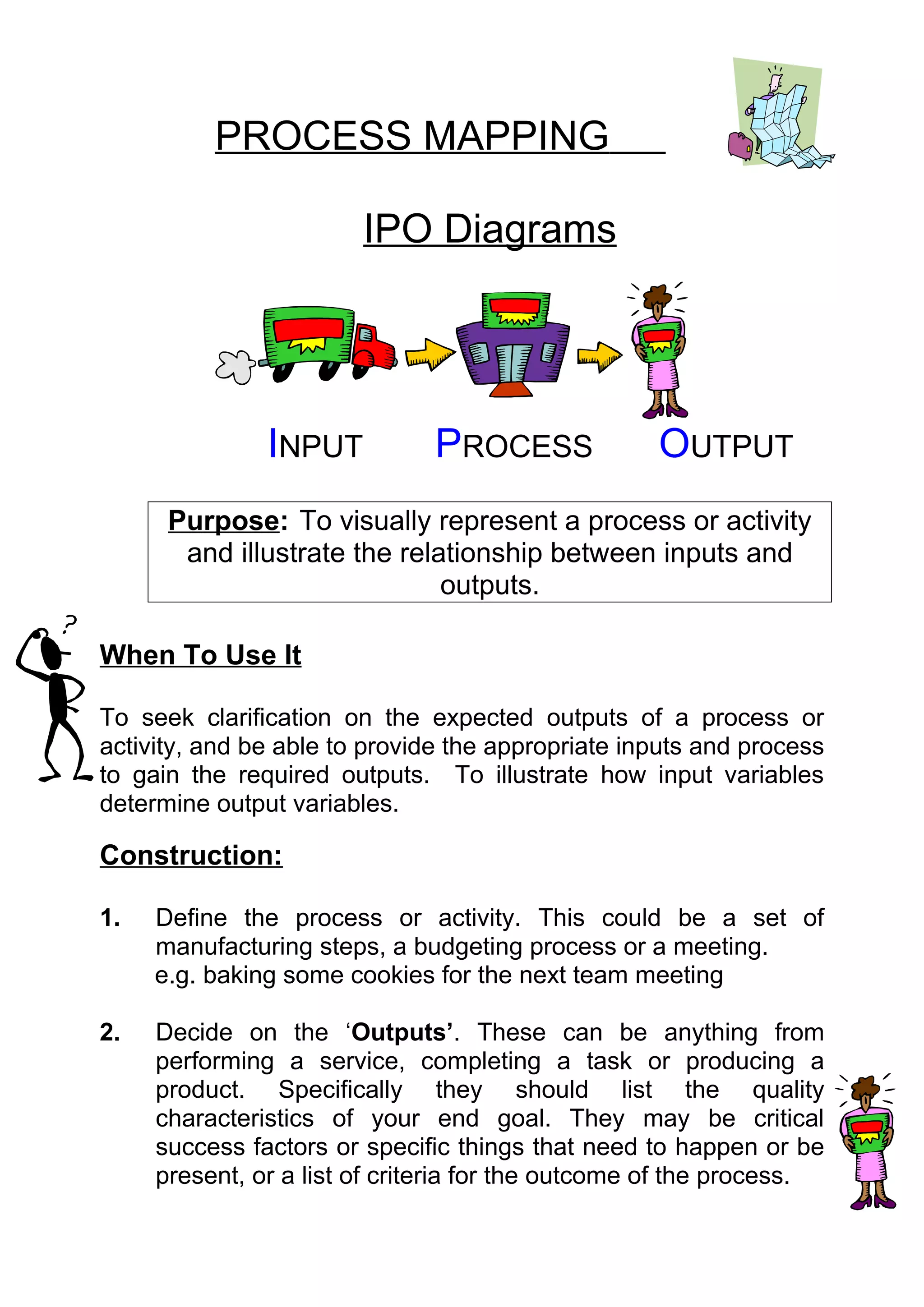
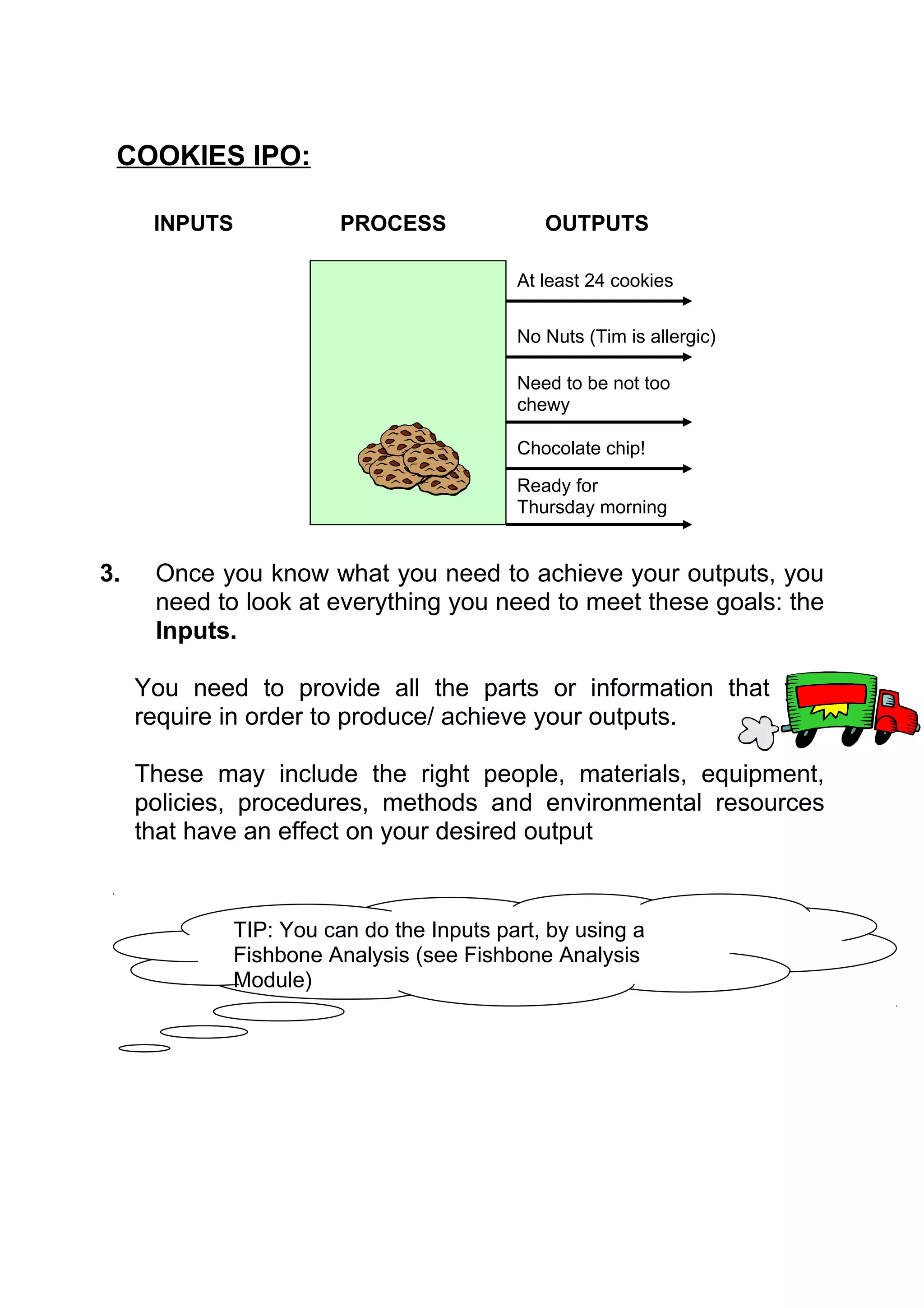
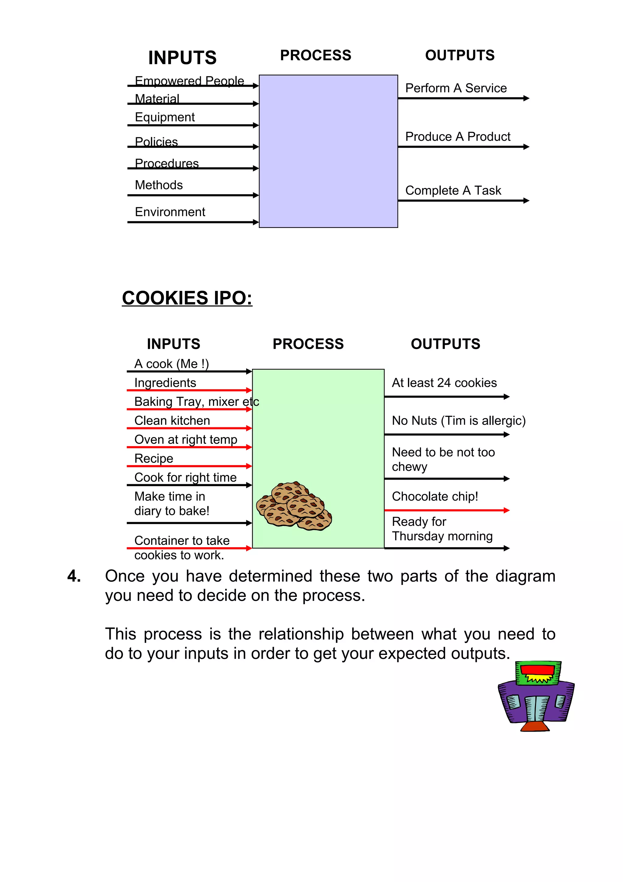
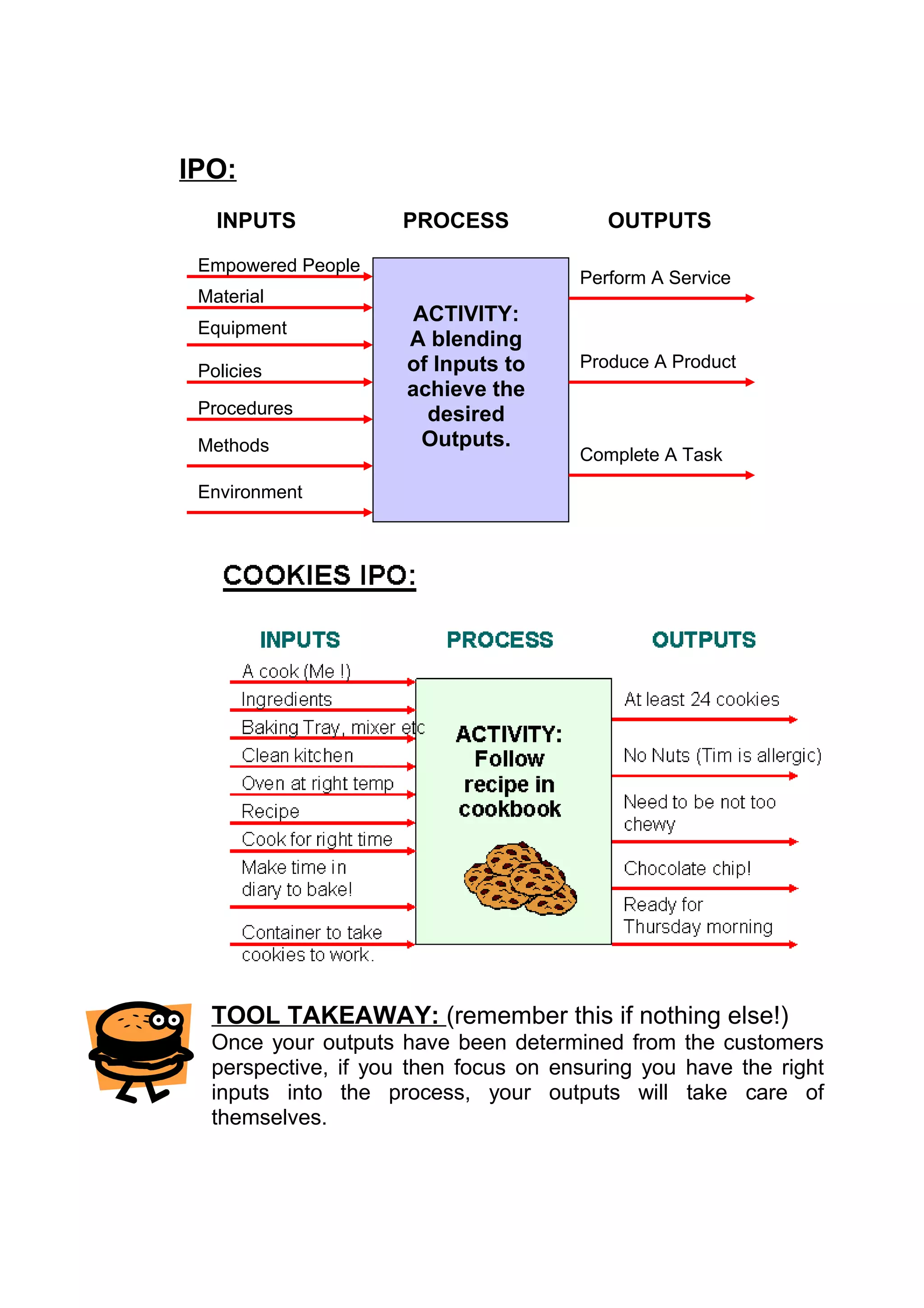
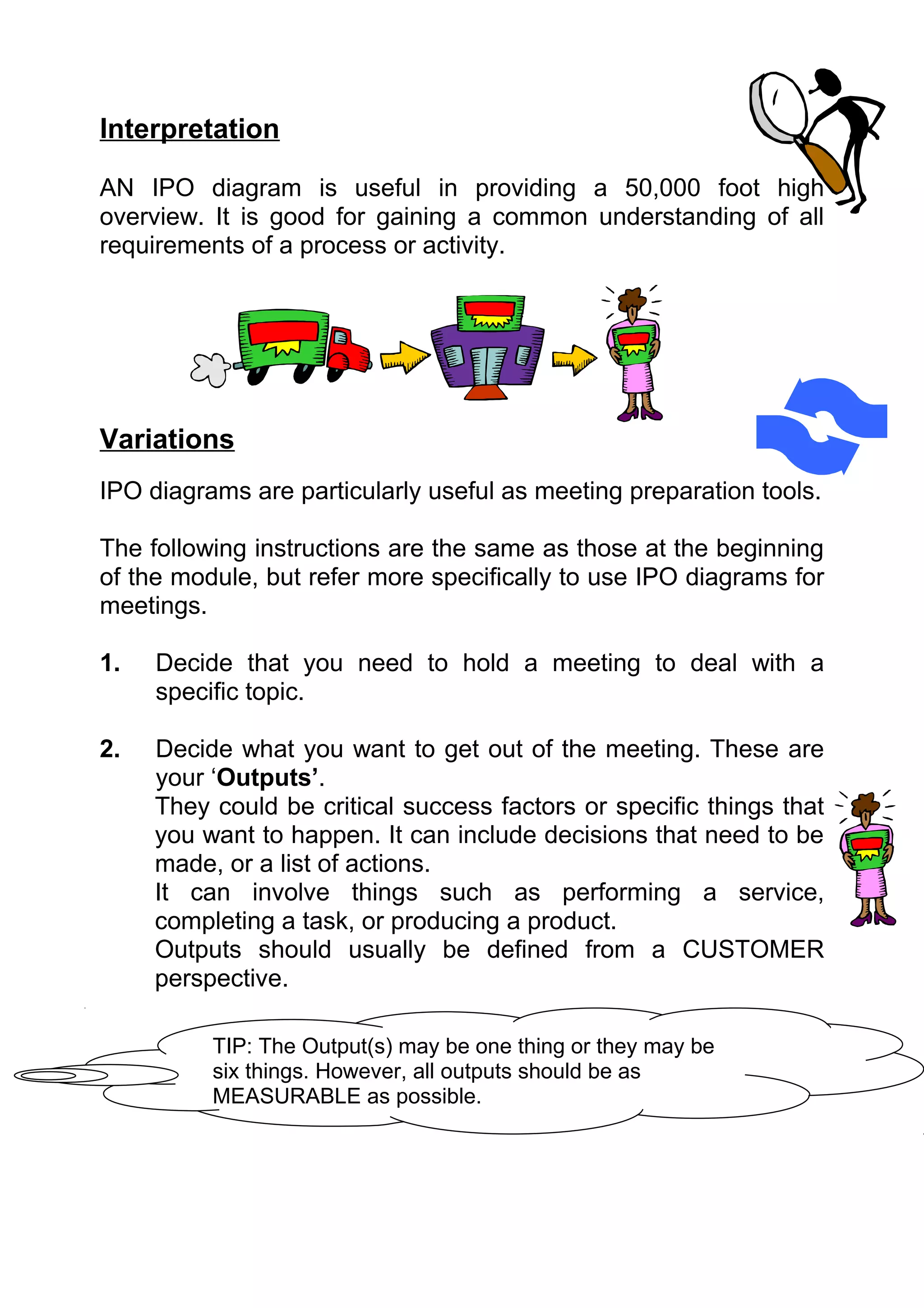
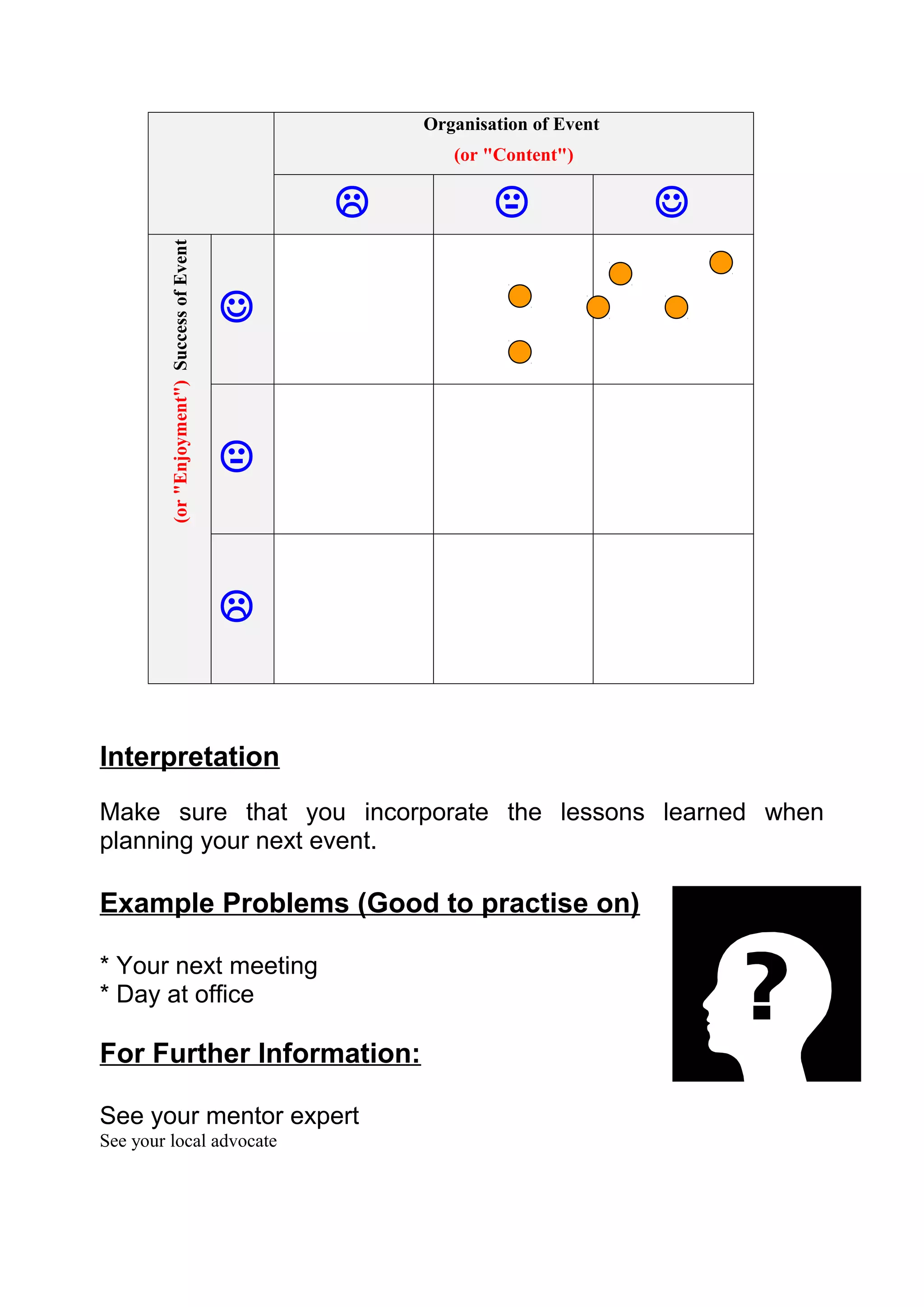
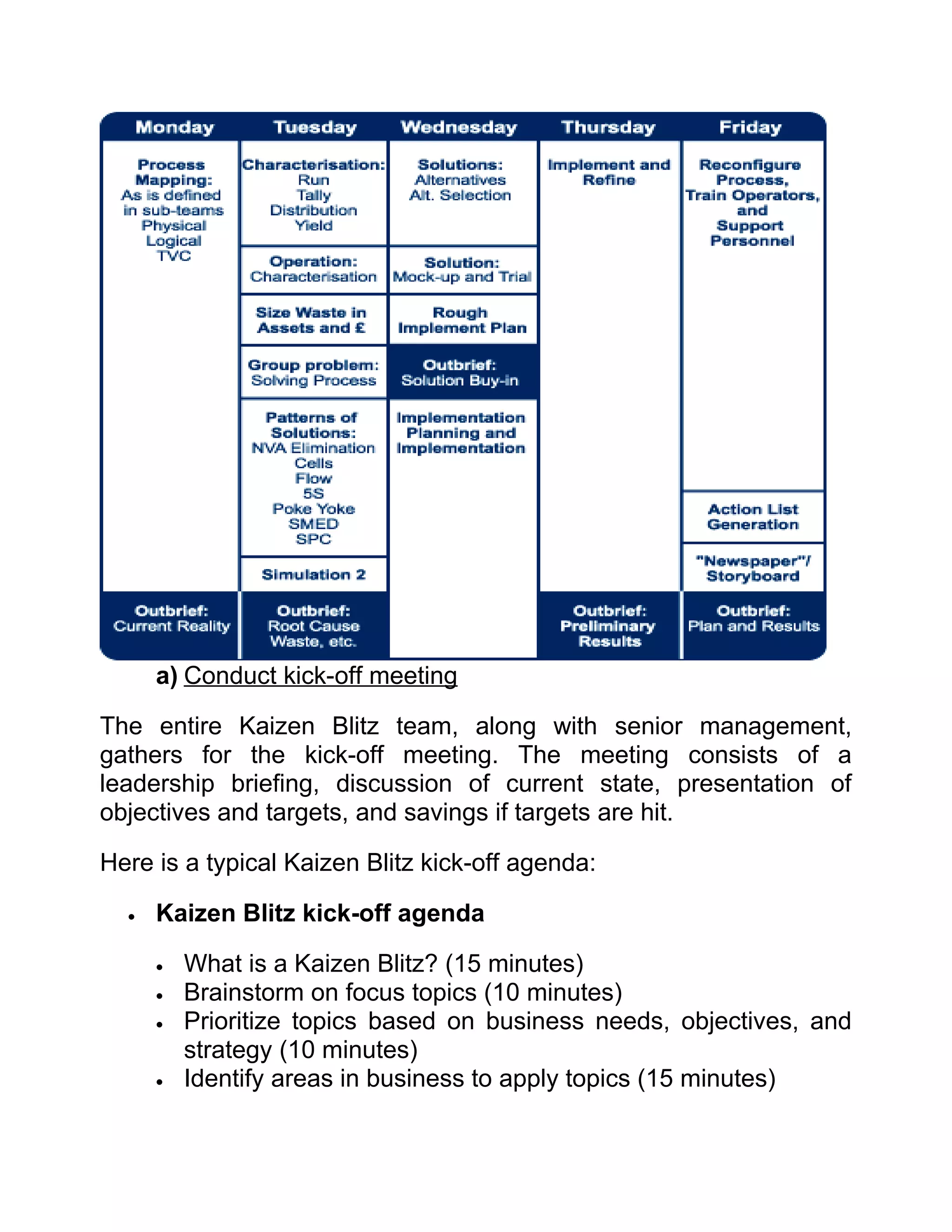
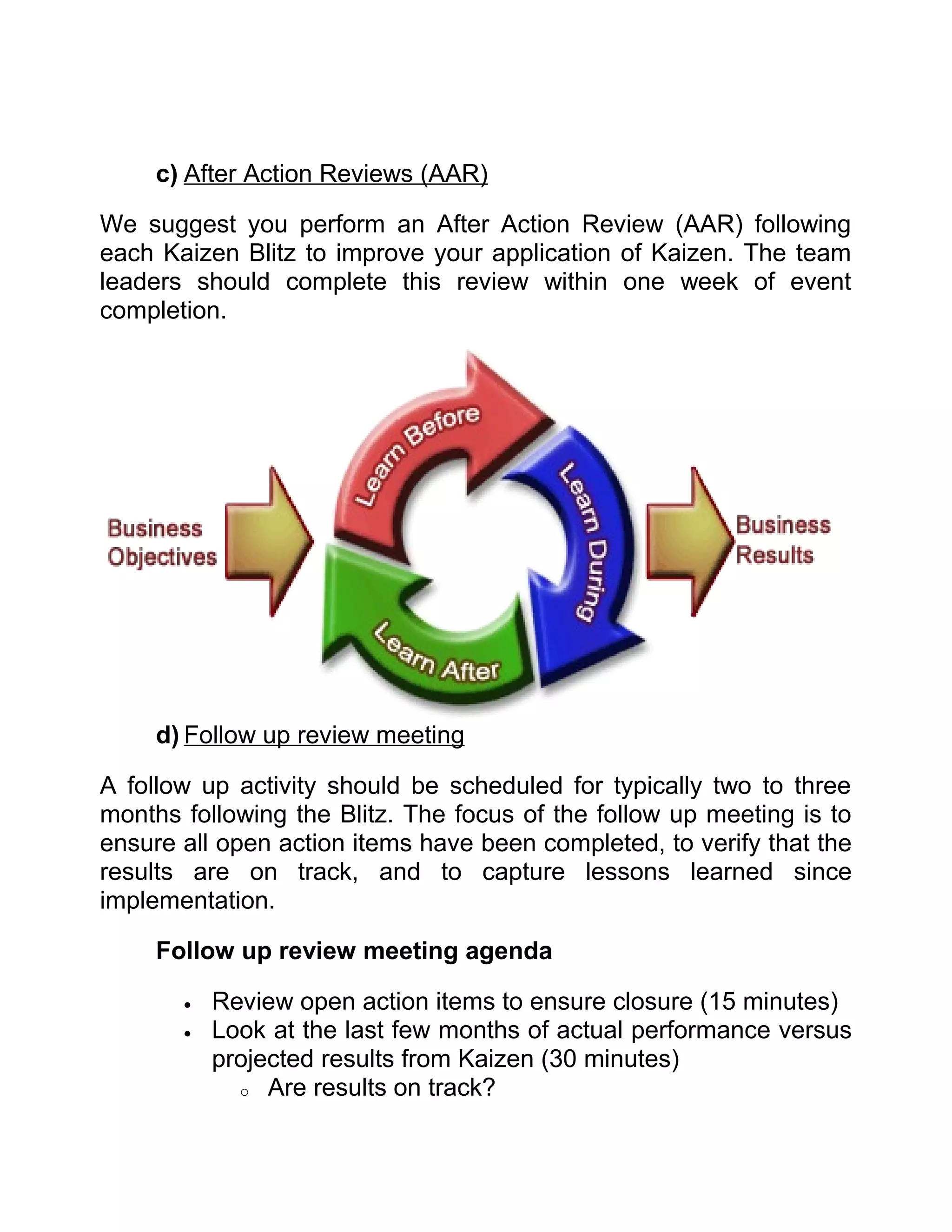
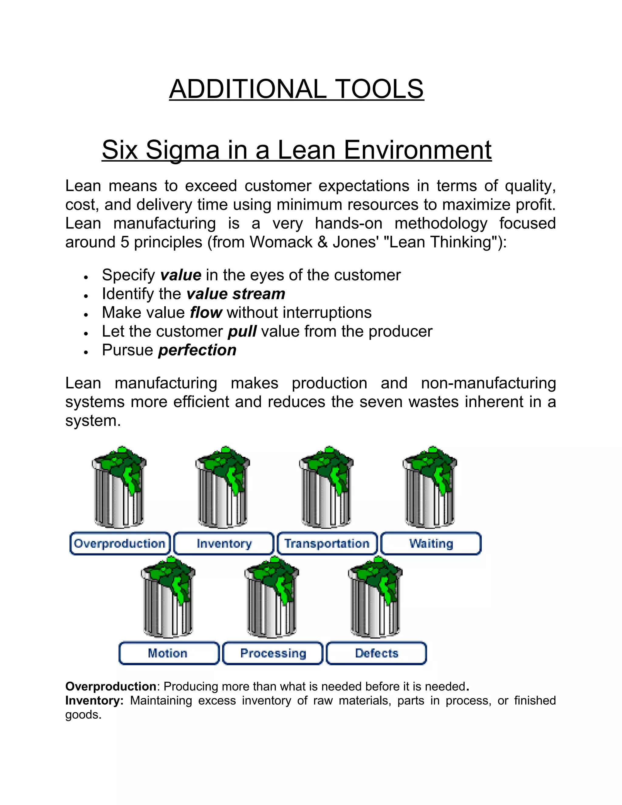
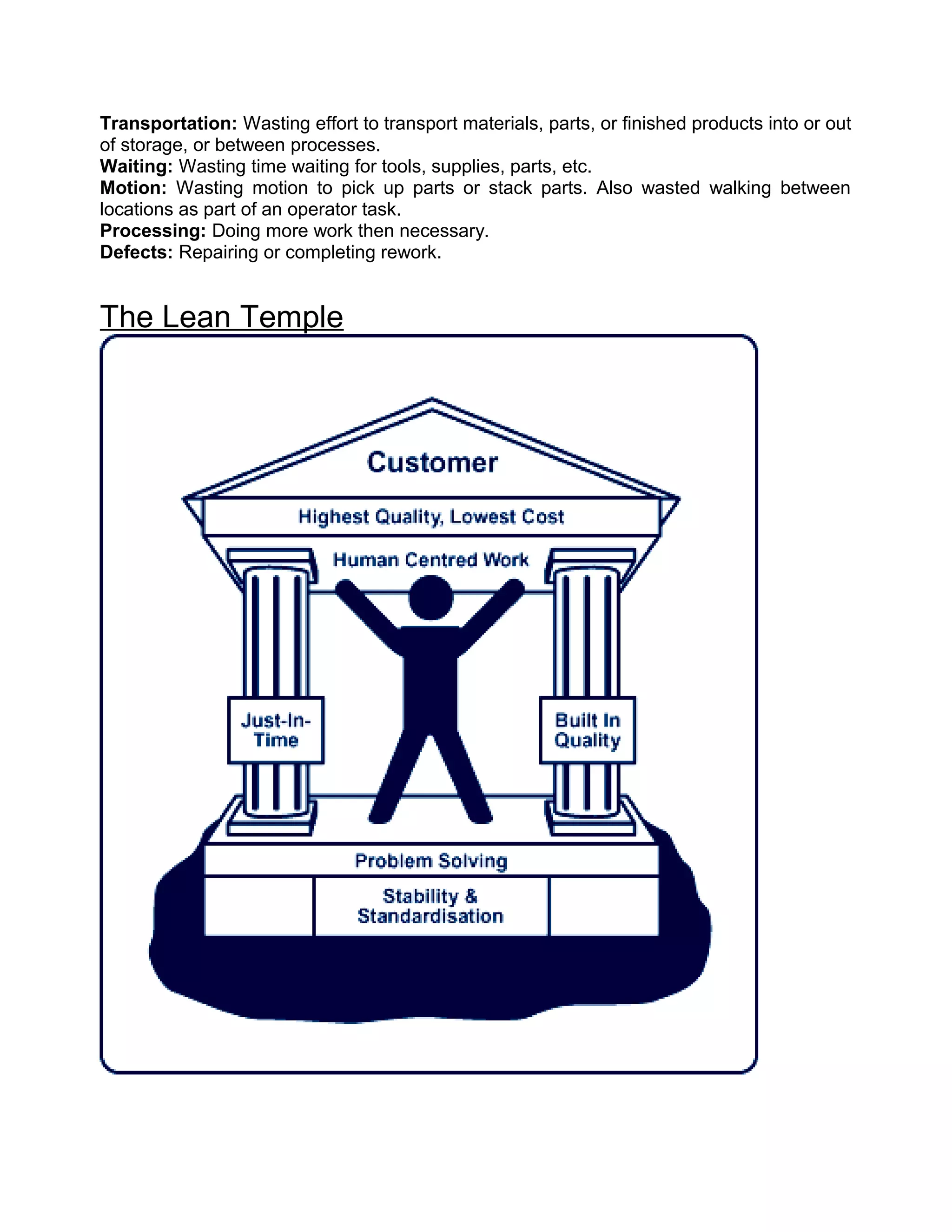
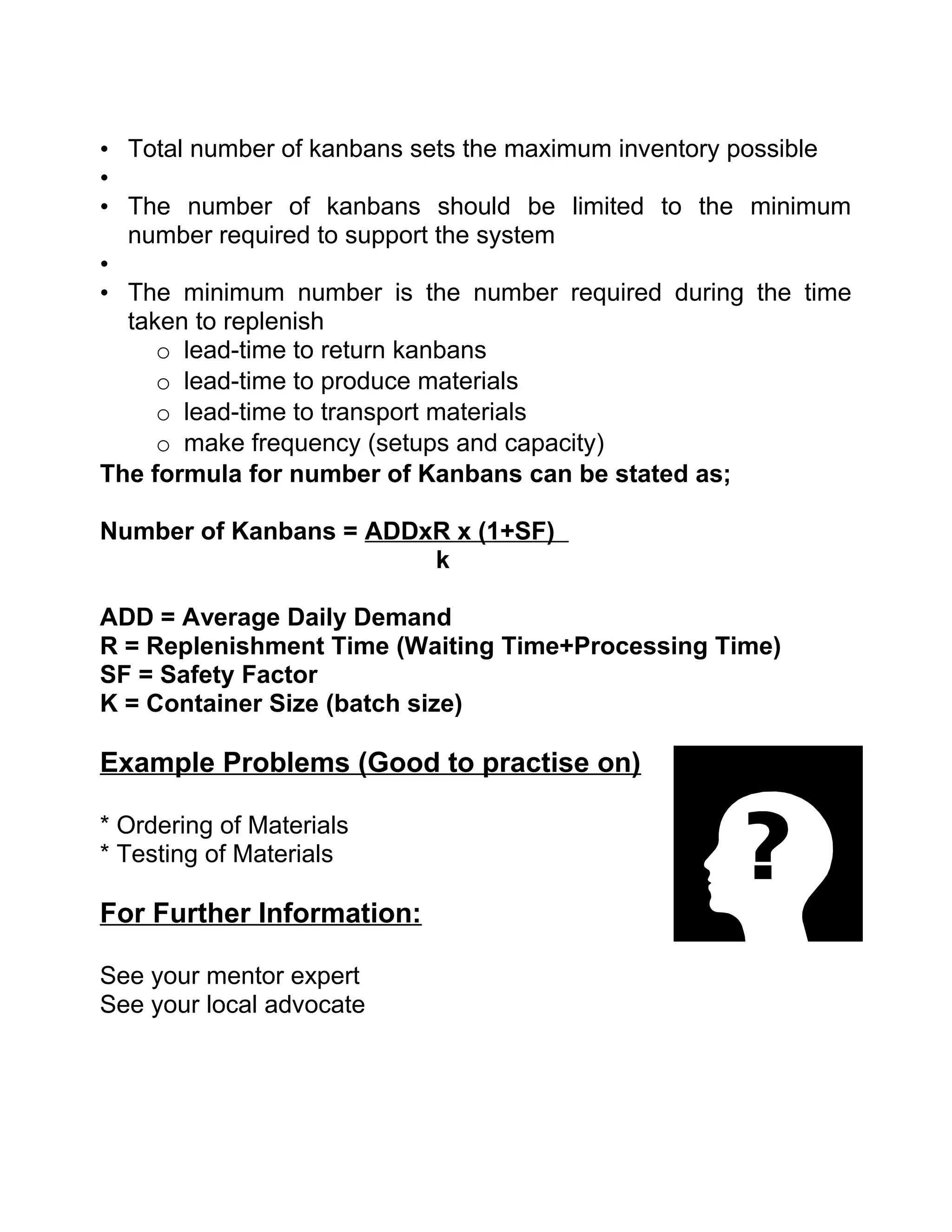
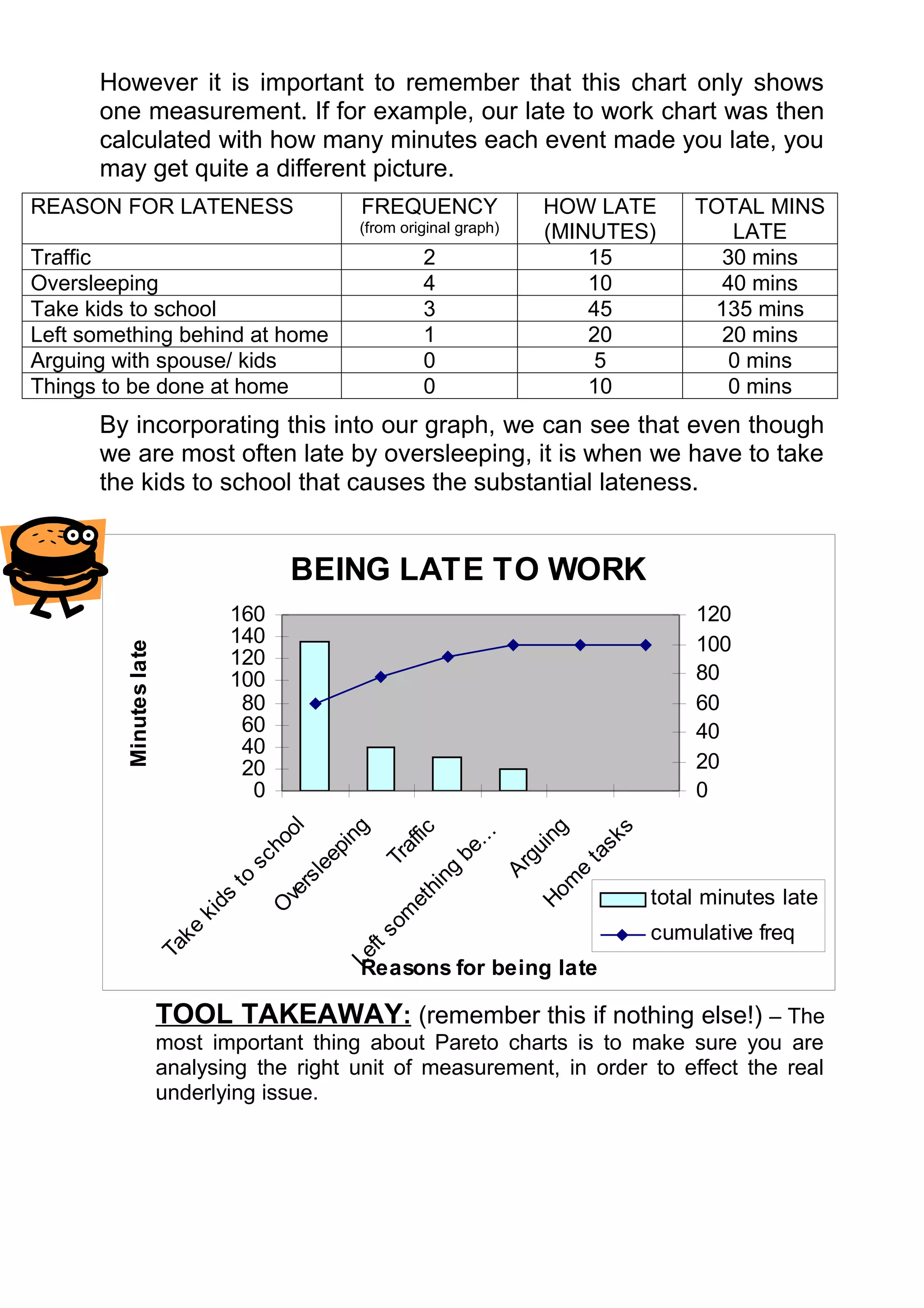
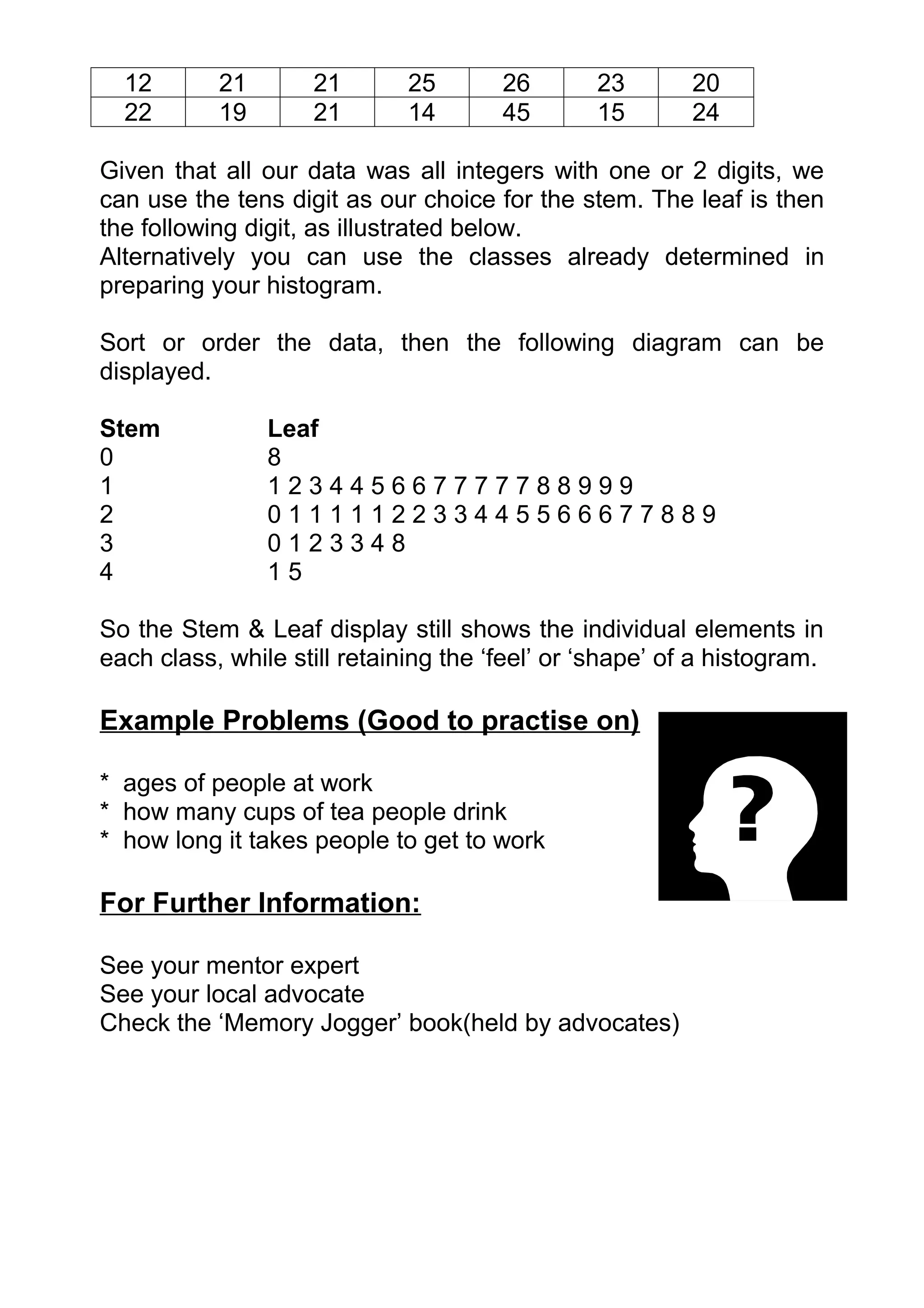
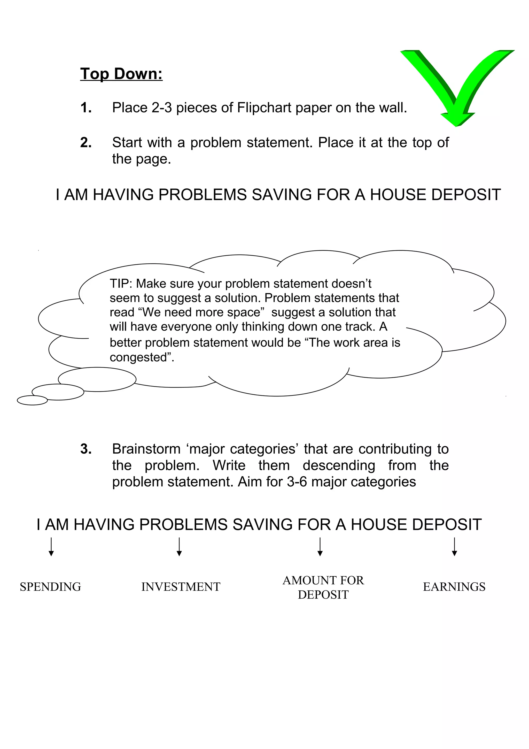
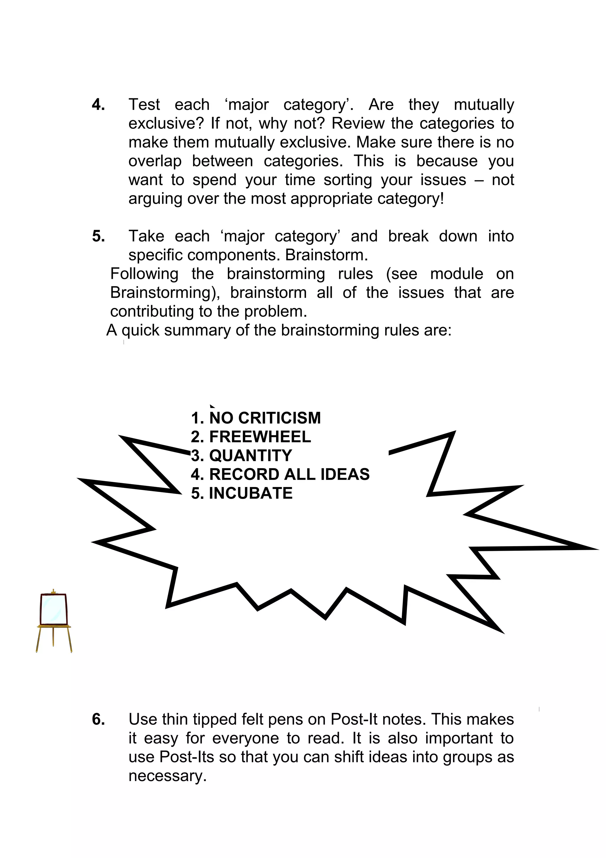
The document discusses operational excellence and provides a guidebook on key principles and tools. It begins by noting the need for organizations to improve productivity and excellence due to competitive pressures. It then discusses how operational excellence combines various theories and methodologies to achieve excellence. The guidebook aims to compile important principles and tools from various sources into a concise desktop reference to help embed an operational excellence philosophy.


![Introduction:
An FMEA asks two basic questions:
- how (i.e. in what ways) can this element fail [failure
modes]?
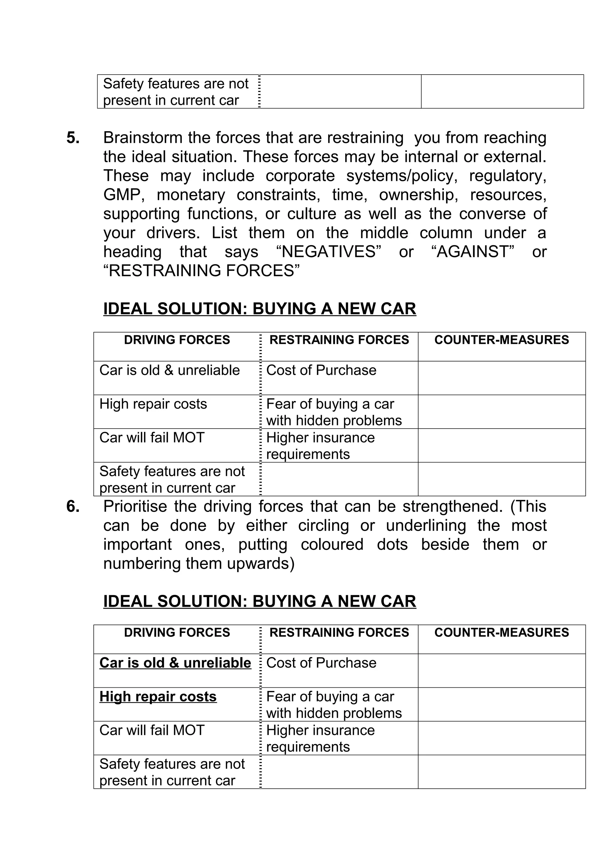
- What will happen to the system and it’s environment if this
element does fail in each of the ways available to it
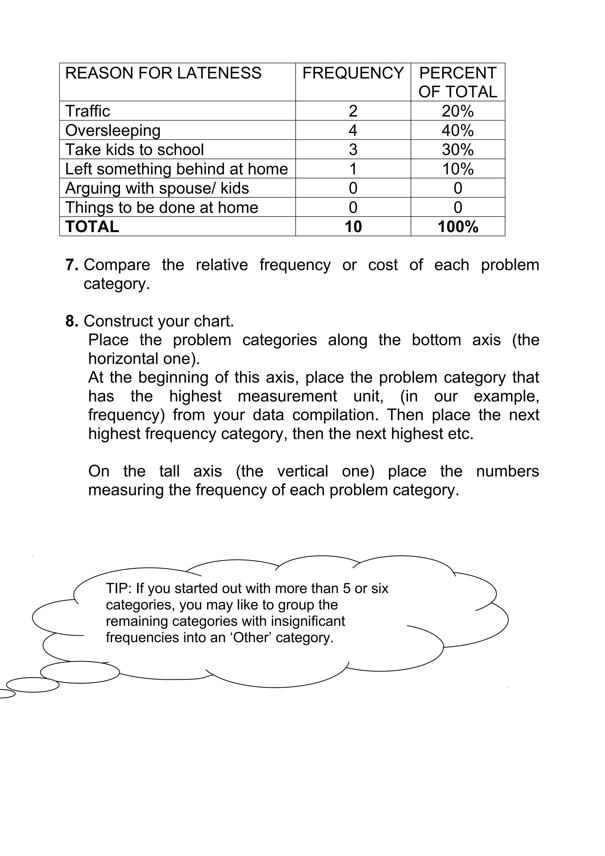
[failure effects] ?
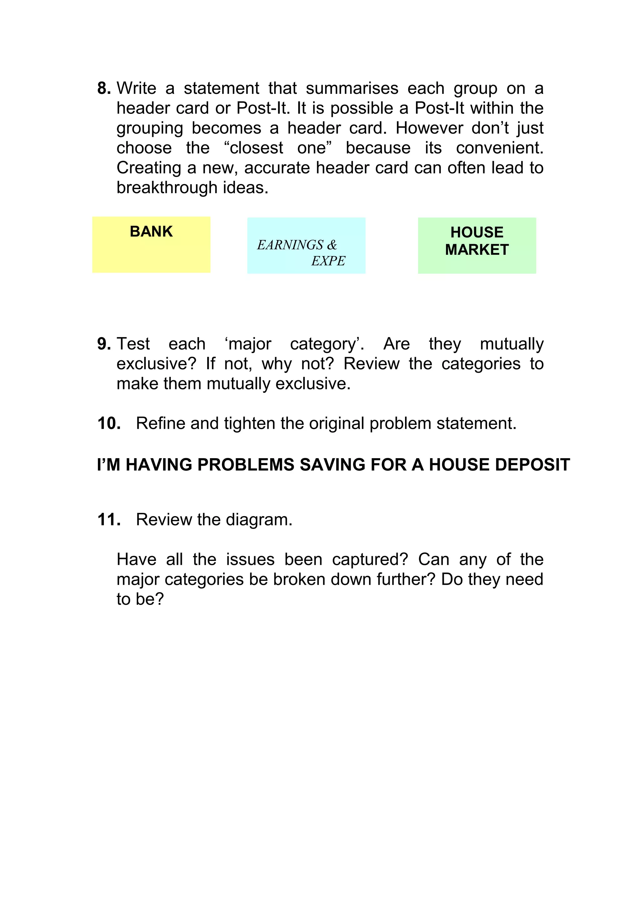
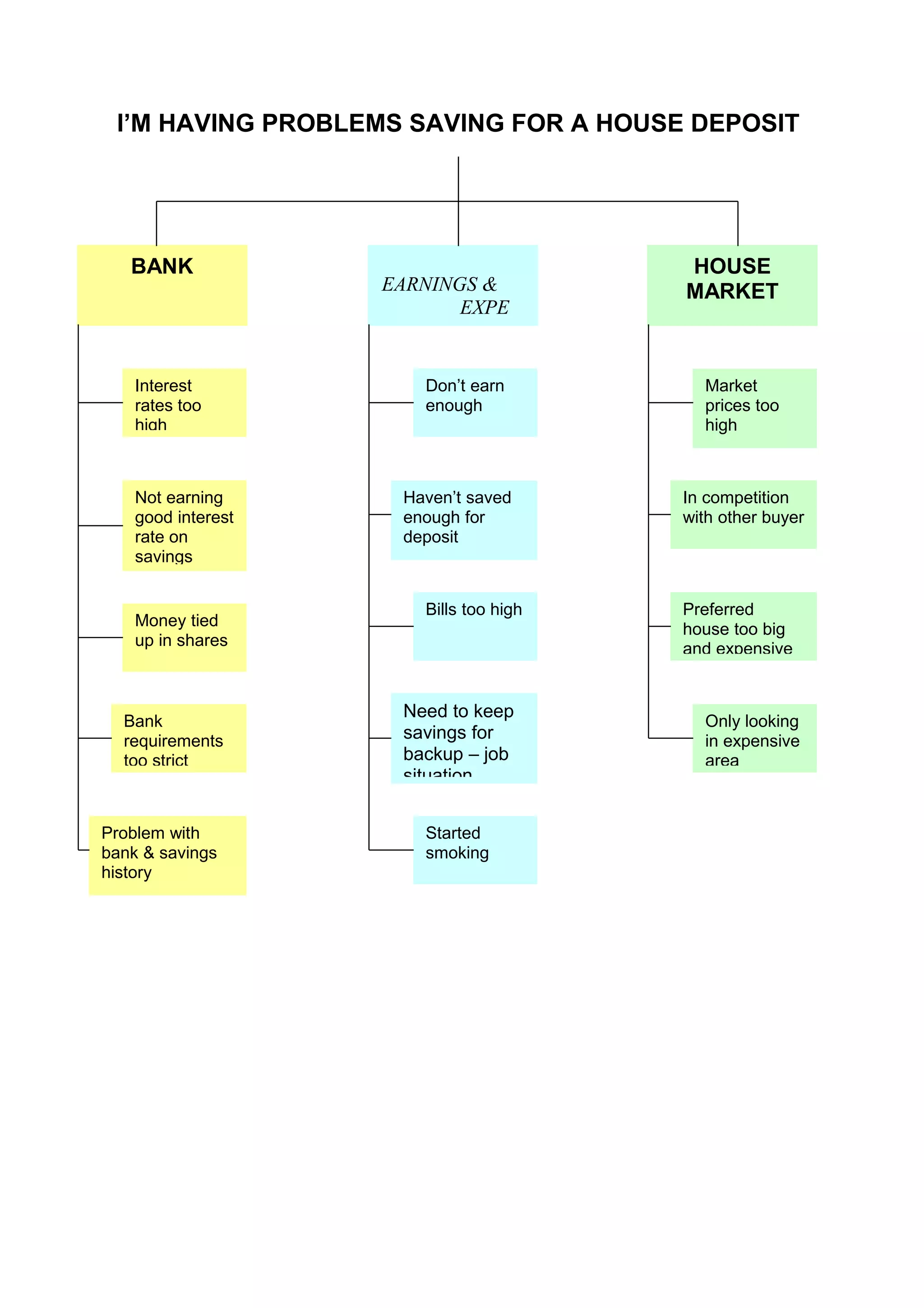
This module will mostly refer to FMEA in terms of systems or
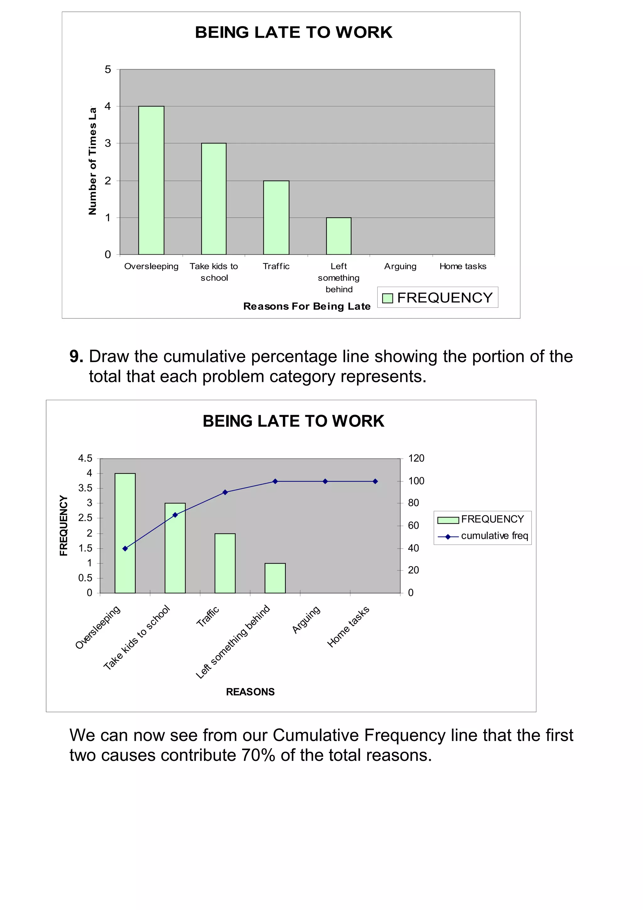
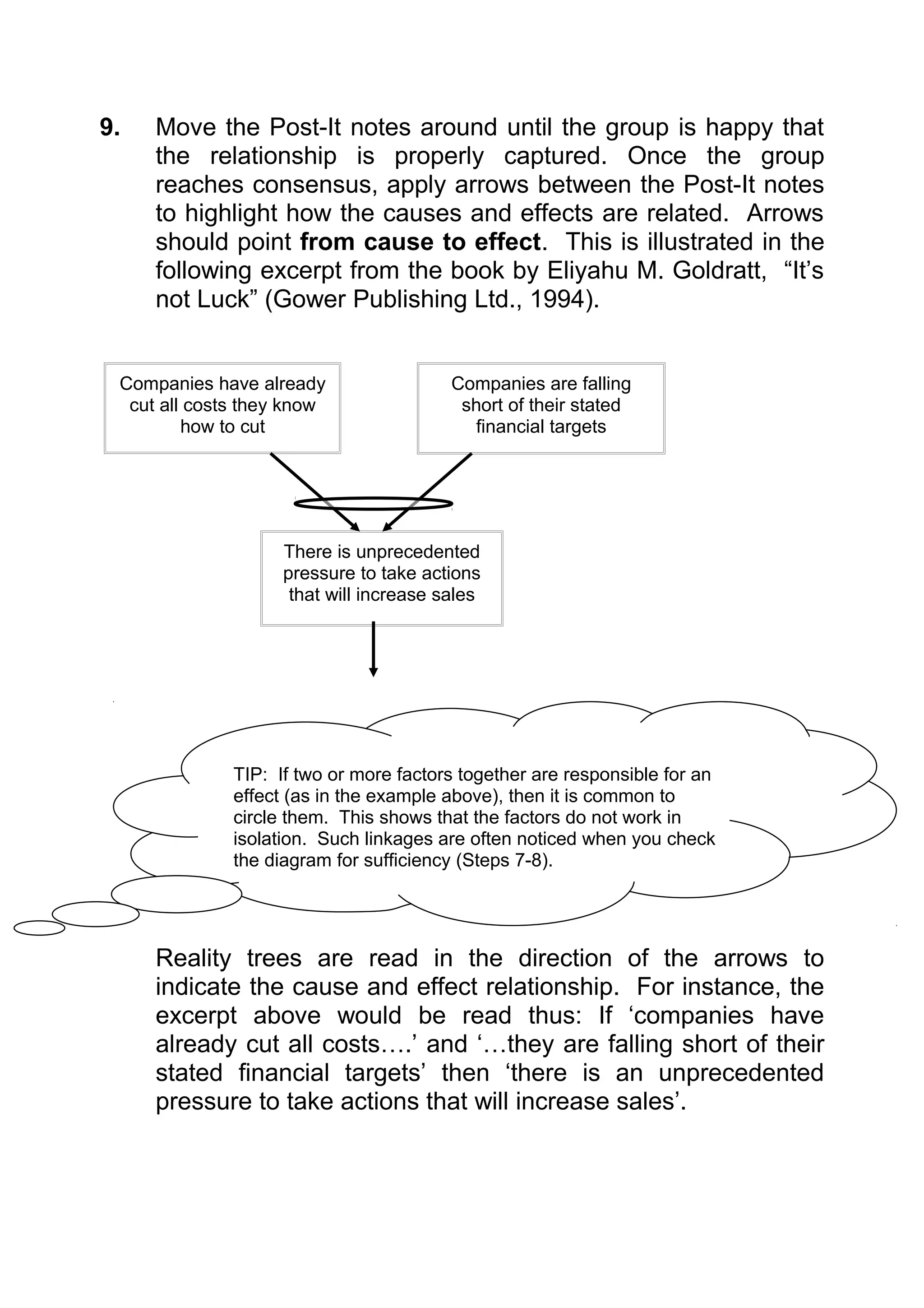
processes. However it can also be applied to any new ways of
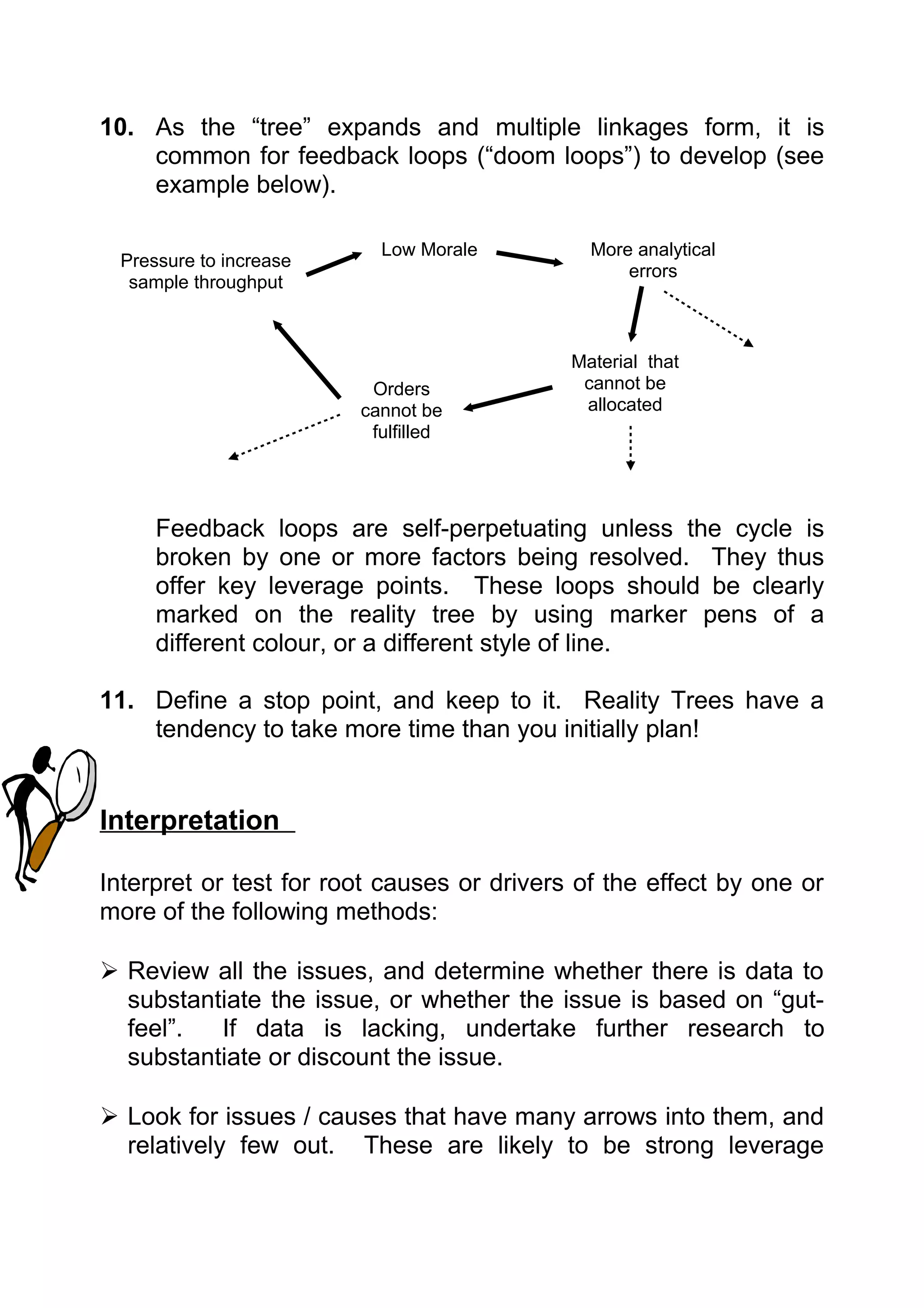
working or implementation of any change process or required
action.
FMEA looks at both potential failures and faults in a system. This
includes the systems:
- inability to function in the desired manner or operating in an
undesired manner (a fault)
- a fault or breakage, wear out, compromised construction (a
TIP: Don’t forget to include human error and
hostile environments in your analysis, as they can
often be overlooked as sources of failure modes.
failure).
A failure mode is the manner in which the fault occurs, i.e. where
or how the element fails.
Effects can be analysed in terms of each of the targets - the
effect on the inputs should it fail. These may include categories
such as personnel/ people, product or equipment.
Construction](https://image.slidesharecdn.com/lstoolsandprinciples-13500405773173-phpapp01-121012061753-phpapp01/75/Ls-Tools-And-Principles-87-2048.jpg)