SlideShare a Scribd company logo
1 of 47
Website Preparations
        Photograph Plans
 For the website there are a range of pictures that will be included. Some of
   these will be used as backgrounds for the web pages, whilst others will
                              incorporated into:
• Advertisements for the Newsletter, Tour, Album release, new hit single
and online sites such as Tumblr and Pinterest
• Additional Album and Single Covers
• Wallpapers
• Posters
• Stickers
• General Pictures
Enter Page


This picture is used for the ‘Enter Page’ however, rather than using this one picture
  by itself. I'm going to edit it to make it look more appealing as well as making it
                 blend in with the background colour of the web page.
To edit this
 picture, I used
‘Windows Photo
  Gallery’ which
was very simple
    and easy. I
     began by
   cropping the
  image so that
 the main focus
was on his face.
Next, I adjusted
   the colour to
  make it black
    and white.
Lastly, I adjusted
the exposure, to
 make it darker.
Home Page: Sign Up to
        Newsletter Advertisement


This picture will be used in order to advertise the Newsletter. It will also
  be located on various pages. Our plan, is to edit this picture using
            Instagram, and add text to it using PowerPoint.
I edited the original image using
                                                                       Instagram whereby I selected
 For this picture, I
                                                                          from a number of colour
    inserted the
                                                                               options/effects.
  shape ‘rounded
rectangle’ into the
 slide. I next filled                                                                 Effect 1 –
 it with the image.
                                                                                       Inkwell


I used the same procedure as I did above, however on this
occasion I added text to it and changed the picture style to
                     Reflected Bevel.                          Effect 2 –
                                                               Willow

 Sign Up
  & Join
 Our                                                                                    Effect 3 –
 News                                                                                   Earlybird

 Letter
Sign Up
 To our
 News Letter

We'll send you the latest updates on new releases and tour
dates, and we'll keep you posted on great new content on our
website.


For this image, I inserted the edited picture into PowerPoint and added text to
it. I also changed the picture style to create a ‘soft edge rectangle’ around the
 image. Lastly, I selected all parts of the image and grouped them in order to
                               save it as an image.
Sign Up
 To our
 News
 Letter
We'll send you the latest updates on new releases and tour
dates, and we'll keep you posted on great new content on our
website.


 For this image, I inserted the shape ‘rounded rectangle’ and filled it with the
 colour grey. Next, I inserted the edited picture into PowerPoint and changed
 the picture style to create a ‘soft edge rectangle’ around the image. In order
for the shape and the image to look like one image I had to change the colour
of the shape slightly. Next, I selected all parts of the image and grouped them
                         in order to save it as an image.
Tour Page – Stand Up Tour
           Advertisement


One of these three pictures will be used as the overall picture for his ‘Stand
Up’ tour advertisement and edited using Instagram. It will also be located on
 various pages. On the tour page, we are going to use one of the pictures
                       also as a background image.
All of these images were edited using
Instagram. The image below was edited using
 PowerPoint by increasing the brightness and
  contrast to +10% and +20%. For all the other
 images, I used Willow to begin with and then
         re-edited using other effects.


                                     Effects on Instagram
                                     1. Willow
                                     2. Willow +Earlybird
                                     3. Willow +Earlybird and shine
                                     4. Willow +Hefe
                                     5. Willow +Rise
BIG         Tour Poster: Idea
QUAN              One
             I created this image by
             using parts of image 1,
             4 and 5. I done this by
             placing each image on
                the page, over one
              another and cropping

    The
              out different parts as I
                went along. Next, I
            added text to the image,
 Stand Up   using fonts ‘Byington’ for
              his name and ‘Lucida

   Tour     Handwriting’ for the title
                    of the tour.
Tour Poster: Idea
               Two
        I created this image by
          using parts of every
        single image that I had
        edited using Instagram.
          In order to do this, I
BIG          used the same
         procedure as before.
QUAN    Next, I added text to the
            image, using font
STAND   ‘Byington’ for his name
UP            and the title.

TOUR
Tour Poster: Idea Three
                     (Final Idea)
               I created this image by using

BIG QUAN
               the image I had edited using
                 PowerPoint. Next, I altered
                 the brightness and contrast
                  to -20% in brightness and
The Stand Up      +20% in contrast. Lastly, I
                   added text to it using the
    Tour         same fonts as my previous
                idea. This consisted of fonts
                 ‘Byington’ for his name and
                 ‘Lucida Handwriting’ for the
                        title of the tour.
Tumblr Advertisement:
                  I AM BIG QUAN


   This picture is going to be used for the Tumblr Advertisement. Tumblr is a blog
  whereby you will be able to see all of Big Quan’s pictures. We intend to edit this
picture using Instagram so that there is more than one picture. It will also be located
                                  on various pages.
Image 1 & 3                          Image 2 & 4


              For these images,
                I firstly put the
              same image into a
                 collage three
              times         (Image
                 1) using Pic
                Jointer. Next, I
                 edited it using
                 Instagram. For
                 image number
              three I used colour
                 effect Willow in
               which I re-edited
              by adding Hudson
                 to make image
                  number four.
                Image number 2
                 is the same as
                   number one
                    however, I
                   changed the
              picture style using
                  PowerPoint to
               have soft edges.
My Final Choice for the Tumblr advertisement was Image number 4 which I                 re-
 edited. I like this choice for the blue effect that it added to the overall image whilst still
  appearing to be black. I inserted the image on to a lilac/grey coloured rectangle – a
 shape that I had previously inserted. Next, I added text using the font ‘Biondi’ as well
  as the Tumblr logo. Originally, I was going to make the image bigger and place the
   text around it in a curved style. However, I was unable to do it using PowerPoint.
             Lastly, I grouped all parts of the image together in order to save it.
Pinterest Advertisement


This picture was used for our enter page in which I edited using Windows Photo
 Gallery. We intend to use the same picture in the same way for the Pinterest
 advertisement but change the colour. It will also be located on various pages.
Idea One


At the top of the page is the two images, I edited using Windows Photo Gallery, for the
      enter page. Using Instagram, I edited image two using colour effects ‘Xpro’ and
   ‘Toaster’. After editing these pictures I inserted it using PowerPoint and placed them
     next to one another to make idea one. However, I didn't like the way in which they
      contrasted with one another. As a result, I made a triple image of each different
      colour effect (shown on the next slide). Next I added text to it using font ‘Lucida
                              handwriting’ and the Pinterest logo.
BQ MERCH Available Now
                    Idea Two


BQ MERCH Available Now
                    Idea Three
BQ MERCH      Idea Four
Available Now    (Final Idea)

                 I created another
                     idea for the
                      Pinterest
                   advertisement
                   however used
                 one image rather
                than three. Lastly,
                  I added the text
                  and the logo as
                     before and
                 grouped all parts
                  of the image so
                 that I can save it.
Brand New Album Release
     ‘Desire To Believe’ Advertisement


  This picture was used for our official album cover called ‘Desire To Believe. In
the advertisement we intend to use the same album cover and add text to it using
                PowerPoint. It will also be located on various pages.
New Hit Single ‘Always on My
        Mind’ Advertisement


 This picture was used on the inside cover of our official album called ‘Desire To
Believe’. In the advertisement for the hit single ‘Always On My Mind’, we intend to
use this picture, edit it using Instagram and add text to it using PowerPoint. It will
                           also be located on various pages.
Idea One & Two                                  Idea Three & Four
                 These images were edited
                   using Instagram. The
                   colour effects for each
                   image are as follows:


                  1. Valencia with shine
                  2. Valencia with shine
                     +Early bird
                  3. Willow
                  4. Willow, crop +Toaster

                     When I inserted each
                     image into the slide, I
                   changed the picture style
                       using PowerPoint.
                      These consisted of:

                  1.   Moderate Frame Black
                  2.   Reflected Bevel, Black
                  3.   Simple Frame, White
                  4.   Simple Frame, White
Final Idea
            1
  For my final idea, I chose
 Idea four because I felt the
  colour effect on the image
made it look very vintage. It
 also looked like something
you would see on the album
  covers of artists today. To
  finalise my single cover, I
added the parental advisory
and iTunes logo to signify to
   the audience the type of
    single it was as well as
      having the option to
download it on ITunes. The
   font I used for this image
         was ‘Byington’.
Final Idea
        2
    Whilst choosing
  fonts for my single
   cover, I used the
      font ‘Lucida
   handwriting’ once
 again for the name
 of the song. I made
 a second option so
that I could see how
 it would look once I
   changed the font.
Music Page: Album & Single Covers
Album
1. Desire To Believe – Picture of
    the artist                      2. Words of
2. Words of Wisdom - Words            Wisdom
3. Poetic Justice – Back to Back
    Picture of the artist

Singles
1. Always On My Mind –       (1st
    Album) Picture of Artist
2. The Truth (2nd Album) –
    Picture of Artist
3. Lyricality (2nd Album)-
    Symbols
4. Explode - (2nd Album) - An
    explosion
5. One More Time (3rd Album) –
    Picture of fingers/hands
6. Strive – (3rd Album) Colour
    with arrow or aeroplane
7. Two Roads – Picture of two
    roads
Music Page:
    Album Covers
1. ‘Desire To Believe’

        The ‘Desire To Believe’
           album cover was
        previously done for the
         digipak, therefore no
        work had to be done to
                   it.
Music Page: Album Covers
  2) ‘Words of Wisdom’

                      For the ‘Words of
                       Wisdom’ album
                       cover, I decided
                          to use only
                        letters rather


  BIG QUAN
                       than a image. I
                           started by
                          inserting a
                        square shape
  WORDS OF WISDOM      and adding text
                         to it. For his
                        name and the
                         album title, I
                        used the font
                          ‘Byington’.
Music Page: Album Covers
               3) ‘Poetic Justice’
                                  For the Poetic Justice album,
                                   we intend to use one image
                                  but reverse it to make it look
                                    like two images using the
                                  programmes Instagram and
                                            Pic Jointer.


     To begin with I made a                                        For my third idea, I used idea
 collage of two images using                                        number 2 and adjusted the
    Pic Jointer. I done this by                                       colour and exposure on
inserting two images into the                                      Windows Photo Gallery. I felt
   collage, and reversing the                                        that this idea looked very
  right image. Next I added a                                         unique and modern, so
black frame to it (idea 1) and                                      therefore chose it to be my
 then a white frame (idea 2).                                                 final idea.
Final Idea
                     1
            For this idea, I added


Big Quan
               text using the font
                ‘Byington’ for his
           name and ‘Edwardian
             script’ for the album


 Poetic
           title. Next, I added the
               Parental Advisory
                 logo so that the


 Justice
                viewer can know
            what type of album it
                        is.
Final Idea 2
                  For this idea, I used
                     the font ‘Vivaldi’
                  because I wanted to


Big Quan
                     see the how the
                   album cover would
                   look if there was a
                   variety of texts. for

Poetic Justice   the album title. Next, I
                   added the Parental
                  Advisory logo to the
                  bottom right corner,
                 so that the viewer can
                   know what type of
                       album it is.
Final Idea 3
                   For this idea, I used
                 the font ‘Bradley Hand
                 ITC’ for the album title.


Big Quan
                    Next, I added the
                 Parental Advisory logo,
                  so that the viewer can
                    know what type of

Poetic Justice
                        album it is.
Final Idea
                          4
                  For this idea, I used


Big Quan
                     the font ‘Lucida
                  Handwriting’. for the
                   album title. Next, I
                  added the Parental

Poetic Justice
                  Advisory logo to the
                  bottom right corner,
                 so that the viewer can
                   know what type of
                       album it is.
Music Page: Single
                             Covers
                     1) ‘Always On My Mind’


The same process that I applied for the new hit single advertisement, was
applied to the ‘Always On My Mind’ single cover. However, I removed the
            Parental Advisory and Download on ITunes Logo.
Music Page: Single Covers
                                    2) ‘The Truth’
                           I edited all of these images using Instagram by adding different colour effects. On
                              Image 1, I cropped it to make it landscape. I also changed the picture style to
                                           have soft edges on images 1 and 2 using PowerPoint.

Effect 1 - Willow             Effect 2 – Willow                   Effect 3 – Willow+XPro


Effect 4– Willow+Toaster        Effect 5 – Willow+Earlybird           Effect 6 – Willow+Suto
Final Idea 1
              For this idea, I used
             effects 3 to 6. I think
              overall, this concept
                 was very good
             because it was fairly


Big Quan
                creative. Next, I
             added text to it using
             the fonts, ‘Byington’
               for the album title
                  and ‘Lucida
              Handwriting’ for the
 The Truth    name of the single.
               Lastly, I added the
               Parental Advisory
               logo to the image
             and grouped all parts
             of the image in order
             to save it. Final Idea
                1 was the single
              cover that I used in
                  my website.
Final Idea 2
             For this idea, I used
              effects 3 which was
             Willow +XPro. I kept
             the same text as my


Big Quan
                 previous ideam
                which was fonts,
                ‘Byington’ for the
                 album title and
             ‘Lucida Handwriting’
              for the name of the
 The Truth       single. Lastly, I
              added the Parental
             Advisory logo to the
              image and grouped
             all parts of the image
               in order to save it.
Big Quan
                                  The Truth


                                          Final Idea 2
 For this idea, I used effect 3 which was Willow +XPro. I kept the same text as my previous idea
which was fonts, ‘Byington’ for the album title and ‘Lucida Handwriting’ for the name of the single.
Lastly, I added the Parental Advisory logo to the image and grouped all parts of the image in order
    to save it. The only difference to this picture, was changing the size of it so that it could be
Music Page: Single Covers
      3) ‘Lyricality’        The plan behind this
                                   single cover
                             Was to have symbols
                              as the background.
                              However, I liked the
                            idea of coloured lights
                            so researched this into
                            Google images. Once I


    Big Quan
                               found my image, I
                                  edited it using
                                 PowerPoint by
                                  increasing the
                              brightness to 40%.
                             After going through a
                            range of fonts, I chose
                            the font ‘Mistral’ for its
                              sophisticated style.

         Lyricality           Lastly, I added the
                            Parental Advisory logo
                                to the image and
                            grouped all parts of the
                            image in order to save
                                        it.
Music Page: Single Covers
       4) ‘Explode’
                           The plan behind this
                         single cover was to have
                            an explosion as the
                         background which linked


     Big
                        to the name of the song. I
                            researched this into
                            Google images and
                       inserted it into PowerPoint.
                           After going through a
                        range of fonts, I chose the
                             font ‘Carbon Block’
                        because it contrasted well


    Quan
                          with the image. Lastly, I
                            added the Parental
                       Advisory logo to the image
                         and grouped all parts of
                        the image in order to save
                                      it.


     explode
Music Page: Single Covers      The plan behind this
                                single cover was to
                              have hands or fingers

  5) ‘One More Chance’        as the background to
                                   signify the artist
                                 wanting one more
                               ________. However,
                            after looking on Google
                            images I found a better
                              image which was of a
                              person who had their
                                hands firmly placed
                                  behind a blurred
                               screen. I thought this
                                image looked really
                                   effective and so
                                    inserted it into
                               PowerPoint. I chose


      Big Quan
                                   the font ‘Biondi’
                               because it was bold
                            and was straight to the
                                 point – just like the
                                name of the single.
       One more chance           Lastly, I added the
                             Parental Advisory logo
                                  to the image and
                            grouped all parts of the
                             image in order to save
                                           it.
Music Page: Single
     Covers          The plan behind this single
                        cover was to have either


    6) ‘Strive’
                                arrows or an
                         aeroplane in the sky as
                             the background to
                            emphasise the word
                        ‘strive’ – meaning in this
                           context reaching for a


 Big Quan                    goal. I researched
                        ‘aeroplanes’ into Google
                       images yet found nothing
                          great. Adding the word

      STRIVE
                         ‘Tumblr’ to it resulted in
                       many more images which
                     is how I found this image. I
                      chose the fonts ‘Neuropol’
                        for his name and ‘Biondi’
                       for the name of the single
                     because it reminded me of
                          the big bold letters you
                        would normally see on a
                      aeroplane. Lastly, I added
                      the Parental Advisory logo
                      to the image and grouped
                         all parts of the image in
                              order to save it.
Music Page: Single
      Covers           The plan behind this single
                           cover was to have two

 7) ‘Two Roads’              lonely roads as the
                         background image which
                     would link with the single title.
                        The image I imagined was
                         not one that came up on
                        Google images. However
                        after a while of searching I
                       came across rail way tracks
                       that had a sepia effect to it.
                       Using PowerPoint I added a


  Big Quan
                        border around the image.
                       Next, I added text to it using
                          the fonts ‘Neuropol’ but
                     positioned it in various places
                      before choosing to have it in
       Two roads      the middle. I still felt that this
                      idea as a whole wasn’t good
                      enough so I therefore added
                          a border to it which I felt
                      looked quite effective. Lastly,
                     I added the Parental Advisory
                           logo to the image and
                          grouped all parts of the
                         image in order to save it.
Store Page: Posters, Wallpapers &
             Calenders


For the posters and wallpapers, I used photographs that the      Colour Effects on Instagram
other members of my group had taken in front of the green        1. Inkwell
screen. Using Pic Jointer, I made a number of collages that      2. Inkwell +Toaster
consisted of 2 and three images that differed in various ways.   3. Inkwell +Sierra
I also edited one particular image using Instagram by            4. Willow
changing the colour effect (shown above).                        5. Willow +Toaster (and cropped)
Big Quan             Final Idea
                             1
                         My first idea
                     consisted of parts
                    of images 1, 2 and
                    3. I created this by
                    placing each image
                        on top of one
                         another and
                     cropping the parts
                     that I didn’t want,
                     out. Next, I added
                      text to the image
                        using the font
                    ‘Byington’. Lastly, I
                    selected all parts of
                       the image and
                    grouped it, in order

    2013 Calender         to save it.
Big Quan          Final Idea 2
                       My first idea
                    consisted of parts
                  of images 5 which I
                      enlarged to the
                  size of my previous
                  idea. Next, I added
                    text to the image
                      using the same
                  font as my last idea
                   - ‘Byington’. Lastly,
                   I selected all parts
                    of the image and
                  grouped it, in order
                         to save it.


           2013
      Calendar

More Related Content

What's hot

Evalution question 4
Evalution question 4Evalution question 4
Evalution question 4AmazonRose
 
4. Production Experiments fmp
4. Production Experiments fmp4. Production Experiments fmp
4. Production Experiments fmpLibby Whitehorn
 
Question 4 media evaluation
Question 4 media evaluationQuestion 4 media evaluation
Question 4 media evaluationlibbyardley
 
Poster production
Poster productionPoster production
Poster productionnecizzle
 
Media evaluation question 4
Media evaluation question 4Media evaluation question 4
Media evaluation question 4sibsz
 
A2 media posterconstruction
A2 media posterconstructionA2 media posterconstruction
A2 media posterconstructionCharlotte Burton
 
Poster technical skills
Poster technical skillsPoster technical skills
Poster technical skillskjnnict
 
DII front cover 3rd draft
DII front cover   3rd draftDII front cover   3rd draft
DII front cover 3rd draftAiWhitehouse
 
Ancillary poster (steps) production log 12
Ancillary poster (steps) production log 12Ancillary poster (steps) production log 12
Ancillary poster (steps) production log 12Rubenm2
 
Digipak Recreations
Digipak RecreationsDigipak Recreations
Digipak Recreationsella potton
 
Evaluation of unit 21 animation (2)fsf
Evaluation of unit 21 animation (2)fsfEvaluation of unit 21 animation (2)fsf
Evaluation of unit 21 animation (2)fsfaigmu
 
6. production reflection
6. production reflection6. production reflection
6. production reflectionMedia Studies
 
Evaluation question 4
Evaluation question 4 Evaluation question 4
Evaluation question 4 symonaguilar
 
Construction dvd cover...
Construction dvd cover...Construction dvd cover...
Construction dvd cover...salaffina
 
Poster Making
Poster MakingPoster Making
Poster Makingheather96
 

What's hot (20)

Evalution question 4
Evalution question 4Evalution question 4
Evalution question 4
 
4. Production Experiments fmp
4. Production Experiments fmp4. Production Experiments fmp
4. Production Experiments fmp
 
Question 4 media evaluation
Question 4 media evaluationQuestion 4 media evaluation
Question 4 media evaluation
 
Poster production
Poster productionPoster production
Poster production
 
Media evaluation question 4
Media evaluation question 4Media evaluation question 4
Media evaluation question 4
 
A2 media posterconstruction
A2 media posterconstructionA2 media posterconstruction
A2 media posterconstruction
 
Dev diary
Dev diaryDev diary
Dev diary
 
Poster technical skills
Poster technical skillsPoster technical skills
Poster technical skills
 
Post production diary
Post production diaryPost production diary
Post production diary
 
DII front cover 3rd draft
DII front cover   3rd draftDII front cover   3rd draft
DII front cover 3rd draft
 
Ancillary poster (steps) production log 12
Ancillary poster (steps) production log 12Ancillary poster (steps) production log 12
Ancillary poster (steps) production log 12
 
Digipak Recreations
Digipak RecreationsDigipak Recreations
Digipak Recreations
 
Evaluation of unit 21 animation (2)fsf
Evaluation of unit 21 animation (2)fsfEvaluation of unit 21 animation (2)fsf
Evaluation of unit 21 animation (2)fsf
 
6. production reflection
6. production reflection6. production reflection
6. production reflection
 
Problem solving 2019 fmp
Problem solving 2019 fmpProblem solving 2019 fmp
Problem solving 2019 fmp
 
Evaluation question 4
Evaluation question 4 Evaluation question 4
Evaluation question 4
 
Construction dvd cover...
Construction dvd cover...Construction dvd cover...
Construction dvd cover...
 
Image manipulation
Image manipulation Image manipulation
Image manipulation
 
Poster Making
Poster MakingPoster Making
Poster Making
 
Question 4
Question 4Question 4
Question 4
 

Viewers also liked

Assignment 1 - Case Study. Web 2 Tools
Assignment 1 - Case Study. Web 2 ToolsAssignment 1 - Case Study. Web 2 Tools
Assignment 1 - Case Study. Web 2 ToolsPilgim
 
Question 3 - Part 2
Question 3 - Part 2Question 3 - Part 2
Question 3 - Part 2LarelleShay
 
Working capital management (1)
Working capital management (1)Working capital management (1)
Working capital management (1)ajesh Reddy
 
Back To Basics Recruiting New Recruiter Training
Back To Basics Recruiting   New Recruiter TrainingBack To Basics Recruiting   New Recruiter Training
Back To Basics Recruiting New Recruiter Trainingmdubois2010
 
CV (October 2015)
CV (October 2015)CV (October 2015)
CV (October 2015)Diana North
 
Bw resume 2013 share
Bw resume 2013 shareBw resume 2013 share
Bw resume 2013 shareBrian Wilson
 
Crear una-cuenta-en-slideshare-1222948756873100-9
Crear una-cuenta-en-slideshare-1222948756873100-9Crear una-cuenta-en-slideshare-1222948756873100-9
Crear una-cuenta-en-slideshare-1222948756873100-9martha oakes murillo
 
Aula 2 ucam jpa 2013 - redes sociais
Aula 2   ucam jpa 2013 - redes sociaisAula 2   ucam jpa 2013 - redes sociais
Aula 2 ucam jpa 2013 - redes sociaisAngelo Peres
 
Music record companies
Music record companiesMusic record companies
Music record companiesAlice Bywater
 
Hiria Smart Cities Summit 2013
Hiria Smart Cities Summit 2013Hiria Smart Cities Summit 2013
Hiria Smart Cities Summit 2013Vinnicius Vieira
 
Poesia La Astronauta
Poesia La AstronautaPoesia La Astronauta
Poesia La Astronautamonicatenza
 
automatic transmission
 automatic transmission automatic transmission
automatic transmissionAjinkya patil
 
Social enterprise business by and for the community
Social enterprise   business by and for the communitySocial enterprise   business by and for the community
Social enterprise business by and for the communityTim Maxwell
 
Power plus distribution new
Power plus distribution newPower plus distribution new
Power plus distribution newShivansh Tyagi
 

Viewers also liked (20)

Assignment 1 - Case Study. Web 2 Tools
Assignment 1 - Case Study. Web 2 ToolsAssignment 1 - Case Study. Web 2 Tools
Assignment 1 - Case Study. Web 2 Tools
 
Floor Plan
Floor PlanFloor Plan
Floor Plan
 
Question 3 - Part 2
Question 3 - Part 2Question 3 - Part 2
Question 3 - Part 2
 
Working capital management (1)
Working capital management (1)Working capital management (1)
Working capital management (1)
 
Back To Basics Recruiting New Recruiter Training
Back To Basics Recruiting   New Recruiter TrainingBack To Basics Recruiting   New Recruiter Training
Back To Basics Recruiting New Recruiter Training
 
CV (October 2015)
CV (October 2015)CV (October 2015)
CV (October 2015)
 
Bw resume 2013 share
Bw resume 2013 shareBw resume 2013 share
Bw resume 2013 share
 
Crear una-cuenta-en-slideshare-1222948756873100-9
Crear una-cuenta-en-slideshare-1222948756873100-9Crear una-cuenta-en-slideshare-1222948756873100-9
Crear una-cuenta-en-slideshare-1222948756873100-9
 
Aula 2 ucam jpa 2013 - redes sociais
Aula 2   ucam jpa 2013 - redes sociaisAula 2   ucam jpa 2013 - redes sociais
Aula 2 ucam jpa 2013 - redes sociais
 
the curious girl
the curious girlthe curious girl
the curious girl
 
Music record companies
Music record companiesMusic record companies
Music record companies
 
Hiria Smart Cities Summit 2013
Hiria Smart Cities Summit 2013Hiria Smart Cities Summit 2013
Hiria Smart Cities Summit 2013
 
Ap1_dBLab-2012_en-v01
Ap1_dBLab-2012_en-v01Ap1_dBLab-2012_en-v01
Ap1_dBLab-2012_en-v01
 
Poesia La Astronauta
Poesia La AstronautaPoesia La Astronauta
Poesia La Astronauta
 
Kemenpan Outreach Strategi (Draft) 2013-2014
Kemenpan Outreach Strategi (Draft) 2013-2014Kemenpan Outreach Strategi (Draft) 2013-2014
Kemenpan Outreach Strategi (Draft) 2013-2014
 
Train13 share
Train13 shareTrain13 share
Train13 share
 
automatic transmission
 automatic transmission automatic transmission
automatic transmission
 
Plan de estudio cátedra: Taller de medios digitales
Plan de estudio cátedra: Taller de medios digitalesPlan de estudio cátedra: Taller de medios digitales
Plan de estudio cátedra: Taller de medios digitales
 
Social enterprise business by and for the community
Social enterprise   business by and for the communitySocial enterprise   business by and for the community
Social enterprise business by and for the community
 
Power plus distribution new
Power plus distribution newPower plus distribution new
Power plus distribution new
 

Similar to Website Preparations - Photograph Plans

Supporting Piece Process
Supporting Piece ProcessSupporting Piece Process
Supporting Piece Processzoewoodbridge
 
Step by step construction of double spread page (DPS)
Step by step construction of double spread page (DPS)Step by step construction of double spread page (DPS)
Step by step construction of double spread page (DPS)GKaur18
 
Photoshop stages
Photoshop stagesPhotoshop stages
Photoshop stagesmoniday
 
6. production reflection(3)
6. production reflection(3)6. production reflection(3)
6. production reflection(3)aliceleeman
 
Stages of Production - Double Page Spread Article
Stages of Production - Double Page Spread ArticleStages of Production - Double Page Spread Article
Stages of Production - Double Page Spread ArticleGregoryMcLaney
 
Chosen i mages one
Chosen i mages oneChosen i mages one
Chosen i mages onearnellgrace
 
Techniques powerpoint
Techniques powerpointTechniques powerpoint
Techniques powerpointbeckyyoungs
 
Photoshop Process
Photoshop ProcessPhotoshop Process
Photoshop Processjaimiesian
 
Producing the contents
Producing the contentsProducing the contents
Producing the contentsBen Thatcher
 
Contents page production log
Contents page production logContents page production log
Contents page production loglilflickmania
 
Construction
ConstructionConstruction
Constructionsalaffina
 
Magazine Advertisement Development Diary
Magazine Advertisement Development DiaryMagazine Advertisement Development Diary
Magazine Advertisement Development Diarysamjewiss
 
Construction magazine
Construction magazineConstruction magazine
Construction magazineFahmida Begum
 
Construction magazine
Construction magazineConstruction magazine
Construction magazineFahmida Begum
 
First initial construction of mag advert
First initial construction of mag advertFirst initial construction of mag advert
First initial construction of mag advertfelicityputman
 
Music Magazine Construction
Music Magazine ConstructionMusic Magazine Construction
Music Magazine ConstructionAdella1
 

Similar to Website Preparations - Photograph Plans (20)

Supporting Piece Process
Supporting Piece ProcessSupporting Piece Process
Supporting Piece Process
 
Step by step construction of double spread page (DPS)
Step by step construction of double spread page (DPS)Step by step construction of double spread page (DPS)
Step by step construction of double spread page (DPS)
 
Photoshop stages
Photoshop stagesPhotoshop stages
Photoshop stages
 
6. production reflection(3)
6. production reflection(3)6. production reflection(3)
6. production reflection(3)
 
Stages of Production - Double Page Spread Article
Stages of Production - Double Page Spread ArticleStages of Production - Double Page Spread Article
Stages of Production - Double Page Spread Article
 
Chosen i mages one
Chosen i mages oneChosen i mages one
Chosen i mages one
 
Techniques powerpoint
Techniques powerpointTechniques powerpoint
Techniques powerpoint
 
Q6
Q6Q6
Q6
 
Photoshop Process
Photoshop ProcessPhotoshop Process
Photoshop Process
 
Producing the contents
Producing the contentsProducing the contents
Producing the contents
 
Presentation2
Presentation2Presentation2
Presentation2
 
Contents page production log
Contents page production logContents page production log
Contents page production log
 
Construction
ConstructionConstruction
Construction
 
Magazine Advertisement Development Diary
Magazine Advertisement Development DiaryMagazine Advertisement Development Diary
Magazine Advertisement Development Diary
 
Construction magazine
Construction magazineConstruction magazine
Construction magazine
 
Construction magazine
Construction magazineConstruction magazine
Construction magazine
 
First initial construction of mag advert
First initial construction of mag advertFirst initial construction of mag advert
First initial construction of mag advert
 
Editing my images
Editing my imagesEditing my images
Editing my images
 
Music Magazine Construction
Music Magazine ConstructionMusic Magazine Construction
Music Magazine Construction
 
Q6
Q6 Q6
Q6
 

More from LarelleShay

Music Video Analysis
Music Video AnalysisMusic Video Analysis
Music Video AnalysisLarelleShay
 
Andrew Goodwin Theory
Andrew Goodwin TheoryAndrew Goodwin Theory
Andrew Goodwin TheoryLarelleShay
 
Evaluation of a2 students media website
Evaluation of a2 students media websiteEvaluation of a2 students media website
Evaluation of a2 students media websiteLarelleShay
 
Evaluation of A2 Students Media Website
Evaluation of A2 Students Media WebsiteEvaluation of A2 Students Media Website
Evaluation of A2 Students Media WebsiteLarelleShay
 
Evaluation of a2 students media website
Evaluation of a2 students media websiteEvaluation of a2 students media website
Evaluation of a2 students media websiteLarelleShay
 
History of music videos
History of music videosHistory of music videos
History of music videosLarelleShay
 
Media construction steps
Media construction stepsMedia construction steps
Media construction stepsLarelleShay
 
Photo plan for digipack
Photo plan for digipackPhoto plan for digipack
Photo plan for digipackLarelleShay
 
Media Construction steps
Media Construction stepsMedia Construction steps
Media Construction stepsLarelleShay
 
Questionnair results question 3
Questionnair results  question 3Questionnair results  question 3
Questionnair results question 3LarelleShay
 
Website Research - Analysis of Genre Websites
Website Research - Analysis of Genre WebsitesWebsite Research - Analysis of Genre Websites
Website Research - Analysis of Genre WebsitesLarelleShay
 
Website Research - Analysis of Genre Websites
Website Research - Analysis of Genre WebsitesWebsite Research - Analysis of Genre Websites
Website Research - Analysis of Genre WebsitesLarelleShay
 
Website research 2
Website research 2Website research 2
Website research 2LarelleShay
 
Website research 2
Website research 2Website research 2
Website research 2LarelleShay
 
Website Research
Website ResearchWebsite Research
Website ResearchLarelleShay
 
Digipak Analysis
Digipak AnalysisDigipak Analysis
Digipak AnalysisLarelleShay
 
Page Flow Diagram
Page Flow Diagram Page Flow Diagram
Page Flow Diagram LarelleShay
 

More from LarelleShay (20)

Music Video Analysis
Music Video AnalysisMusic Video Analysis
Music Video Analysis
 
Andrew Goodwin Theory
Andrew Goodwin TheoryAndrew Goodwin Theory
Andrew Goodwin Theory
 
Filming pics
Filming picsFilming pics
Filming pics
 
Evaluation of a2 students media website
Evaluation of a2 students media websiteEvaluation of a2 students media website
Evaluation of a2 students media website
 
Evaluation of A2 Students Media Website
Evaluation of A2 Students Media WebsiteEvaluation of A2 Students Media Website
Evaluation of A2 Students Media Website
 
Evaluation of a2 students media website
Evaluation of a2 students media websiteEvaluation of a2 students media website
Evaluation of a2 students media website
 
History of music videos
History of music videosHistory of music videos
History of music videos
 
Media construction steps
Media construction stepsMedia construction steps
Media construction steps
 
Photo plan for digipack
Photo plan for digipackPhoto plan for digipack
Photo plan for digipack
 
Media Construction steps
Media Construction stepsMedia Construction steps
Media Construction steps
 
Questionnair results question 3
Questionnair results  question 3Questionnair results  question 3
Questionnair results question 3
 
Filming pics
Filming picsFilming pics
Filming pics
 
Website Research - Analysis of Genre Websites
Website Research - Analysis of Genre WebsitesWebsite Research - Analysis of Genre Websites
Website Research - Analysis of Genre Websites
 
Website Research - Analysis of Genre Websites
Website Research - Analysis of Genre WebsitesWebsite Research - Analysis of Genre Websites
Website Research - Analysis of Genre Websites
 
Website research 2
Website research 2Website research 2
Website research 2
 
Website research 2
Website research 2Website research 2
Website research 2
 
Website Research
Website ResearchWebsite Research
Website Research
 
Digipak Analysis
Digipak AnalysisDigipak Analysis
Digipak Analysis
 
Page Flow Diagram
Page Flow Diagram Page Flow Diagram
Page Flow Diagram
 
Artist Logo
Artist LogoArtist Logo
Artist Logo
 

Website Preparations - Photograph Plans

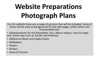
  • 1. Website Preparations Photograph Plans For the website there are a range of pictures that will be included. Some of these will be used as backgrounds for the web pages, whilst others will incorporated into: • Advertisements for the Newsletter, Tour, Album release, new hit single and online sites such as Tumblr and Pinterest • Additional Album and Single Covers • Wallpapers • Posters • Stickers • General Pictures
  • 2. Enter Page This picture is used for the ‘Enter Page’ however, rather than using this one picture by itself. I'm going to edit it to make it look more appealing as well as making it blend in with the background colour of the web page.
  • 3. To edit this picture, I used ‘Windows Photo Gallery’ which was very simple and easy. I began by cropping the image so that the main focus was on his face. Next, I adjusted the colour to make it black and white. Lastly, I adjusted the exposure, to make it darker.
  • 4. Home Page: Sign Up to Newsletter Advertisement This picture will be used in order to advertise the Newsletter. It will also be located on various pages. Our plan, is to edit this picture using Instagram, and add text to it using PowerPoint.
  • 5. I edited the original image using Instagram whereby I selected For this picture, I from a number of colour inserted the options/effects. shape ‘rounded rectangle’ into the slide. I next filled Effect 1 – it with the image. Inkwell I used the same procedure as I did above, however on this occasion I added text to it and changed the picture style to Reflected Bevel. Effect 2 – Willow Sign Up & Join Our Effect 3 – News Earlybird Letter
  • 6. Sign Up To our News Letter We'll send you the latest updates on new releases and tour dates, and we'll keep you posted on great new content on our website. For this image, I inserted the edited picture into PowerPoint and added text to it. I also changed the picture style to create a ‘soft edge rectangle’ around the image. Lastly, I selected all parts of the image and grouped them in order to save it as an image.
  • 7. Sign Up To our News Letter We'll send you the latest updates on new releases and tour dates, and we'll keep you posted on great new content on our website. For this image, I inserted the shape ‘rounded rectangle’ and filled it with the colour grey. Next, I inserted the edited picture into PowerPoint and changed the picture style to create a ‘soft edge rectangle’ around the image. In order for the shape and the image to look like one image I had to change the colour of the shape slightly. Next, I selected all parts of the image and grouped them in order to save it as an image.
  • 8. Tour Page – Stand Up Tour Advertisement One of these three pictures will be used as the overall picture for his ‘Stand Up’ tour advertisement and edited using Instagram. It will also be located on various pages. On the tour page, we are going to use one of the pictures also as a background image.
  • 9. All of these images were edited using Instagram. The image below was edited using PowerPoint by increasing the brightness and contrast to +10% and +20%. For all the other images, I used Willow to begin with and then re-edited using other effects. Effects on Instagram 1. Willow 2. Willow +Earlybird 3. Willow +Earlybird and shine 4. Willow +Hefe 5. Willow +Rise
  • 10. BIG Tour Poster: Idea QUAN One I created this image by using parts of image 1, 4 and 5. I done this by placing each image on the page, over one another and cropping The out different parts as I went along. Next, I added text to the image, Stand Up using fonts ‘Byington’ for his name and ‘Lucida Tour Handwriting’ for the title of the tour.
  • 11. Tour Poster: Idea Two I created this image by using parts of every single image that I had edited using Instagram. In order to do this, I BIG used the same procedure as before. QUAN Next, I added text to the image, using font STAND ‘Byington’ for his name UP and the title. TOUR
  • 12. Tour Poster: Idea Three (Final Idea) I created this image by using BIG QUAN the image I had edited using PowerPoint. Next, I altered the brightness and contrast to -20% in brightness and The Stand Up +20% in contrast. Lastly, I added text to it using the Tour same fonts as my previous idea. This consisted of fonts ‘Byington’ for his name and ‘Lucida Handwriting’ for the title of the tour.
  • 13. Tumblr Advertisement: I AM BIG QUAN This picture is going to be used for the Tumblr Advertisement. Tumblr is a blog whereby you will be able to see all of Big Quan’s pictures. We intend to edit this picture using Instagram so that there is more than one picture. It will also be located on various pages.
  • 14. Image 1 & 3 Image 2 & 4 For these images, I firstly put the same image into a collage three times (Image 1) using Pic Jointer. Next, I edited it using Instagram. For image number three I used colour effect Willow in which I re-edited by adding Hudson to make image number four. Image number 2 is the same as number one however, I changed the picture style using PowerPoint to have soft edges.
  • 15. My Final Choice for the Tumblr advertisement was Image number 4 which I re- edited. I like this choice for the blue effect that it added to the overall image whilst still appearing to be black. I inserted the image on to a lilac/grey coloured rectangle – a shape that I had previously inserted. Next, I added text using the font ‘Biondi’ as well as the Tumblr logo. Originally, I was going to make the image bigger and place the text around it in a curved style. However, I was unable to do it using PowerPoint. Lastly, I grouped all parts of the image together in order to save it.
  • 16. Pinterest Advertisement This picture was used for our enter page in which I edited using Windows Photo Gallery. We intend to use the same picture in the same way for the Pinterest advertisement but change the colour. It will also be located on various pages.
  • 17. Idea One At the top of the page is the two images, I edited using Windows Photo Gallery, for the enter page. Using Instagram, I edited image two using colour effects ‘Xpro’ and ‘Toaster’. After editing these pictures I inserted it using PowerPoint and placed them next to one another to make idea one. However, I didn't like the way in which they contrasted with one another. As a result, I made a triple image of each different colour effect (shown on the next slide). Next I added text to it using font ‘Lucida handwriting’ and the Pinterest logo.
  • 18. BQ MERCH Available Now Idea Two BQ MERCH Available Now Idea Three
  • 19. BQ MERCH Idea Four Available Now (Final Idea) I created another idea for the Pinterest advertisement however used one image rather than three. Lastly, I added the text and the logo as before and grouped all parts of the image so that I can save it.
  • 20. Brand New Album Release ‘Desire To Believe’ Advertisement This picture was used for our official album cover called ‘Desire To Believe. In the advertisement we intend to use the same album cover and add text to it using PowerPoint. It will also be located on various pages.
  • 21.
  • 22. New Hit Single ‘Always on My Mind’ Advertisement This picture was used on the inside cover of our official album called ‘Desire To Believe’. In the advertisement for the hit single ‘Always On My Mind’, we intend to use this picture, edit it using Instagram and add text to it using PowerPoint. It will also be located on various pages.
  • 23. Idea One & Two Idea Three & Four These images were edited using Instagram. The colour effects for each image are as follows: 1. Valencia with shine 2. Valencia with shine +Early bird 3. Willow 4. Willow, crop +Toaster When I inserted each image into the slide, I changed the picture style using PowerPoint. These consisted of: 1. Moderate Frame Black 2. Reflected Bevel, Black 3. Simple Frame, White 4. Simple Frame, White
  • 24. Final Idea 1 For my final idea, I chose Idea four because I felt the colour effect on the image made it look very vintage. It also looked like something you would see on the album covers of artists today. To finalise my single cover, I added the parental advisory and iTunes logo to signify to the audience the type of single it was as well as having the option to download it on ITunes. The font I used for this image was ‘Byington’.
  • 25. Final Idea 2 Whilst choosing fonts for my single cover, I used the font ‘Lucida handwriting’ once again for the name of the song. I made a second option so that I could see how it would look once I changed the font.
  • 26. Music Page: Album & Single Covers Album 1. Desire To Believe – Picture of the artist 2. Words of 2. Words of Wisdom - Words Wisdom 3. Poetic Justice – Back to Back Picture of the artist Singles 1. Always On My Mind – (1st Album) Picture of Artist 2. The Truth (2nd Album) – Picture of Artist 3. Lyricality (2nd Album)- Symbols 4. Explode - (2nd Album) - An explosion 5. One More Time (3rd Album) – Picture of fingers/hands 6. Strive – (3rd Album) Colour with arrow or aeroplane 7. Two Roads – Picture of two roads
  • 27. Music Page: Album Covers 1. ‘Desire To Believe’ The ‘Desire To Believe’ album cover was previously done for the digipak, therefore no work had to be done to it.
  • 28. Music Page: Album Covers 2) ‘Words of Wisdom’ For the ‘Words of Wisdom’ album cover, I decided to use only letters rather BIG QUAN than a image. I started by inserting a square shape WORDS OF WISDOM and adding text to it. For his name and the album title, I used the font ‘Byington’.
  • 29. Music Page: Album Covers 3) ‘Poetic Justice’ For the Poetic Justice album, we intend to use one image but reverse it to make it look like two images using the programmes Instagram and Pic Jointer. To begin with I made a For my third idea, I used idea collage of two images using number 2 and adjusted the Pic Jointer. I done this by colour and exposure on inserting two images into the Windows Photo Gallery. I felt collage, and reversing the that this idea looked very right image. Next I added a unique and modern, so black frame to it (idea 1) and therefore chose it to be my then a white frame (idea 2). final idea.
  • 30. Final Idea 1 For this idea, I added Big Quan text using the font ‘Byington’ for his name and ‘Edwardian script’ for the album Poetic title. Next, I added the Parental Advisory logo so that the Justice viewer can know what type of album it is.
  • 31. Final Idea 2 For this idea, I used the font ‘Vivaldi’ because I wanted to Big Quan see the how the album cover would look if there was a variety of texts. for Poetic Justice the album title. Next, I added the Parental Advisory logo to the bottom right corner, so that the viewer can know what type of album it is.
  • 32. Final Idea 3 For this idea, I used the font ‘Bradley Hand ITC’ for the album title. Big Quan Next, I added the Parental Advisory logo, so that the viewer can know what type of Poetic Justice album it is.
  • 33. Final Idea 4 For this idea, I used Big Quan the font ‘Lucida Handwriting’. for the album title. Next, I added the Parental Poetic Justice Advisory logo to the bottom right corner, so that the viewer can know what type of album it is.
  • 34. Music Page: Single Covers 1) ‘Always On My Mind’ The same process that I applied for the new hit single advertisement, was applied to the ‘Always On My Mind’ single cover. However, I removed the Parental Advisory and Download on ITunes Logo.
  • 35. Music Page: Single Covers 2) ‘The Truth’ I edited all of these images using Instagram by adding different colour effects. On Image 1, I cropped it to make it landscape. I also changed the picture style to have soft edges on images 1 and 2 using PowerPoint. Effect 1 - Willow Effect 2 – Willow Effect 3 – Willow+XPro Effect 4– Willow+Toaster Effect 5 – Willow+Earlybird Effect 6 – Willow+Suto
  • 36. Final Idea 1 For this idea, I used effects 3 to 6. I think overall, this concept was very good because it was fairly Big Quan creative. Next, I added text to it using the fonts, ‘Byington’ for the album title and ‘Lucida Handwriting’ for the The Truth name of the single. Lastly, I added the Parental Advisory logo to the image and grouped all parts of the image in order to save it. Final Idea 1 was the single cover that I used in my website.
  • 37. Final Idea 2 For this idea, I used effects 3 which was Willow +XPro. I kept the same text as my Big Quan previous ideam which was fonts, ‘Byington’ for the album title and ‘Lucida Handwriting’ for the name of the The Truth single. Lastly, I added the Parental Advisory logo to the image and grouped all parts of the image in order to save it.
  • 38. Big Quan The Truth Final Idea 2 For this idea, I used effect 3 which was Willow +XPro. I kept the same text as my previous idea which was fonts, ‘Byington’ for the album title and ‘Lucida Handwriting’ for the name of the single. Lastly, I added the Parental Advisory logo to the image and grouped all parts of the image in order to save it. The only difference to this picture, was changing the size of it so that it could be
  • 39. Music Page: Single Covers 3) ‘Lyricality’ The plan behind this single cover Was to have symbols as the background. However, I liked the idea of coloured lights so researched this into Google images. Once I Big Quan found my image, I edited it using PowerPoint by increasing the brightness to 40%. After going through a range of fonts, I chose the font ‘Mistral’ for its sophisticated style. Lyricality Lastly, I added the Parental Advisory logo to the image and grouped all parts of the image in order to save it.
  • 40. Music Page: Single Covers 4) ‘Explode’ The plan behind this single cover was to have an explosion as the background which linked Big to the name of the song. I researched this into Google images and inserted it into PowerPoint. After going through a range of fonts, I chose the font ‘Carbon Block’ because it contrasted well Quan with the image. Lastly, I added the Parental Advisory logo to the image and grouped all parts of the image in order to save it. explode
  • 41. Music Page: Single Covers The plan behind this single cover was to have hands or fingers 5) ‘One More Chance’ as the background to signify the artist wanting one more ________. However, after looking on Google images I found a better image which was of a person who had their hands firmly placed behind a blurred screen. I thought this image looked really effective and so inserted it into PowerPoint. I chose Big Quan the font ‘Biondi’ because it was bold and was straight to the point – just like the name of the single. One more chance Lastly, I added the Parental Advisory logo to the image and grouped all parts of the image in order to save it.
  • 42. Music Page: Single Covers The plan behind this single cover was to have either 6) ‘Strive’ arrows or an aeroplane in the sky as the background to emphasise the word ‘strive’ – meaning in this context reaching for a Big Quan goal. I researched ‘aeroplanes’ into Google images yet found nothing great. Adding the word STRIVE ‘Tumblr’ to it resulted in many more images which is how I found this image. I chose the fonts ‘Neuropol’ for his name and ‘Biondi’ for the name of the single because it reminded me of the big bold letters you would normally see on a aeroplane. Lastly, I added the Parental Advisory logo to the image and grouped all parts of the image in order to save it.
  • 43. Music Page: Single Covers The plan behind this single cover was to have two 7) ‘Two Roads’ lonely roads as the background image which would link with the single title. The image I imagined was not one that came up on Google images. However after a while of searching I came across rail way tracks that had a sepia effect to it. Using PowerPoint I added a Big Quan border around the image. Next, I added text to it using the fonts ‘Neuropol’ but positioned it in various places before choosing to have it in Two roads the middle. I still felt that this idea as a whole wasn’t good enough so I therefore added a border to it which I felt looked quite effective. Lastly, I added the Parental Advisory logo to the image and grouped all parts of the image in order to save it.
  • 44. Store Page: Posters, Wallpapers & Calenders For the posters and wallpapers, I used photographs that the Colour Effects on Instagram other members of my group had taken in front of the green 1. Inkwell screen. Using Pic Jointer, I made a number of collages that 2. Inkwell +Toaster consisted of 2 and three images that differed in various ways. 3. Inkwell +Sierra I also edited one particular image using Instagram by 4. Willow changing the colour effect (shown above). 5. Willow +Toaster (and cropped)
  • 45.
  • 46. Big Quan Final Idea 1 My first idea consisted of parts of images 1, 2 and 3. I created this by placing each image on top of one another and cropping the parts that I didn’t want, out. Next, I added text to the image using the font ‘Byington’. Lastly, I selected all parts of the image and grouped it, in order 2013 Calender to save it.
  • 47. Big Quan Final Idea 2 My first idea consisted of parts of images 5 which I enlarged to the size of my previous idea. Next, I added text to the image using the same font as my last idea - ‘Byington’. Lastly, I selected all parts of the image and grouped it, in order to save it. 2013 Calendar

Editor's Notes

  1. +10 brightness & +20 contrast