SlideShare a Scribd company logo
1 of 3
A custom logo has been created for the
                         movie, which is the style of a high
                                  school stamp
 All of the cast is
 present on the                                                Using the colours red
      poster                                                      and white are
                                                                  appealing to a
                                                                teenage audience.

  Conventional
clothes used that
are appealing to a                                              A long shot of the
teenage audience                                                 main characters
                                                               show what they are
                                                               wearing, in this case
   Conventional                                                 there clothes are
colours which are                                               average that you
present in the logo                                              would expect an
  and cover lines                                                 average school
                                                                 boy/girl to wear.


                        Credits at the bottom of the poster
Like other posters I used a conventional font that
                represents a high school, I made the font 3D to make it
                                    stand out more.
 All of the cast is
  present on the                                                  I have stuck to a
 poster which is                                                conventional colour
conventional with                                               scheme that works
both the superbad                                                   well together.
and American Pie

  Conventional
clothes used that
are appealing to a                                               A group shot shows
teenage audience                                                  off the characters
                                                                  and what they are
                                                                 wearing, in this case
The colour scheme
                                                                   we are wearing
 has been carried
                                                                 nerdy clothes which
across the logo and
                                                                 relates to our genre
 most of the font
  present on the
      poster
             Credits at the bottom of the poster along wit the company
                              logs and website address.
The Magazine Logo stands out from the rest of the text
                    and blends in well with the colour scheme.
  The photo is a
 single image of                                               The cover lines are
Megan fox which                                               listed to one side of
 emphasis she is                                              the magazine which
the main focus of                                             makes room for the
  the magazine.                                                    main image

   Conventional
 clothes used that
are appealing to a                                               The clothes that
teenage audience.                                                 Megan Fox is
                                                                wearing relates to
                                                               the movie she stars
The colour scheme
                                                               in which attract the
    works well
                                                                  correct target
  together mixing
                                                                    audience.
 red and blue with
  the picture and
        font
              Quotes at the bottom of the page advertise the content
                                      inside

More Related Content

What's hot

Magazine cover analysis_worksheet
Magazine cover analysis_worksheetMagazine cover analysis_worksheet
Magazine cover analysis_worksheet
reeceC
 
Magazine Front Covers Analysis
Magazine Front Covers AnalysisMagazine Front Covers Analysis
Magazine Front Covers Analysis
HannahASmedia
 
Juno poster
Juno posterJuno poster
Juno poster
bir
 
Bob Kurtz case study
Bob Kurtz case study Bob Kurtz case study
Bob Kurtz case study
Billy Hogger
 
Pitch Powerpoint
Pitch PowerpointPitch Powerpoint
Pitch Powerpoint
HezLW
 
Magazine front covers analysis
Magazine front covers analysisMagazine front covers analysis
Magazine front covers analysis
HannahASmedia
 
How effective is the combination of your
How effective is the combination of yourHow effective is the combination of your
How effective is the combination of your
indiarose
 
Matthew Ewing Evaluation Q.1
Matthew Ewing Evaluation Q.1Matthew Ewing Evaluation Q.1
Matthew Ewing Evaluation Q.1
mewing27
 
Title and competition logo
Title and competition logoTitle and competition logo
Title and competition logo
ravensinnott
 
Ncpcc advert
Ncpcc advertNcpcc advert
Ncpcc advert
kaylon009
 
Deconstruction of double page spread for music magazine
Deconstruction of double page spread for music magazineDeconstruction of double page spread for music magazine
Deconstruction of double page spread for music magazine
rachelblack10
 
beginning stages of media...
beginning stages of media...beginning stages of media...
beginning stages of media...
ritavrinda
 

What's hot (20)

Evalutation Q1
Evalutation Q1Evalutation Q1
Evalutation Q1
 
Magazine cover analysis_worksheet
Magazine cover analysis_worksheetMagazine cover analysis_worksheet
Magazine cover analysis_worksheet
 
Magazine Front Covers Analysis
Magazine Front Covers AnalysisMagazine Front Covers Analysis
Magazine Front Covers Analysis
 
Juno poster
Juno posterJuno poster
Juno poster
 
Costume
CostumeCostume
Costume
 
Bob Kurtz case study
Bob Kurtz case study Bob Kurtz case study
Bob Kurtz case study
 
Sight and siound
Sight and sioundSight and siound
Sight and siound
 
Pitch Powerpoint
Pitch PowerpointPitch Powerpoint
Pitch Powerpoint
 
Magazine front covers analysis
Magazine front covers analysisMagazine front covers analysis
Magazine front covers analysis
 
Question 2
Question 2Question 2
Question 2
 
How effective is the combination of your
How effective is the combination of yourHow effective is the combination of your
How effective is the combination of your
 
Matthew Ewing Evaluation Q.1
Matthew Ewing Evaluation Q.1Matthew Ewing Evaluation Q.1
Matthew Ewing Evaluation Q.1
 
Mise en scene
Mise en sceneMise en scene
Mise en scene
 
Title and competition logo
Title and competition logoTitle and competition logo
Title and competition logo
 
Ncpcc advert
Ncpcc advertNcpcc advert
Ncpcc advert
 
Inital ideas
Inital ideasInital ideas
Inital ideas
 
Evaluation
EvaluationEvaluation
Evaluation
 
Deconstruction of double page spread for music magazine
Deconstruction of double page spread for music magazineDeconstruction of double page spread for music magazine
Deconstruction of double page spread for music magazine
 
Mag ad evaluation 1
Mag ad evaluation 1Mag ad evaluation 1
Mag ad evaluation 1
 
beginning stages of media...
beginning stages of media...beginning stages of media...
beginning stages of media...
 

Similar to Media conclusion (20)

Evaluation 2
Evaluation 2Evaluation 2
Evaluation 2
 
Magazine cover analysis Kerrang! magazine
Magazine cover analysis Kerrang! magazineMagazine cover analysis Kerrang! magazine
Magazine cover analysis Kerrang! magazine
 
Question 2
Question 2   Question 2
Question 2
 
Question 2
Question 2   Question 2
Question 2
 
Question 2 finished
Question 2 finishedQuestion 2 finished
Question 2 finished
 
Superbad
SuperbadSuperbad
Superbad
 
Q1 evaulation
Q1   evaulationQ1   evaulation
Q1 evaulation
 
Music magazine analysiss
Music magazine analysissMusic magazine analysiss
Music magazine analysiss
 
Magazine Cover Analysis
Magazine Cover AnalysisMagazine Cover Analysis
Magazine Cover Analysis
 
Nme contents page analysis
Nme contents page analysisNme contents page analysis
Nme contents page analysis
 
Analysis of magazines
Analysis of magazinesAnalysis of magazines
Analysis of magazines
 
Question 2
Question 2Question 2
Question 2
 
Coursework evaluation q2 - Ancillary work
Coursework evaluation q2 - Ancillary workCoursework evaluation q2 - Ancillary work
Coursework evaluation q2 - Ancillary work
 
BRNC Evaluation
BRNC EvaluationBRNC Evaluation
BRNC Evaluation
 
Evaluation - Real Magazine Annotations of Conventions
Evaluation - Real Magazine Annotations of Conventions Evaluation - Real Magazine Annotations of Conventions
Evaluation - Real Magazine Annotations of Conventions
 
Presentation2
Presentation2Presentation2
Presentation2
 
Evaluation question 1
Evaluation  question 1Evaluation  question 1
Evaluation question 1
 
MediaEvaluationQuestionOne
MediaEvaluationQuestionOneMediaEvaluationQuestionOne
MediaEvaluationQuestionOne
 
Textual analysis
Textual analysisTextual analysis
Textual analysis
 
Visual Comparison
Visual ComparisonVisual Comparison
Visual Comparison
 

More from Kirby Parrish

More from Kirby Parrish (17)

Question 1 presentation
Question 1 presentation  Question 1 presentation
Question 1 presentation
 
Strenghts of my target audience
Strenghts of my target audienceStrenghts of my target audience
Strenghts of my target audience
 
Question 3
Question 3Question 3
Question 3
 
Summary of audience research
Summary of audience researchSummary of audience research
Summary of audience research
 
Pitch
PitchPitch
Pitch
 
Poster Designs
Poster DesignsPoster Designs
Poster Designs
 
Magazine Designs
Magazine DesignsMagazine Designs
Magazine Designs
 
Risk assessment
Risk assessmentRisk assessment
Risk assessment
 
Shot list
Shot listShot list
Shot list
 
Research Presentation
Research Presentation Research Presentation
Research Presentation
 
Evaluation3
Evaluation3Evaluation3
Evaluation3
 
Focus Group Questionnaire
Focus Group QuestionnaireFocus Group Questionnaire
Focus Group Questionnaire
 
Magazine Analysis
Magazine Analysis Magazine Analysis
Magazine Analysis
 
Focus group
Focus groupFocus group
Focus group
 
Pitch
PitchPitch
Pitch
 
Planning my magazine
Planning my magazinePlanning my magazine
Planning my magazine
 
Magazine analysis
Magazine analysisMagazine analysis
Magazine analysis
 

Media conclusion

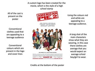
  • 1. A custom logo has been created for the movie, which is the style of a high school stamp All of the cast is present on the Using the colours red poster and white are appealing to a teenage audience. Conventional clothes used that are appealing to a A long shot of the teenage audience main characters show what they are wearing, in this case Conventional there clothes are colours which are average that you present in the logo would expect an and cover lines average school boy/girl to wear. Credits at the bottom of the poster
  • 2. Like other posters I used a conventional font that represents a high school, I made the font 3D to make it stand out more. All of the cast is present on the I have stuck to a poster which is conventional colour conventional with scheme that works both the superbad well together. and American Pie Conventional clothes used that are appealing to a A group shot shows teenage audience off the characters and what they are wearing, in this case The colour scheme we are wearing has been carried nerdy clothes which across the logo and relates to our genre most of the font present on the poster Credits at the bottom of the poster along wit the company logs and website address.
  • 3. The Magazine Logo stands out from the rest of the text and blends in well with the colour scheme. The photo is a single image of The cover lines are Megan fox which listed to one side of emphasis she is the magazine which the main focus of makes room for the the magazine. main image Conventional clothes used that are appealing to a The clothes that teenage audience. Megan Fox is wearing relates to the movie she stars The colour scheme in which attract the works well correct target together mixing audience. red and blue with the picture and font Quotes at the bottom of the page advertise the content inside