1. Salford City College
Eccles Centre
AS Media Studies
Foundation Portfolio
Masthead Comment on how the design of the magazine cover attracts the target audience: Colour
Red on black is dominant. There is a constant black and white colour running
Red= Power through this with a few tinges of red and grey. The
Black= Serious red colour used connotes to love which relates to the
style of music that Cheryl Cole sings about.
Up in the left corner- Unusual
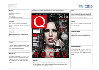
Main image Typefaces
It has a certain amount of sex appeal to it. Easy and clear to read.Formal text and simple
Shows the ‘ideal/perfect’ woman. Role model font style- Sans Serif.
image.
Direct mode of address
Model credit Photography Lighting
Bold in the bottom centre. Contrasts on the It is low lit, Desaturated and muted to add a
black- emphasises power seductive and provocative look with the red
colour.
Coverlines
“3 Words” advertising song by the artist. Adds
interest to the target audience as it appeals to Design Principles Used?
them. Bold, visible text stands out.
I think the design principle used is the
rule of thirds simple because the main
image occupies most of the magazine
Main cover line
cover.
Words gradually get larger, from, a small sized
text to a text that spans the full length of the
magazine front cover. It is the main focus to
the audience and it also relates to the main House Style
image.
The font style is constant throughout this front page, the text size does vary but
the style used is the same. There has only been 4 colours used, red, white, black
and grey. This adds a simplistic look to the page.