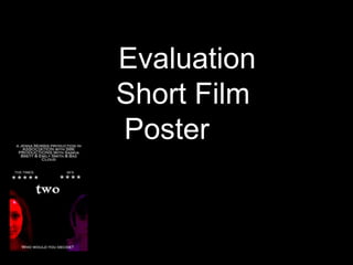
2. The location of the font is crucial for the representation of the short films content and its genre. On both posters the title font is in the centre of the page instead of in the traditional top or bottom of the design. By placing the title here it represents the creative theme and the connection between the characters and the title. Stylised font is important for making a unique and interesting design. The font that is used on the graphic two is important also for the representation of the location and the inversion of normality. The title of the short film on this poster follows conventions because it is a clear legible font and has the ability to advertise the content accurately. It also follows conventions because the font is bold and has taken the focal point of the composition.
3. By including this in my poster I have developed the conventions of short film posters. This factor was also important to me as it allowed my poster to look more professional. Reviews from magazines is a common feature on posters for feature length films. Feature length films use this idea in order to convey the success of the film compared to its rivals. As my work is a short film this element is not necessarily important but I chose to use this feature as it represented the importance of positive interpretations. The use of the star rating system is crucial, as it is a globally recognised system and is simple to understand. The two magazines and newspapers I used “The Times and SFX” represent status and clout and convey that the film is successful in its aims. By using two actual magazines it enforces the realism of my product.
4. The black background once again is conforming to the conventions of real media products. In order for a poster to be successful the design is often on a plain or simple background and example being the out of focus background on the poster Purge. This poster was on a black background so it does not detract from the other images. It also would be cheaper to print during the production process. Black is a sophisticated colour and therefore by using this on my poster it resembles the trait from my target audience and highlights the importance of the audiences perception. The black background is also reinforcing a convention from the horror genre. Black symbolizes darkness and death both of which are features of my short film. Conveying this on the poster enforces the relationship between the three products.
5. Once again taglines are a feature often found on the posters of feature length films. By using this convention on my short film poster I have developed this factor in order to make a point upon the poster that is easy to remember and therefore advertises the film successfully. The tagline creates a summary of the films narrative. Being simple to remember it also has a practical use, as the writing at the bottom of the page keeps the eye line there; along with the two central images that are the main focus of the entire poster. By using features from traditional film posters it helps an audience that may not be familiar with short films and there focus upon imagery relate to the posters that they see. It highlights the link between the two different conventions and how to keep the audience connected that the elements may have to overlap.
6. In the poster of Purge below the image of the character is only partly viable on screen. I decided to take this trait and develop it so that both my images where only partially on screen. They symbolize the lack of normality in the narrative as well as creating mystery and intrigue for the audience. The fact that the characters are not full images could also portray that the have no power or rights of humanity any longer, enforcing the importance of the social genre. The two images on this poster reflect an array of different opinions and factors to the audience. Most importantly though these images represent the characters of Kathy and Rhys. Using images of characters from the film on the poster, allows the audience their first insight into their lives and that is why such images are a strong convention on film posters. The blue and red filters together are recognisable contrasting colours. They usually represent hot and cold. This symbolises the relationship that both characters have with each other, both in the narrative and their suggested previous lives. These images draw the attention of the audience to them. By doing this it advertises the film as it keeps the attention on the film poster. Both Kathy and Rhys’ picture contrasts from the background. The red filter on Kathy represents the horror genre e.g. danger where as Rhys’ Blue filter represents the social genre as he is cold and apathetic after choosing to save Lucy. Kathy’s image takes more focus that Rhys’ due to the strength of colour, conveying her importance to the plot and the other characters.
7. Overall, the conventions used on my poster are features that come from short film posters that I have researched. By in keeping with conventions it helps the audience recognise the content of the poster. Although, I have also developed and used ideas from feature length film posters in an attempt to bring in viewers to short films who may never have seen many before. The target market group that I have chosen for my short film is vast and by using traits and conventions that they openly recognise could be a marketing method to keep the interested in my short film. Comparing my product to a previously existing one has allowed me to evaluate the decisions I made. I think that my short film poster would complete its task successfully and I pleased with the work that I have achieved.