2. IMAGERY
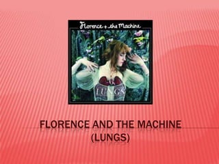
Florence is the main focus of the album.
She is wearing a necklace in the shape of
lungs over where her real lungs are.
She is looking away from the camera so she
could be reasonably well known.
3. CONTINUED
The images in the magazine are mostly of
her.
She is doing unusual and awkward poses.
4. FONT
The font for her name is very girly and is in
the style of those fluorescent lights seen in
shop windows.
5. CONTINUED
The name of the album is in block capitals in
a plain font.
It is a lot smaller than the title.
7. CONTINUED
The font on the back of the album is in italics.
The songs are also labelled with the
numbers in italics around and in the image of
the lungs.
8. COLOUR
The colouring throughout the album is quite
dark and plain.
There are a few images that have a little
colour but nothing vibrant.
9. POSITIONS
Throughout the album she is the main focus.
On the front she is reasonably close and in
the centre.
All the writing is also in the middle.
10. CONTINUED
On the back the image of the lungs is top
centre.
The track list is then bottom centre.