VIP Call Girls Asansol Ananya 8250192130 Independent Escort Service Asansol
Funeral party poster analysis 2
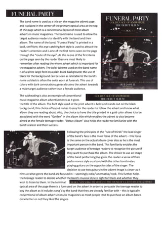
1. The band name is used as a title on the magazine advert page
and is placed in the center of the primary optical area at the top
of the page which is a conventional layout of most album
adverts in music magazines. The band name is used to allow the
target audience readers to identify with the band and their
album. The name of the band; “Funeral Party” is printed in a
bold, serif font; this eye-catching font style is used to attract the
reader’s attention and is one of the first items seen on the page
through the “route of the eye”. As this is one of the first items
on the page seen by the reader they are most likely to
remember after reading the whole advert which is important for
the magazine advert. The color scheme used on the band name
is of a white large font on a plain black background; the use of
black for the background can be seen as relatable to the band’s
name as black is often the color worn at funerals. This use of
colors with dark connotations generally aims the advert towards
a male target audience rather than a female audience.
The subheading is also an example of conventional
music magazine album advertisements as it gives
the title of the album. The font style used in the print advert is bold and stands out on the black
background; this choice of layout makes it easy for the reader to follow the advert and know what
album they are reading about. Also, the choice to have the title printed in a gold color allows it to be
associated with the word “Golden” in the album title which enables the advert to also become
aimed at the female teenage reader. “Debut Album” also helps the reader to familiarize with the
band’s career and their success.
Following the principles of the “rule of thirds” the lead singer
of the band’s face is the main focus of the advert – this focus
is the same on the actual album cover also as he is the most
important person in the band. This familiarity enables the
target audience of teenage readers to recognize the picture if
they want to purchase the album. The choice to use an image
of the band performing live gives the reader a sense of their
performance style as a band with the other band mates
playing guitars on the opposite sides of the singer. The
decision to use two guitars in the advert image is clever as it
hints at what genre the band are focused in – seemingly indie/ alternative/ rock. This further helps
the teenage reader to decide whether the band’s musical style is right for them and whether they
wish to listen to them. In the terminal
optical area of the page there is a lure used on the advert in order to persuade the teenage reader to
buy the album as it includes song’s by the band that they are already familiar with – this is typically
conventional of album adverts in music magazines as most people tend to purchase an album based
on whether or not they liked the singles.
2. At the bottom of the magazine advert there is
a web link for fans of the band to enter and
find out extra information about the album and keep up to date with the band itself; this is highly
conventional of album advertisements in music magazines. The language used in the album advert is
mostly colloquial which relates to the teenage target audience reader; allowing the advert to fit in
linguistically with the rest of the magazine. Also, in the terminal optical area of the page at the
bottom the release date of the album is printed in a large eyecatching
font; this is the last thing that the reader will remember about the
advert and will therefore be knowledgeable about the album’s release.
Finally, written in smaller print is “CD/ Download”; this features on the advert
so the reader is aware that they can either physically purchase the album from
a shop or they can download it online: this is an example of how music can now be heard through
multi media and how there are varying ways of gaining the album.