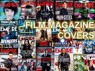
2. Iron Man 2 – Empire
Magazine
This is the cover of Empire magazine promoting Iron Man 2. Immediately we are
drawn in towards the bright areas of the cover which are seen in Iron Man‟s chest
as well as the masthead of the magazine. The light area on Iron Man‟s chest is
significant and iconic to that that specific character and so it entices readers and
fans of the film to find out all they need about the upcoming release. The lightning
effect on the Empire has two effects; for one it draws the attention of the audience
toward the fact that the magazine is Empire magazine, but secondly, it reinforces
the power behind the large figure of Iron Man, which alone stands prominent and
promotes the magazine to a great extent.
The cover line “New Suit. New Enemies. Same Attitude” is sharp, but effective as
it teases audiences to know more about the new features of the film, it gives the
audience an insight into what the movie entails without giving away much at all
about the film, and I turn this gives the desired effect of making the audiences
purchase the magazine to know more instead of just reading about it on the
cover.
There is a buzz word featured below the masthead on the right hand side which
reads “Ultimate Review of 2009”. The word is used to give the audience a feel
that this isn't just any review of 2009, it‟s going to feature a lot more than your
average review seen on the internet or rival magazines. Another buzz word/sell
line is seen below the “Iron Man 2” cover line, reading “Plus! Three AMAZING
exclusives”. The word amazing is used, again, to gives audiences the impression
that not only do they have an incredible story written about the upcoming Iron
Man movie, but they have enough space to include some AMAZING exclusives
as well, such as Avatar and Kick-Ass which have proved popular with a majority
of the population. The buzz word exclusive as well gives the impression that only
this magazine will cover these movies in one magazine, unlike rival magazines
such as Total Film.
The price of the magazine is £3.99, which to some may seem quite pricey, but for
the amount of content featured inside, I expect many buyers of the magazine are
unlikely to be disappointed as the cover of the magazine really sells it them in an
exciting fashion.
3. Salt – Total Film This is the cover of Total Film, featuring a prominent central image of Angelina
Jolie in the movie „Salt‟. An indication to the type of film we‟re looking at is hinted
by the overall graphology of the magazine; the Total Film logo appears in a
shattered glass format to convey a sense of action and danger, typically seen in
films such as „The Bourne Identity‟ or „Mission Impossible‟. Not only this but the
background is seen to have a fiery blur to again reinforce the idea of action and
danger. The main figure in the centre of the cover is „Salt‟, the black robe, top and
hair colour as well as the prominent gun she is holding, all reveal what kind of film
is being advertised. The general explosive graphology of the cover draws the
attention of the audience in.
The header, above the masthead, which reads „The Modern guide to Movies‟ is
supported by the special effects seen present on the masthead as well as the
background which brings the magazine to life, creating a fire-like appearance.
The tag line „Cinema just got a new super spy‟ is quite attracting as it makes the
reader intrigued as to what kind of person this spy is. The buzz word „super‟ also
reinforces the idea that it isn't just any spy coming to cinema. Also considering
that the spy is Angelina Jolie it makes fans of her films, more involved in the film
advertised.
In the bottom right hand corner, we can see a large, prominent „100‟ followed by
„Coolest things in movies ever‟. The impression audiences get from this is that
only this magazine will give you an insight into a behind-the-scenes look at some
of the best movie gadgets and gizmos that we don‟t get to see first hand. The
world coolest reinforces an image of superiority, nothing else compares.
Just below the masthead, on the right hand side, we can see a flash featuring the
words „The world‟s best movie reviews‟. This statement is almost bragging about
the magazines success and almost convincing audiences that this magazine is
the one they need, and therefore essentially persuading them to opt for this one
over Empire.
4. Shutter Island – Total Film This is the cover of Total Film advertising the thriller „Shutter Island‟. The
audience are made aware of the thriller connotations of the film through the
mysterious fog that is present on the lower half of the central image. Not only this
but the image of the figure walking towards us is wearing a long coat typically
associated with detective appearance seen in something like „Sherlock Holmes‟,
this therefore reinforces the mysterious element to the image.
Another thing that is likely to grab the audiences is that the main figure is famous
film star Leonardo Di Caprio, and so those who are fans of him are likely to look
further into what the film is about and what sort of role he plays in it. Also, above
the title of film, we can see the words „Dicaprio Exclusive!‟ which can be
highlighted as an important feature as it gives the impression that only this
magazine will be covering an interview with the actor.
The blood-red, decaying font that is a consistent feature on the page is striking
and stands prominent against the misty blue background, to allow audiences to
be made fully aware of the key features the issue has to offer.
The header, above the masthead, „GREATEST MOVIE ART EVER‟ is bold and
eye catching. Not only this but the use of the word „GREATEST‟ connotes an idea
that this issue features the best movie artwork in a magazine, no other magazine
can match this level of excellence and superiority.
5. Tron Legacy – Empire
Magazine
This is the cover of Empire Magazine, advertising sci-fi blockbuster Tron Legacy.
Audiences are immediately made aware of the type of film being advertised,
simply by the graphology of the cover itself and not just by the central image. The
graphology of the page has been moulded around a futuristic, sci-fi atmosphere
created by Tron, which we can see in things such as the masthead and the cover
stories.
The masthead of the issue has been designed to match the genre of the film,
through the use of the hollow font which an electric blue glow, to create the
illusion of some sort of light source being emitted, like a halogen bulb.
Above the masthead, we have the header which reads „HUGE COMIC-CON
PREVIEW‟. Comic-Con is an extremely popular media convention and so by
Empire magazine highlighting it in a bold, bright font, the audience is made fully
aware that inside the issue there is a „huge‟ preview, giving the impression of a
power among other magazines that don‟t have this exclusive access.
Referring back to the graphology of the magazine, the cover stories have been
edited in a way that gives them a yellow glow, to reinforce the futuristic element
given off by the move being advertised. This effect also enhances the
appearance of the cover stories, making them stand out from the contrasting blue
background.
6. The Dark Knight Rises– Total
Film
The cover of Total Film features popular superhero Batman/The Dark Knight. The
metallic appearance of both the masthead and the main cover line give the
magazine a more personal feel for the film, seeing as it is a Batman issue. It also
matches Batman‟s metallic looking utility belt
We are all aware of what type of film Batman is and so the audience are mostly
aware of the genre of the film. The prominent figure of Batman as well is likely to
attract audiences.
Above the masthead of the magazine, we have the line that reads “The ultimate
Batman issue”. This connotes a sense of exclusivity amongst other magazines,
as well as conveying the idea that this issue is truly dedicated to delivering a
whole load of Batman information for fans of the movie franchise.
Above the main cover line, we have the buzz word „exclusive!‟, which promotes
the idea that only Total Film will cover this particular film to a degree of depth and
detail.
Above the main cover line reading „The Dark Knight Rises‟, we have the buzz
word „Exclusive!‟, is likely to draw audiences closer to the movie the magazine is
focused closely on.
Cover stories on the sides of the magazine advertise things like Tim Burton
writing exclusively for YOU. Emphasis is placed on you to establish a closer
relationship with the reader and the magazine. We also have an attracting cover
story on the bottom left side which reads „Real‟ Movie gadgets‟ – „buy your own
lightsaber!‟. For those who are familiar with that gadget in Star Wars, they will
know how much of an exciting prospect that is and will want to read on.
7. Inception – Empire magazine Empire magazine are advertising the mind-boggling film Inception. The illusive
element to the film is incorporated through the use of the slanted text for the
cover stories at the sides of the magazine. This gives the magazine more a of a
personal feel towards the movie, dedicating their editing techniques to give the
audience a feel for the movie‟s third-dimensional concept. This is also reveals the
genre of the movie; the special effects on the text and the background city scape
give this a sort of modern „sci-fi‟ feel to it.
The titles are in a bold, red font to separate themselves from the greyish-blue
background, making a bold statement about the film title, as well as the other
included information about „The Complete Hitchcock‟, which could entice readers
who are fans of his work.
Below the main cover story, we have „The Matrix meets 007 “on steroids!”‟. For
those who are familiar with both the Matrix and the 007 films, they will know that
for critics to hail this movie as a combination of the two epics in film is something
special and they will therefore be more inclined and intrigued as to how good the
movie is.