
Recommended
More Related Content
Viewers also liked
Viewers also liked (10)
Similar to Poster analysis
Similar to Poster analysis (20)
More from ylrice
More from ylrice (20)
Recently uploaded
Recently uploaded (20)
Poster analysis
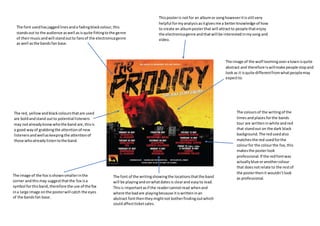
- 1. The font usedhasjaggedlinesanda fadingblackcolour,this standsout to the audience aswell asisquite fittingtothe genre of theirmusicandwill standoutto fansof the electronicagenre as well asthe bandsfan base. The image of the wolf loomingoveratownisquite abstract and therefore iswillmake people stopand lookas it isquite differentfromwhatpeoplemay expectto. The red, yellow andblackcoloursthatare used are boldandstand outto potential listeners may notalreadyknowwhothe band are,thisis a good wayof grabbingthe attentionof new listenersandwellaskeepingthe attentionof those whoalreadylistentothe band. The font of the writingshowingthe locationsthatthe band will be playingandonwhatdatesis clearand easyto lead. Thisis importantasif the readercannotread whenand where the badare playingbecause itiswritteninan abstract fontthentheymightnot botherfindingoutwhich couldaffectticketsales. The coloursof the writingof the timesandplacesforthe bands tour are writteninwhite andred that standout on the dark black background.The redusedalso matchesthe red usedforthe colourfor the colourthe fox,this makesthe posterlook professional.If the redfontwas actuallyblue oranothercolour that doesnotrelate to the restof the posterthenit wouldn’tlook as professional. The image of the fox isshownsmallerinthe corner andthismay suggestthatthe fox isa symbol forthisband,therefore the use of the fox ina large image onthe posterwill catch the eyes of the bandsfan base. Thisposteris notfor an albumor songhoweveritisstill very helpful formyanalysisasitgivesme a betterknowledge of how to create an albumposterthat will attractto people thatenjoy the electronicagenre andthatwill be interestedinmysong and video.