

Recommended
More Related Content
Similar to Guía graficos ingles 2 2015
Similar to Guía graficos ingles 2 2015 (20)
More from Yenny Medina
More from Yenny Medina (20)
Recently uploaded
Recently uploaded (20)
Guía graficos ingles 2 2015
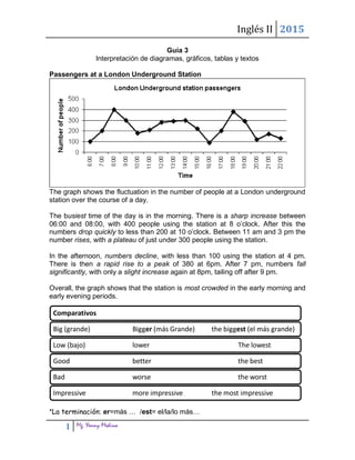
- 1. Inglés II 2015 1 Mg. Yenny Medina Guía 3 Interpretación de diagramas, gráficos, tablas y textos Passengers at a London Underground Station The graph shows the fluctuation in the number of people at a London underground station over the course of a day. The busiest time of the day is in the morning. There is a sharp increase between 06:00 and 08:00, with 400 people using the station at 8 o’clock. After this the numbers drop quickly to less than 200 at 10 o’clock. Between 11 am and 3 pm the number rises, with a plateau of just under 300 people using the station. In the afternoon, numbers decline, with less than 100 using the station at 4 pm. There is then a rapid rise to a peak of 380 at 6pm. After 7 pm, numbers fall significantly, with only a slight increase again at 8pm, tailing off after 9 pm. Overall, the graph shows that the station is most crowded in the early morning and early evening periods. *La terminación: er=más … /est= el/la/lo más… Comparativos Big (grande) Bigger (más Grande) the biggest (el más grande) Low (bajo) lower The lowest Good better the best Bad worse the worst Impressive more impressive the most impressive
- 2. Inglés II 2015 2 Mg. Yenny Medina Internet Usage in Taiwan by Age The graph shows changes in the age profile of Internet users in Taiwan between 1998 and 2000. (Oración Introductoria) The main users of the Internet in Taiwan are young adults between 16 and 30 years old. In 1998, they accounted for more than half of all users. In 1999 the number dropped slightly to 45%, but even in 2000 they were the biggest group. (Describe grupo más grande) The second biggest group of users is aged between 31 and 50. They made up 41% in 1998, falling slightly to 37% in 2000. When combined with the 16-30 age group, over 94% of users in 1998 were between 16 and 50. (Describe grupos con menor presencia) However, this number is dropping steadily as more children and older users log on. In 1999, the number of children online quadrupled from 2% to 8%, and it continued to increase in 2000. There were similar increases for older users, rising from 4% in 1998 to 10% in 2000. In summary, while adults between 16 and 50 still represent the great majority of Internet users in Taiwan, their share is declining as more children and older users join the web. Conclusión Conector para señalar tendencia
- 3. Inglés II 2015 3 Mg. Yenny Medina 2.- Expresiones Figures show that women were more likely to be promoted than hired into management positions. __________________________________________________________________ __________________________________________________________________ The basic level of income tax will rise later this year __________________________________________________________________ Almost every country in the graph produced more coffee in 2011 than in 2010.Only two countries in the graph exported less in 2011. __________________________________________________________________ __________________________________________________________________ Vietnam was the second largest producer. It exported over 17 million bags in 2011, up from 14 million in the previous year. __________________________________________________________________ __________________________________________________________________ Only two countries in the graph exported less in 2011. __________________________________________________________________
- 4. Inglés II 2015 4 Mg. Yenny Medina __________________________________________________________________ 3.- Identifique la tendencia que indican las siguientes palabras Go up Go down decrease climb drop decline lift rise fall 4.- Empareje las líneas del gráfico con las siguientes expresiones 1. remain steady 2. fluctuate 3. increase slightly 4. decrease dramatically 5. decrease slightly 6. increase rapidly 7. rise dramatically 8. plunge 9. drop suddenly 10. stay the same 11. go up a little 12. go down slightly
- 5. Inglés II 2015 5 Mg. Yenny Medina 5..- 6.- selecciona la respuesta correcta Vocabulario Account for representar As likely tener (…) probabilidades de Between entre Few poco Fewer menos High alto Low bajo Make up totalizar Share participación (grupo) Sharp pronunciado Show mostrar, demostrar. Slightly ligeramente Twice dos veces, doble Which of the following is the best interpretation of the graph below? A. The largest increase in meat consumption has occurred in the past 20 years. B. Meat consumption has increased steadily over the past 40 years. C. Meat consumption doubles in developing countries every 20 years. D. The largest increase in meat consumption occurred between 1980 and 1990.