Tagarino_14510147_Design Communication Document AS1.pdf
new double page spread
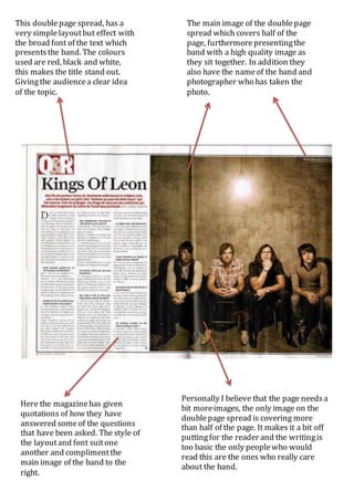
1. This doublepage spread, has a
very simplelayoutbut effect with
the broad font of the text which
presentsthe band. The colours
used are red, black and white,
this makes the title stand out.
Givingthe audiencea clear idea
of the topic.
The main image of the doublepage
spread which covers half of the
page, furthermorepresentingthe
band with a high quality image as
they sit together. In addition they
also have the nameof the band and
photographer who has taken the
photo.
Here the magazinehas given
quotations of how they have
answered someof the questions
that have been asked. The style of
the layoutand font suitone
another and complimentthe
main image of the band to the
right.
Personally I believe that the page needsa
bit moreimages, the only image on the
doublepage spread is covering more
than half of the page. It makes it a bit off
puttingfor the reader and the writingis
too basic the only peoplewho would
read this are the ones who really care
about the band.