1. Course 3, Lesson 9-2
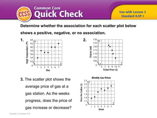
Determine whether the association for each scatter plot below
shows a positive, negative, or no association.
1. 2.
3. The scatter plot shows the
average price of gas at a
gas station. As the weeks
progress, does the price of
gas increase or decrease?
6. To
• use a line of best fit to predict,
• write and use an equation for a
line of best fit
Course 3, Lesson 9-2
Statistics and Probability
7. • line of best fit
Course 3, Lesson 9-2
Statistics and Probability
8. 1
Need Another Example?
Step-by-Step Example
1. Construct a scatter plot using the data. Then draw and assess a line
that seems to best represent the data.
Graph each of the data points. Draw a line that fits the data.
Refer to the information in the table about the cost of cookies.
About half of the points are above the line and half of the points
are below the line. Judge the closeness of the data points to the
line. Most of the points are close to the line.
9. Answer
Need Another Example?
Construct a scatter plot using the data in the table. Then draw and
assess a line that seems to best represent the data.
Sample answer: Most of the points are
close to the line of fit.
10. 1
Need Another Example?
Step-by-Step Example
2. Use the line of best fit to make a conjecture about the
cost of cookies in 2013.
Refer to the information in the table about the cost of cookies.
Extend the line so that you can estimate the y-value for an x-value of
2013 – 2000 or 13. The y-value for 13 is about $3.35. We can predict that
in 2013, a pound of chocolate chip cookies will cost $3.35.
11. Answer
Need Another Example?
Construct a scatter plot using the data in the table. Then draw and assess a
line that seems to best represent the data. Use the line of best fit to make a
conjecture about the maximum longevity for an animal with an average
longevity of 33 years.
Sample answer: about 67 years.
12. 1
Need Another Example?
2
3 4
5
6
Step-by-Step Example
3. Write an equation in slope intercept
form for the line of best fit that is drawn,
and interpret the slope and y-intercept.
The scatter plot shows the number of cellular service
subscribers in the U.S.
Choose any two points on the line. They may or may not
be data points. The line passes through points (3, 150) and (9, 275).
Use these points to find the slope, or rate of change, of the line.
or about 20.83
m =
m =
m =
Definition of slope
(x1, y1) = (3, 150) and (x2, y2) = (9, 275)
Simplify.
The slope is about 20.83. This means
the number of cell phone subscribers
increased by about 20.83 million
people per year.
The y-intercept is 87.5 because the
line of fit crosses the y-axis at about
the point (0, 87.5). This means there
were about 87.5 million cell phone
subscribers in 1999.y = mx + b Slope-intercept form
The equation for the line of best fit is y = 20.83x + 87.5.
y = 20.83x + 87.5
Replace m with 20.83 and
b with 87.5.
13. Answer
Need Another Example?
The scatter plot shows the number of new foods claiming to be
high in fruit. Write an equation in slope-intercept form for the line
of best fit that is drawn.
Sample answer: y = 25x + 110.
14. 1
Need Another Example?
2
3
Step-by-Step Example
4. Use the equation y = 20.83x + 87.5 to
make a conjecture about the number
of cellular subscribers in 2015.
The scatter plot shows the number of cellular service
subscribers in the U.S.
The year 2015 is 16 years after 1999.
y = 20.83x + 87.5
y = 20.83(16) + 87.5
y = 333.28 + 87.5
Equation for the line of best fit
Replace x with 16.
Simplify.
So, in 2015, there will be about 420.83 million cellular subscribers.
15. Answer
Need Another Example?
The scatter plot shows the number of new foods claiming to
be high in fruit. Use the equation y = 25x + 110 to make a
conjecture about the number of new foods that will claim to
be high in fruit in 2017.
about 410
16. How did what you learned
today help you answer the
How are patterns used
when comparing two quantities?
Course 3, Lesson 9-2
GeometryStatistics and Probability
17. How did what you learned
today help you answer the
How are patterns used
when comparing two quantities?
Course 3, Lesson 9-2
GeometryStatistics and Probability
Sample answers:
• If the data approximate a linear relationship, you can
write an equation for the line which is called the line of
best fit.
• You can use the equation for the line of best fit to make
a conjecture about data that is not represented in the
data set.
18. What steps would you take
to find a line of best fit for
data in a scatter plot?
Course 3, Lesson 9-2
Ratios and Proportional RelationshipsFunctionsStatistics and Probability