1. Olivia Singleton
Unit 57: Photography and
Photographic Practice
Selection of final images & review
(P4, M4, D4)
Landscape Images
Image No: All Images
Image 1
Image 2
4. Olivia Singleton
Image 9
Theme or focus of image & reasons for choice
Theme and focus for all images and reasons for choice – for this images my main
focus was architecture in Salford and although within the course we were expected
to take pictures of Salford quays, we were allowed to go and take pictures of other
architecture, with that in mind I did go and explore other places including china town
in Manchester town and of course Manchester town centre itself, but I came to the
conclusion that media city in Salford quays was the best place to take pictures of
architecture as most of the buildings are newly developed like the BBC and ITV also
the old buildings like the lowry which was built in 1999 so they’re very nice buildings
and a lot of history went on there so it wasn’t just the buildings I was capturing it was
also the history.
Techniques used
In these photos I used the manual setting with all the images because that’s what we
were instructed to do by our tutor, also I used the slow shutter speed so to capture all
the light in the frame, because when it’s dark and you take a picture with fast shutter
speed you will notice it doesn’t capture everything in the frame, so I used a tri-pod
and slow shutter speed of 10 seconds and it worked out perfectly.
Strengths & suggested improvements
I think a few strengths in these images are the time of shutter I used, if it would’ve
been any slower it would’ve been too bright and if I did it any faster it wouldn’t have
captured everything that I wanted it too. I really like the way I’ve edited them in
5. Olivia Singleton
Photoshop but with a few images I went over the top and added overlays of drastic
things like a moon behind a building and stars so in the future I won’t go so dramatic
with overlaying if I want to do that. I think image 9 is too strong on terms of colouring
and lighting, it’s also badly edited because I added an overlay of a sunset to go
behind the building as it was so dark to begin with I wanted to add character to it but
ended up overdoing it. With image 7 it’s different to all the rest, it was a test shoot in
my garden but I like the way I’ve edited the dirt off the walls and to begin with their
were clouds in the sky so it looked gloomy, I wanted to change that with a nice
overlay. I really like the night lighting in image 6 because I didn’t go overboard with
correcting the brightness, so it looks very centred and nice.
Editing details
When I edited my pictures I pretty much edited them all the same on terms of
lighting, contrast and saturation, I added overlays to most of them but on a few like
image 4 and image 9 I went overboard with the overlays and spoilt the pictures, I
ruined image 4 by adding a moon in the background of the building and I badly
edited the moon itself so it looks very materialistic and unnatural. With image 7 I used
the clone tool to correct the marks on the wall so to make it look cleaner. With image
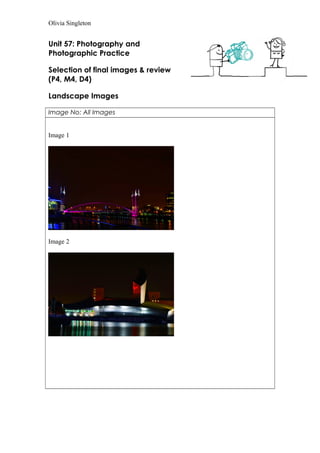
one I used the dodging tool to make the lights on the bridge lighter and then used
the burn tool to saturate it.
6. Olivia Singleton
Photoshop but with a few images I went over the top and added overlays of drastic
things like a moon behind a building and stars so in the future I won’t go so dramatic
with overlaying if I want to do that. I think image 9 is too strong on terms of colouring
and lighting, it’s also badly edited because I added an overlay of a sunset to go
behind the building as it was so dark to begin with I wanted to add character to it but
ended up overdoing it. With image 7 it’s different to all the rest, it was a test shoot in
my garden but I like the way I’ve edited the dirt off the walls and to begin with their
were clouds in the sky so it looked gloomy, I wanted to change that with a nice
overlay. I really like the night lighting in image 6 because I didn’t go overboard with
correcting the brightness, so it looks very centred and nice.
Editing details
When I edited my pictures I pretty much edited them all the same on terms of
lighting, contrast and saturation, I added overlays to most of them but on a few like
image 4 and image 9 I went overboard with the overlays and spoilt the pictures, I
ruined image 4 by adding a moon in the background of the building and I badly
edited the moon itself so it looks very materialistic and unnatural. With image 7 I used
the clone tool to correct the marks on the wall so to make it look cleaner. With image
one I used the dodging tool to make the lights on the bridge lighter and then used
the burn tool to saturate it.