
Recommended
Recommended
More Related Content
Similar to Melange perfume
Similar to Melange perfume (20)
More from Timmy Litondo
More from Timmy Litondo (20)
Recently uploaded
Recently uploaded (20)
Melange perfume
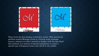
- 1. These were the first designs I started to create. This was for my perfume named Melange which is a French word, melange means a mixture so what I wanted to display with the logo that’s that perfume is a mixture of special ingredients to create a special type of fragrance hence why the M in the middle.
- 2. As you see the two logo’s have different colours, this is because this a fragrance for both men and women. The blue is for men and the red is for the women. I wanted to make sure there was a differentiation from logo’s when it come to making the men’s logo and doing the women’s logo as the fragrances is for both men and women
- 3. With these images I all I did was move a few bits an pieces around, these images were not chosen for the final logo. All I did was have different colours and move the title of the name into the actual space of the box and removed the “M”. This was during the creation process.
- 4. With this particular design I completely moved the letters around making the M incredibly small so it could fit in between the box but it’s just big enough for you to see it. Obviously making the colour of the M different to the one in the box.
- 5. I first started of with two rectangles, one smaller and one a bit bigger making it a huge box. I used the rectangle tool to create the box.
- 6. Then by using the type tool I create an M and added a different format to it called Vivaldi which gave it a different look, it looks more elegant. After I used the colour tool to make it light blue.
- 7. After that I used the rectangle tool to make little rectangle boxes to put in within the large box. After I use a filling in the little rectangle box and made the little boxes light blue.
- 8. Then I put the small rectangles in the large box in between and space them out like a few centimetres away and also making it even so that it’s not over. This was important because I had to be precise with the size making sure it’s not to big or small and that it fit inside the rectangle and that there wasn’t to many of them over filling the rectangle
- 9. So then I added a light blue shade inside the box using the swatches. When using the tool I had to make sure I clicked the inside the box so that the colour could be filled inside the box instead of it outside or even just on the M.
- 10. After that I used the type tool again to write the name of the fragrance named melange then I obviously I changed the look of the word to the same style as the M in the box to Vivaldi but I put just under the box and also changed the colour to match the same of the one that’s in the box dark blue/navy.