
Recommended
More Related Content
What's hot
What's hot (17)
Similar to 2 piece's of journalism
Similar to 2 piece's of journalism (20)
More from Timmy Litondo
More from Timmy Litondo (20)
Recently uploaded
Recently uploaded (20)
2 piece's of journalism
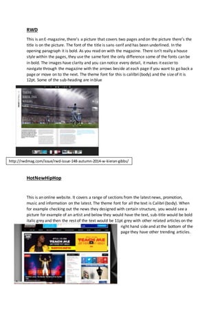
- 1. RWD This is an E-magazine, there’s a picture that covers two pages and on the picture there’s the title is on the picture. The font of the title is sans-serif and has been underlined. In the opening paragraph it is bold. As you read on with the magazine. There isn’t really a house style within the pages, they use the same font the only difference some of the fonts can be in bold. The images have clarity and you can notice every detail, it makes it easier to navigate through the magazine with the arrows beside at each page if you want to go back a page or move on to the next. The theme font for this is calilbri (body) and the size of it is 12pt. Some of the sub-heading are in blue HotNewHipHop This is an online website. It covers a range of sections from the latest news, promotion, music and information on the latest. The theme font for all the text is Calibri (body). When for example checking out the news they designed with certain structure, you would see a picture for example of an artist and below they would have the text, sub-title would be bold italic grey and then the rest of the text would be 11pt grey with other related articles on the right hand side and at the bottom of the page they have other trending articles. http://rwdmag.com/issue/rwd-issue-148-autumn-2014-w-kieran-gibbs/