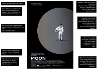
1. Astronaut is surprisingly
small on the poster which
reflects the film in that he is a
man on the moon, and
means that the poster
doesn’t intend to highlight
the actor.
Slogan is small but stands out
with grey on black and capital
letters.
Title is the largest, white on
black stands out heavily,
capital letters. All makes it
dramatic as well.
Echo of the name reflects sci-fi genre.
Name of main star appear at the
top in an obvious position for
people to see – many people see
films to see the certain actors.
The use of graphics
rather than an image of
the film increases
ambiguity and adds a
quality to the poster
itself.
Essential names, titles and
logos at the bottom of the
poster so that they are out
of the way of the main
features and don’t distract
the viewer.
Black and white colour scheme
throughout.
Also makes the orange on the
astronaut’s helmet and suit
stand out and so draws
attention to him.
Not too much black/negative space –
the poster does not look empty or too
full.
Has a minimalist style.