call girls in Kamla Market (DELHI) 🔝 >༒9953330565🔝 genuine Escort Service 🔝✔️✔️
Final Ideas
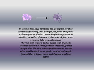
1. In these slides I have combined the ideas from my style
sheet along with my final ideas for flat plans. This paints
a clearer picture of what I want the finished product to
look like, as well as giving me a plan to work from when
I come to take my photographs.
I have chosen to use a darker purple than originally
intended because in some feedback I received, people
thought that lilac was a more feminine colour. I asked
what would make it more gender neutral and people
thought that a deeper more pastel purple would be
better.
2. I chose to use this kind
of picture because in my
research I found that
most front covers use
close up photo of a
person/band. They do
this so that the reader
feels instantly
connected to the person
on the magazine
cover, and therefore
with the magazine. This
makes it seem more
personal to you, making
you want to buy it.
3. For the contents page I
have chosen to use a
range of studio and live
shots, this is to show the
variation of cover lines
within the magazine.
This helps to show that
the magazine isn’t just
about one thing, it is
variable and has
something for everyone.
Therefore it appeals to a
larger target audience.
4. For the DPS I wanted
both pages to feel
connected, so I have
chosen photographs that
interact with each other.
I have chosen a variety of
shots, ranging from long shots to
close up. This gives the reader more
visual information about the person
they are reading about, so they feel
as if they know more about them.