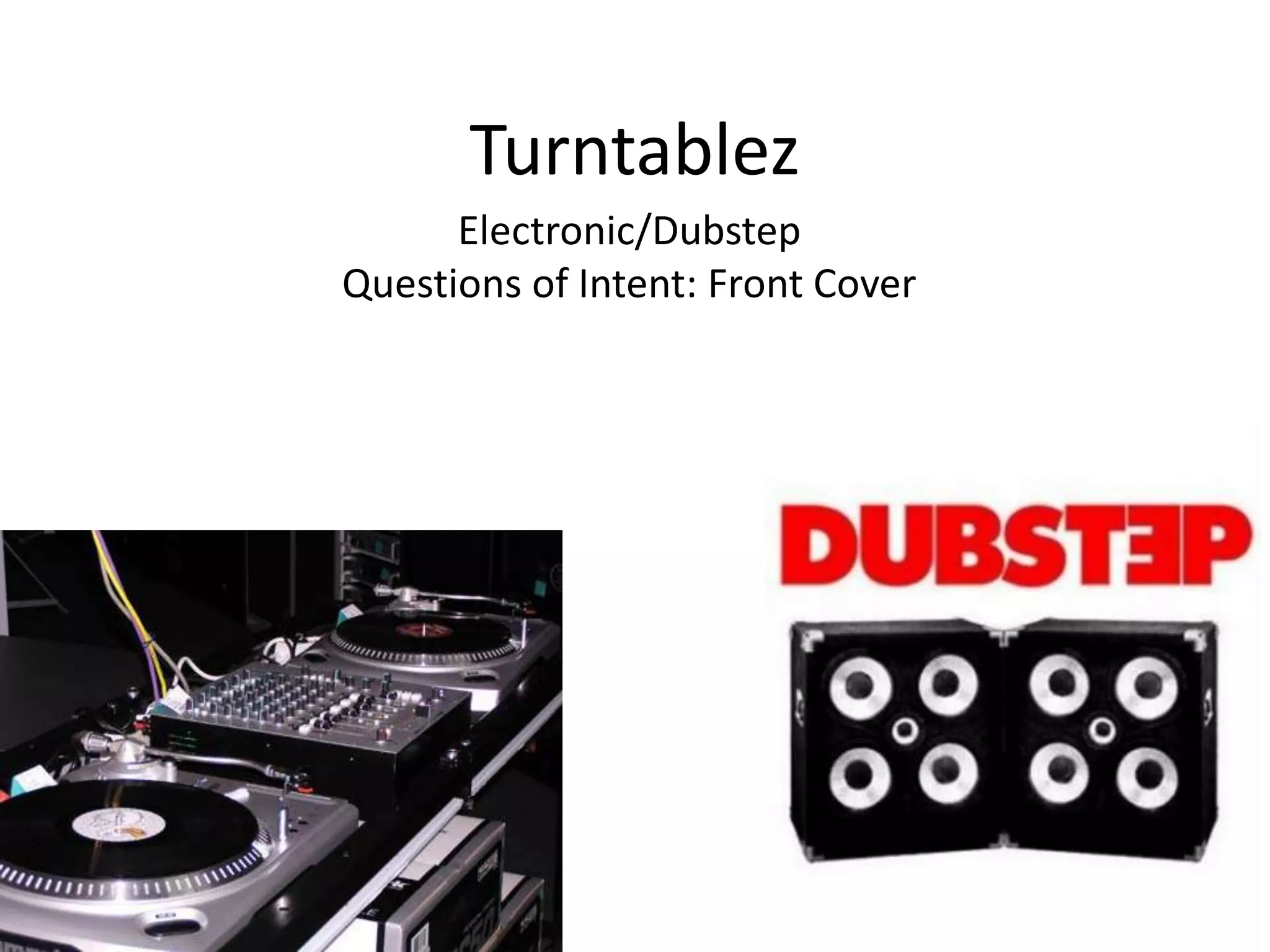
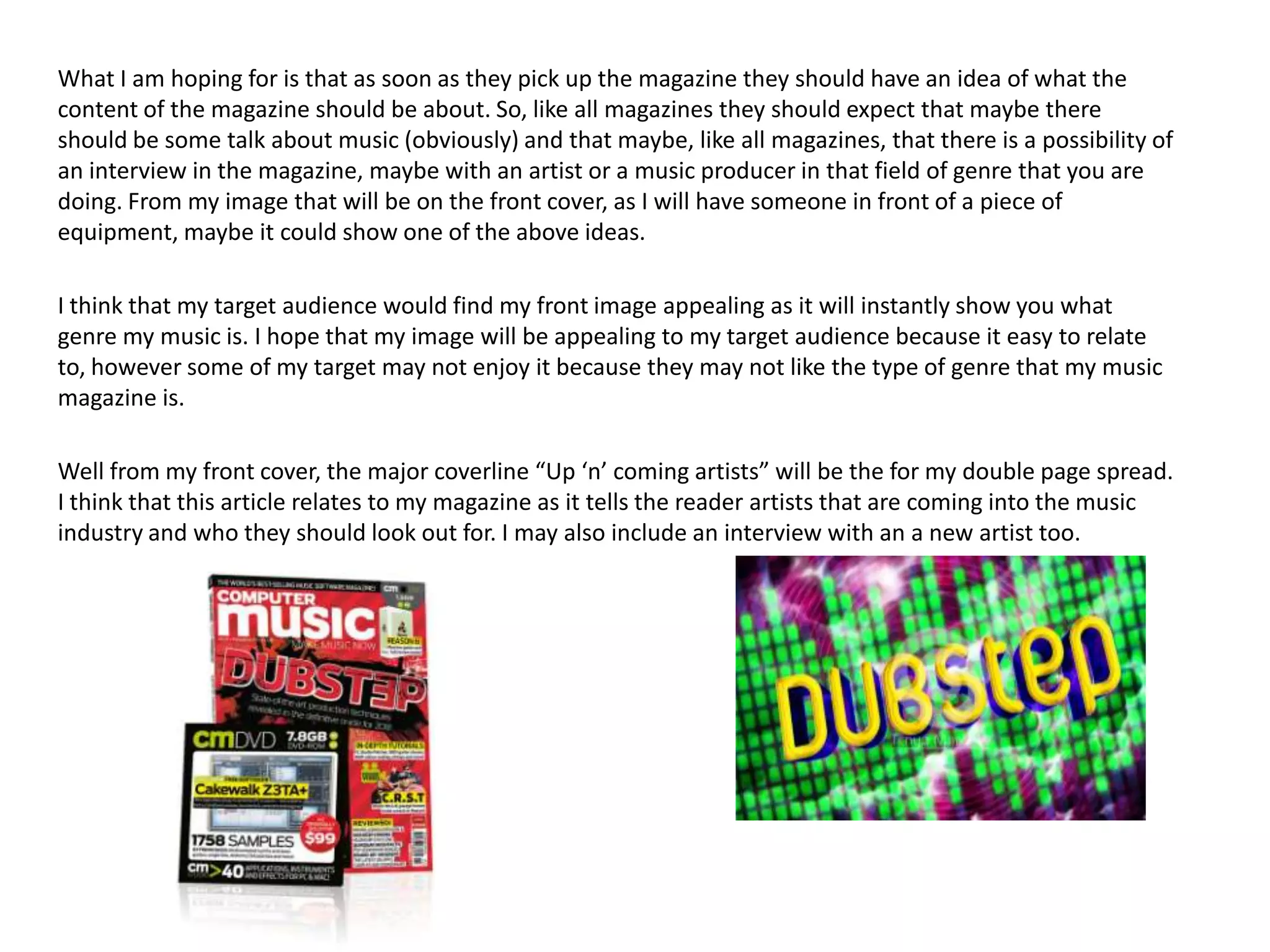
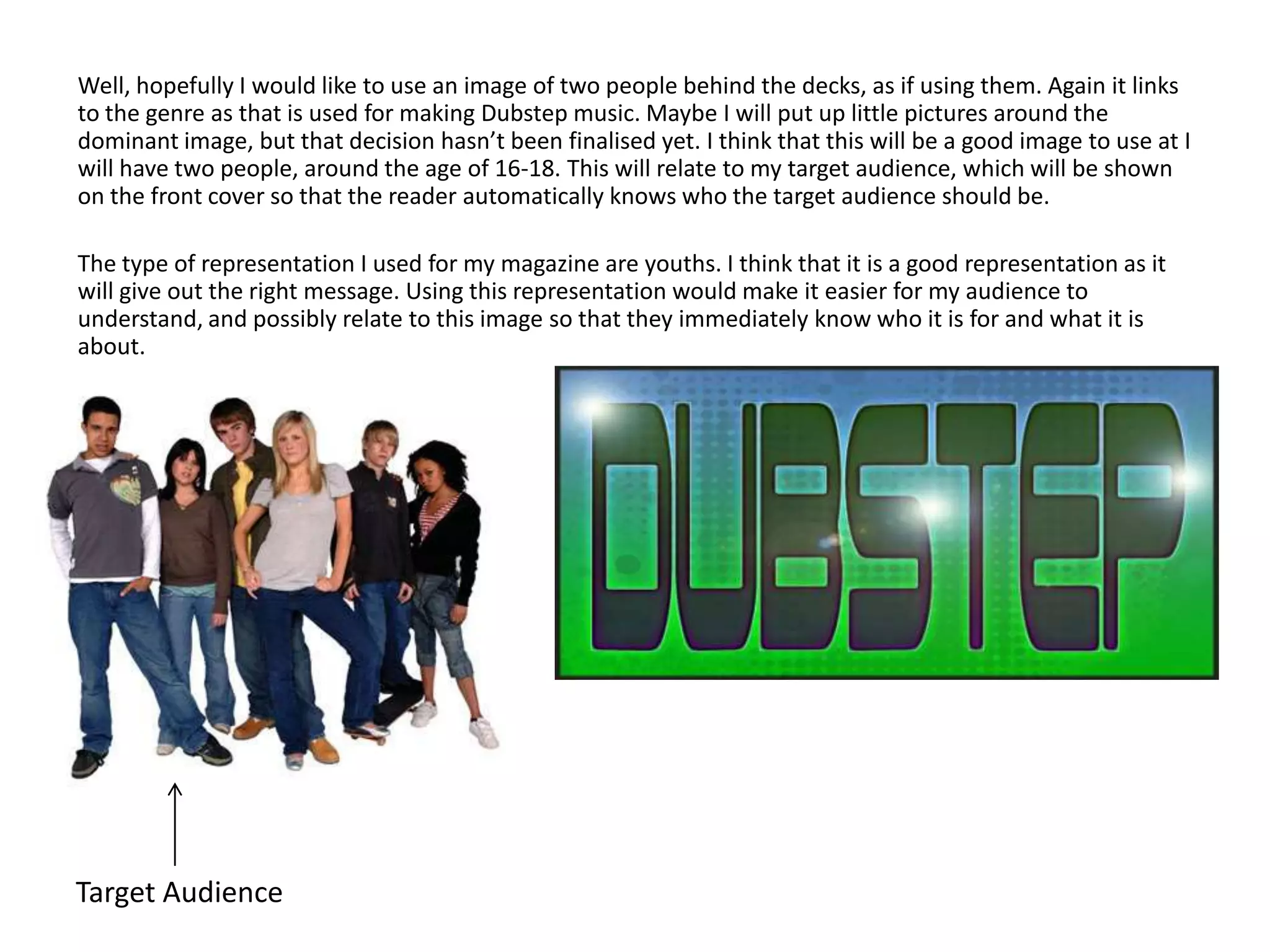
The document discusses the development of a front cover for a music magazine called "Turntablez" focused on dubstep music. Key details include:
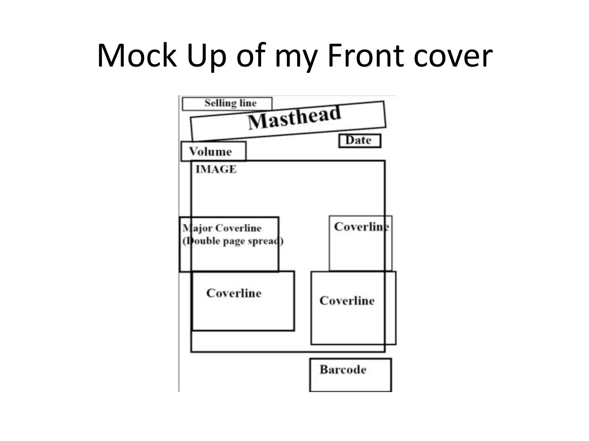
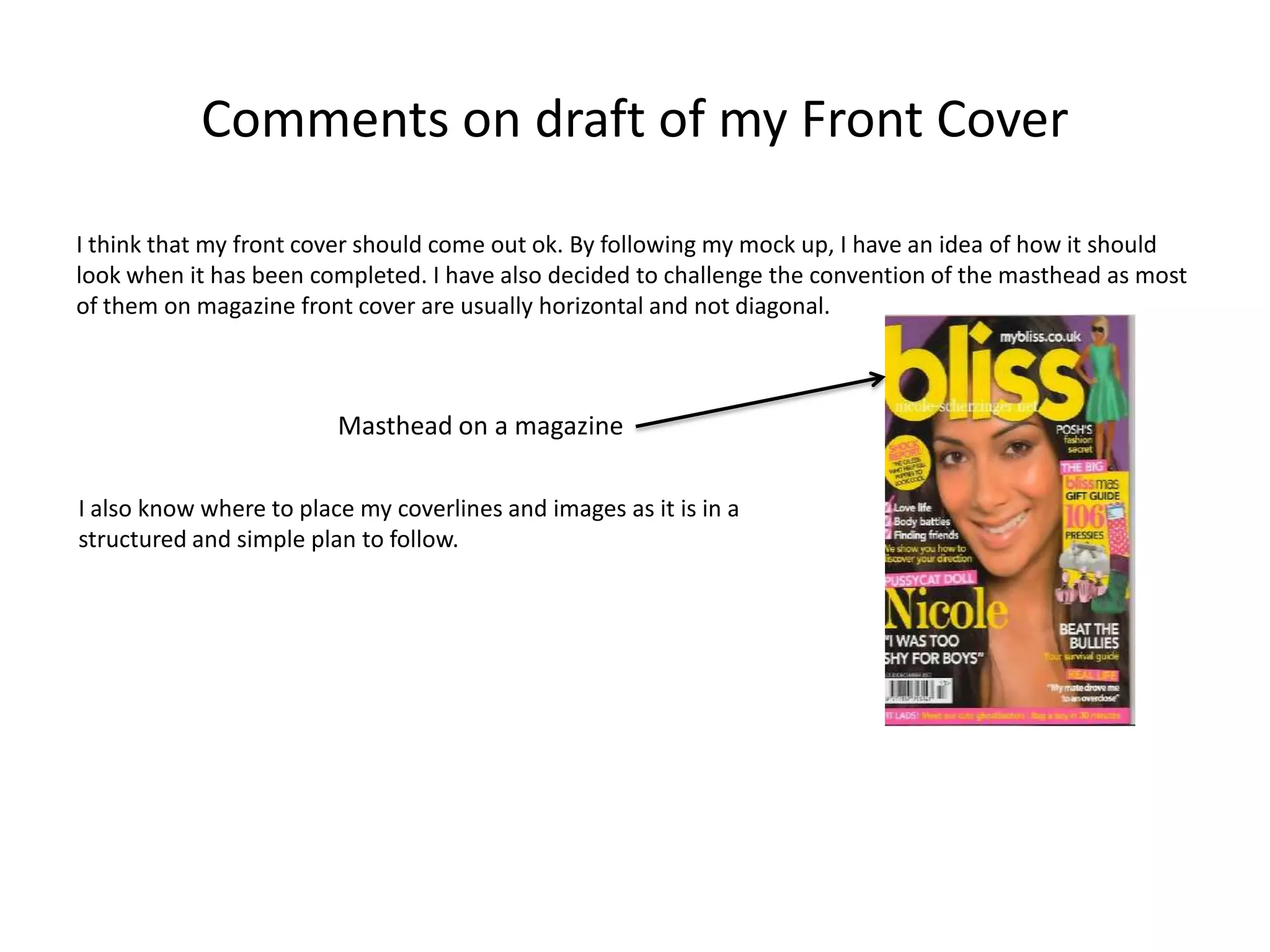
1) The masthead will be diagonal rather than horizontal to challenge convention. Coverlines and images will follow a structured layout.
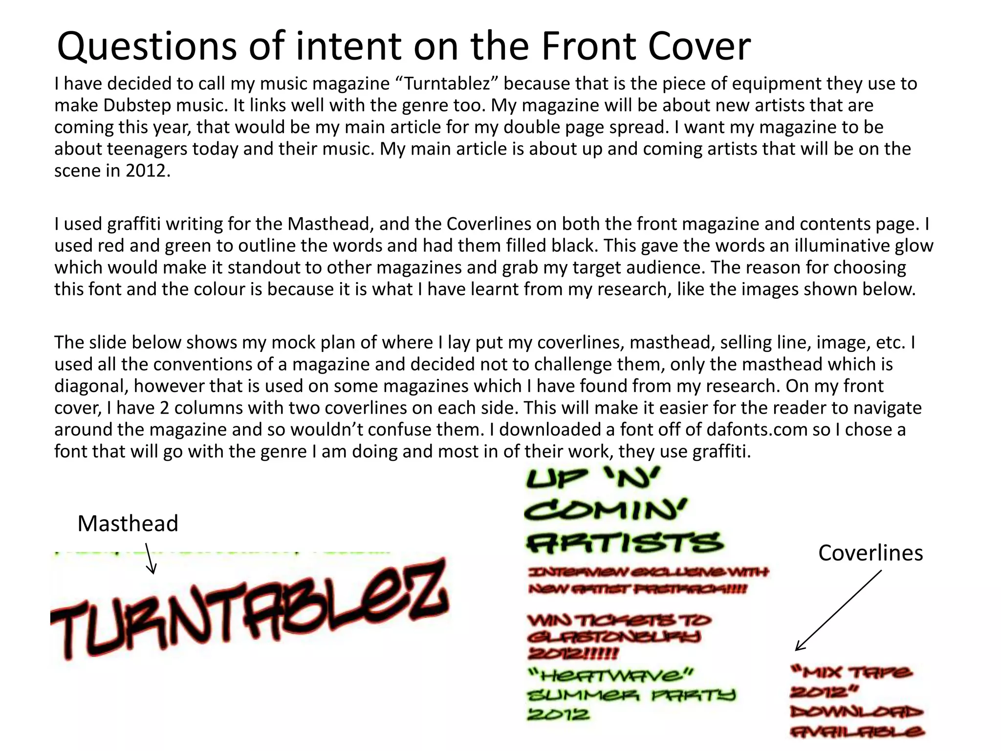
2) The magazine will focus on up-and-coming artists in 2012 to appeal to teenage readers interested in current music.
3) The front cover design uses graffiti fonts and red/green outlines to stand out visually based on research of magazine design trends.


![7.[39 44]rfid based automatic shopping cart](https://cdn.slidesharecdn.com/ss_thumbnails/7-39-44rfidbasedautomaticshoppingcart-111203185132-phpapp02-thumbnail.jpg?width=640&height=640&fit=bounds)


