SlideShare a Scribd company logo
1 of 6
On this magazine front cover, the band stands out the
most; they are all in black which links to how they are
named ‘the worlds most dangerous band’. The colour black
has connotations with mystery, evil, death and danger. The
idea of the band being named dangerous, would make the
reader feel drawn in and wanting to know more about this
band. Each member of the band looks serious and some
members are holding potential ‘weapons’ this also gives
the impression of danger. Finally, the masthead is barely
visible, due to the fact that the band is covering it which
suggests their importance.
The word ’FREE’ stands out so that the reader will feel
attracted to the magazine and more likely to buy the
magazine, if there is something free included.
The other mentioned bands, are all in red writing because
the colour red stands out over the black themed
background. Also the colour red has connotations with
passion, determination , strength and energy which shows
how determined each band is, and how they have a strong
passion for music.
The band ‘Funeral for a friend’ is overlapping ‘Panic! At the
disco’ because the magazine could be trying to promote
them more than ‘Panic! At the disco’. This could be due to
the fact that ‘Panic! at the disco’ are already popular and
that the other bands need more promotion.
A lot of words are in capitals on this magazine front which
shows how the magazine is trying to promote certain
things more than others. It also shows how it is trying to
attract readers, and is trying to stand out by almost
‘shouting’ at the reader through the use of capitals.
Each band member is wearing black
which suits the genre of music they
produce; heavy metal. They are all
wearing stereotypical ’rocker’ outfits
which also suits the genre of the
magazine. The people who purchase
the magazine are expecting a certain
style, so ’Kerrang’ has to fill these
expectations by using alternative
bands.
Finally, the bands mentioned on the
bottom of the magazine, are all in
white text which represents how they
contrast to ’Avenged Sevenfold’ who
are all in black. This could be because
the bands mentioned below are of
slightly different sub-genres of Rock.
They are all mentioned on a yellow
background, to stand out against the
red and the black.
Last of all, the barcode in the bottom
of the magazine is quite reserved
compared to other magazines. This
shows that ‘Kerrang’ has better things
to publish on the front cover rather
than showing off about the cheap
price.
On this contents page, the first thing that stands out is Gerard Way; lead singer of My
Chemical Romance. He is in all black, including his hair and black has connotations with
death. This could represent the ’death’ of My Chemical Romance and how they split up.
The next thing that stands out on this contents page, is the quote from Gerard Way,
especially the words ‘Let it Go’. This could suggest that Gerard Way is trying to get his fans
to ‘let go’ and move on from the end of My Chemical Romance.
The background behind Gerard Way is all white, this makes him stand out more. Also, the
contents page is a deliberately simple design to ensure that the focus is entirely on
Gerard Way.
The magazine name, issue number and date is really clear which helps it to stand out to
the reader.
The only colours featured on this contents page are black, red and white; all of the
colours contrast with each other. Black and red are both ‘dangerous’ colours whereas
white is simple and pure. This could represent how My Chemical Romance is over but
there is ‘hope’ for more new bands.
Each band name is in capital letters, to stand out to the reader and represent the
importance of each band.
The way the magazine uses swearing in the contents page, gives and edgy feel to it. This
also links to the genre of the magazine.
‘Rock Sound’ gives the impression that it likes to be real to its readers. Especially when it
says ‘ignoring the idle gossip’ in relation to Marilyn Manson; and how the media like to
make false rumors about him. ’Rock Sound’ isn’t jumping on the bandwagon of
‘hounding’ celebrities, the editors are trying to provide a truthful magazine for the
readers.
‘Rock Sound’ likes to use rhetorical questions which makes the magazine conversational
and makes the reader feel included.
In this double-page spread, Lily Allen takes up a big proportion of
the page as well as the enlarged quote. She is wearing a red plaid
shirt which is often associated with the more alternative style.
Along with the black hair and dark eyeshadow, she fits the genre
of the magazine; NME.
The big black and white quote next to her looks like the cut outs of
newspaper letters, like when you send a ransom note. The letters
look unorganized and of different sizes, this could represent her
unorganized/carefree lifestyle.
In the article, when Lily Allen’s name is mentioned, it is in red
letters which suggests she is energetic and has a lot of passion
(connotations with red).
The magazine, NME, seems to want to dig deeper when publishing
stories. This shows that they aren’t interested in common rumors
and that they want to show readers the truth ‘NME dodges the
paparazzi and attempts to get behind the headlines’.
The colour scheme for this double-page spread is mainly black and
white with the exception of Lily Allen wearing a red shirt. The
colours blend well and don’t clash, they are also common colours
in the alternative fashion scene.
The fact that Lily Allen is leaning forward slightly, makes the reader
feel more included. She also has very relaxed body language which
is good for the reader to feel more comfortable when reading the
double-page spread about her.
On this magazine front cover, Jared Leto is the main feature of this magazines
issue. Although it is about his band, he is the only member there which shows his
importance and how the magazine issue could be focusing on him more than the
band. He gives quite a menacing/threatening look along with making a fist in
threatening way. This makes him look intimidating which links to the pull quote; ‘I
could be your worst enemy!’.
Jared Leto is dressed all in black which suits his music genre and the genre of the
magazine. Also, the colour black has connotations with power an mystery. This
connects to the pull quote; ‘Jared Leto’s dark side exposed!’. The pull quote also
suggests that Jared Leto has a bad side to him and that he could turn nasty if you
don’t tread carefully. This attracts the reader because they want to know about
his ‘dark side’.
The masthead is over the top of Jared Leto, but part of it has been edited to
make way for Jared Leto’s head which also signifies his importance/popularity.
Around Jared Leto, there are smaller images of other bands/singers. For example,
in relation to the band All Time Low; ‘Pop-punk’s new star laid bare!’ this pull
quote suggests that since the singer is new, people want to know everything
about him. The pun; ‘laid bare’ suggests that the magazine have lot’s of
information about him that other magazines may not have.
The magazine seems to have a humorous/light-hearted outlook. For example
from the pull quote; ‘‘I nearly croaked!’ Zakk Wylde’s Health Scare’ this suggests
their light-hearted outlook on a serious subject. The pun is used for humor which
readers often enjoy.
The colour scheme of this magazine front cover is mainly red, white and black.
Each of these colours can be associated with the ‘Rock’ genre and sub-genres of
‘Rock’. Also, red and black have connotations with power, mystery, determination
and passion which is a representation of singers/bands.
First of all, this contents page gives a simplistic look. You see Florence
Welch in plain black, quite elegant looking an a plain background. The
fact that the background is so plain, emphasizes the importance of
Florence Welch and how she is the main feature of this magazines
issue.
The pull quote; ‘Solitude: It’s an age-old problem for female
performers on the road.’ it suggests that she is talking about herself.
Florence Welch gives the impression that she is lonely which links to
the pull quote. The way that she is standing on her own, with a simple
background is a representation of her lonely lifestyle.
In the first text; ‘How did a chubby, melancholy Green Day fan
transform herself into the soul-dripping high fashion that is Florence
And The Machine? John Harris goes behind the glamour to find out.’
this all suggests that she has changed a lot, that she is considered very
glamourous which is shown in her picture; with the elegant jewelry
and dress. Also, it suggests that she almost hides behind the glamour,
and that the glamour is just a front; Florence Welch could be really
different when she isn’t under the spotlight. One of the pages;
‘Unearthed Rock portraits of steely cool and statuesque beauty, from
the rediscovered archive…’ I interpret this as a reference to Florence
Welch and how she is stood in a ’statuesque’ pose.
The overall colour theme for this contents page is quite ‘cool’ and
’steely’ and this is all a reference to Florence Welch and how she is
lonely. Also, the use of quite boring/plain/steely colours helps to make
Florence Welch stand out; especially with the warm colour of her hair.
The thing that stand out the most on this double
page spread is definitely the masthead/title. With
the big, bold font and the bright yellow, it
definitely serves it’s purpose; to attract the reader.
The reasoning behind using bright yellow I so it
stands out against the black background. Also, the
colour yellow has connotations with happiness
which refers to the band name; ‘Fun!’. Below all of
the text, are the members of the band; covered in
food because they are trying to give of the
impression they are having fun (like their band
name).
Although the yellow text is bold and easy to read,
the white text is quite difficult to see; it might be
different in the actual magazine but the online
version is almost unintelligible.
The colour scheme of yellow and black reminds me
of hazard tape/cordon tape which suggests that
the band is quite mischievous and that they could
have a bad/dangerous side. There is definitely a
contrast of colours; yellow is a happy colour
whereas black is a mysterious/evil colour. Also,
white is an innocent colour , so the text contrasts
with the background. The use of different colours
represents the different sides to the band.

More Related Content

What's hot

Kerrang Feature Analysis
Kerrang Feature AnalysisKerrang Feature Analysis
Kerrang Feature Analysismeghanmooreg321
 
Music Magazine Research
Music Magazine ResearchMusic Magazine Research
Music Magazine Researchlewis galloway
 
Kerrang! Front Page Analysis
Kerrang! Front Page AnalysisKerrang! Front Page Analysis
Kerrang! Front Page Analysismeghanmooreg321
 
Magazine cover analysis 2
Magazine cover analysis 2Magazine cover analysis 2
Magazine cover analysis 2georgialaurenmc
 
Magazine cover analysis 1,2 and 3
Magazine cover analysis 1,2 and 3Magazine cover analysis 1,2 and 3
Magazine cover analysis 1,2 and 3georgialaurenmc
 
Double Page Spread A
Double Page Spread ADouble Page Spread A
Double Page Spread ADemiDrummond
 
Analysis of existing pages
Analysis of existing pagesAnalysis of existing pages
Analysis of existing pagesPravinaumah13
 
Existing magazine pages
Existing magazine pagesExisting magazine pages
Existing magazine pagesPravinaumah13
 
Analysing double page spreads in music magazines
Analysing double page spreads in music magazinesAnalysing double page spreads in music magazines
Analysing double page spreads in music magazinesHenriettaDent
 
Presentation1 xx
Presentation1 xxPresentation1 xx
Presentation1 xxmolliedyer7
 
Year 12 media dps analysis
Year 12 media  dps analysisYear 12 media  dps analysis
Year 12 media dps analysisFelanQuirke
 

What's hot (18)

Kerrang Feature Analysis
Kerrang Feature AnalysisKerrang Feature Analysis
Kerrang Feature Analysis
 
Metal hammer
Metal hammerMetal hammer
Metal hammer
 
Music Magazine Research
Music Magazine ResearchMusic Magazine Research
Music Magazine Research
 
Q Front Page Analysis
Q Front Page AnalysisQ Front Page Analysis
Q Front Page Analysis
 
Kerrang! Front Page Analysis
Kerrang! Front Page AnalysisKerrang! Front Page Analysis
Kerrang! Front Page Analysis
 
All 3 cover analysis
All 3 cover analysisAll 3 cover analysis
All 3 cover analysis
 
All 3 cover analysis 2
All 3 cover analysis 2All 3 cover analysis 2
All 3 cover analysis 2
 
All 3 cover analysis
All 3 cover analysisAll 3 cover analysis
All 3 cover analysis
 
Magazine cover analysis 2
Magazine cover analysis 2Magazine cover analysis 2
Magazine cover analysis 2
 
All 3 cover analysis
All 3 cover analysisAll 3 cover analysis
All 3 cover analysis
 
Nme Front Page Analysis
Nme Front Page AnalysisNme Front Page Analysis
Nme Front Page Analysis
 
Magazine cover analysis 1,2 and 3
Magazine cover analysis 1,2 and 3Magazine cover analysis 1,2 and 3
Magazine cover analysis 1,2 and 3
 
Double Page Spread A
Double Page Spread ADouble Page Spread A
Double Page Spread A
 
Analysis of existing pages
Analysis of existing pagesAnalysis of existing pages
Analysis of existing pages
 
Existing magazine pages
Existing magazine pagesExisting magazine pages
Existing magazine pages
 
Analysing double page spreads in music magazines
Analysing double page spreads in music magazinesAnalysing double page spreads in music magazines
Analysing double page spreads in music magazines
 
Presentation1 xx
Presentation1 xxPresentation1 xx
Presentation1 xx
 
Year 12 media dps analysis
Year 12 media  dps analysisYear 12 media  dps analysis
Year 12 media dps analysis
 

Viewers also liked

'The Recce'
'The Recce''The Recce'
'The Recce'Meg Lily
 
Final costume ideas
Final costume ideasFinal costume ideas
Final costume ideasMeg Lily
 
Costume, hair and makeup
Costume, hair and makeupCostume, hair and makeup
Costume, hair and makeupMeg Lily
 
Fonts inspiration
Fonts inspirationFonts inspiration
Fonts inspirationMeg Lily
 
Audience profiles
Audience profilesAudience profiles
Audience profilesMeg Lily
 
Colour scheme
Colour schemeColour scheme
Colour schemeMeg Lily
 
Location search
Location searchLocation search
Location searchMeg Lily
 
Moodboard; magazine genre
Moodboard; magazine genreMoodboard; magazine genre
Moodboard; magazine genreMeg Lily
 
Proposal Form
Proposal FormProposal Form
Proposal FormMeg Lily
 
Calendar December 2016
Calendar December 2016Calendar December 2016
Calendar December 2016Elisha Delaney
 
Instituion research final
Instituion research finalInstituion research final
Instituion research finalElisha Delaney
 
Instituion research final
Instituion research finalInstituion research final
Instituion research finalElisha Delaney
 
Calendar November 2016
Calendar November 2016Calendar November 2016
Calendar November 2016Elisha Delaney
 
Institution research
Institution research Institution research
Institution research rachsafff
 
Deconstructing magazines
Deconstructing magazinesDeconstructing magazines
Deconstructing magazinesadamtyson12
 
Photoshoptools 170125094354
Photoshoptools 170125094354Photoshoptools 170125094354
Photoshoptools 170125094354Elisha Delaney
 

Viewers also liked (20)

'The Recce'
'The Recce''The Recce'
'The Recce'
 
Final costume ideas
Final costume ideasFinal costume ideas
Final costume ideas
 
Costume, hair and makeup
Costume, hair and makeupCostume, hair and makeup
Costume, hair and makeup
 
Fonts inspiration
Fonts inspirationFonts inspiration
Fonts inspiration
 
Audience profiles
Audience profilesAudience profiles
Audience profiles
 
Colour scheme
Colour schemeColour scheme
Colour scheme
 
Interview
InterviewInterview
Interview
 
Location search
Location searchLocation search
Location search
 
Moodboard; magazine genre
Moodboard; magazine genreMoodboard; magazine genre
Moodboard; magazine genre
 
Proposal Form
Proposal FormProposal Form
Proposal Form
 
Reader profile
Reader profileReader profile
Reader profile
 
Calendar December 2016
Calendar December 2016Calendar December 2016
Calendar December 2016
 
Instituion research final
Instituion research finalInstituion research final
Instituion research final
 
Q5
Q5Q5
Q5
 
Instituion research final
Instituion research finalInstituion research final
Instituion research final
 
Calendar November 2016
Calendar November 2016Calendar November 2016
Calendar November 2016
 
Generic conventions
Generic conventionsGeneric conventions
Generic conventions
 
Institution research
Institution research Institution research
Institution research
 
Deconstructing magazines
Deconstructing magazinesDeconstructing magazines
Deconstructing magazines
 
Photoshoptools 170125094354
Photoshoptools 170125094354Photoshoptools 170125094354
Photoshoptools 170125094354
 

Similar to Deconstructions

Magazine analysis real
Magazine analysis realMagazine analysis real
Magazine analysis realmadelainegee
 
Digipak analysis
Digipak analysisDigipak analysis
Digipak analysiscaleah kerr
 
Deconstructions of rock magazines
Deconstructions of rock magazinesDeconstructions of rock magazines
Deconstructions of rock magazinesShahEman
 
Media cw music magazine reaserch and ideas annabel lucey
Media cw music magazine reaserch and ideas annabel luceyMedia cw music magazine reaserch and ideas annabel lucey
Media cw music magazine reaserch and ideas annabel luceybell101
 
Media cw music magazine reaserch and ideas annabel lucey
Media cw music magazine reaserch and ideas annabel luceyMedia cw music magazine reaserch and ideas annabel lucey
Media cw music magazine reaserch and ideas annabel luceybell101
 
Final media music magazine annabel lucey
Final media music magazine annabel luceyFinal media music magazine annabel lucey
Final media music magazine annabel luceybell101
 
Music magazine annabel lucey
Music magazine annabel luceyMusic magazine annabel lucey
Music magazine annabel luceybell101
 
Deconstructions
DeconstructionsDeconstructions
DeconstructionsCalsMC
 
Kerrang Magazine Front Cover Analysis
Kerrang Magazine Front Cover AnalysisKerrang Magazine Front Cover Analysis
Kerrang Magazine Front Cover Analysismaddyhowell
 
Music magazine reaserch and ideas annabel lucey
Music magazine reaserch and ideas annabel luceyMusic magazine reaserch and ideas annabel lucey
Music magazine reaserch and ideas annabel luceybell101
 
Music magazine reaserch and ideas annabel lucey
Music magazine reaserch and ideas annabel luceyMusic magazine reaserch and ideas annabel lucey
Music magazine reaserch and ideas annabel luceybell101
 
Analysis of covers, contents, and double page spreads
Analysis of covers, contents, and double page spreadsAnalysis of covers, contents, and double page spreads
Analysis of covers, contents, and double page spreadseliroddy
 
Analysis of covers, contents, and double page spreads
Analysis of covers, contents, and double page spreadsAnalysis of covers, contents, and double page spreads
Analysis of covers, contents, and double page spreadseliroddy
 
Textual analysis of ‘real texts’ digi pak
Textual analysis of ‘real texts’ digi pakTextual analysis of ‘real texts’ digi pak
Textual analysis of ‘real texts’ digi pakcharlottekellytps
 
Media Coursework
Media CourseworkMedia Coursework
Media Courseworkgibson8955
 

Similar to Deconstructions (20)

Deconstructions
DeconstructionsDeconstructions
Deconstructions
 
Magazine analysis real
Magazine analysis realMagazine analysis real
Magazine analysis real
 
Magazine Analysis
Magazine AnalysisMagazine Analysis
Magazine Analysis
 
Music magazines
Music magazinesMusic magazines
Music magazines
 
Digipak analysis
Digipak analysisDigipak analysis
Digipak analysis
 
Deconstructions of rock magazines
Deconstructions of rock magazinesDeconstructions of rock magazines
Deconstructions of rock magazines
 
Rock sound
Rock soundRock sound
Rock sound
 
Media cw music magazine reaserch and ideas annabel lucey
Media cw music magazine reaserch and ideas annabel luceyMedia cw music magazine reaserch and ideas annabel lucey
Media cw music magazine reaserch and ideas annabel lucey
 
Media cw music magazine reaserch and ideas annabel lucey
Media cw music magazine reaserch and ideas annabel luceyMedia cw music magazine reaserch and ideas annabel lucey
Media cw music magazine reaserch and ideas annabel lucey
 
Final media music magazine annabel lucey
Final media music magazine annabel luceyFinal media music magazine annabel lucey
Final media music magazine annabel lucey
 
Music magazine annabel lucey
Music magazine annabel luceyMusic magazine annabel lucey
Music magazine annabel lucey
 
Deconstructions
DeconstructionsDeconstructions
Deconstructions
 
Kerrang Magazine Front Cover Analysis
Kerrang Magazine Front Cover AnalysisKerrang Magazine Front Cover Analysis
Kerrang Magazine Front Cover Analysis
 
Music magazine reaserch and ideas annabel lucey
Music magazine reaserch and ideas annabel luceyMusic magazine reaserch and ideas annabel lucey
Music magazine reaserch and ideas annabel lucey
 
Music magazine reaserch and ideas annabel lucey
Music magazine reaserch and ideas annabel luceyMusic magazine reaserch and ideas annabel lucey
Music magazine reaserch and ideas annabel lucey
 
Analysis of covers, contents, and double page spreads
Analysis of covers, contents, and double page spreadsAnalysis of covers, contents, and double page spreads
Analysis of covers, contents, and double page spreads
 
Analysis of covers, contents, and double page spreads
Analysis of covers, contents, and double page spreadsAnalysis of covers, contents, and double page spreads
Analysis of covers, contents, and double page spreads
 
Textual analysis of ‘real texts’ digi pak
Textual analysis of ‘real texts’ digi pakTextual analysis of ‘real texts’ digi pak
Textual analysis of ‘real texts’ digi pak
 
Media Coursework
Media CourseworkMedia Coursework
Media Coursework
 
Analysis of chosen magazine
Analysis of chosen magazineAnalysis of chosen magazine
Analysis of chosen magazine
 

Recently uploaded

HỌC TỐT TIẾNG ANH 11 THEO CHƯƠNG TRÌNH GLOBAL SUCCESS ĐÁP ÁN CHI TIẾT - CẢ NĂ...
HỌC TỐT TIẾNG ANH 11 THEO CHƯƠNG TRÌNH GLOBAL SUCCESS ĐÁP ÁN CHI TIẾT - CẢ NĂ...HỌC TỐT TIẾNG ANH 11 THEO CHƯƠNG TRÌNH GLOBAL SUCCESS ĐÁP ÁN CHI TIẾT - CẢ NĂ...
HỌC TỐT TIẾNG ANH 11 THEO CHƯƠNG TRÌNH GLOBAL SUCCESS ĐÁP ÁN CHI TIẾT - CẢ NĂ...Nguyen Thanh Tu Collection
 
ECONOMIC CONTEXT - LONG FORM TV DRAMA - PPT
ECONOMIC CONTEXT - LONG FORM TV DRAMA - PPTECONOMIC CONTEXT - LONG FORM TV DRAMA - PPT
ECONOMIC CONTEXT - LONG FORM TV DRAMA - PPTiammrhaywood
 
Karra SKD Conference Presentation Revised.pptx
Karra SKD Conference Presentation Revised.pptxKarra SKD Conference Presentation Revised.pptx
Karra SKD Conference Presentation Revised.pptxAshokKarra1
 
Q4 English4 Week3 PPT Melcnmg-based.pptx
Q4 English4 Week3 PPT Melcnmg-based.pptxQ4 English4 Week3 PPT Melcnmg-based.pptx
Q4 English4 Week3 PPT Melcnmg-based.pptxnelietumpap1
 
ECONOMIC CONTEXT - PAPER 1 Q3: NEWSPAPERS.pptx
ECONOMIC CONTEXT - PAPER 1 Q3: NEWSPAPERS.pptxECONOMIC CONTEXT - PAPER 1 Q3: NEWSPAPERS.pptx
ECONOMIC CONTEXT - PAPER 1 Q3: NEWSPAPERS.pptxiammrhaywood
 
Roles & Responsibilities in Pharmacovigilance
Roles & Responsibilities in PharmacovigilanceRoles & Responsibilities in Pharmacovigilance
Roles & Responsibilities in PharmacovigilanceSamikshaHamane
 
4.18.24 Movement Legacies, Reflection, and Review.pptx
4.18.24 Movement Legacies, Reflection, and Review.pptx4.18.24 Movement Legacies, Reflection, and Review.pptx
4.18.24 Movement Legacies, Reflection, and Review.pptxmary850239
 
ISYU TUNGKOL SA SEKSWLADIDA (ISSUE ABOUT SEXUALITY
ISYU TUNGKOL SA SEKSWLADIDA (ISSUE ABOUT SEXUALITYISYU TUNGKOL SA SEKSWLADIDA (ISSUE ABOUT SEXUALITY
ISYU TUNGKOL SA SEKSWLADIDA (ISSUE ABOUT SEXUALITYKayeClaireEstoconing
 
Difference Between Search & Browse Methods in Odoo 17
Difference Between Search & Browse Methods in Odoo 17Difference Between Search & Browse Methods in Odoo 17
Difference Between Search & Browse Methods in Odoo 17Celine George
 
ACC 2024 Chronicles. Cardiology. Exam.pdf
ACC 2024 Chronicles. Cardiology. Exam.pdfACC 2024 Chronicles. Cardiology. Exam.pdf
ACC 2024 Chronicles. Cardiology. Exam.pdfSpandanaRallapalli
 
AMERICAN LANGUAGE HUB_Level2_Student'sBook_Answerkey.pdf
AMERICAN LANGUAGE HUB_Level2_Student'sBook_Answerkey.pdfAMERICAN LANGUAGE HUB_Level2_Student'sBook_Answerkey.pdf
AMERICAN LANGUAGE HUB_Level2_Student'sBook_Answerkey.pdfphamnguyenenglishnb
 
THEORIES OF ORGANIZATION-PUBLIC ADMINISTRATION
THEORIES OF ORGANIZATION-PUBLIC ADMINISTRATIONTHEORIES OF ORGANIZATION-PUBLIC ADMINISTRATION
THEORIES OF ORGANIZATION-PUBLIC ADMINISTRATIONHumphrey A Beña
 
Full Stack Web Development Course for Beginners
Full Stack Web Development Course  for BeginnersFull Stack Web Development Course  for Beginners
Full Stack Web Development Course for BeginnersSabitha Banu
 
USPS® Forced Meter Migration - How to Know if Your Postage Meter Will Soon be...
USPS® Forced Meter Migration - How to Know if Your Postage Meter Will Soon be...USPS® Forced Meter Migration - How to Know if Your Postage Meter Will Soon be...
USPS® Forced Meter Migration - How to Know if Your Postage Meter Will Soon be...Postal Advocate Inc.
 
Keynote by Prof. Wurzer at Nordex about IP-design
Keynote by Prof. Wurzer at Nordex about IP-designKeynote by Prof. Wurzer at Nordex about IP-design
Keynote by Prof. Wurzer at Nordex about IP-designMIPLM
 

Recently uploaded (20)

HỌC TỐT TIẾNG ANH 11 THEO CHƯƠNG TRÌNH GLOBAL SUCCESS ĐÁP ÁN CHI TIẾT - CẢ NĂ...
HỌC TỐT TIẾNG ANH 11 THEO CHƯƠNG TRÌNH GLOBAL SUCCESS ĐÁP ÁN CHI TIẾT - CẢ NĂ...HỌC TỐT TIẾNG ANH 11 THEO CHƯƠNG TRÌNH GLOBAL SUCCESS ĐÁP ÁN CHI TIẾT - CẢ NĂ...
HỌC TỐT TIẾNG ANH 11 THEO CHƯƠNG TRÌNH GLOBAL SUCCESS ĐÁP ÁN CHI TIẾT - CẢ NĂ...
 
ECONOMIC CONTEXT - LONG FORM TV DRAMA - PPT
ECONOMIC CONTEXT - LONG FORM TV DRAMA - PPTECONOMIC CONTEXT - LONG FORM TV DRAMA - PPT
ECONOMIC CONTEXT - LONG FORM TV DRAMA - PPT
 
Karra SKD Conference Presentation Revised.pptx
Karra SKD Conference Presentation Revised.pptxKarra SKD Conference Presentation Revised.pptx
Karra SKD Conference Presentation Revised.pptx
 
YOUVE_GOT_EMAIL_PRELIMS_EL_DORADO_2024.pptx
YOUVE_GOT_EMAIL_PRELIMS_EL_DORADO_2024.pptxYOUVE_GOT_EMAIL_PRELIMS_EL_DORADO_2024.pptx
YOUVE_GOT_EMAIL_PRELIMS_EL_DORADO_2024.pptx
 
Model Call Girl in Tilak Nagar Delhi reach out to us at 🔝9953056974🔝
Model Call Girl in Tilak Nagar Delhi reach out to us at 🔝9953056974🔝Model Call Girl in Tilak Nagar Delhi reach out to us at 🔝9953056974🔝
Model Call Girl in Tilak Nagar Delhi reach out to us at 🔝9953056974🔝
 
Q4 English4 Week3 PPT Melcnmg-based.pptx
Q4 English4 Week3 PPT Melcnmg-based.pptxQ4 English4 Week3 PPT Melcnmg-based.pptx
Q4 English4 Week3 PPT Melcnmg-based.pptx
 
ECONOMIC CONTEXT - PAPER 1 Q3: NEWSPAPERS.pptx
ECONOMIC CONTEXT - PAPER 1 Q3: NEWSPAPERS.pptxECONOMIC CONTEXT - PAPER 1 Q3: NEWSPAPERS.pptx
ECONOMIC CONTEXT - PAPER 1 Q3: NEWSPAPERS.pptx
 
Roles & Responsibilities in Pharmacovigilance
Roles & Responsibilities in PharmacovigilanceRoles & Responsibilities in Pharmacovigilance
Roles & Responsibilities in Pharmacovigilance
 
4.18.24 Movement Legacies, Reflection, and Review.pptx
4.18.24 Movement Legacies, Reflection, and Review.pptx4.18.24 Movement Legacies, Reflection, and Review.pptx
4.18.24 Movement Legacies, Reflection, and Review.pptx
 
TataKelola dan KamSiber Kecerdasan Buatan v022.pdf
TataKelola dan KamSiber Kecerdasan Buatan v022.pdfTataKelola dan KamSiber Kecerdasan Buatan v022.pdf
TataKelola dan KamSiber Kecerdasan Buatan v022.pdf
 
ISYU TUNGKOL SA SEKSWLADIDA (ISSUE ABOUT SEXUALITY
ISYU TUNGKOL SA SEKSWLADIDA (ISSUE ABOUT SEXUALITYISYU TUNGKOL SA SEKSWLADIDA (ISSUE ABOUT SEXUALITY
ISYU TUNGKOL SA SEKSWLADIDA (ISSUE ABOUT SEXUALITY
 
Difference Between Search & Browse Methods in Odoo 17
Difference Between Search & Browse Methods in Odoo 17Difference Between Search & Browse Methods in Odoo 17
Difference Between Search & Browse Methods in Odoo 17
 
ACC 2024 Chronicles. Cardiology. Exam.pdf
ACC 2024 Chronicles. Cardiology. Exam.pdfACC 2024 Chronicles. Cardiology. Exam.pdf
ACC 2024 Chronicles. Cardiology. Exam.pdf
 
OS-operating systems- ch04 (Threads) ...
OS-operating systems- ch04 (Threads) ...OS-operating systems- ch04 (Threads) ...
OS-operating systems- ch04 (Threads) ...
 
AMERICAN LANGUAGE HUB_Level2_Student'sBook_Answerkey.pdf
AMERICAN LANGUAGE HUB_Level2_Student'sBook_Answerkey.pdfAMERICAN LANGUAGE HUB_Level2_Student'sBook_Answerkey.pdf
AMERICAN LANGUAGE HUB_Level2_Student'sBook_Answerkey.pdf
 
THEORIES OF ORGANIZATION-PUBLIC ADMINISTRATION
THEORIES OF ORGANIZATION-PUBLIC ADMINISTRATIONTHEORIES OF ORGANIZATION-PUBLIC ADMINISTRATION
THEORIES OF ORGANIZATION-PUBLIC ADMINISTRATION
 
FINALS_OF_LEFT_ON_C'N_EL_DORADO_2024.pptx
FINALS_OF_LEFT_ON_C'N_EL_DORADO_2024.pptxFINALS_OF_LEFT_ON_C'N_EL_DORADO_2024.pptx
FINALS_OF_LEFT_ON_C'N_EL_DORADO_2024.pptx
 
Full Stack Web Development Course for Beginners
Full Stack Web Development Course  for BeginnersFull Stack Web Development Course  for Beginners
Full Stack Web Development Course for Beginners
 
USPS® Forced Meter Migration - How to Know if Your Postage Meter Will Soon be...
USPS® Forced Meter Migration - How to Know if Your Postage Meter Will Soon be...USPS® Forced Meter Migration - How to Know if Your Postage Meter Will Soon be...
USPS® Forced Meter Migration - How to Know if Your Postage Meter Will Soon be...
 
Keynote by Prof. Wurzer at Nordex about IP-design
Keynote by Prof. Wurzer at Nordex about IP-designKeynote by Prof. Wurzer at Nordex about IP-design
Keynote by Prof. Wurzer at Nordex about IP-design
 

Deconstructions

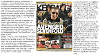
  • 1. On this magazine front cover, the band stands out the most; they are all in black which links to how they are named ‘the worlds most dangerous band’. The colour black has connotations with mystery, evil, death and danger. The idea of the band being named dangerous, would make the reader feel drawn in and wanting to know more about this band. Each member of the band looks serious and some members are holding potential ‘weapons’ this also gives the impression of danger. Finally, the masthead is barely visible, due to the fact that the band is covering it which suggests their importance. The word ’FREE’ stands out so that the reader will feel attracted to the magazine and more likely to buy the magazine, if there is something free included. The other mentioned bands, are all in red writing because the colour red stands out over the black themed background. Also the colour red has connotations with passion, determination , strength and energy which shows how determined each band is, and how they have a strong passion for music. The band ‘Funeral for a friend’ is overlapping ‘Panic! At the disco’ because the magazine could be trying to promote them more than ‘Panic! At the disco’. This could be due to the fact that ‘Panic! at the disco’ are already popular and that the other bands need more promotion. A lot of words are in capitals on this magazine front which shows how the magazine is trying to promote certain things more than others. It also shows how it is trying to attract readers, and is trying to stand out by almost ‘shouting’ at the reader through the use of capitals. Each band member is wearing black which suits the genre of music they produce; heavy metal. They are all wearing stereotypical ’rocker’ outfits which also suits the genre of the magazine. The people who purchase the magazine are expecting a certain style, so ’Kerrang’ has to fill these expectations by using alternative bands. Finally, the bands mentioned on the bottom of the magazine, are all in white text which represents how they contrast to ’Avenged Sevenfold’ who are all in black. This could be because the bands mentioned below are of slightly different sub-genres of Rock. They are all mentioned on a yellow background, to stand out against the red and the black. Last of all, the barcode in the bottom of the magazine is quite reserved compared to other magazines. This shows that ‘Kerrang’ has better things to publish on the front cover rather than showing off about the cheap price.
  • 2. On this contents page, the first thing that stands out is Gerard Way; lead singer of My Chemical Romance. He is in all black, including his hair and black has connotations with death. This could represent the ’death’ of My Chemical Romance and how they split up. The next thing that stands out on this contents page, is the quote from Gerard Way, especially the words ‘Let it Go’. This could suggest that Gerard Way is trying to get his fans to ‘let go’ and move on from the end of My Chemical Romance. The background behind Gerard Way is all white, this makes him stand out more. Also, the contents page is a deliberately simple design to ensure that the focus is entirely on Gerard Way. The magazine name, issue number and date is really clear which helps it to stand out to the reader. The only colours featured on this contents page are black, red and white; all of the colours contrast with each other. Black and red are both ‘dangerous’ colours whereas white is simple and pure. This could represent how My Chemical Romance is over but there is ‘hope’ for more new bands. Each band name is in capital letters, to stand out to the reader and represent the importance of each band. The way the magazine uses swearing in the contents page, gives and edgy feel to it. This also links to the genre of the magazine. ‘Rock Sound’ gives the impression that it likes to be real to its readers. Especially when it says ‘ignoring the idle gossip’ in relation to Marilyn Manson; and how the media like to make false rumors about him. ’Rock Sound’ isn’t jumping on the bandwagon of ‘hounding’ celebrities, the editors are trying to provide a truthful magazine for the readers. ‘Rock Sound’ likes to use rhetorical questions which makes the magazine conversational and makes the reader feel included.
  • 3. In this double-page spread, Lily Allen takes up a big proportion of the page as well as the enlarged quote. She is wearing a red plaid shirt which is often associated with the more alternative style. Along with the black hair and dark eyeshadow, she fits the genre of the magazine; NME. The big black and white quote next to her looks like the cut outs of newspaper letters, like when you send a ransom note. The letters look unorganized and of different sizes, this could represent her unorganized/carefree lifestyle. In the article, when Lily Allen’s name is mentioned, it is in red letters which suggests she is energetic and has a lot of passion (connotations with red). The magazine, NME, seems to want to dig deeper when publishing stories. This shows that they aren’t interested in common rumors and that they want to show readers the truth ‘NME dodges the paparazzi and attempts to get behind the headlines’. The colour scheme for this double-page spread is mainly black and white with the exception of Lily Allen wearing a red shirt. The colours blend well and don’t clash, they are also common colours in the alternative fashion scene. The fact that Lily Allen is leaning forward slightly, makes the reader feel more included. She also has very relaxed body language which is good for the reader to feel more comfortable when reading the double-page spread about her.
  • 4. On this magazine front cover, Jared Leto is the main feature of this magazines issue. Although it is about his band, he is the only member there which shows his importance and how the magazine issue could be focusing on him more than the band. He gives quite a menacing/threatening look along with making a fist in threatening way. This makes him look intimidating which links to the pull quote; ‘I could be your worst enemy!’. Jared Leto is dressed all in black which suits his music genre and the genre of the magazine. Also, the colour black has connotations with power an mystery. This connects to the pull quote; ‘Jared Leto’s dark side exposed!’. The pull quote also suggests that Jared Leto has a bad side to him and that he could turn nasty if you don’t tread carefully. This attracts the reader because they want to know about his ‘dark side’. The masthead is over the top of Jared Leto, but part of it has been edited to make way for Jared Leto’s head which also signifies his importance/popularity. Around Jared Leto, there are smaller images of other bands/singers. For example, in relation to the band All Time Low; ‘Pop-punk’s new star laid bare!’ this pull quote suggests that since the singer is new, people want to know everything about him. The pun; ‘laid bare’ suggests that the magazine have lot’s of information about him that other magazines may not have. The magazine seems to have a humorous/light-hearted outlook. For example from the pull quote; ‘‘I nearly croaked!’ Zakk Wylde’s Health Scare’ this suggests their light-hearted outlook on a serious subject. The pun is used for humor which readers often enjoy. The colour scheme of this magazine front cover is mainly red, white and black. Each of these colours can be associated with the ‘Rock’ genre and sub-genres of ‘Rock’. Also, red and black have connotations with power, mystery, determination and passion which is a representation of singers/bands.
  • 5. First of all, this contents page gives a simplistic look. You see Florence Welch in plain black, quite elegant looking an a plain background. The fact that the background is so plain, emphasizes the importance of Florence Welch and how she is the main feature of this magazines issue. The pull quote; ‘Solitude: It’s an age-old problem for female performers on the road.’ it suggests that she is talking about herself. Florence Welch gives the impression that she is lonely which links to the pull quote. The way that she is standing on her own, with a simple background is a representation of her lonely lifestyle. In the first text; ‘How did a chubby, melancholy Green Day fan transform herself into the soul-dripping high fashion that is Florence And The Machine? John Harris goes behind the glamour to find out.’ this all suggests that she has changed a lot, that she is considered very glamourous which is shown in her picture; with the elegant jewelry and dress. Also, it suggests that she almost hides behind the glamour, and that the glamour is just a front; Florence Welch could be really different when she isn’t under the spotlight. One of the pages; ‘Unearthed Rock portraits of steely cool and statuesque beauty, from the rediscovered archive…’ I interpret this as a reference to Florence Welch and how she is stood in a ’statuesque’ pose. The overall colour theme for this contents page is quite ‘cool’ and ’steely’ and this is all a reference to Florence Welch and how she is lonely. Also, the use of quite boring/plain/steely colours helps to make Florence Welch stand out; especially with the warm colour of her hair.
  • 6. The thing that stand out the most on this double page spread is definitely the masthead/title. With the big, bold font and the bright yellow, it definitely serves it’s purpose; to attract the reader. The reasoning behind using bright yellow I so it stands out against the black background. Also, the colour yellow has connotations with happiness which refers to the band name; ‘Fun!’. Below all of the text, are the members of the band; covered in food because they are trying to give of the impression they are having fun (like their band name). Although the yellow text is bold and easy to read, the white text is quite difficult to see; it might be different in the actual magazine but the online version is almost unintelligible. The colour scheme of yellow and black reminds me of hazard tape/cordon tape which suggests that the band is quite mischievous and that they could have a bad/dangerous side. There is definitely a contrast of colours; yellow is a happy colour whereas black is a mysterious/evil colour. Also, white is an innocent colour , so the text contrasts with the background. The use of different colours represents the different sides to the band.