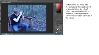
1. First I inserted the image into
Photoshop and then readjusted it
so it would fit into the rule of
thirds, I also did this in order to
make sure that the plants that
surround this location are visible in
the picture.
2. I then adjusted the colour balance, vibrance
and the brightness/contrast. I did this in order
to make the colours of the model’s clothes
stand out clearer, this is important for a fashion
spread as the clothes are the main focus of the
product.
3. I then added in the title to my fashion
spreads, I decided to place it at the top
of the page in order to make sure that it
doesn’t distract from the background or
the model’s clothes. I chose to use the
font I did as it is slightly eroded so it fits
in with the theme of nature.
4. Next I added in information about the
image, who took it and who the model
is. This is conventional of a fashion
spread therefore it is important that I
added it in.
5. I then added in a small sentence
describing the fashion spreads,
providing some incentive for the reader
to continue reading and look at the
other fashion spreads.
6. Finally I added in the information about
the clothing including how much it costs
and where each item can be bought
from. I placed this information in the
bottom right corner in order to not
distract from the image. I also shrank
the information about the photo for the
same reason as well as placing it in the
top right corner.